|
| Group |
Round |
C/R |
Comment |
Date |
Image |
| 14 |
Mar 17 |
Reply |
Thank you for the comparison. I like the composition and colors of the second one better - the flash at the tip gives it a position reference. |
Mar 12th |
| 14 |
Mar 17 |
Reply |
Larry/Arun, I struggled with the shadow and eventually leaned toward Larry's thinking. Thanks for the comments.
I don't know how to make it brighter without washing out the colors? Suggestions for a Lightroom/Photoshop user? |
Mar 12th |
| 14 |
Mar 17 |
Comment |
I think I commented on this before and the comments disappeared. Lets see if these agree:
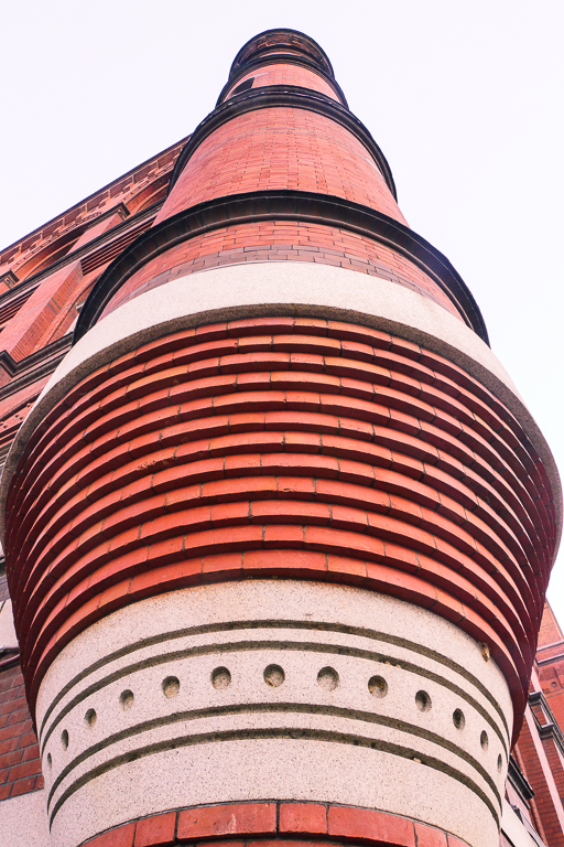
The faded monochrome image enhances the appearance of age on an often photographed object. The introduction of gradient vignetting on the lower portion further enhances the feeling of age - I like it.
As an example of art mixed with architectural photography, I like the small perspective correction to make the sides more parallel.
The edge treatment reduces the apparent sharpness and detracts from the architectural strength of the image. |
Mar 12th |
| 14 |
Mar 17 |
Comment |
I love the bold colors and de-focus of the background.
Minor nit, the monkey's right hand is missing some fingers - I'm not sure if that could be fixed, but if you have the fingers on the original, it is worth seeing how that image looks.
I believe the monkey is commenting on today's political news. :-) |
Mar 12th |
| 14 |
Mar 17 |
Comment |
The color, clouds, and framing give the feeling of the Mississippi. My last Mississippi included hundreds of water images, none showing the depth and colors your image contained.
The colors change "naturally" across the sky. Relaxing, simple composition and water flowing are all pleasing. |
Mar 12th |
| 14 |
Mar 17 |
Comment |
I like the colors, I like the brightness and soft focus in the background.
It is especially nice to see the edges of the important flowers just touching the border. The vignetting is nice, but a little software might better fit the theme (soft flowers?) of the image. |
Mar 12th |
| 14 |
Mar 17 |
Comment |
The colors are impressive - to my eye, it first looked like a photograph of algae or some other growth.
I think the red ending near the right edge reminds me of a portrait with the right fingers cut off. If the original includes the right detail, it would be nice to consider including it and providing some boarder of water to the right. |
Mar 12th |
| 14 |
Mar 17 |
Comment |
Thank you. I enhanced the shadows by reducing the detail in the darker areas to give the photo more depth. The sun was imagined to be coming from the upper right.
Is this the shadow set you were suggesting be eliminated? When I deleted the shadows (the detail is there for enhancing), the photo lacked depth. I'm not sure how to delete the shadow(s) and retain the depth.
I'll work on it some more with your suggestion in mind. |
Mar 12th |
6 comments - 2 replies for Group 14
|
6 comments - 2 replies Total
|