|
| Group |
Round |
C/R |
Comment |
Date |
Image |
| 14 |
Feb 17 |
Comment |
The Auditor's Building was originally the Bureau of Printing and Engraving. It became part of the Department of Agriculture and is now the home of the Forest Service.
I try to minimally process "original" parts of images. The sky was doctored to make it less of an attraction - and since it was doctored, I made it a color that really doesn't occur in nature.
I suppose I should have cropped off the wing, but when I did that it didn't have the appeal.
I also tried more breathing space - it actually looks nicer, but not as striking, if I frame the image.
Thanks for the comments - makes me think.
By the way, the USDA used the building for the Bureau of Waste Management - and the lovers of DC beauty felt the Forest Service was a more appropriate use.
Next door to the Holocaust Museum, the building adds some balance to the city. |
Feb 22nd |
| 14 |
Feb 17 |
Comment |
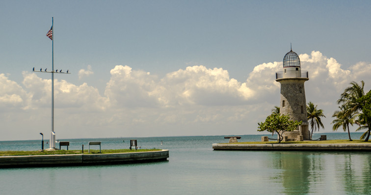
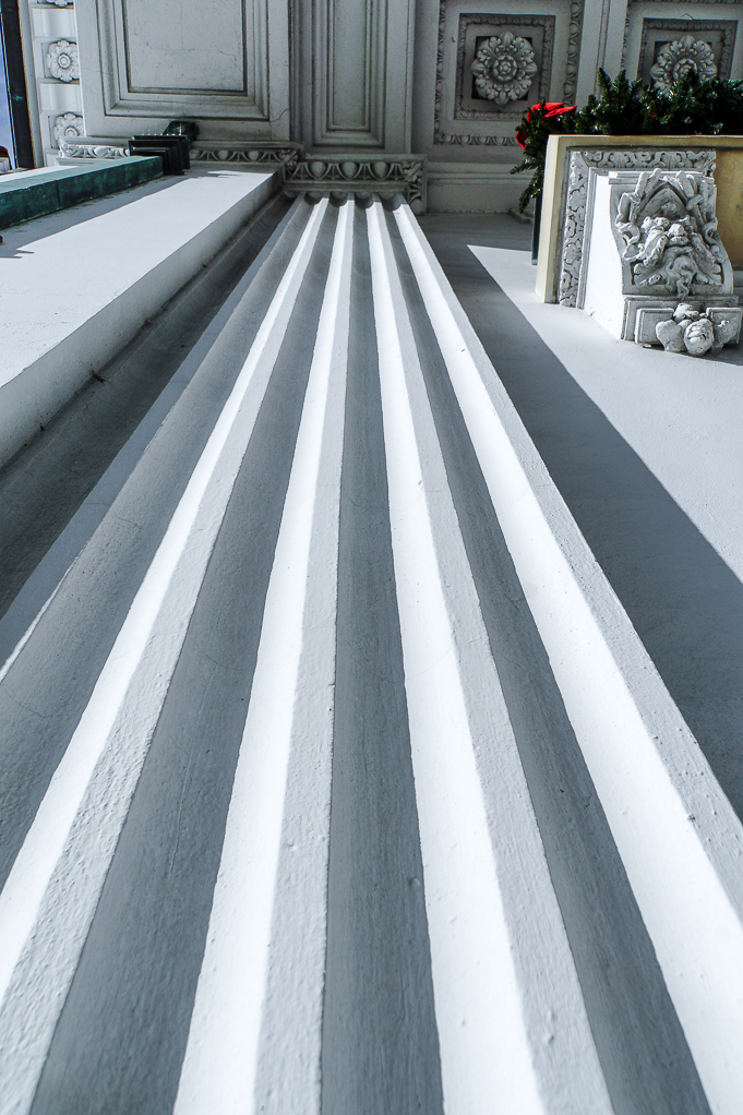
I like the balance, however when I took a little bit of water off with a 3 x 5 card the balance got even better. It looks like the snow is burned out a little bit if there's detail and that I would mask the snow and cut down on the exposure that I would try to detail extract a little more from the clouds I think there's more detail there than you can say that we get the pictures snap. |
Feb 8th |
| 14 |
Feb 17 |
Comment |
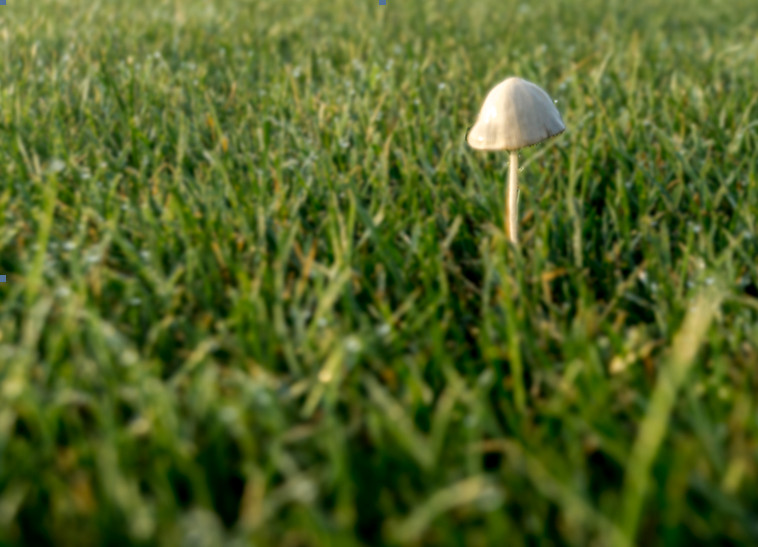
When I look carefully I can just barely see the elf sticking his head out from behind the tree in the middle. The colors an image and texture are beautiful. You might take a minute and take some of the lens or sensor dust in the very bottom out of lighter colored areas it's kind of distracting the second time I look at the image. |
Feb 8th |
| 14 |
Feb 17 |
Comment |
Poor guy looks really hot. I love the steamy feeling. The blood on his hands from motion I find a little distracting makes me think of the blurry put into a racehorse intentionally. I don't see any way to get it out without going to a higher ISO and multiple exposure noise reduction as possible. |
Feb 8th |
| 14 |
Feb 17 |
Comment |
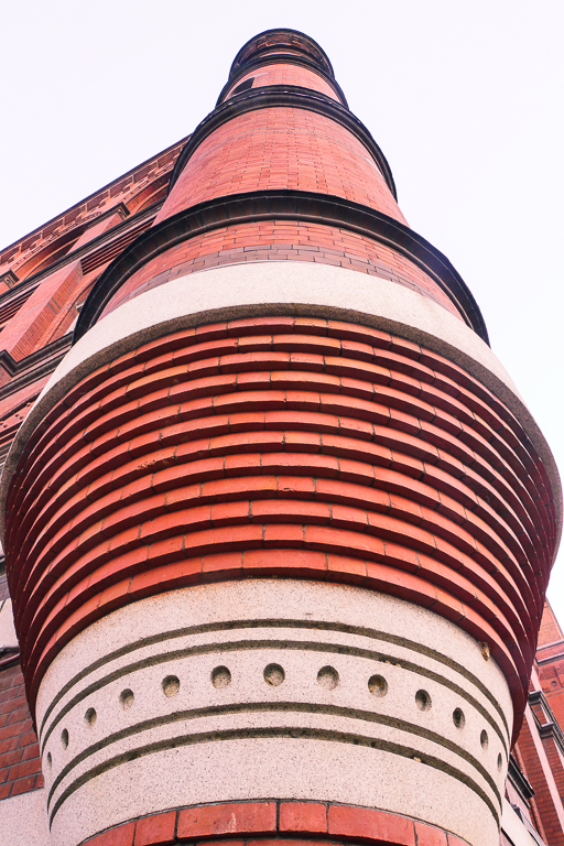
I love the texture and the shapes. The texture where the wall curves isn't quite as pronounced as the texture of the flat surfaces. I would try bringing a little more detail out of the shadows to see if that evens out to Texter? |
Feb 8th |
| 14 |
Feb 17 |
Comment |
Good focus, good lines very sharp focus on the clock. I would like the building to be parallel to the edge since my eye gets distracted by a parent perspective. |
Feb 8th |
| 14 |
Feb 17 |
Comment |
I love the look of the sunlight reflected in the water, even if the sunlight isn't actually reflect in the water. The colors are beautiful. |
Feb 8th |
7 comments - 0 replies for Group 14
|
7 comments - 0 replies Total
|