|
| Group |
Round |
C/R |
Comment |
Date |
Image |
| 19 |
Dec 20 |
Comment |
Barbara, I love your picture. I can almost feel the wind. The almost monochromatic treatment makes it even more moody.
I would not change a thing. |
Dec 15th |
| 19 |
Dec 20 |
Comment |
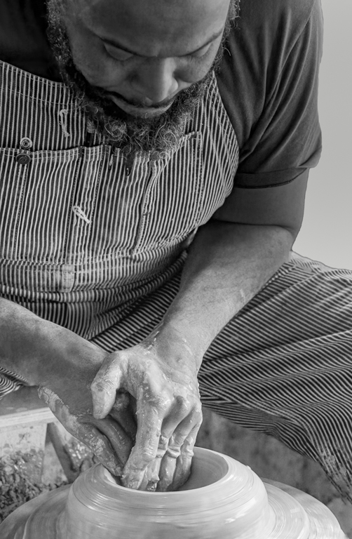
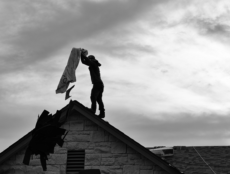
You have not only captured the men's attention, but also the dog's. Quite a feat! I would be tempted to crop some of the space on the left of the picture to make it more balanced, but I don't know if this would be allowed for a PTD image. Great shot!
I intend to read the rules for a PTD image. Thank you, Stan for mentioning the discussion group and even giving us the link. |
Dec 15th |
| 19 |
Dec 20 |
Comment |
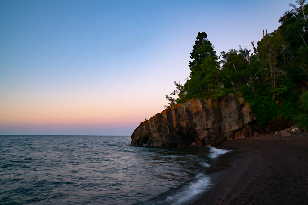
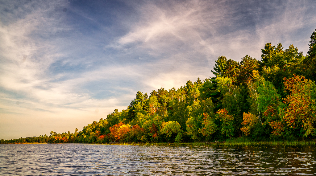
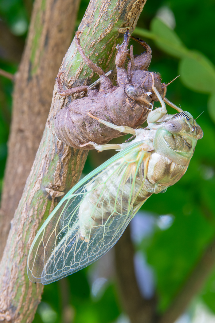
Well exposed in tricky light. Good eye to spot leading lines to rock formation. Good travel photo. |
Dec 15th |
| 19 |
Dec 20 |
Comment |
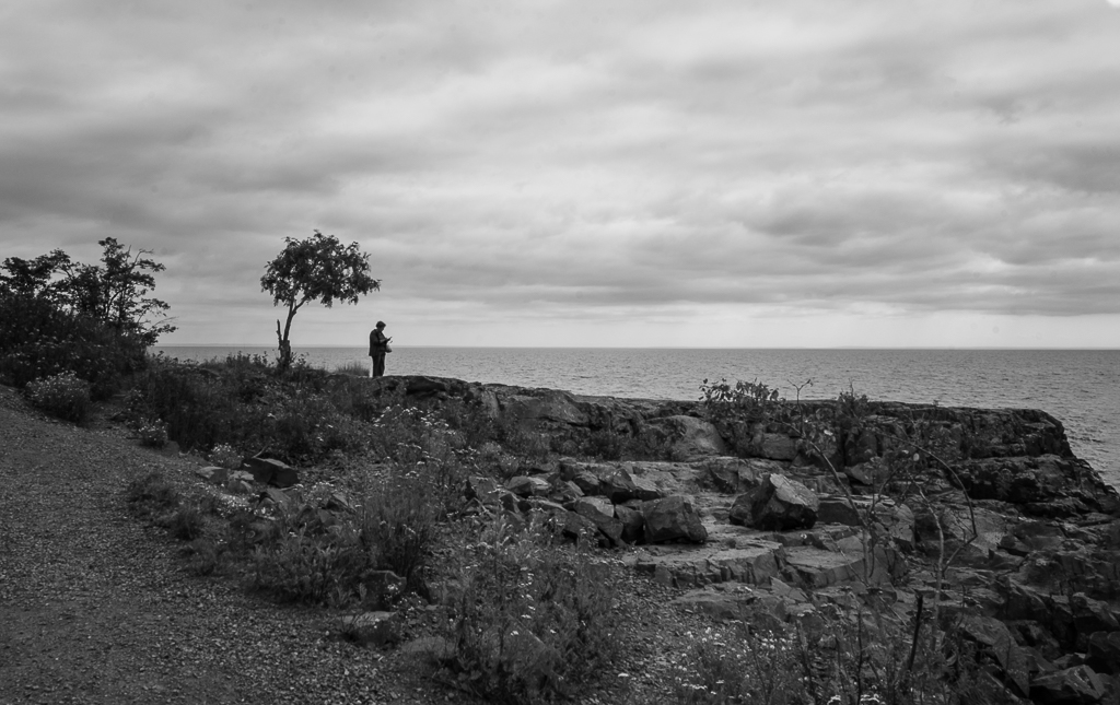
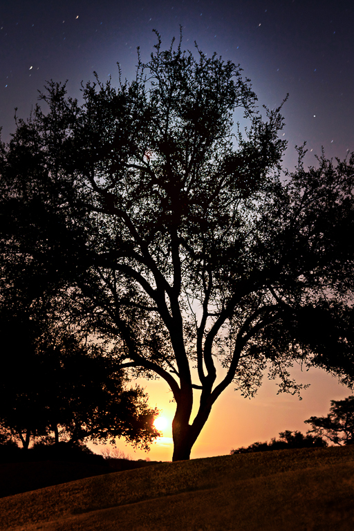
The monochrome treatment accentuates the bleakness of the landscape and gives me a sense of that melancholic feeling you wished to impart. I liked the framing. In my opinion, it is now ready to be hung on the wall. |
Dec 15th |
| 19 |
Dec 20 |
Comment |
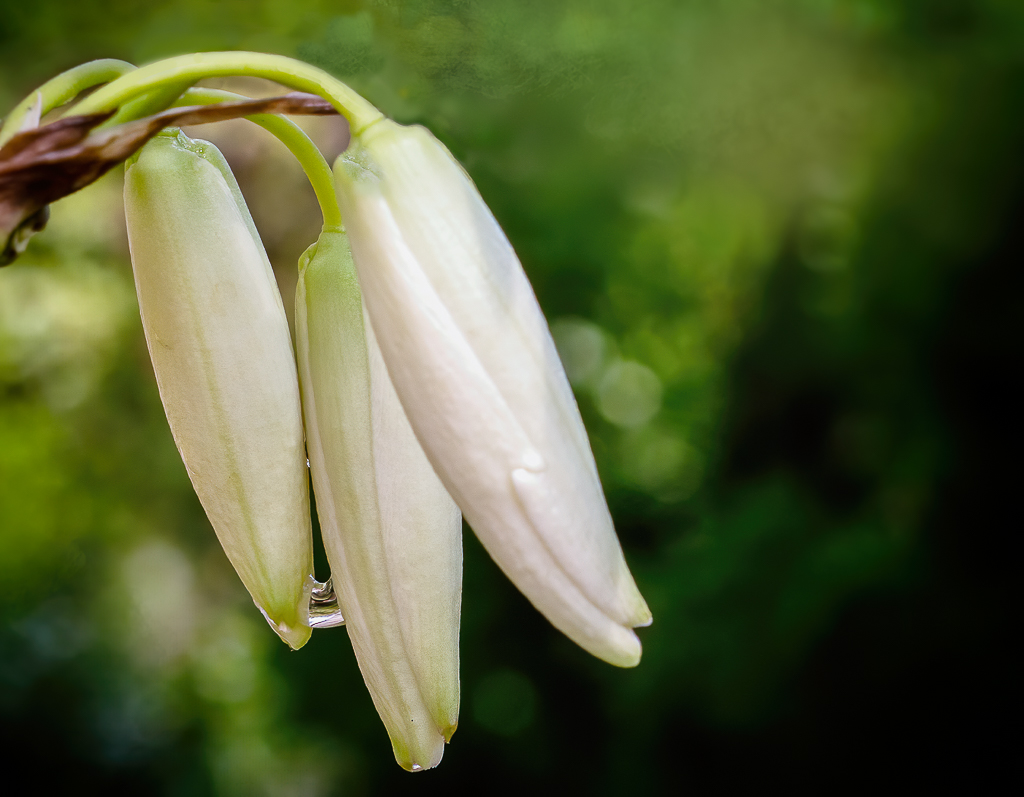
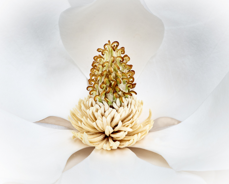
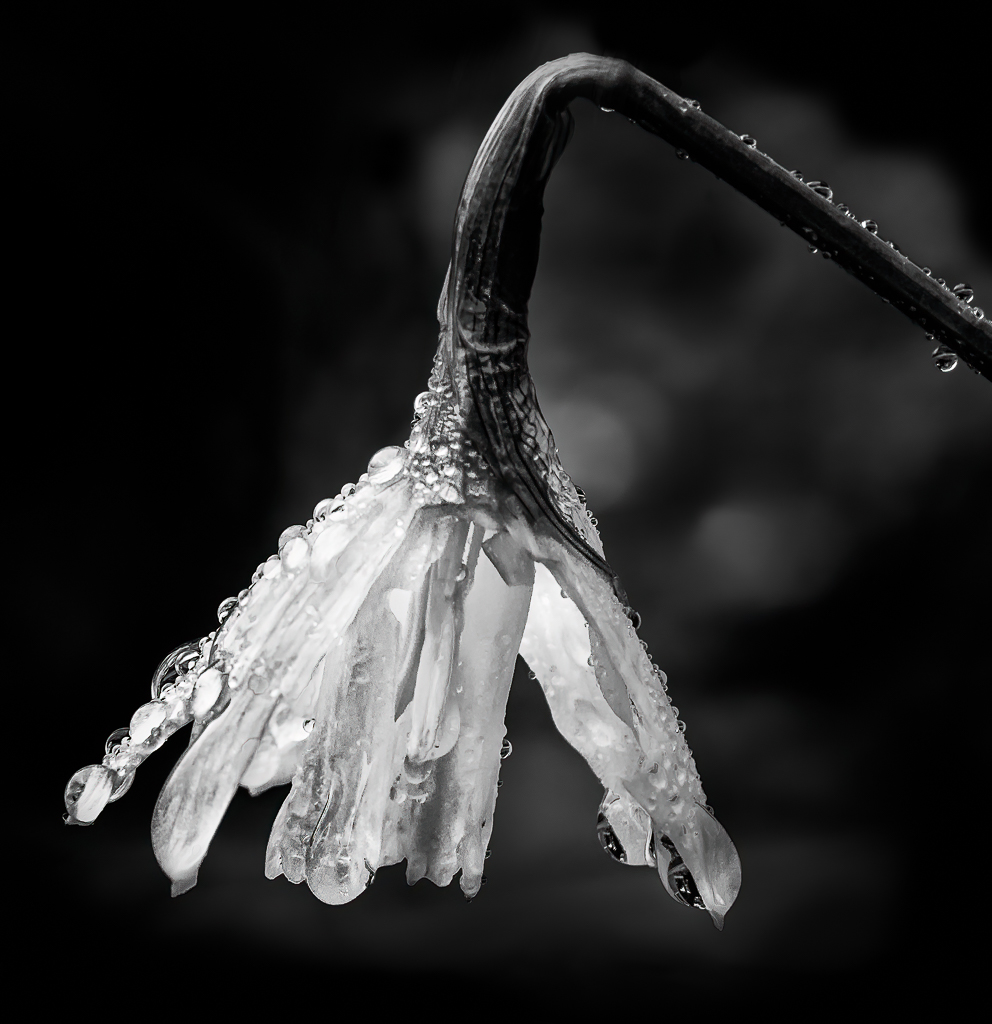
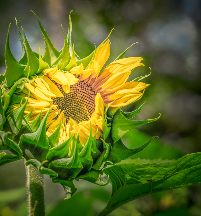
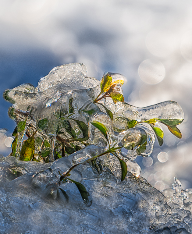
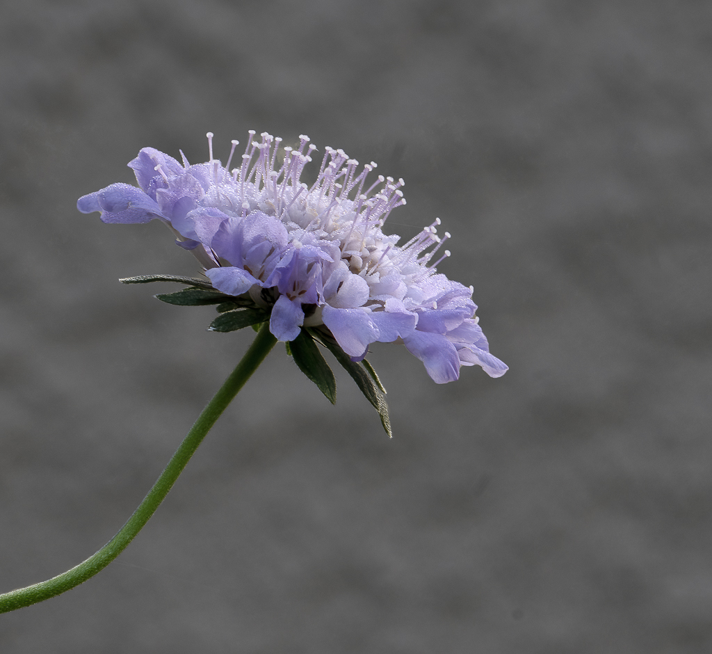
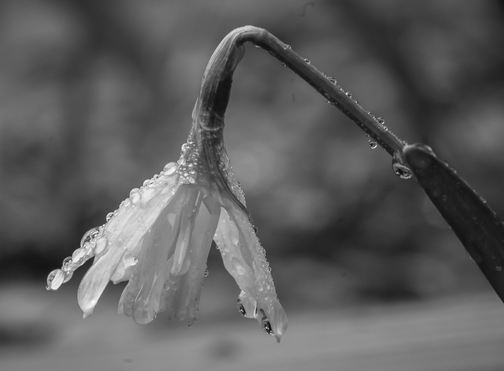
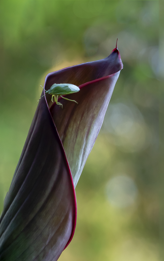
I have a hard time working with dappled light. Although the light shining on the plant is quite beautiful, my eyes keep going back to the shadows. In photoshop I would add a brightness and contrast adjustment and would then convert the picture to black and white. |
Dec 11th |
| 19 |
Dec 20 |
Comment |
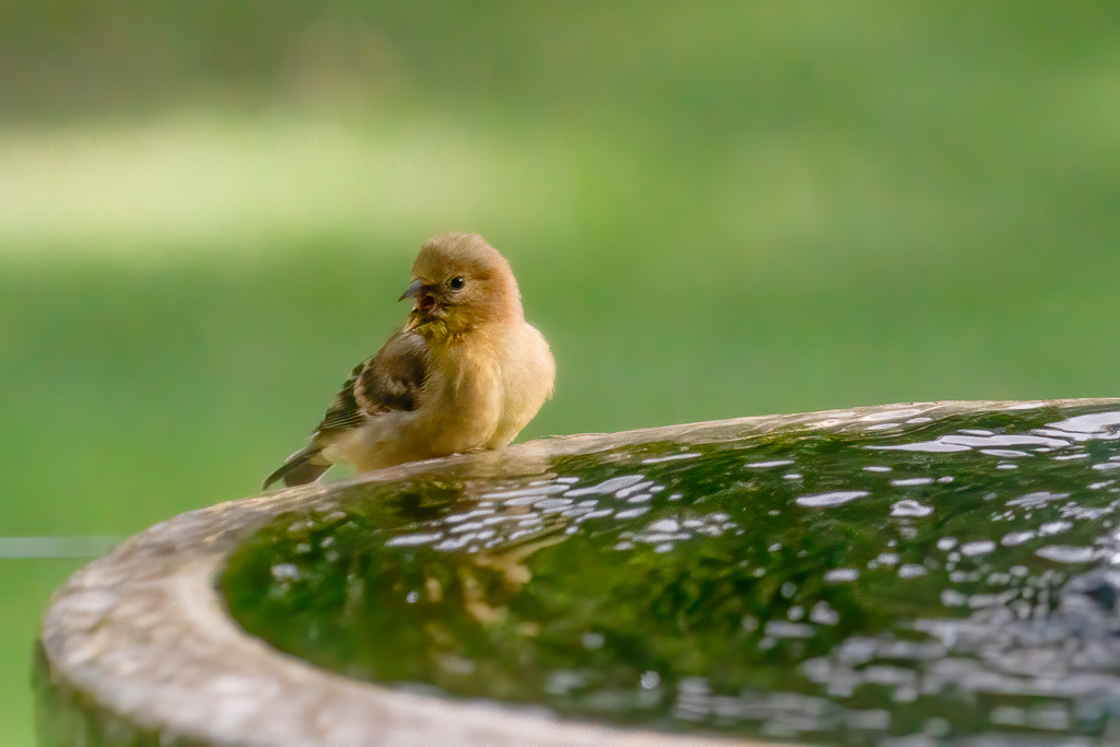
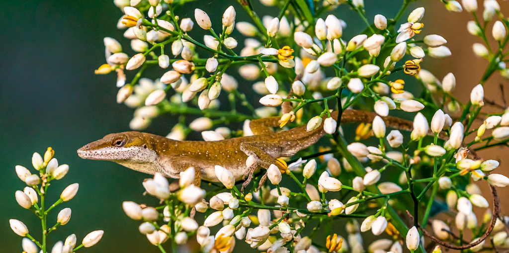
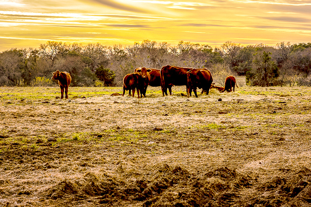
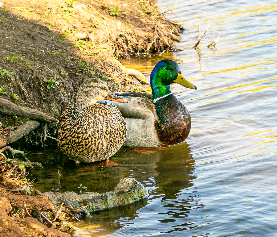
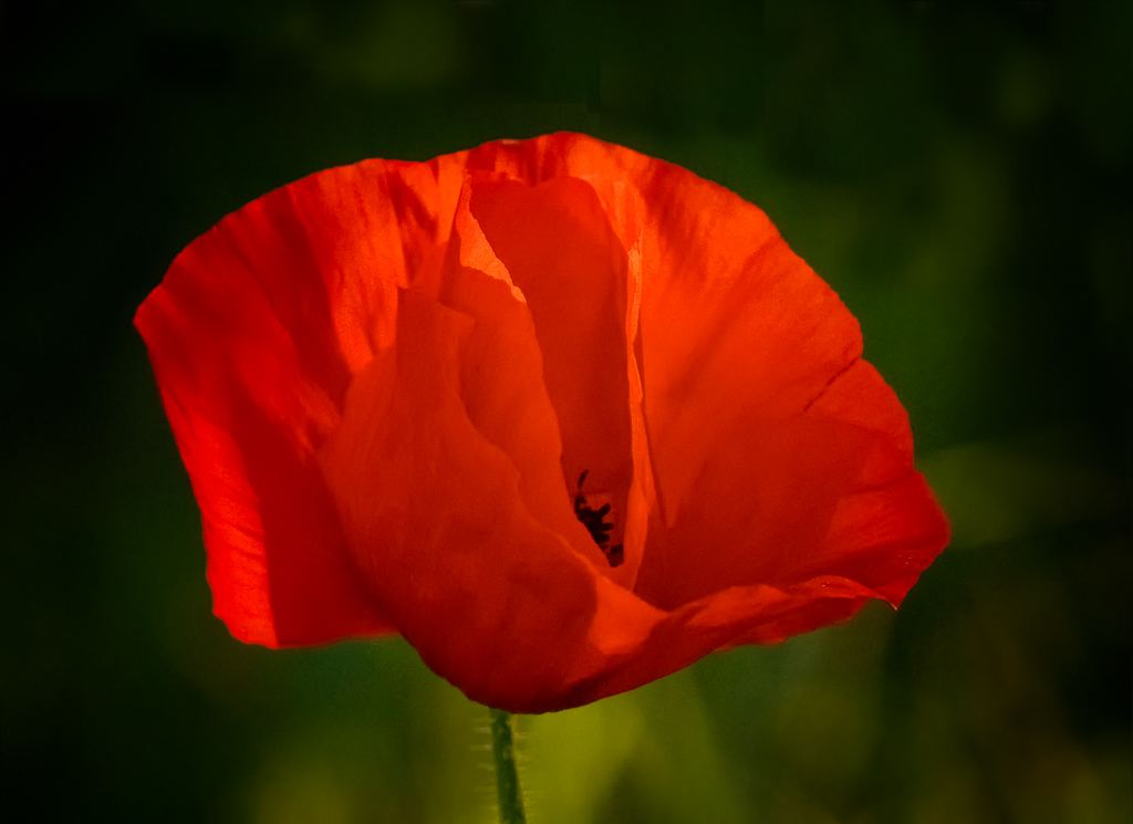
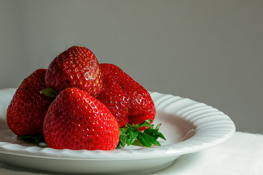
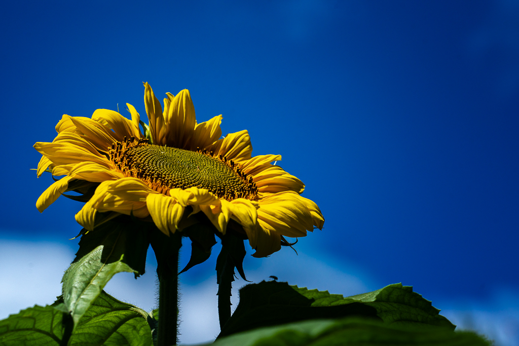
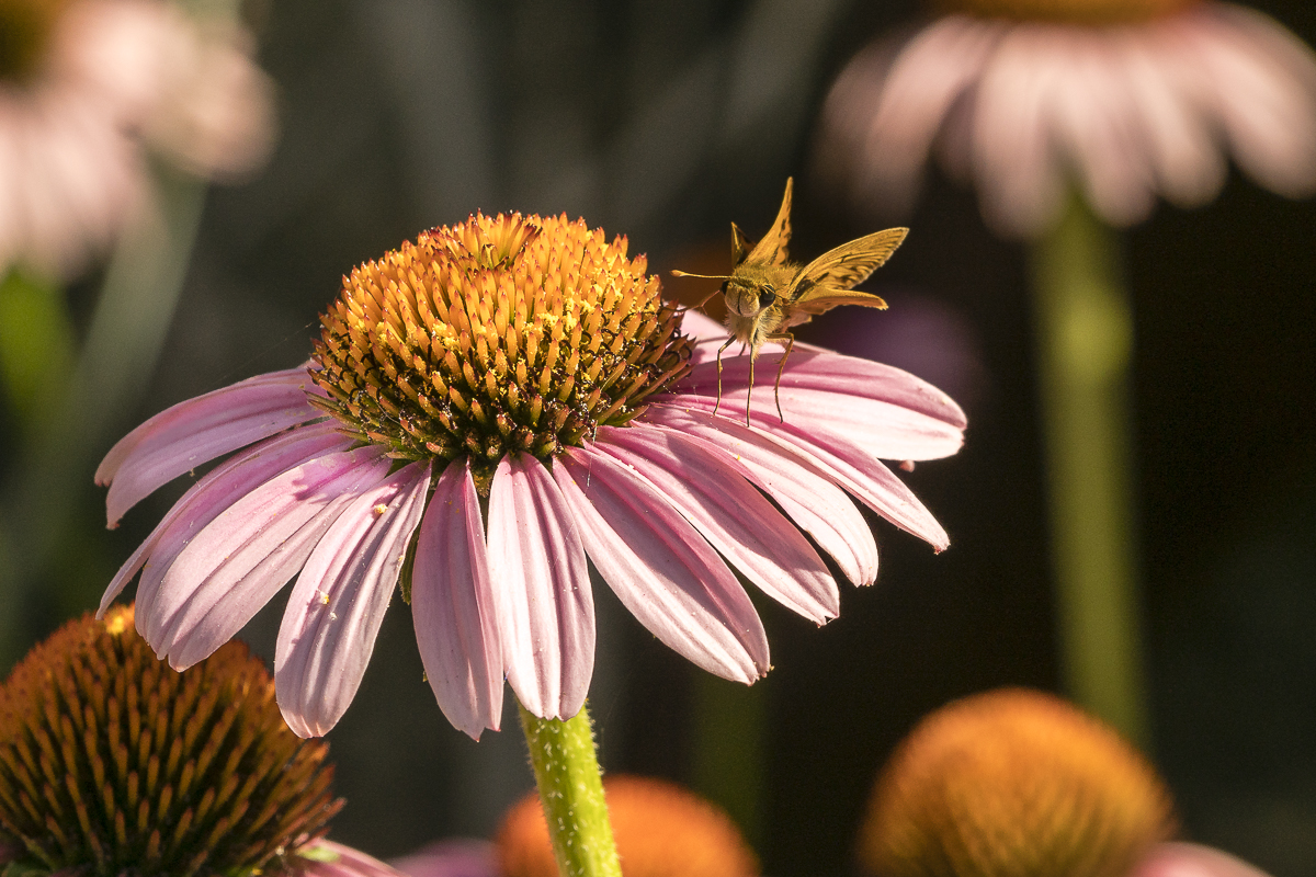
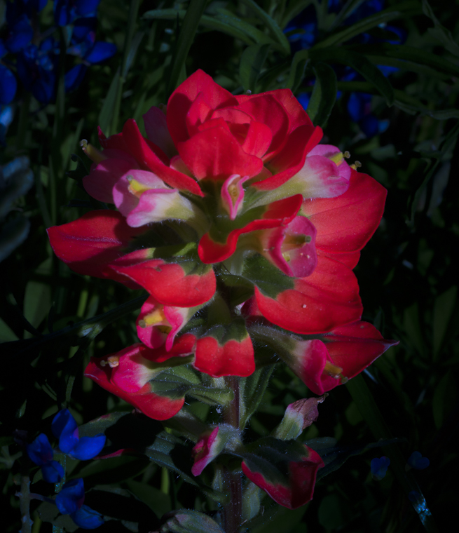
I agree with the chicken. That grass does look greener there. I've got to figure out a way to get there.
Your picture has a story and impact because of the color. I would not change a thing. |
Dec 11th |
6 comments - 0 replies for Group 19
|
| 57 |
Dec 20 |
Comment |
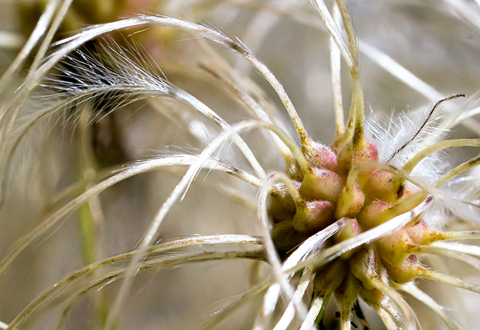
Bob, I also liked the acorn caps. The patterns are so interesting and the appear sharp on my monitor. In my opinion, the blue sky just does not appear to go with the image. |
Dec 15th |
| 57 |
Dec 20 |
Comment |
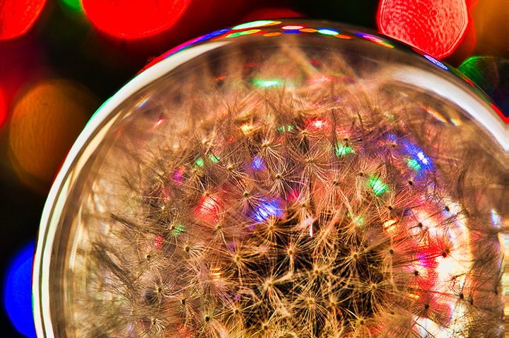
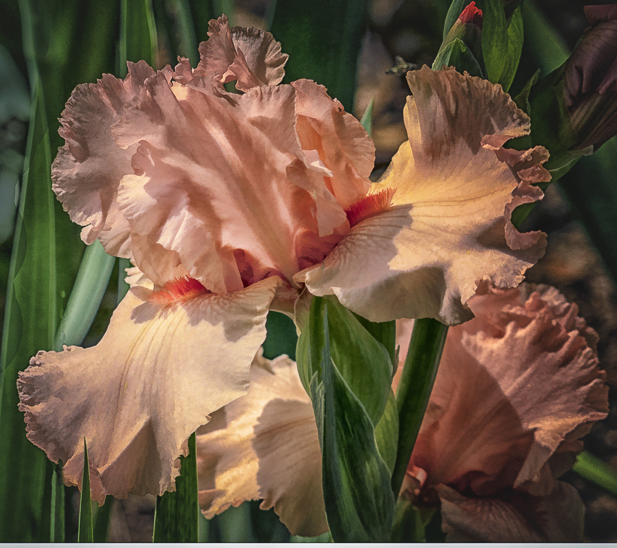
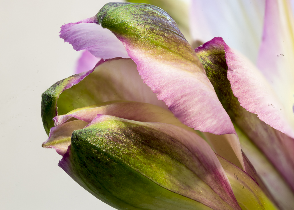
Nelson, I think your Christmas ornament is special. The only think I would fix is to eliminate the white rectangle on the right. It was a little distracting. |
Dec 15th |
| 57 |
Dec 20 |
Comment |
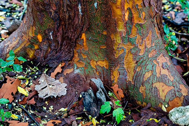
I like the circular patterns and the textures on the fungi and on the tree trunk. I think I would try a closer crop to eliminate the triangular corners and would play with the contrast to bring out more of the fungi textures. |
Dec 15th |
| 57 |
Dec 20 |
Comment |
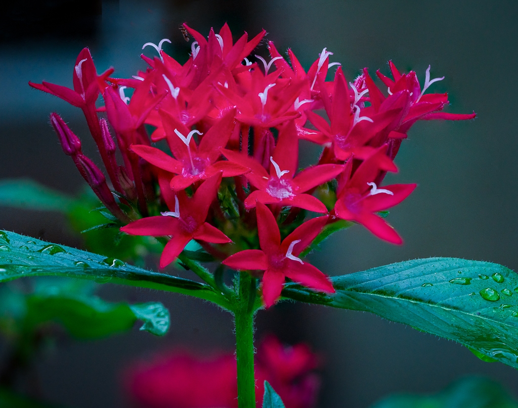
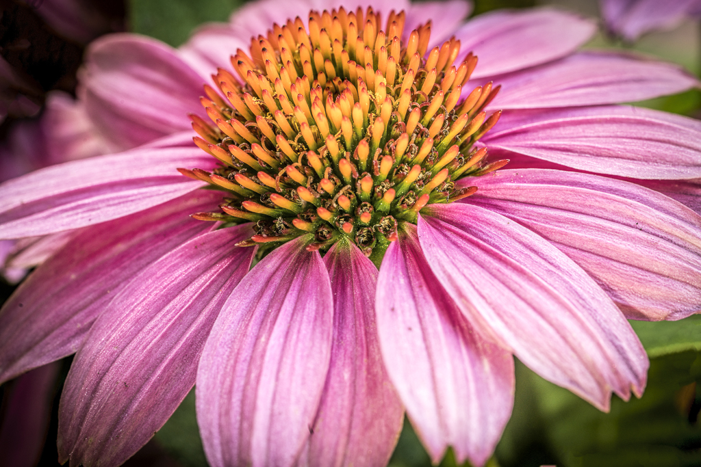
Cindy, I read somewhere that you should not say too much about what the photographer did well when you are doing a critique. Their opinion is that the photographer already knows that. They want to know what they can do to improve it. I think you have a beautiful photo as it stands. I would not change a thing. |
Dec 15th |
| 57 |
Dec 20 |
Comment |
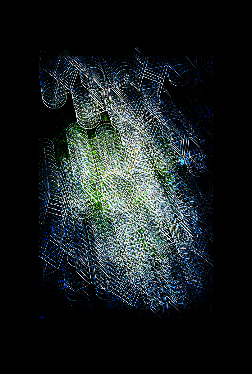
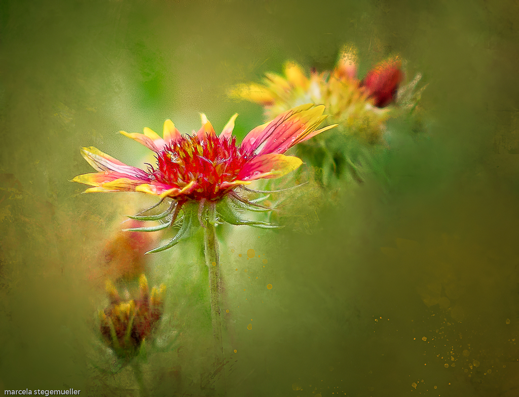
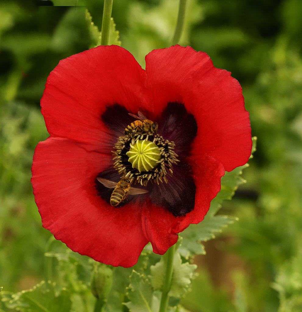
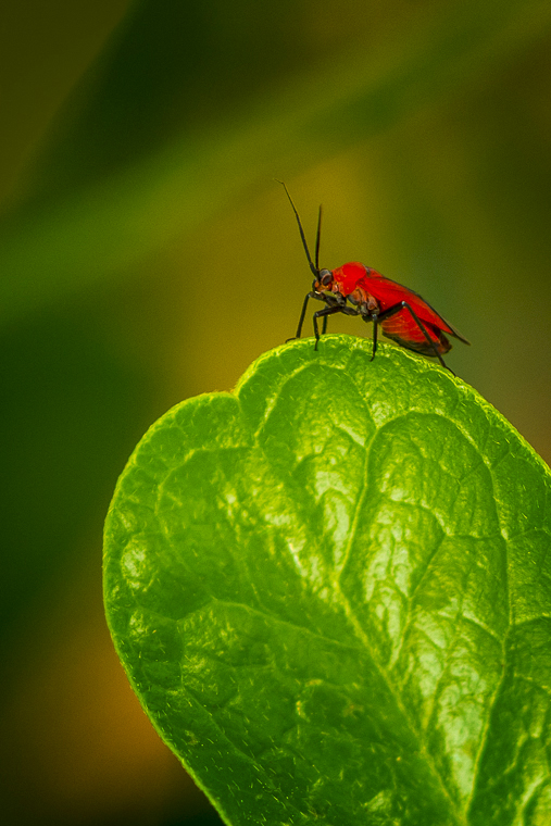
Very creative, Andrew. The strong colors and the light make the photo more striking. You might want to delete the small yellow spot at the upper right of the image. |
Dec 15th |
| 57 |
Dec 20 |
Comment |
Very creative, Andrew. The strong colors and the light make the photo more striking. You might want to delete the small yellow spot at the upper right of the image. |
Dec 15th |
6 comments - 0 replies for Group 57
|
12 comments - 0 replies Total
|