|
| Group |
Round |
C/R |
Comment |
Date |
Image |
| 19 |
Oct 19 |
Comment |
Great image. Captured the action and the boxers. Even though the Italian boxer's back is to us, you can see enough of his features and his magnificent tatoo. The expression on the defeated boxer tells the story. How close were you? How lucky you were not to have anyone in front of you. |
Oct 14th |
| 19 |
Oct 19 |
Comment |
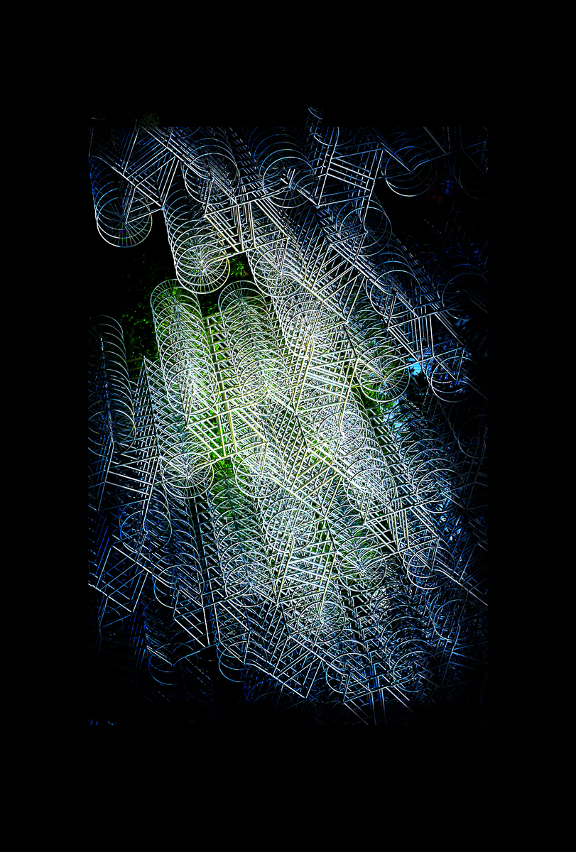
The image does impart an eerie feeling as if you were in another planet looking across space. I believe you achieved the surreal look you wanted. |
Oct 14th |
| 19 |
Oct 19 |
Comment |
The simplicity of the blue sky and leading lines of the path serves to enhance this unusual example of modern architecture. As a travel photo, I believe the tall palm tree and street lights on the right gives the image a sense of place -- Las Vegas. I suppose it depends on what you want to do with the image.
Mobile phones and their cameras are ubiquitous and are so much easier to carry and transmit their images especially on trips. I can still remember sending a roll of film home to develop while traveling... |
Oct 14th |
| 19 |
Oct 19 |
Comment |
You have done justice to Atticus. I think you could hang him portrait on top of your fireplace -- he appears so lord of the manor. In my opinion, your processing was successful in achieving this look. |
Oct 14th |
| 19 |
Oct 19 |
Comment |
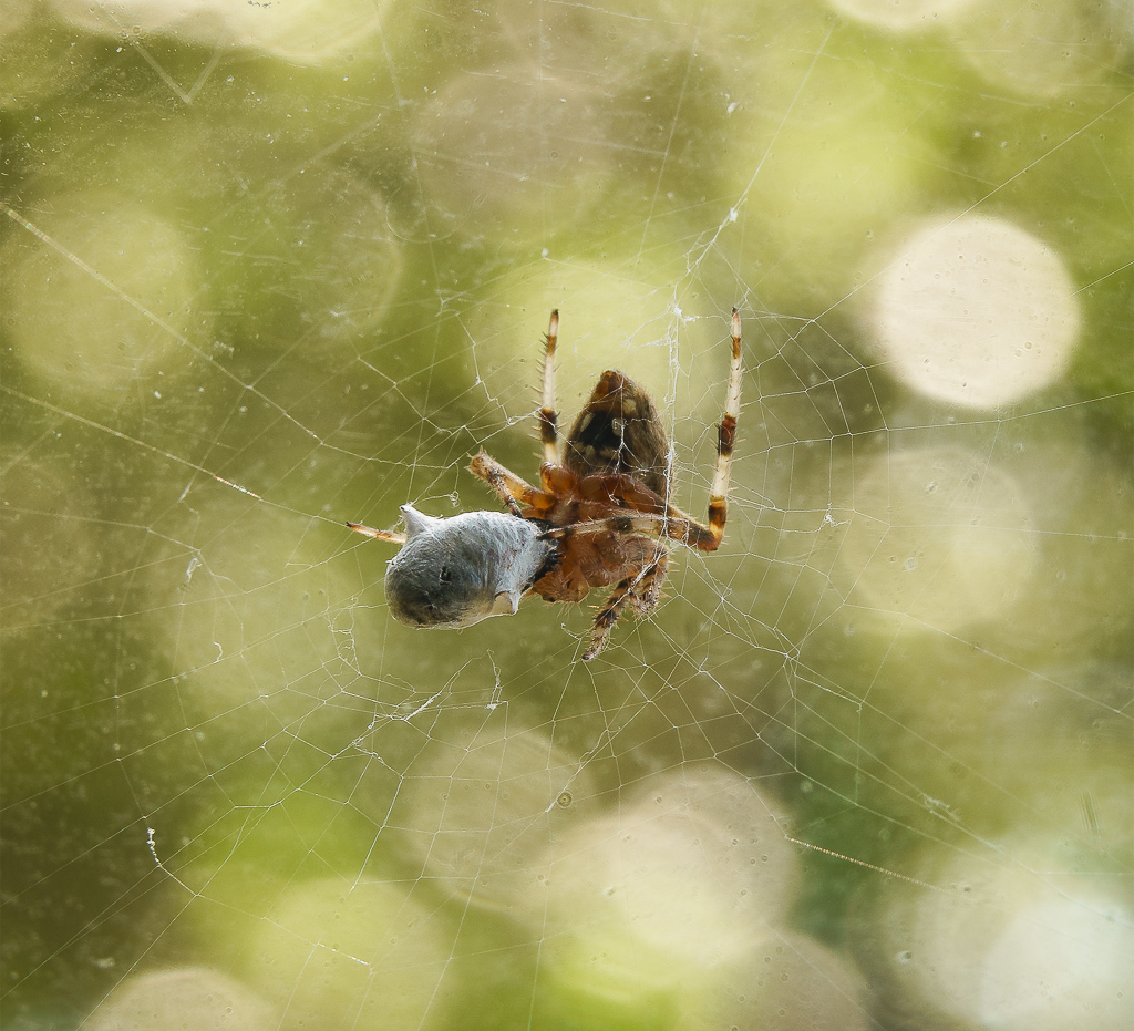
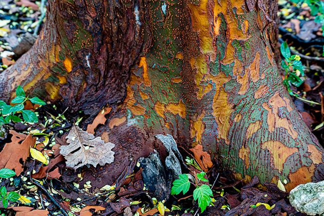
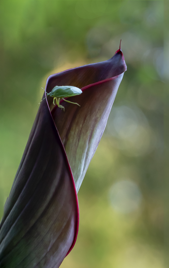
I love the peeling paint and the shapes they make. The two larger rusty shapes anchor the wall or floor?? Color and shapes in my opinion make this abstract so beautiful and interesting. |
Oct 14th |
5 comments - 0 replies for Group 19
|
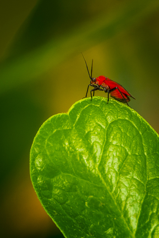
| 57 |
Oct 19 |
Comment |
Thanks, Laurie, I will try. |
Oct 17th |
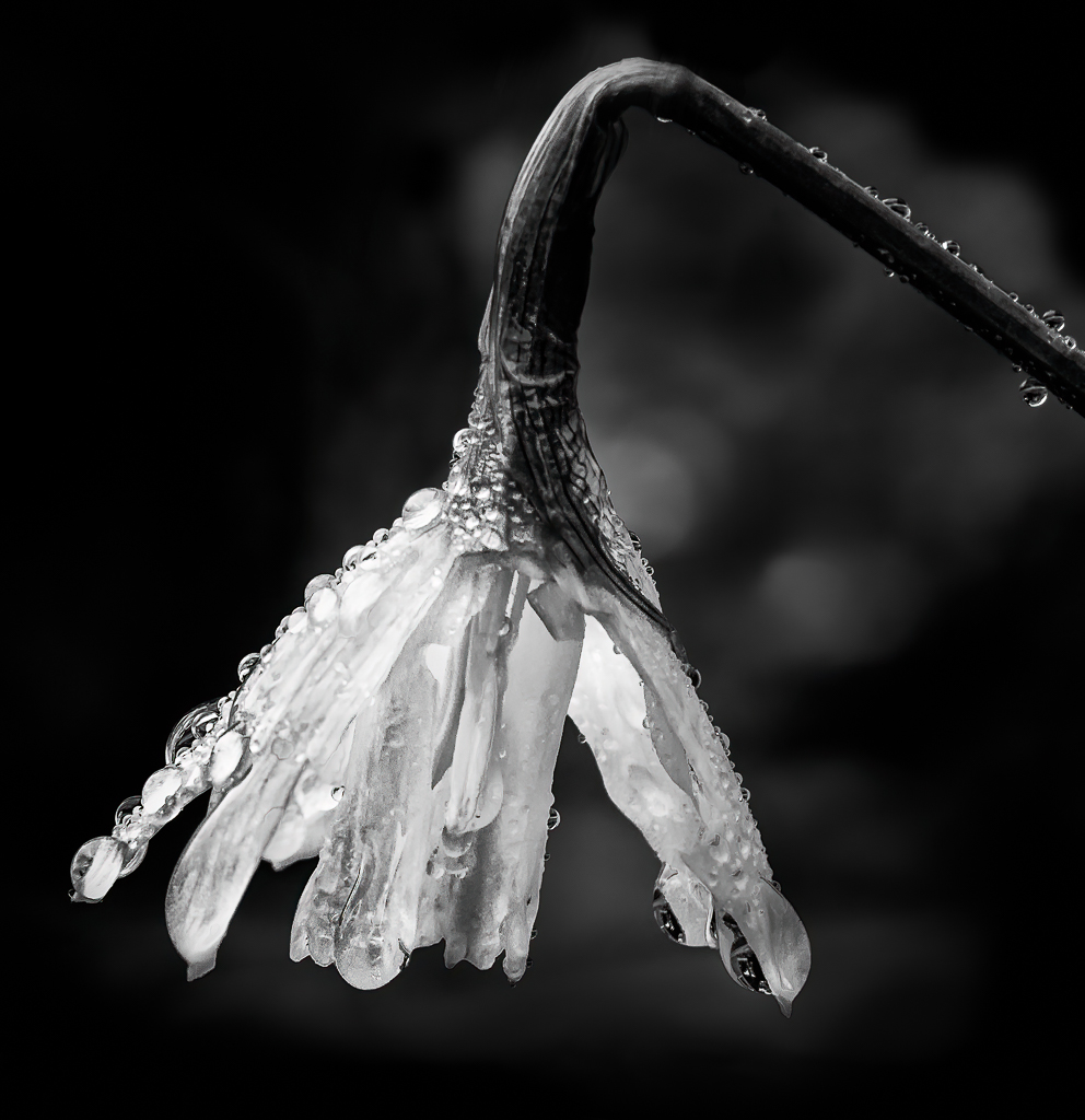
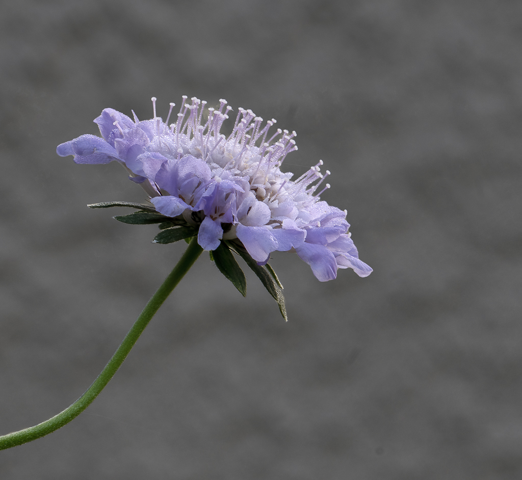
| 57 |
Oct 19 |
Comment |
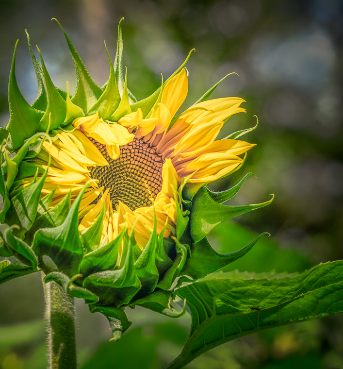
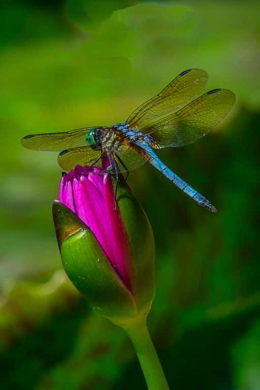
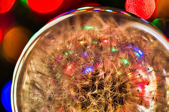
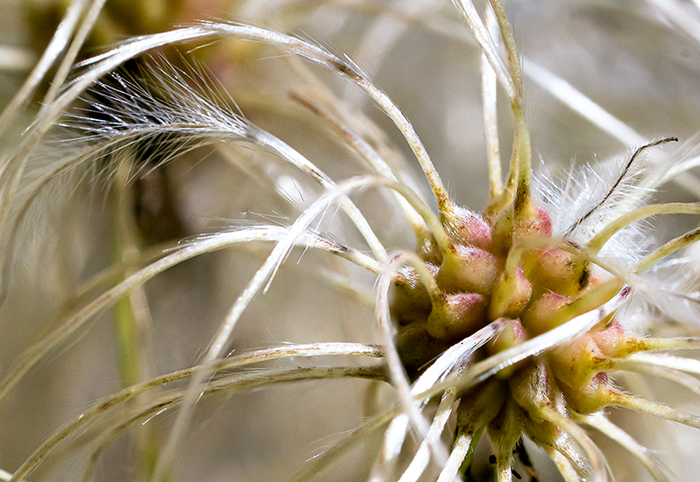
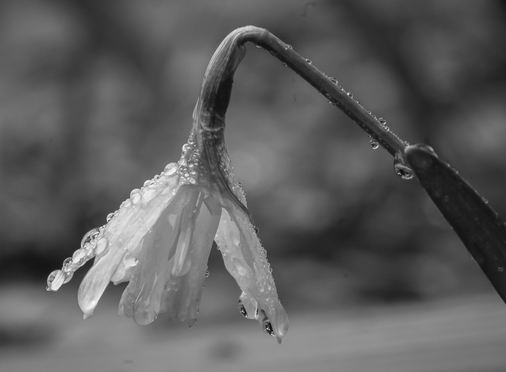
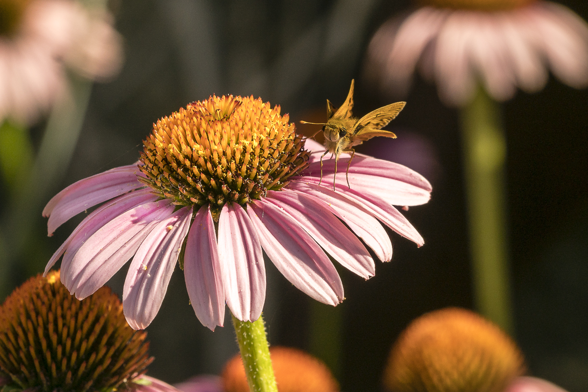
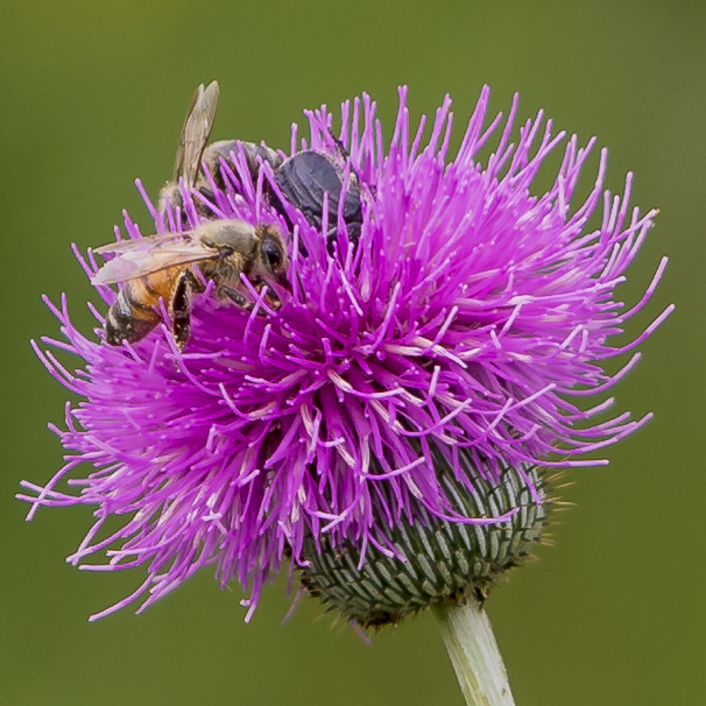
I never suspected that the underside of a thistle could be so interesting to photograph. The image is so sharp that we can see the hairs on the petals and stem. There is color harmony between the green of the thistle and the pinkish background. Placing this symmetrical-looking plant in the center appears to balance the composition. I would not change a thing. |
Oct 14th |
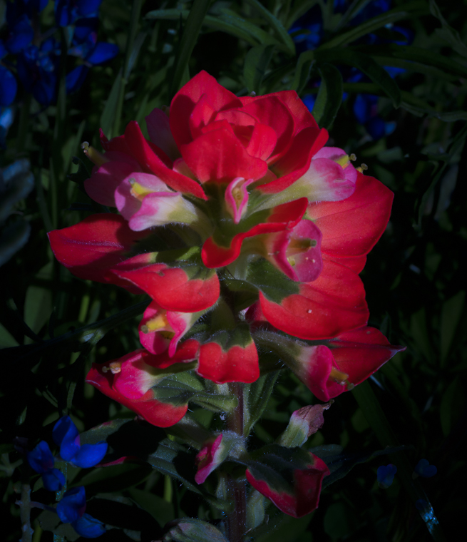
| 57 |
Oct 19 |
Comment |
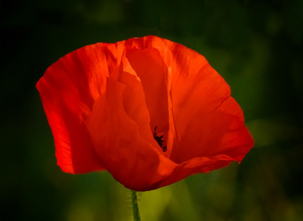
Lovely image, but I would make it a little brighter or a little darker. Right now it frustrates the viewer. I am trying to see more. The grain does not bother me. |
Oct 14th |
| 57 |
Oct 19 |
Comment |
Nelson, You have such neat ideas. I agree with Cindy's suggestion, although I did not notice it at first. Also, I wonder what would happen if you would erase one of the letters such as the "U" and leave the key blank. I wonder if it would have the power of the blue button. Maybe it would be too frustrating. Your eyes would want to complete it.
|
Oct 14th |
| 57 |
Oct 19 |
Comment |
The power of the blue button or is the location? As much as I try to look at the other buttons, my eyes keep going to the blue button. I like that even though the buttons are different sizes and colors, they all have 4 holes (repetition) which also add to the composition. |
Oct 14th |
| 57 |
Oct 19 |
Comment |
Hi Jessica,
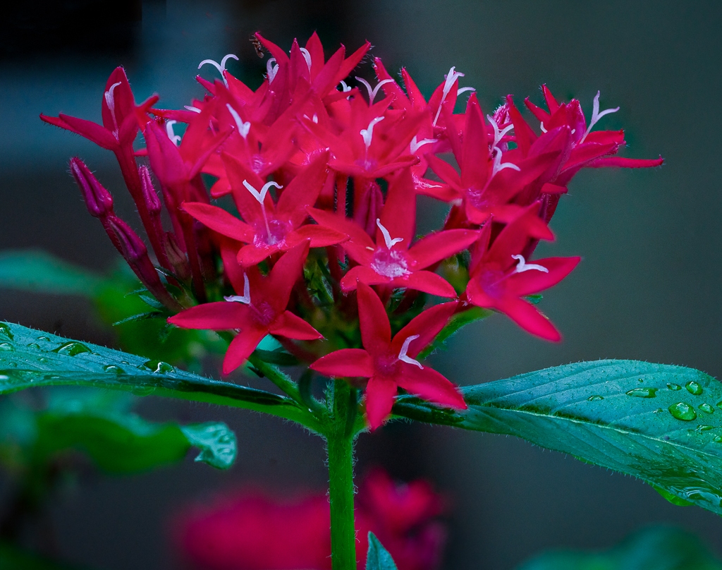
I, too, am a little distracted by the lower right purple foreground. The colors blend so well. You might want to crop the distracting blurred leaf in the foreground just leaving the colors and patterns as your composition elements -- which are beautiful. |
Oct 14th |
6 comments - 0 replies for Group 57
|
11 comments - 0 replies Total
|