|
| Group |
Round |
C/R |
Comment |
Date |
Image |
| 19 |
May 19 |
Comment |
Tracy, my husband who is not a photographer had made the same suggestion so I do think I need to work on the shade a little more. Thank you. |
May 15th |
| 19 |
May 19 |
Reply |
Thank you, Norm. I see where the plant is distracting and am working to eliminate it as well as lightening the dark left corner a bit. |
May 15th |
| 19 |
May 19 |
Comment |
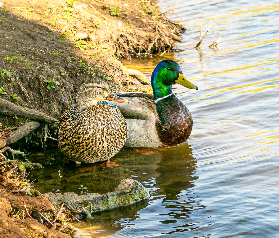
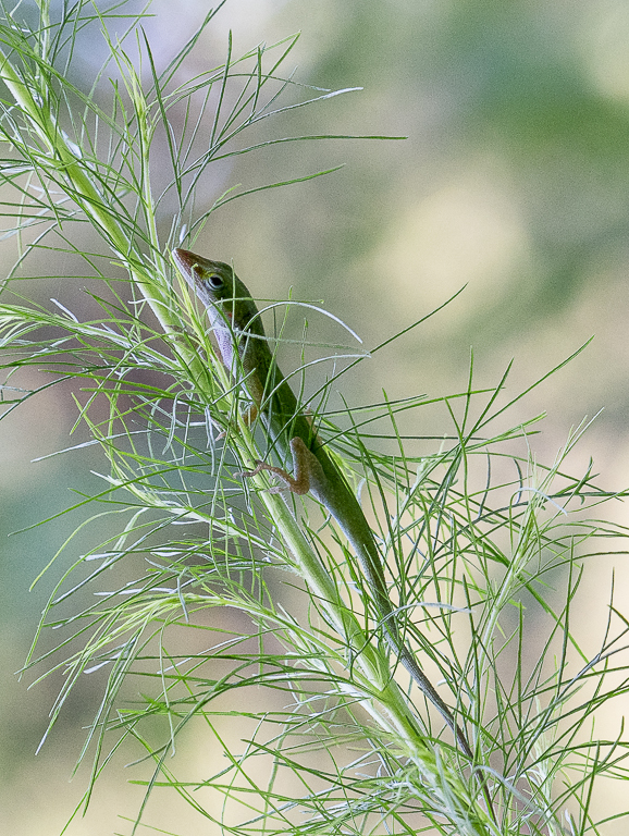
Although I agree that you could have two pictures in this image, I like that the mother and babies are shown in the same picture. The mother's eyes seem to be guarding her babies. The photo is telling a story.
|
May 15th |
| 19 |
May 19 |
Comment |
Great shot! I have tried taking boxing photos and know how hard it is to capture the detail and action shown in your picture -- even the blurred audience in the background. |
May 15th |
| 19 |
May 19 |
Comment |
Your title captures the nostalgic feeling of the image. I like your depth of field and perspective. I think you used a pastel treatment for your picture. Perhaps more of an impressionist treatment would bring the picture up a notch. |
May 15th |
| 19 |
May 19 |
Comment |
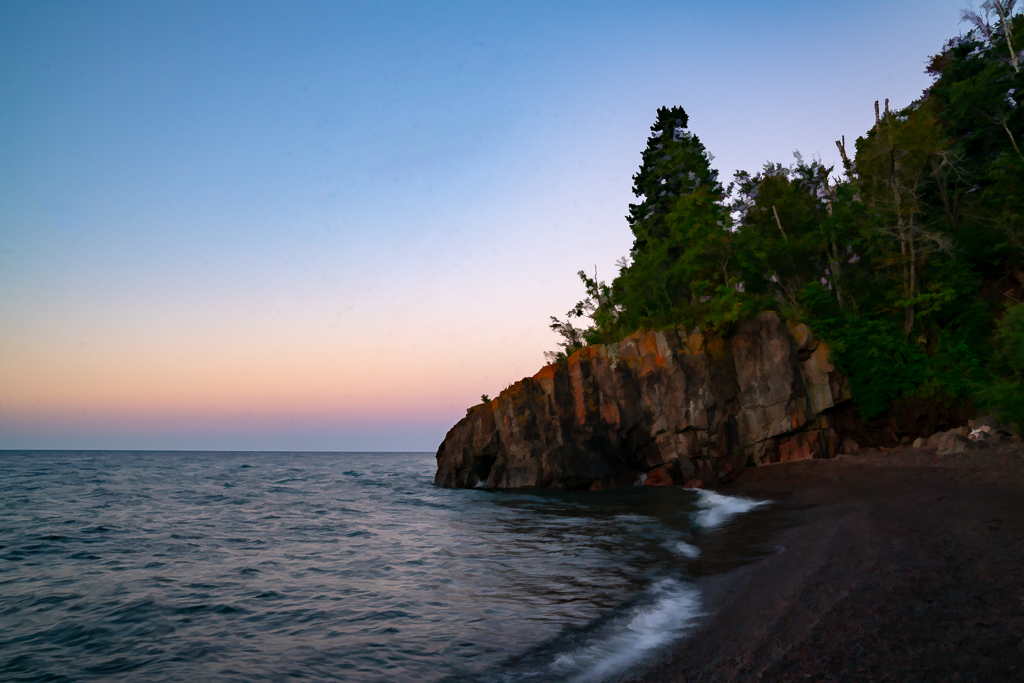
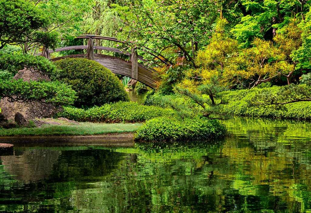
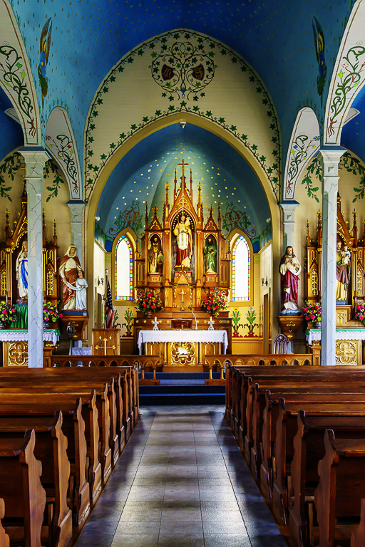
A wonderful travel photograph. This would be a very difficult image for me to shoot. I suspect the room is symmetrical, but where I would have to take the photo would not make the space symmetrical. Yet you have managed to make it appear symmetrical. The lines of the arches and chandeliers contain the spaces below. I like the people shown. The front table seems to bid you to come in and look at the rest of the space which is so interesting -- all the way to the end. In my opinion, the left bottom corner is a little distracting.
I love your Domes of Sheikh Zeyed presently showing. |
May 15th |
| 19 |
May 19 |
Comment |
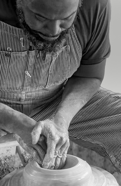
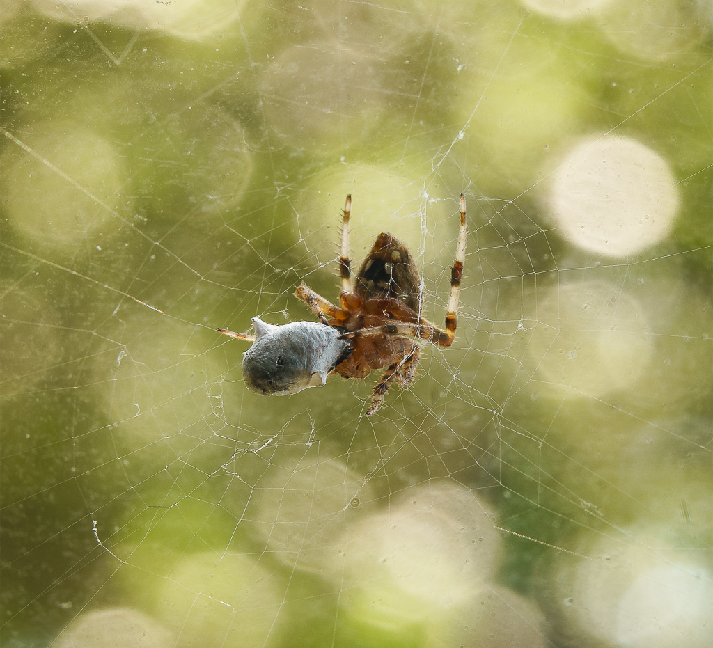
I have never seen a rooster when it has his beak open. You did good to be thinking about taking this picture. I like the cropping and the blurring of the background. I think you and Simon did great to create this image.
Comments about trying to get closer to make the eyes stand out more are valid. You could then just focus on his tiny eyes. I do think it would be hard to get that close -- maybe zooming in more...? |
May 15th |
| 19 |
May 19 |
Comment |
I think these happy bright colors and good design would make this canal boat stand out among others. You captured the texture of the paint and even movement of the vessel by the tilt of the image. In my opinion, this is a good abstract image. I would be interested in knowing a little more about the boat -- where it came from, etc.
I, too, would suggest cropping out the gray part at the bottom of the image. |
May 15th |
7 comments - 1 reply for Group 19
|
| 57 |
May 19 |
Comment |
Thank you. The background blur was a function of the focal length, and the slow running creek, I think. |
May 22nd |
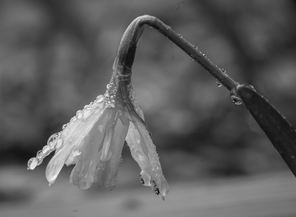
| 57 |
May 19 |
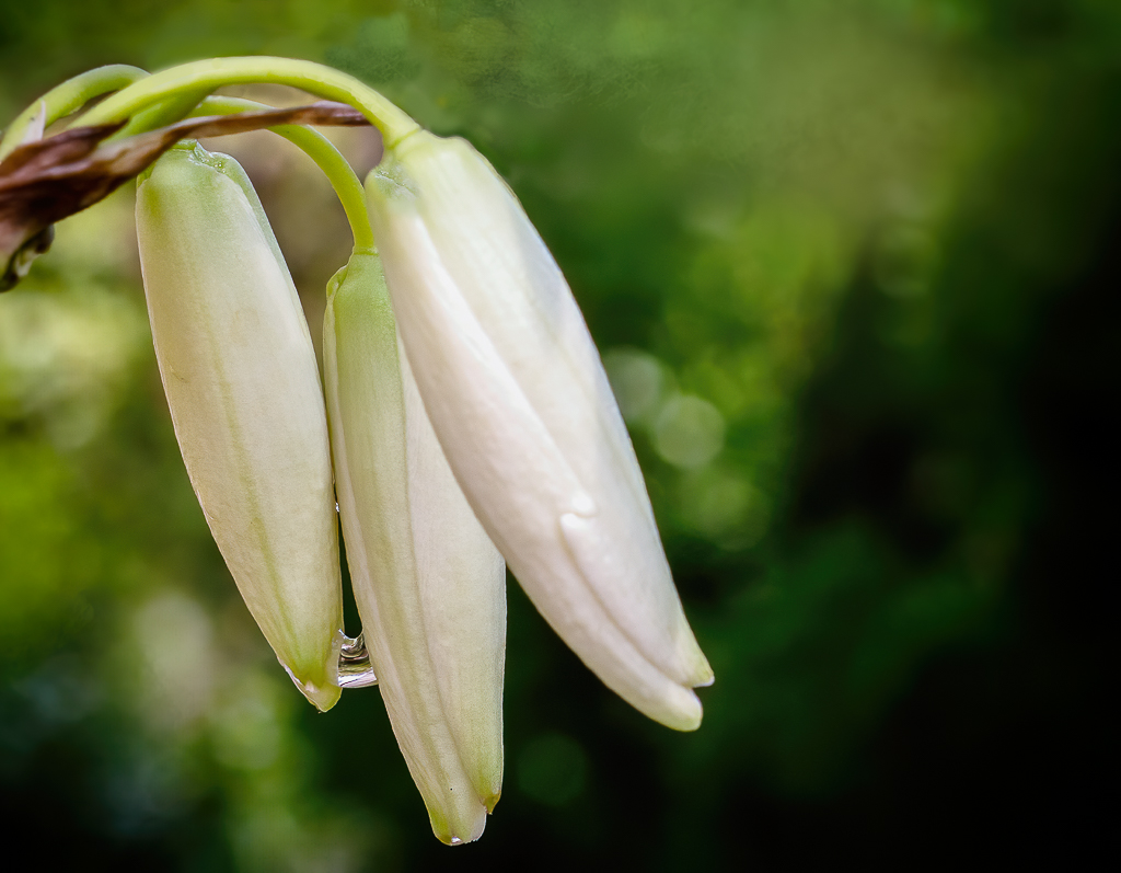
Comment |
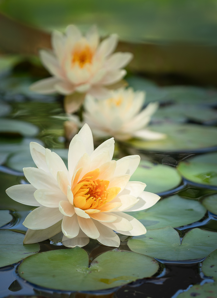
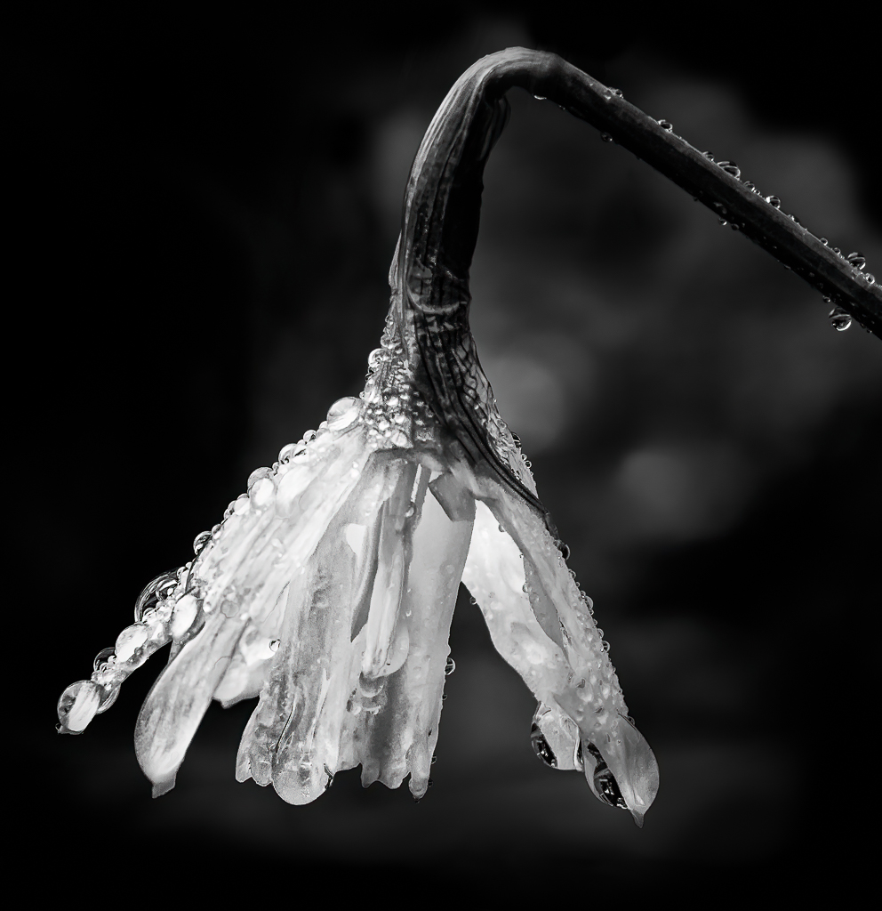
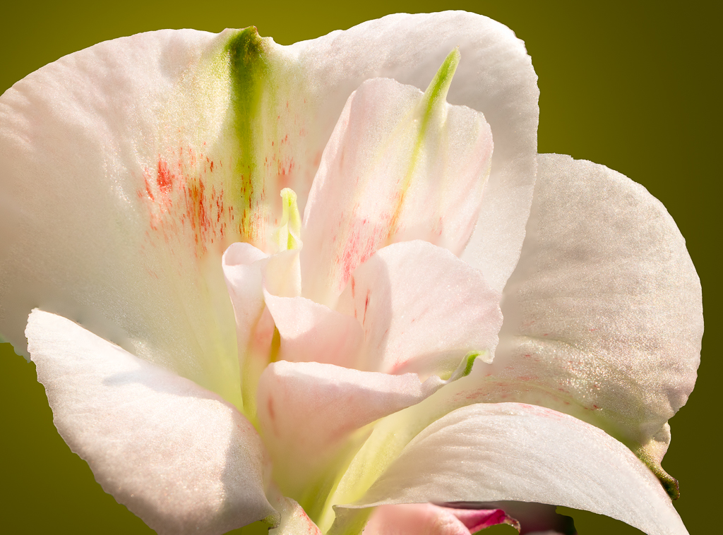
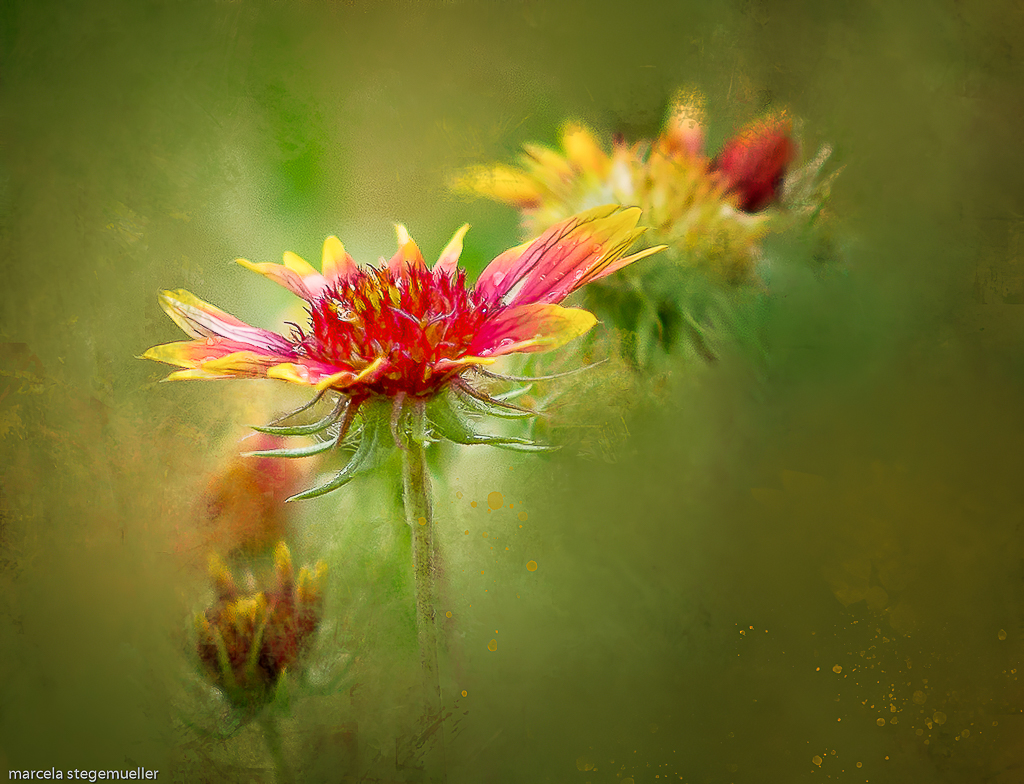
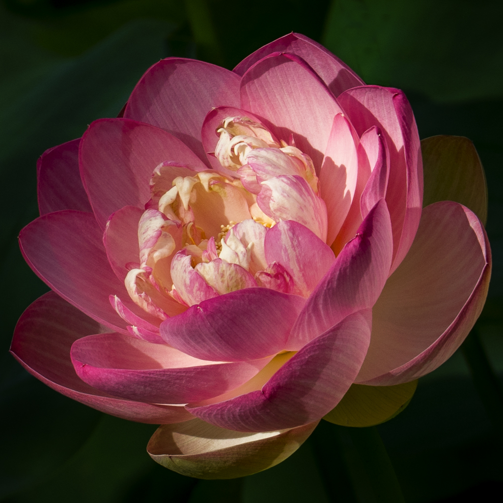
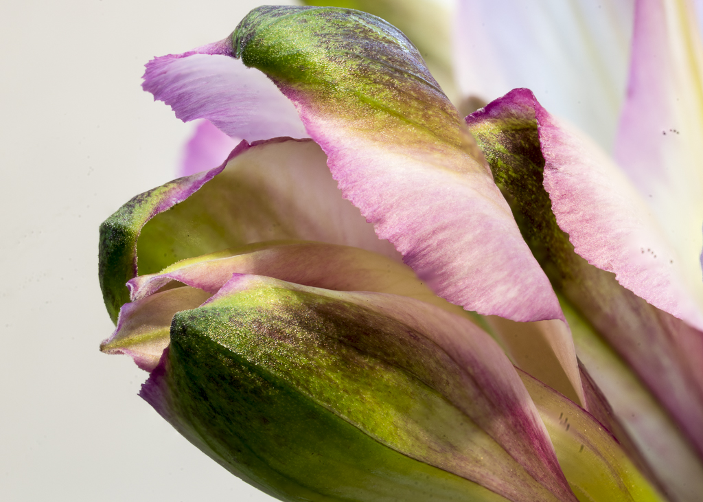
Nelson, I really like your tulip and the frame. The simplicity of the tulip, its sharpness, and the droplets add to its beauty. The lines of the leaves also frame the flower. I had never thought of framing the image the way you did, but I will in the future. I agree with Cindy that the two straight lines in the left and one straight line in the right of the frame distract from the overall image. I also agree with Laurie that the yellow behind the tulip should be toned down somewhat. It is brighter than the yellow on the tulip and distracts from the flower. Beautiful image! |
May 15th |
| 57 |
May 19 |
Comment |
I like the angle and color of the day lily as well as the curved lines the petals make. Cropping from the top might eliminate most of the distracting bright background and make the image stronger. It would put more focus on the day lily. |
May 15th |
| 57 |
May 19 |
Comment |
I like the color, simplicity and angle of the tulip against the blurred background. I find the lighter curved leaves a little distracting and would suggest that you darken them slightly or eliminate them using content aware. |
May 15th |
| 57 |
May 19 |
Comment |
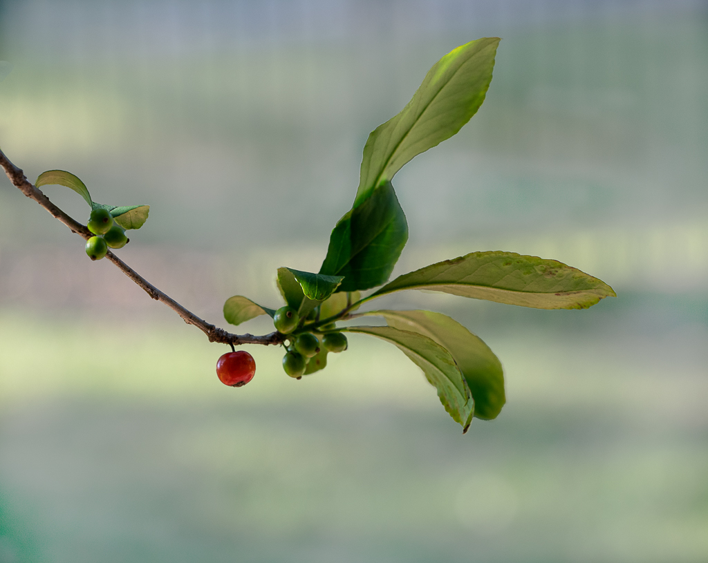
The speckled colors of the berries are absolutely beautiful and the green leaves do a good job framing them. As much as I like the diagonal line the berries make from one side to the other, the upper left two berries and yellowish leaf take away from the beauty of the rest of the berries -- in my opinion. |
May 15th |
| 57 |
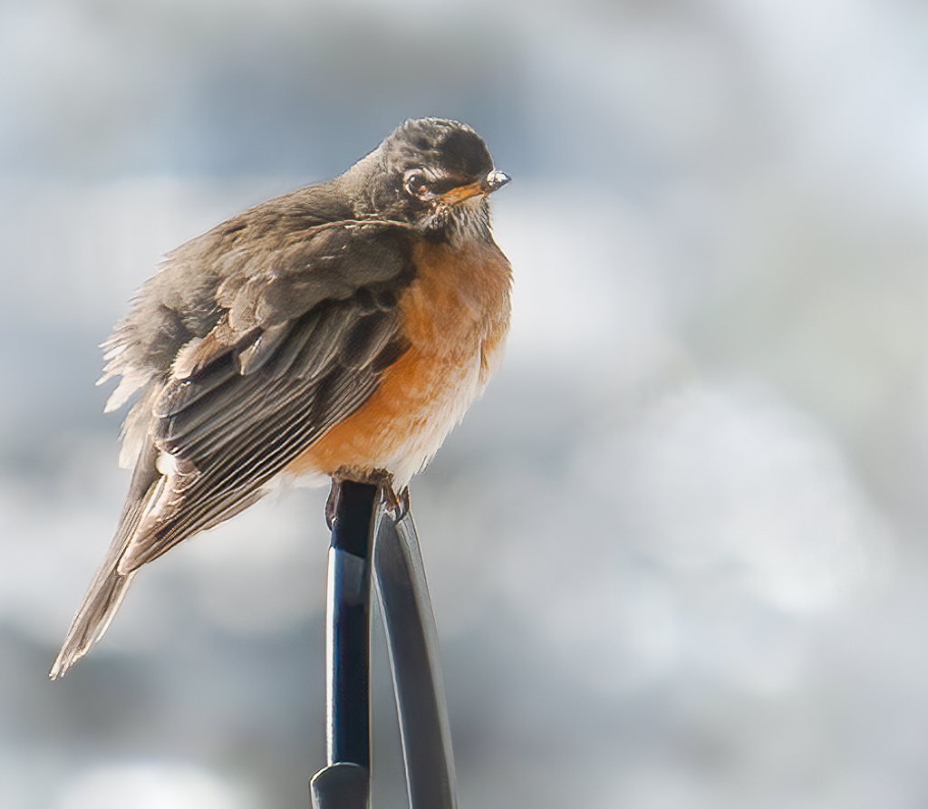
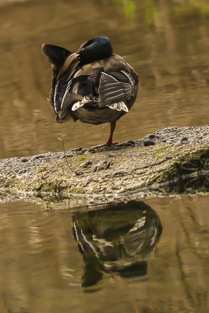
May 19 |
Reply |
Yes, unfortunately, I could not get his eyes. You are absolutely right.Thanks, Cindy. I did straighten the rock he was standing on and it looks much better. |
May 15th |
| 57 |
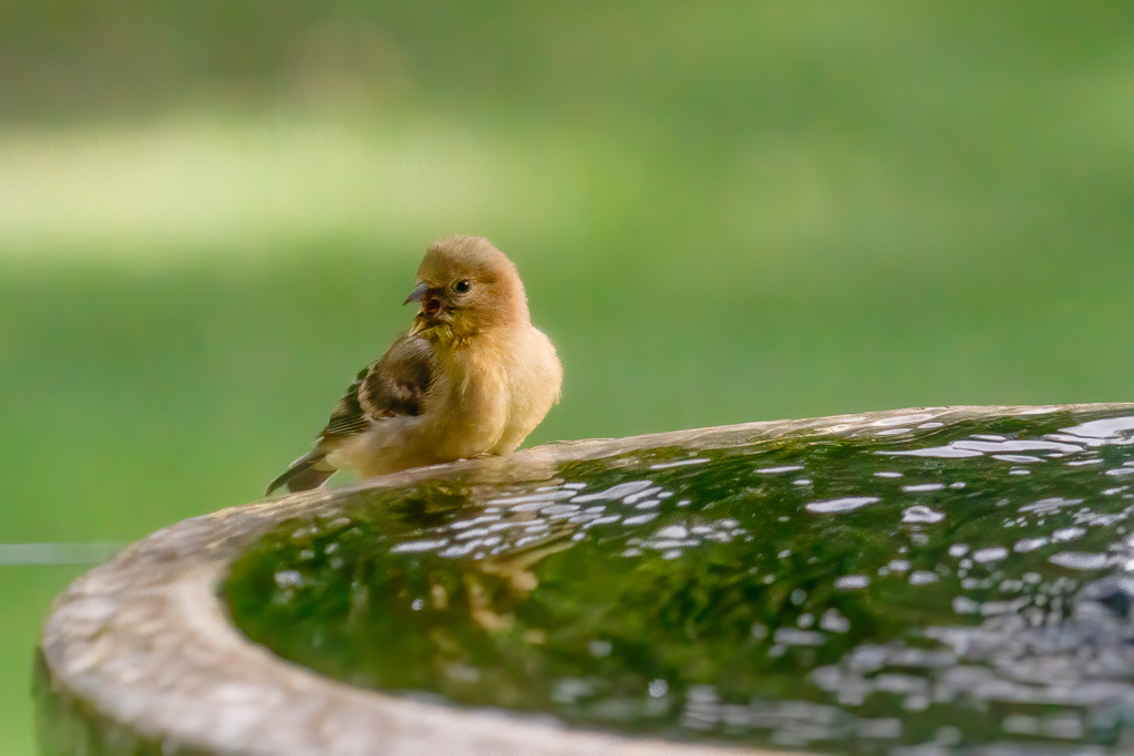
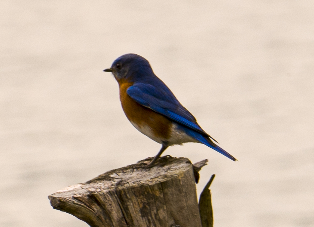
May 19 |
Reply |
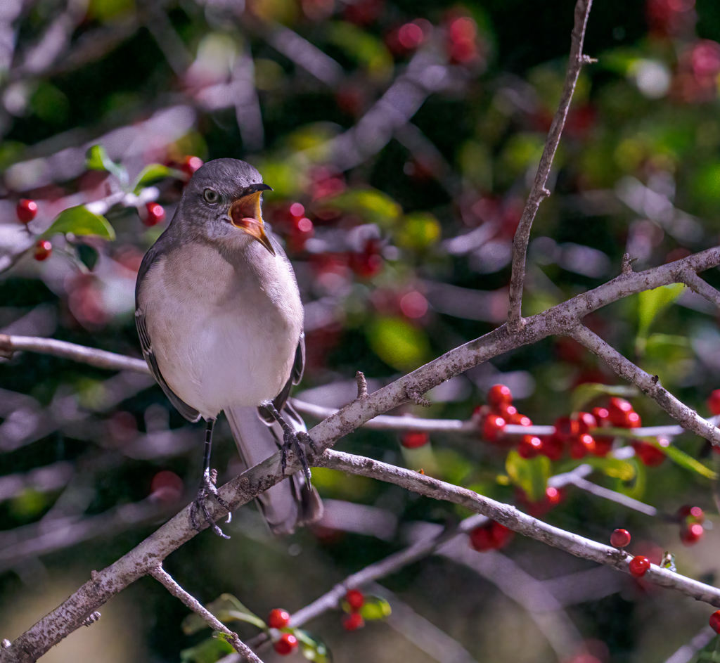
I was trying to keep the bird's leg straight up and down, but after I cropped it like you and Cindy suggested, the leg did not look bad. Thank you Laurie and Cindy.
|
May 15th |
5 comments - 2 replies for Group 57
|
12 comments - 3 replies Total
|