|
| Group |
Round |
C/R |
Comment |
Date |
Image |
| 19 |
Feb 19 |
Reply |
Harriet,
I am not that good at Photoshop, but I played with the tools on this image. Am learning. I have learned that it is more important to take a good picture or try to take a good picture than to learn Photoshop...And thank you for your kind words.
|
Feb 12th |
| 19 |
Feb 19 |
Comment |
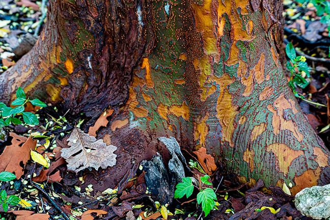
What a jewel. The colors and workmanship are superb. Either Norm's or Stan's suggestion would work. Because I am not that good at Photoshop, I would be tempted to crop. |
Feb 12th |
| 19 |
Feb 19 |
Comment |
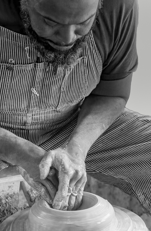
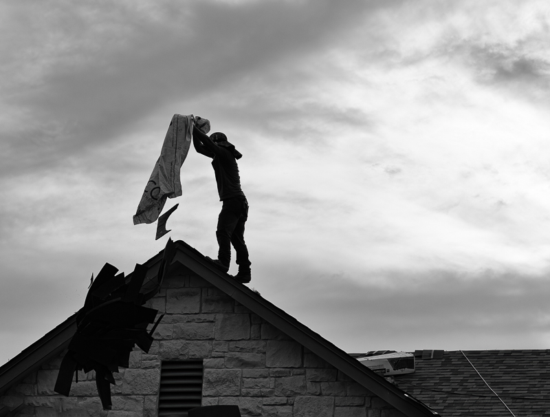
What a great shot and good title. The resolution on your camera is fantastic. I can see the plaid shirt the young man or woman is wearing. If it was your intent to make it a silhouette, you might want to darken his body. I would also suggest that you crop a little more from the bottom. |
Feb 12th |
| 19 |
Feb 19 |
Comment |
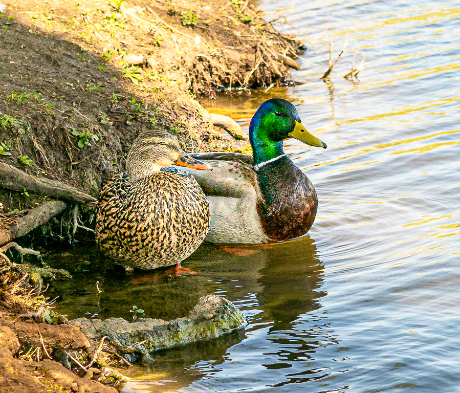
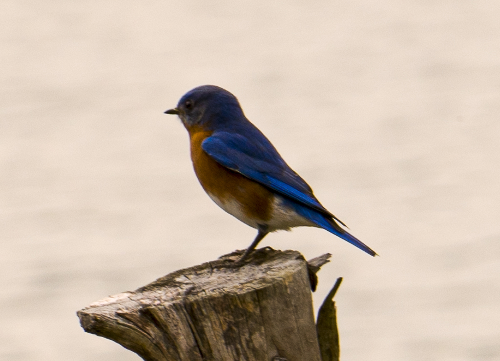
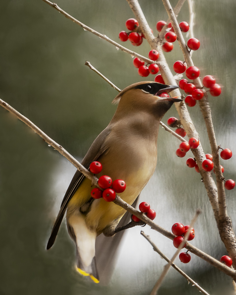
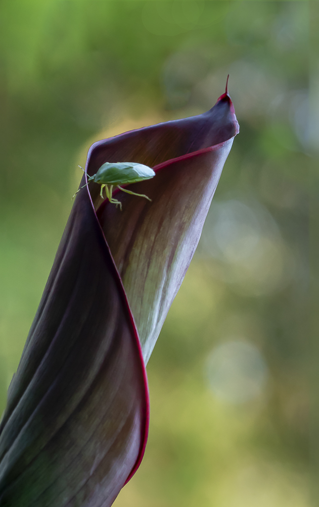
I echo Norm's words: What a beautiful horse, and kudos to you for being outside to take the picture. I don't know what your shutter speed was but a higher speed would have allowed you to make a sharper image. Next time try to focus on his eye or eyes depending on your composition. That would create even a better image. |
Feb 10th |
| 19 |
Feb 19 |
Comment |
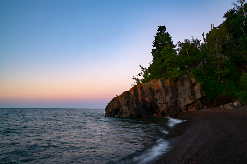
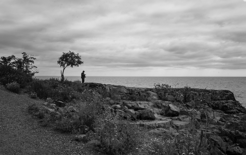
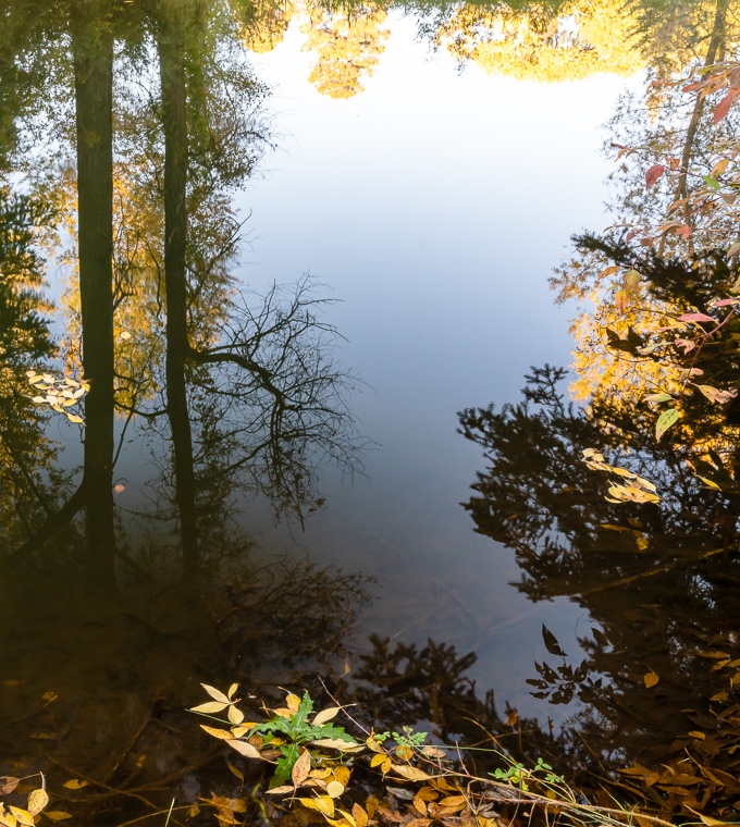
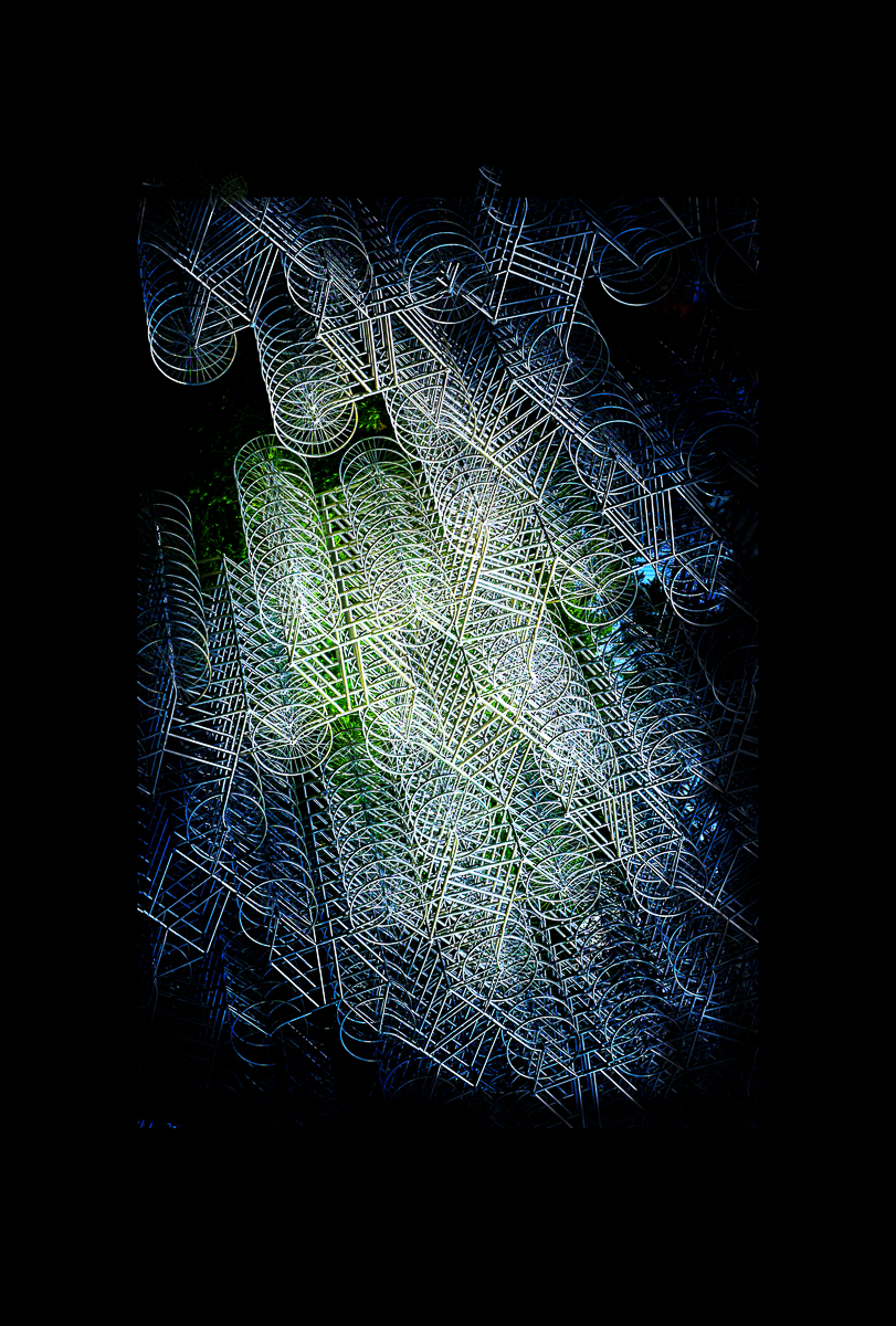
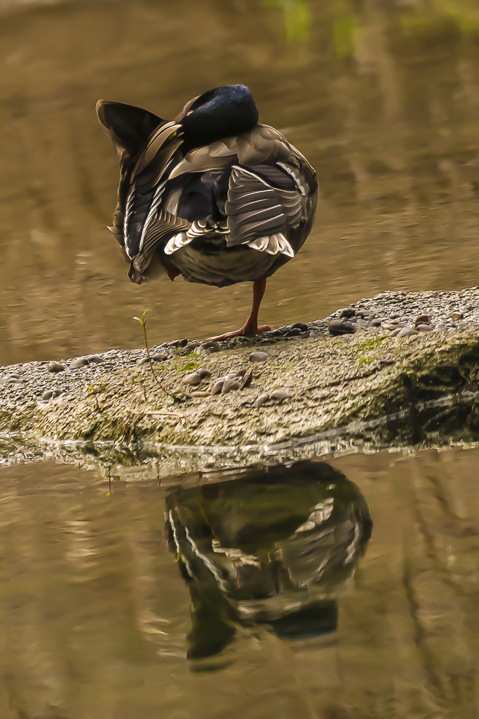
That dull old day was just right to capture the tranquility of this image. If I were to do anything with this image, I would use the soft light blend option at 100% or to taste to make it pop a little.
|
Feb 10th |
| 19 |
Feb 19 |
Comment |
I love the image. I studied it for a long time. I have no suggestions for improvement and I would be very proud to hang it on my wall. |
Feb 10th |
5 comments - 1 reply for Group 19
|
| 57 |
Feb 19 |
Comment |
Laurie, creativity should be fun, and you have achieved it. I like the second image also. |
Feb 10th |
| 57 |
Feb 19 |
Comment |
I can see why you love this woman's eyes. They are so expressive. I do think the crop works; however, if you cropped it closer, it would make the eye even more important. |
Feb 10th |
| 57 |
Feb 19 |
Comment |
Nelson, I like your creativity and your button. The colors harmonize How did you make the button stand up? I did not see the camera setup.image. |
Feb 10th |
| 57 |
Feb 19 |
Comment |
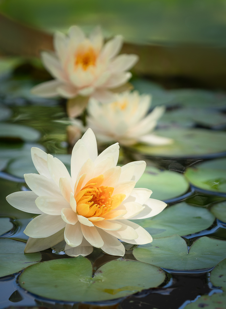
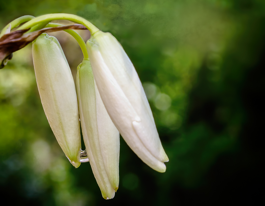
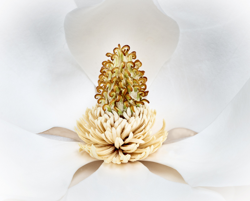
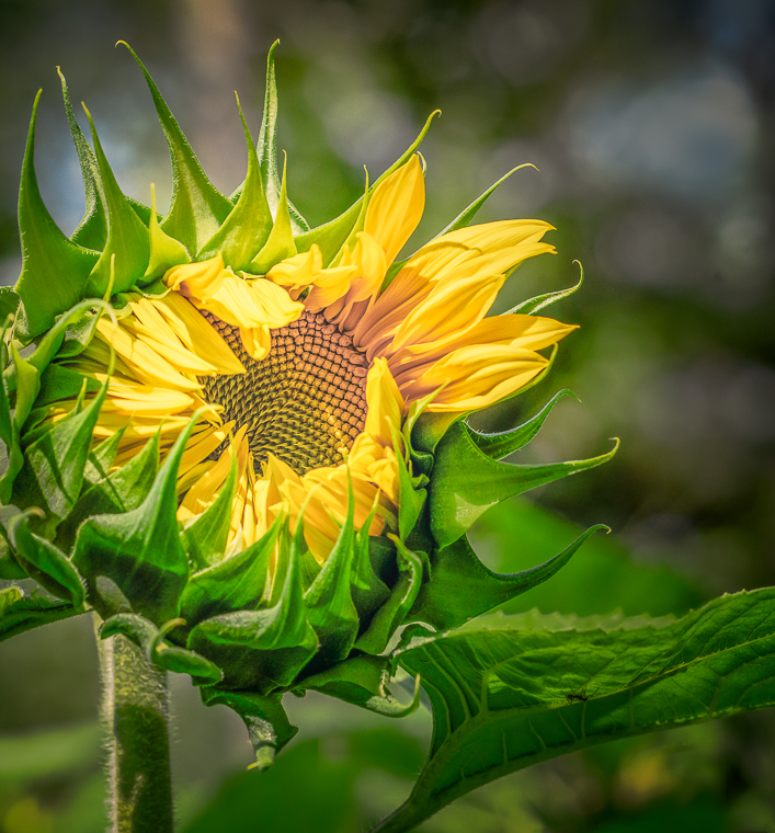
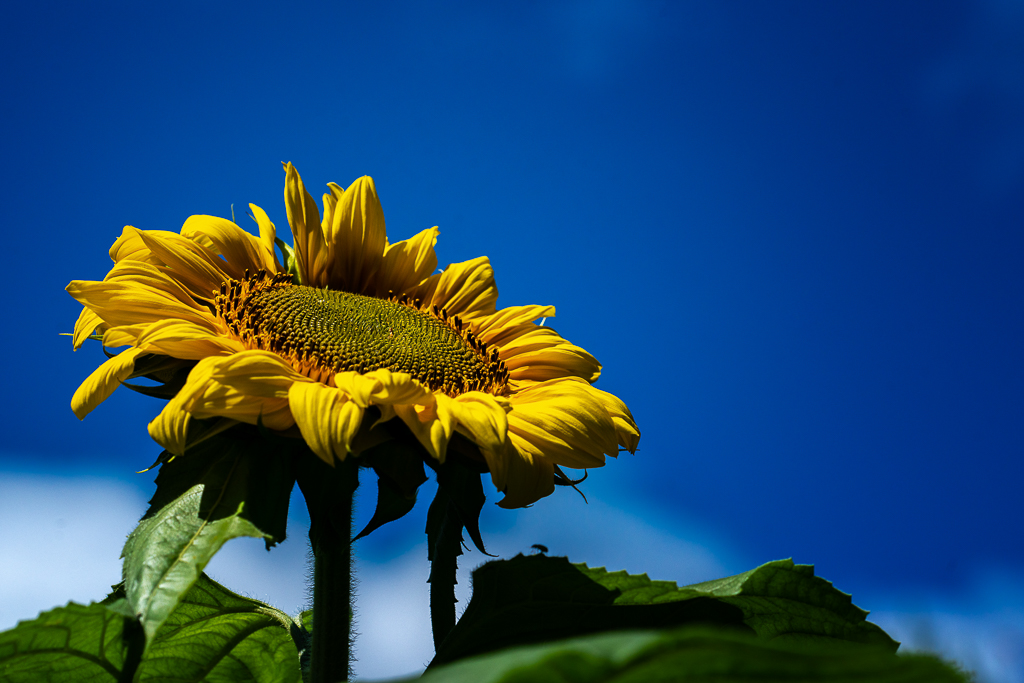
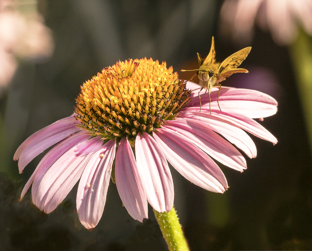
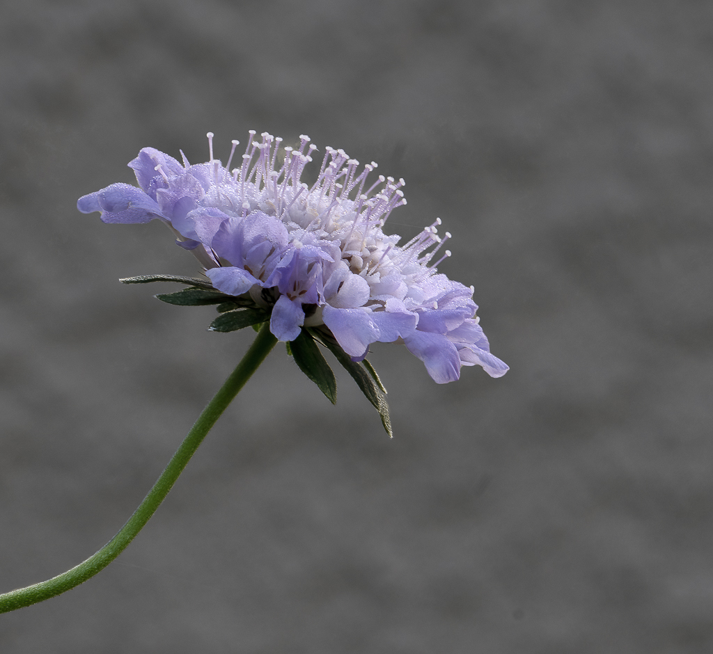
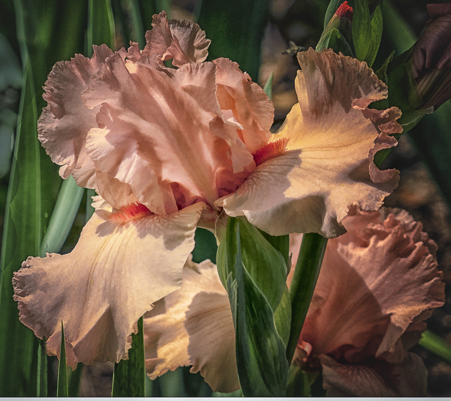
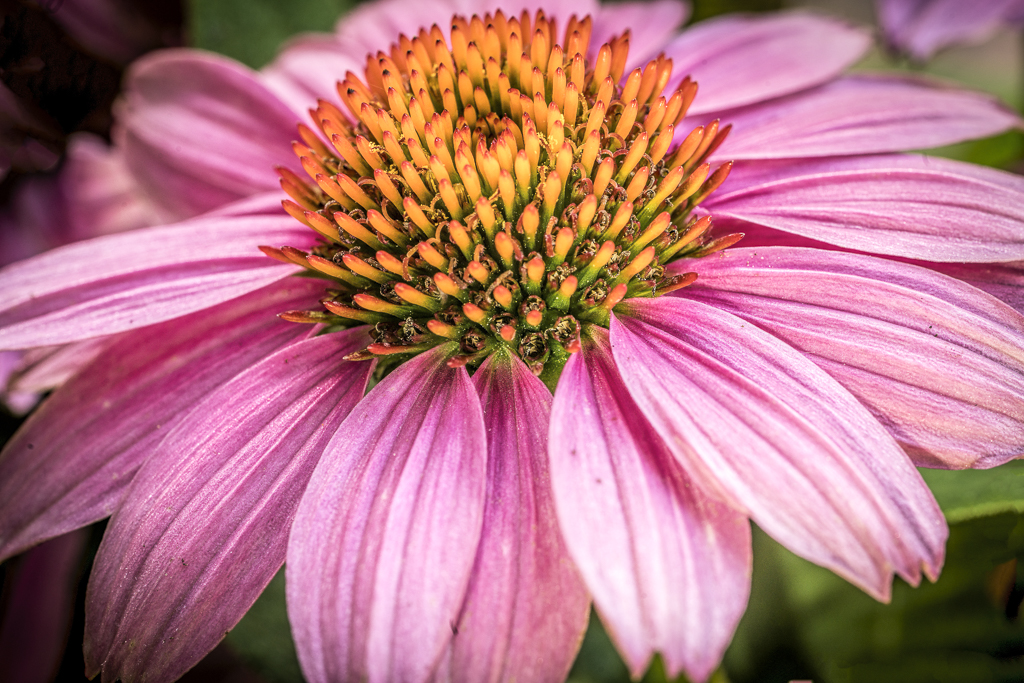
I like the color and lines of the petals, especially the lowest petals. As Laurie pointed out, you might want to darken the highlights. They appear to be blown out at the left upper part of the image and to a lesser degree at the center of the flower and close to the lowest petal. |
Feb 10th |
| 57 |
Feb 19 |
Comment |
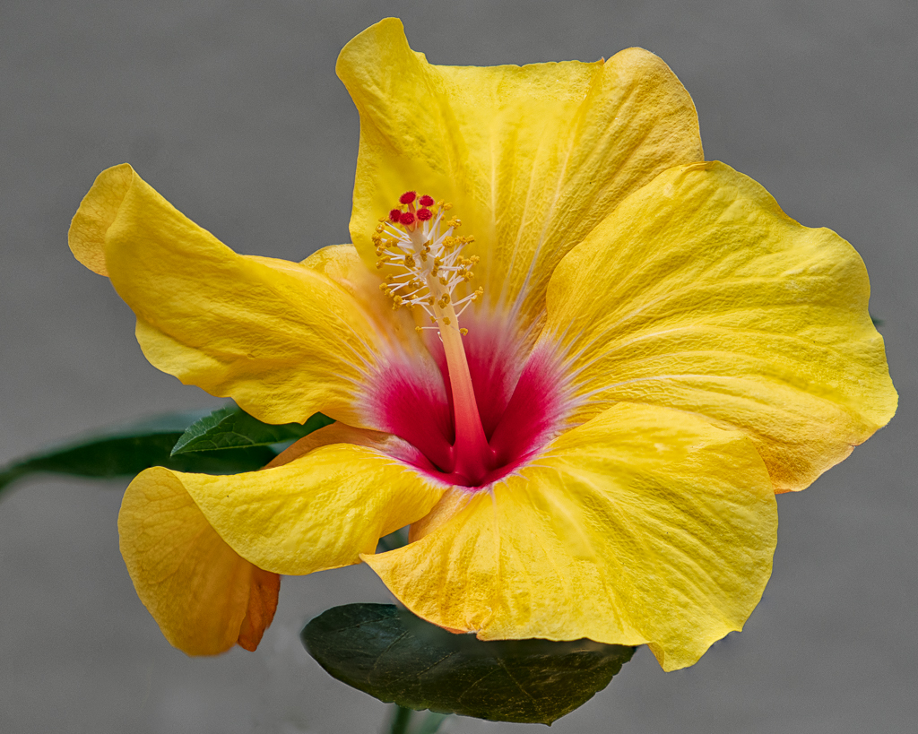
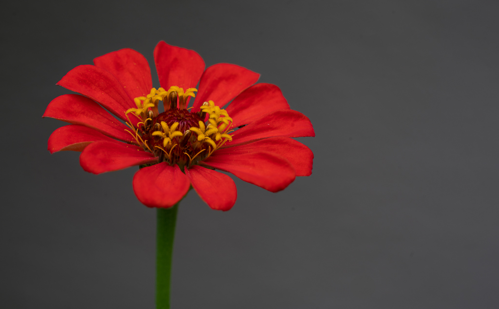
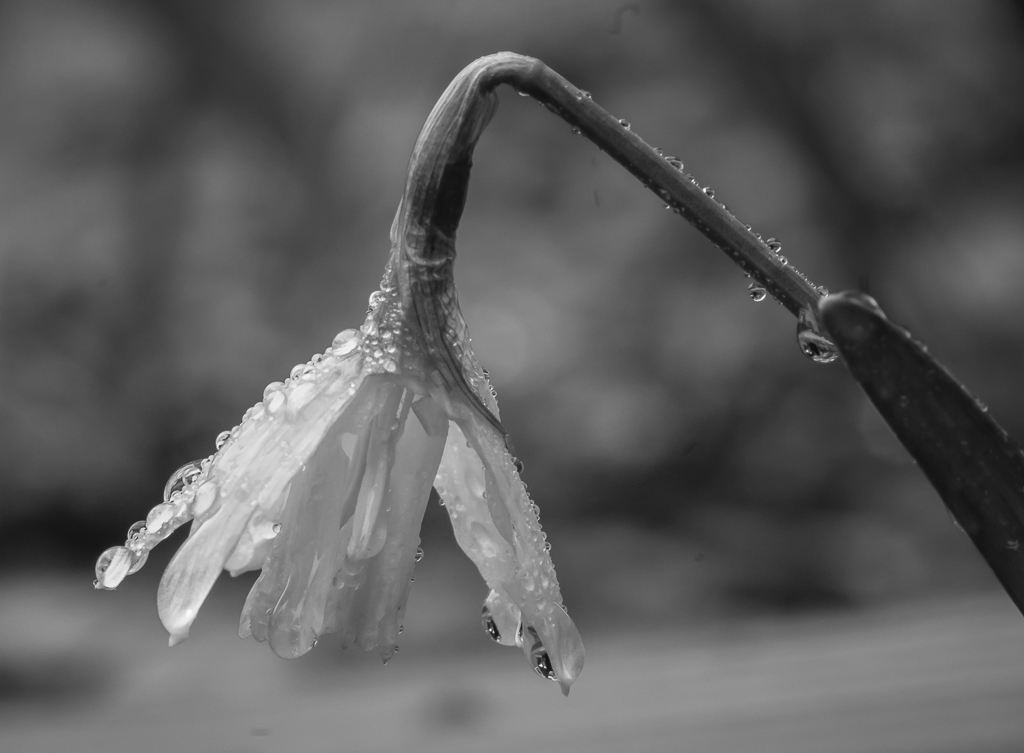
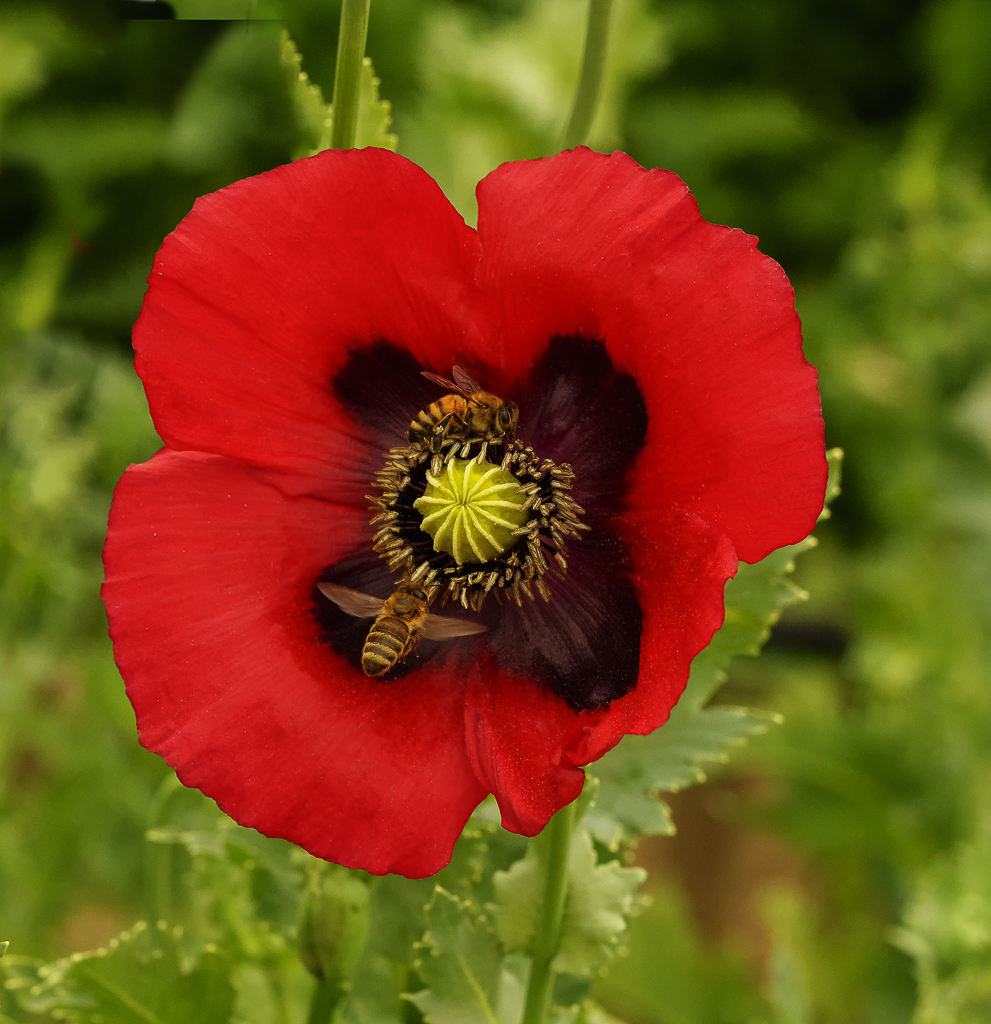
I agree with Laurie, I think a square crop might suit it better. Although as a good photographer, you probably wanted something different. I have seen many square crops for the daffodil. However, I think your image would stand out because of the clarity, background and sharpness even though it would be cropped square. I also wonder how it would look in monochrome. |
Feb 10th |
| 57 |
Feb 19 |
Comment |
Thanks, Cindy. I can see now where I need to touch it up. |
Feb 7th |
| 57 |
Feb 19 |
Comment |
Thanks, Cindy. I can see now where I need to touch it up. |
Feb 7th |
7 comments - 0 replies for Group 57
|
12 comments - 1 reply Total
|