|
| Group |
Round |
C/R |
Comment |
Date |
Image |
| 57 |
May 17 |
Comment |
Thank you, Jessica. I need to try out your technique. I have heard of pushing film photography but did not know how it applied to digital. |
May 22nd |
| 57 |
May 17 |
Comment |
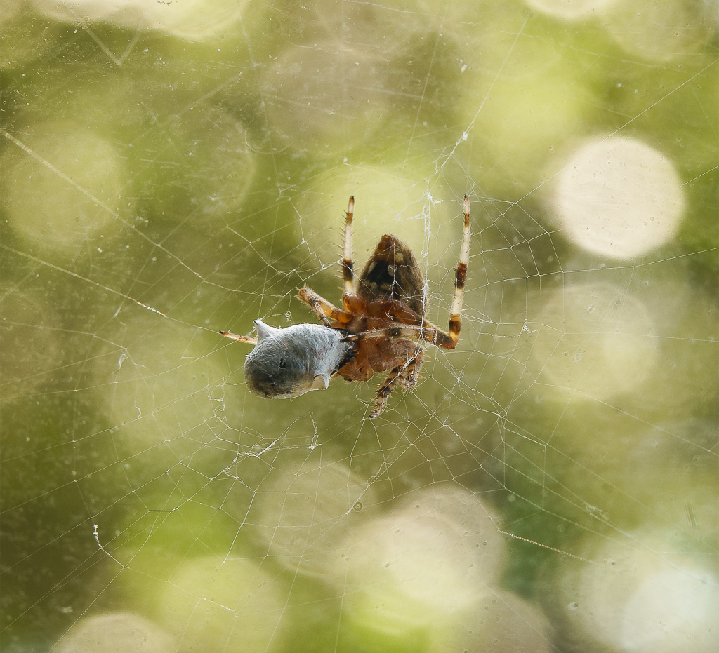
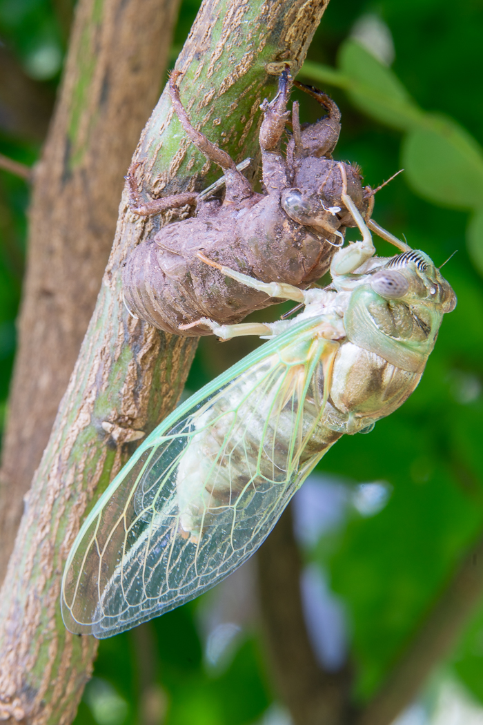
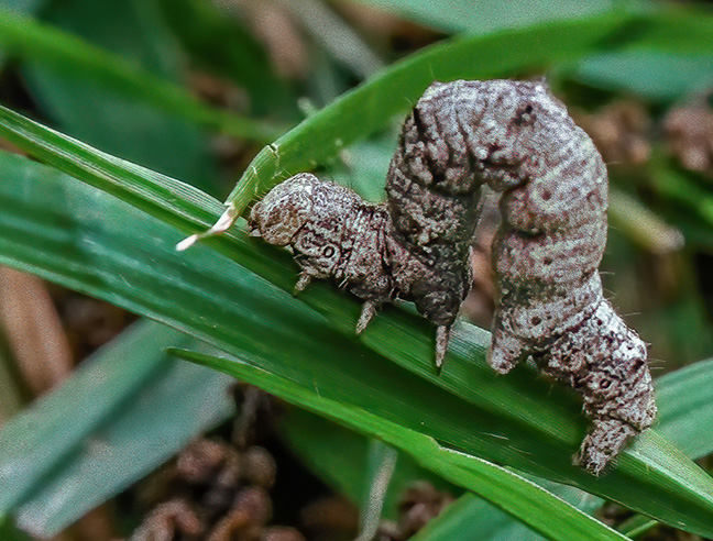
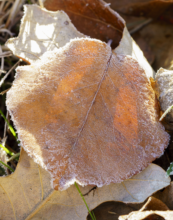
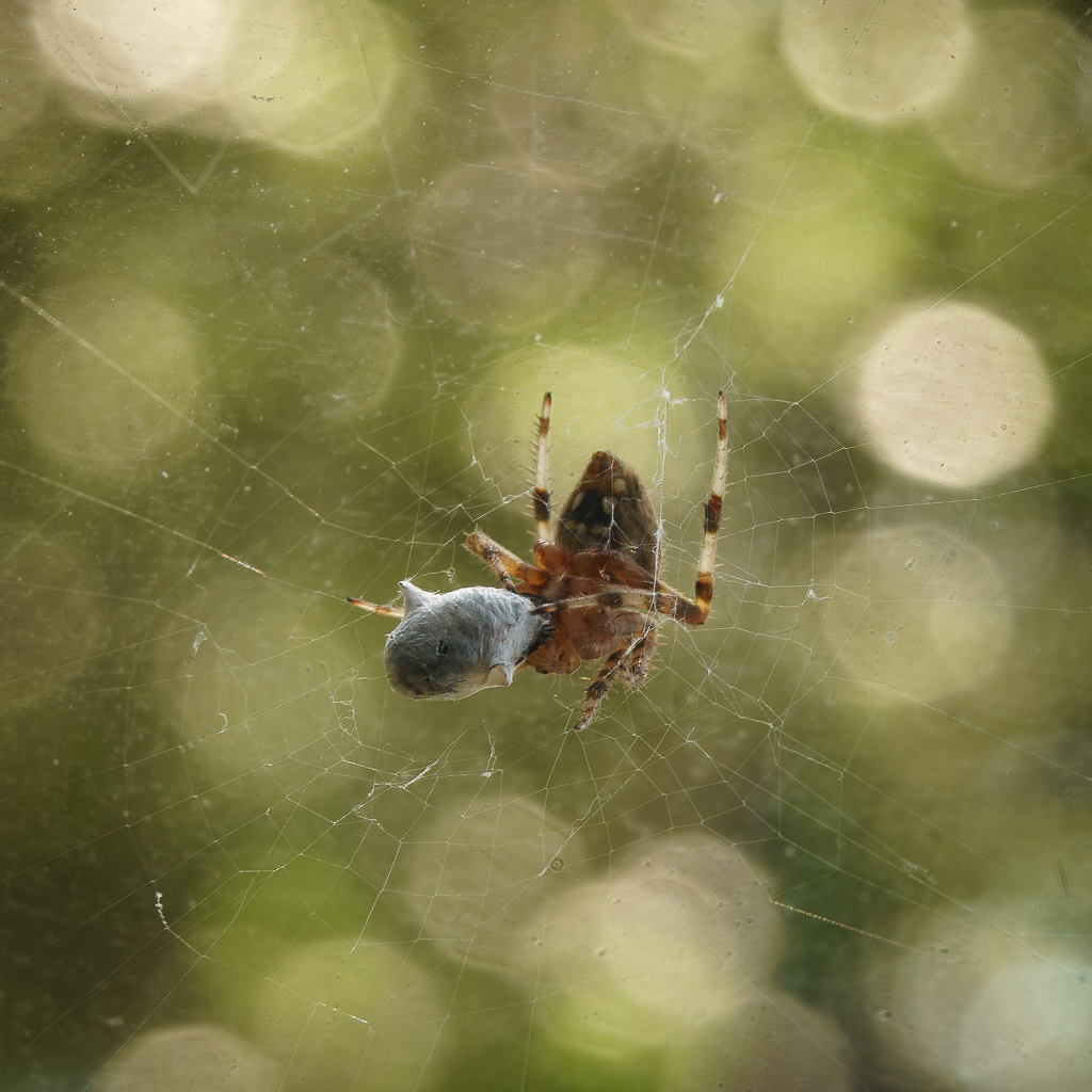
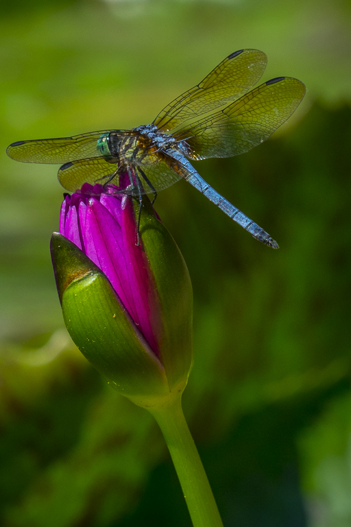
You are all right. The leaf is way too big. Thanks. I don't know what kind of bug it is, but I am sending it to our Nature Club to see if they know. |
May 16th |
| 57 |
May 17 |
Comment |
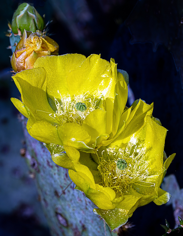
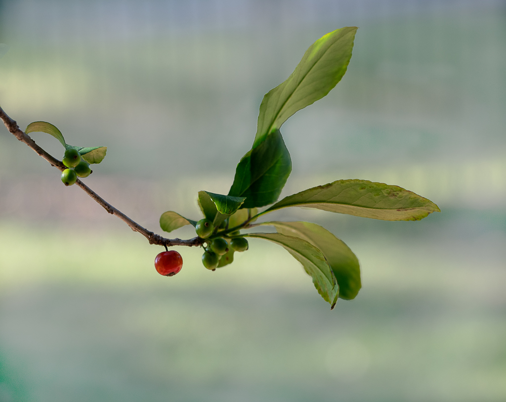
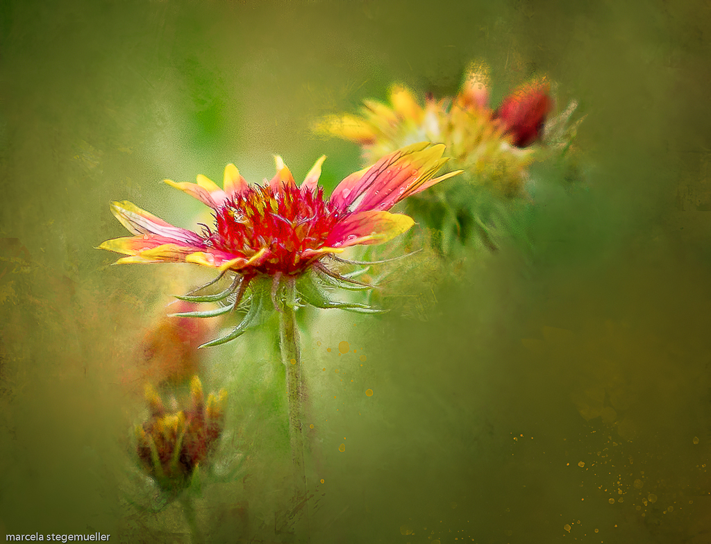
I like your image. It reminds me of some Japanese prints of beautiful flowers. I am intrigued though. What do you mean you "tried to push it?" How did you eliminate some things? Did you use layers? The flowers seem to have white around them. Is that what too much exposure looks like or are cherry blossoms like that? Forgive me for asking so many questions, but I would really like to know. In my opinion, your composition works. The diagonal line of the branch makes it interesting and the white background is different which immediately made me look at your image more closely. interesting. |
May 16th |
| 57 |
May 17 |
Comment |
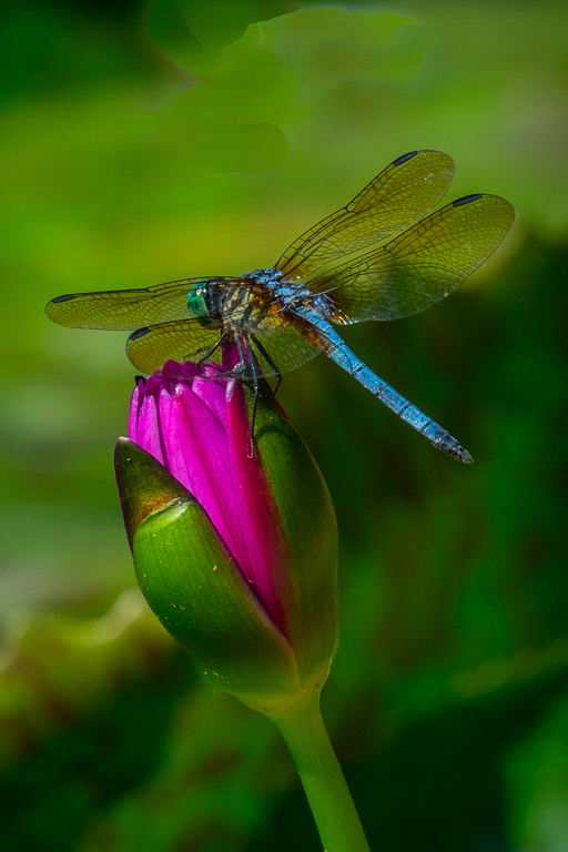
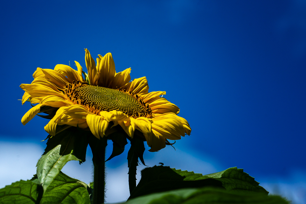
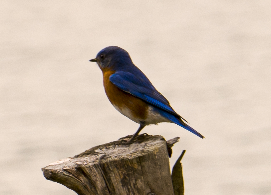
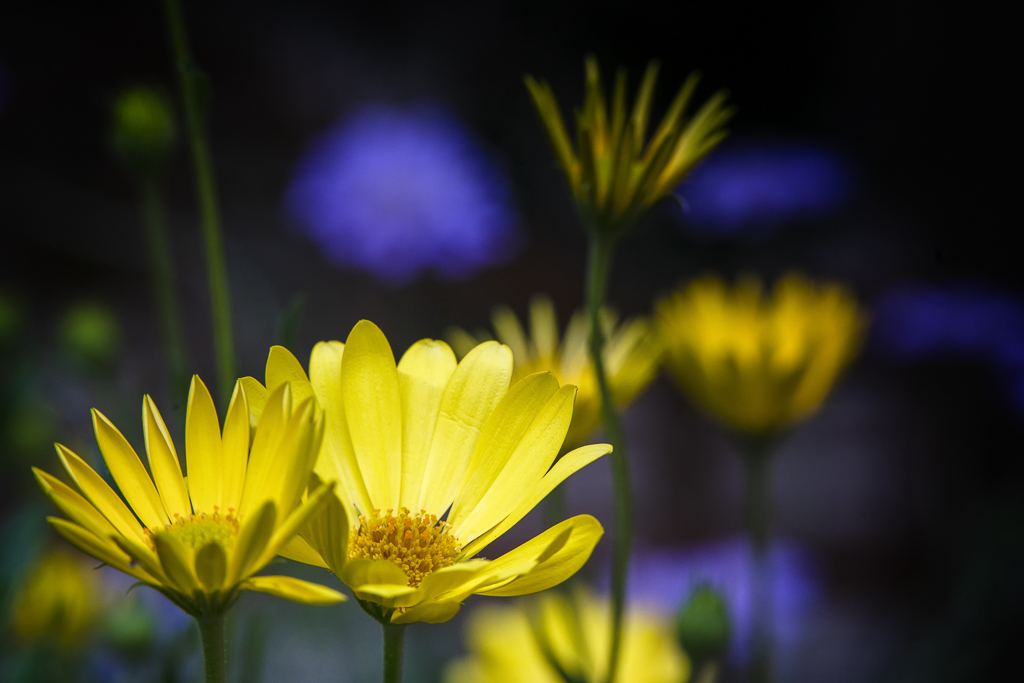
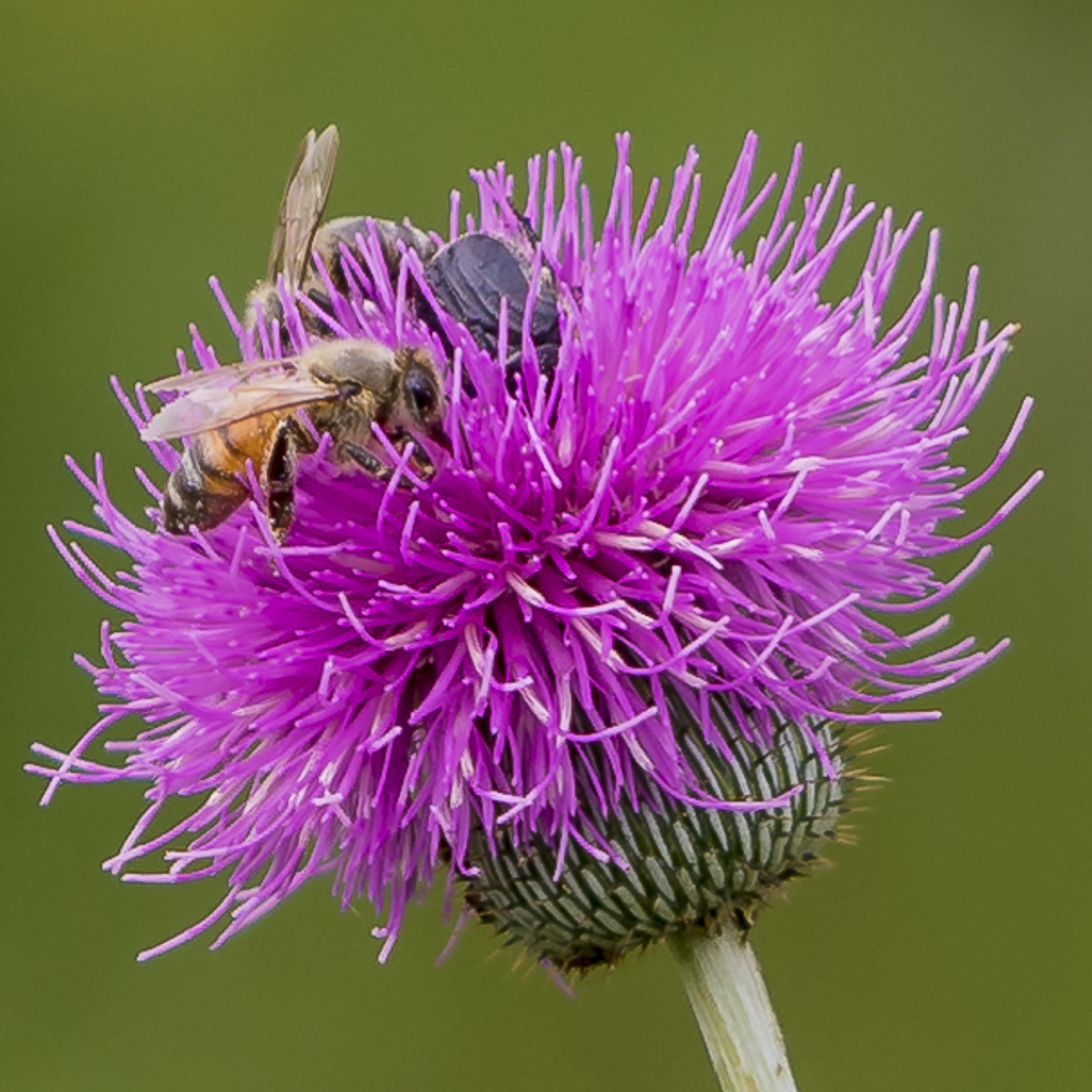
I like the angle the bee is in the flower. It is hard to get the bee facing the camera at the time of the shot. The bee is very sharp. I, too, would consider cropping from the left to put more emphasis on the bee and less on the flower.
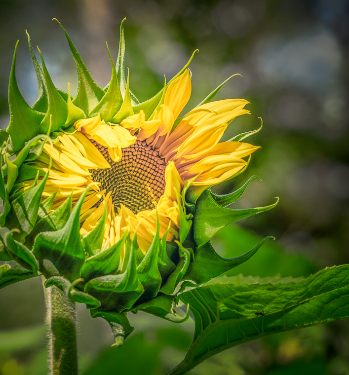
The yellow flower is very soft. |
May 16th |
| 57 |
May 17 |
Comment |
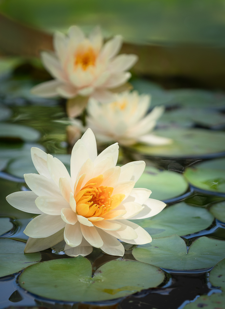
I think the lines of the flower and the leaves keep you in the frame. Your focus appears to be sharp especially inside of the lily.
I would have liked to see more of the bottom of the lily stem bringing the flower higher on the frame.
|
May 16th |
| 57 |
May 17 |
Comment |
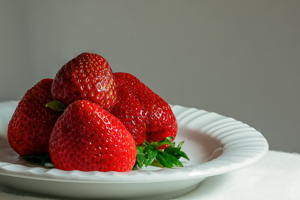
In my opinion, the rim light behind the stem enhances the shape and color of the strawberry artfully lighting the fuzz on the skin of the fruit. To my eyes, the fruit appeared a little dark at first glance. I then adjusted my monitor screen and in my opinion, the exposure was improved.
I agree with Cindy that the focus does not appear to be as sharp left of center of strawberry. To my eyes, the white spots on the table are a little distracting. |
May 16th |
| 57 |
May 17 |
Comment |
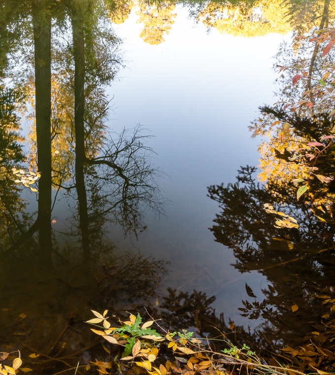
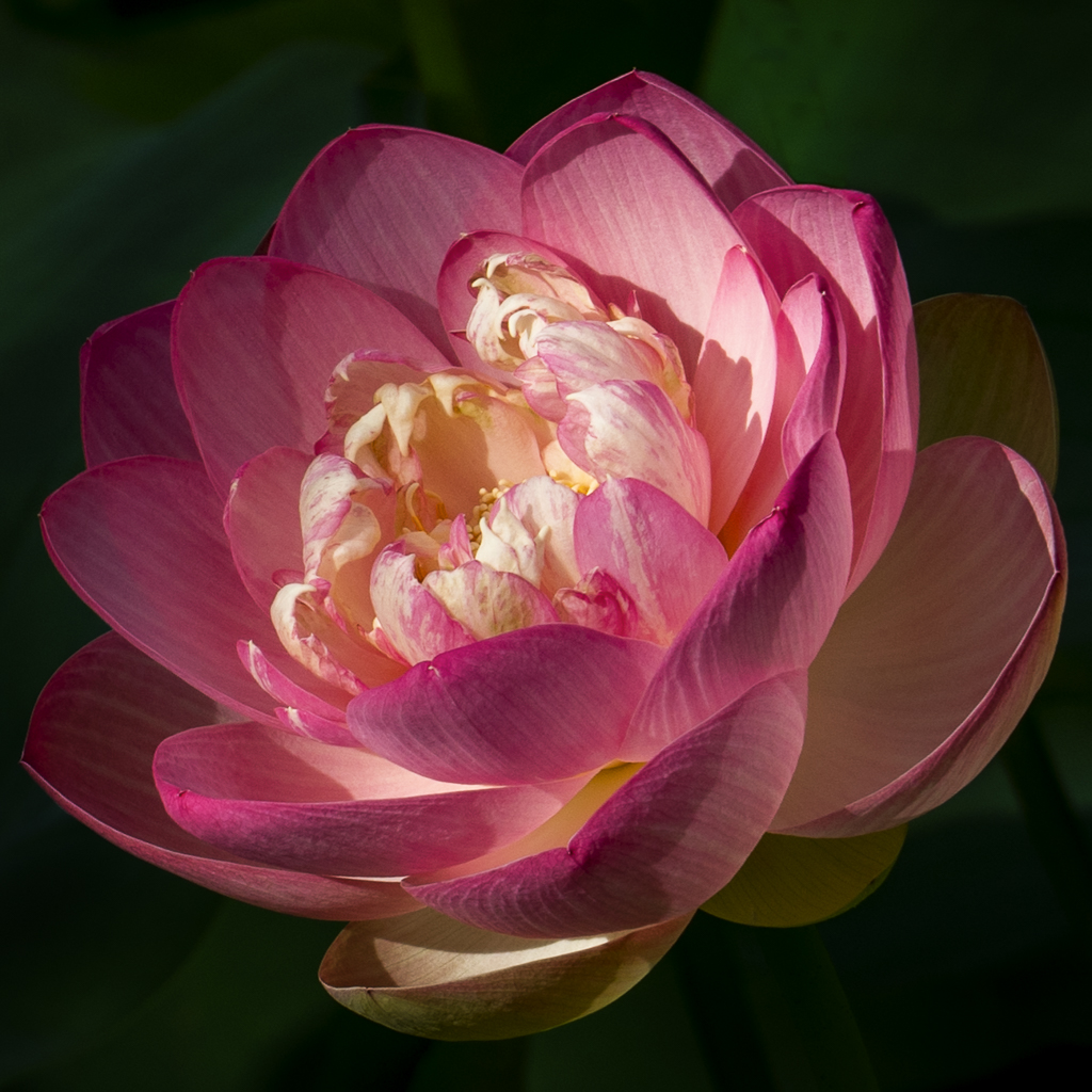
What a gorgeous image and reflection. The lines, the color and shape hold my eyes on the image. I think the black background makes it pop. I would be proud to hang this in my house. |
May 16th |
| 57 |
May 17 |
Comment |
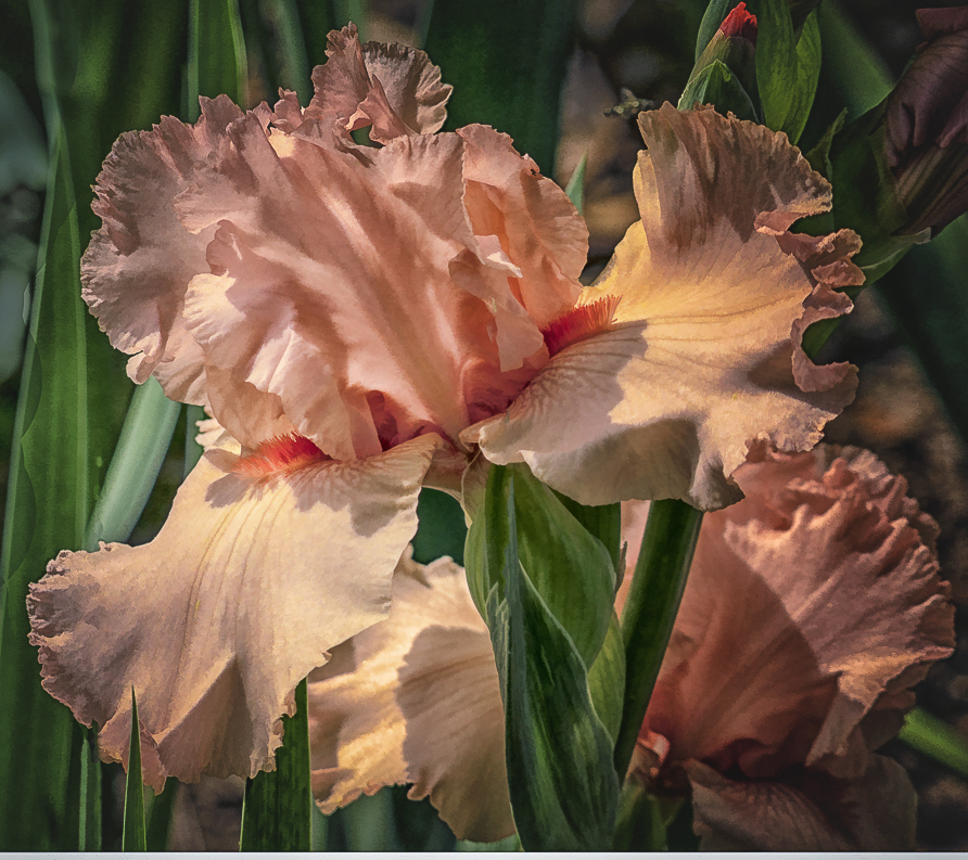
Before I looked at how you did it, I looked at your image and I thought what a soft and interesting background to the irises. I then noticed the water drops and thought early morning dew. In my opinion, the background supports that. The picture gave me a feeling of a clean, fresh peaceful morning. I then looked at how you did it and thought you will be a master at layers if this was your first attempt. Bravo! I am still struggling and getting nowhere.
To my eyes, the iris on the right looks a little bare and stiff. I think a long leaf or two might improve the composition. I agree that a vignette might also keep the focus on the flowers.
|
May 16th |
8 comments - 0 replies for Group 57
|
8 comments - 0 replies Total
|