|
| Group |
Round |
C/R |
Comment |
Date |
Image |
| 65 |
Feb 26 |
Reply |
Thanks for your feedback Maria! |
Feb 16th |
| 65 |
Feb 26 |
Reply |
I tried several angles, but since I was relying on a fixed, natural light source, I couldn't get to extreme. Just trying to work with what was available as I wasn't in the mood to drag out other lighting, LOL. Thanks for your feedback! |
Feb 16th |
| 65 |
Feb 26 |
Comment |
I like your composition/crop for this lily and the texture you captured. In the color version I feel you can see a bit of translucence in the white, so that appeals to me more than the black and white. But maybe just a bit of editing to bring out more "glow" on the white of the b & w version might make an improvement. Frankly, I'm just torn between the two, but beautiful capture of this lily. |
Feb 13th |
| 65 |
Feb 26 |
Comment |
Beautiful image with great color and textures. You captured all of the details so very well. Nicely composed! |
Feb 13th |
| 65 |
Feb 26 |
Comment |
This is a really interesting study in light on these leaves. Very simple and minimalist. I'm torn about wanting more in some of the negative space, or just appreciating what's there, LOL. But I also see the same story as David. |
Feb 13th |
| 65 |
Feb 26 |
Reply |
Thanks for the feedback Dick. I'll continue to play with this image. |
Feb 13th |
| 65 |
Feb 26 |
Comment |
I love this image. The shape of the tall mum with the hanging leaves really appeals to me. The color tones against the bluish snow background works well together in my opinion. Great capture. |
Feb 9th |
| 65 |
Feb 26 |
Comment |
Lovely image of a bright, beautiful flower hanging in there during a cold snow. I like the balance of the amount of snow with the number of uncovered petals. The snow feels light and fluffy. Beautiful. |
Feb 9th |
| 65 |
Feb 26 |
Reply |
I think the spot you are seeing on the right is actually part of a sepal sticking out from behind. I didn't notice that at first either! I agree with the darker background as well. For some reason I didn't catch how much lighter it was than I would usually find suitable until it was posted.
Thanks for the feedback! |
Feb 8th |
| 65 |
Feb 26 |
Reply |
I was torn about the out of focus lower petal as well. But I also liked the edges of the other petals to show so didn't consider a closer crop. I may play around with this some more. Appreciate the feedback! |
Feb 8th |
5 comments - 5 replies for Group 65
|
| 77 |
Feb 26 |
Reply |
I do like that crop as well! |
Feb 16th |
| 77 |
Feb 26 |
Reply |
I agree with you and Georgi that moving the bird more to the left is an improvement. Your crop gives me something to think about as well. I appreciate that you thought about adding a catchlight to the eye. I like that addition, and it looks natural to me.
Thanks for the feedback! |
Feb 13th |
| 77 |
Feb 26 |
Reply |
Thanks for the visual example Georgi. I think moving the bird makes an improvement. |
Feb 13th |
| 77 |
Feb 26 |
Comment |
I love this floral Valentine! You arranged the flowers perfectly to my eye and they look so soft and lush. I also like that you added text to the background, telling whomever is receiving this gift a beautiful story I'm sure.
Great image! |
Feb 13th |
| 77 |
Feb 26 |
Comment |
I really like how you brought out the colors in this statue and the smooth texture to the image. He seems a bid foreboding and tells me a story of a strong figure protecting something important in the monument he's in front of.
You did a great job of removing all of the distractions and he feels like he is sitting in a remote field where he was discovered during some sort of exploration.
I like it just the way it is. |
Feb 13th |
| 77 |
Feb 26 |
Comment |
You came up with a truly unique result from all of your "playing". I love the colors and how you were able to blend the cat into the color tones so well. The cat seems to be emerging from some type of magical portal. This is really interesting to view. |
Feb 13th |
| 77 |
Feb 26 |
Comment |
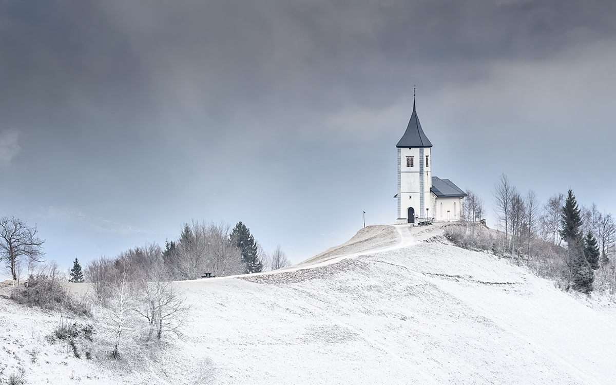
Lovely landscape. I would have never known there wasn't actual snow on the ground had I not seen your original. The gray in the clouds also makes me feel that this had been a snowy day.
I like the long slope leading up to the church, however wondered what a tighter crop would look like. Since the subject is the church I used a rule of thirds grid and lined it up on the right line. I also cropped some from the bottom. It seemed a bit more balanced to me. Food for thought. |
Feb 9th |
 |
| 77 |
Feb 26 |
Comment |
Thanks Rita! I love birds but I'm not great at bird photography. I'm not patient enough! |
Feb 6th |
| 77 |
Feb 26 |
Comment |
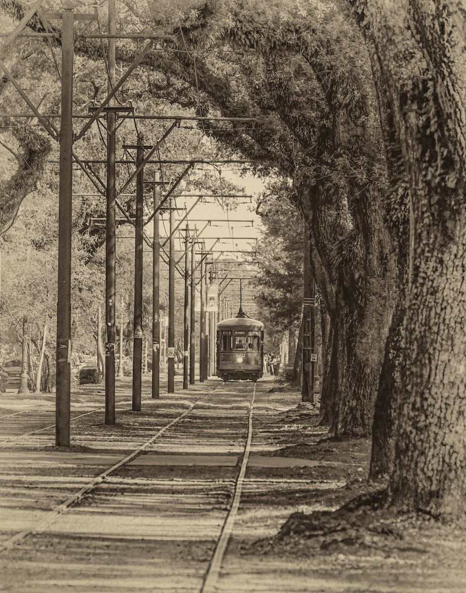
I don't enter contests on PSA so I can't speak to anything about suitability for specific categories. But I CAN say that I like this image a lot. I think you can leave the Audubon sign out. There is no need, in my opinion, to leave it in.
You've framed the trolly beautifully with the trees and the tall power poles on opposite sides. I like the fact that the people are somewhat in the distance and not overly distracting from the scene. The lighter tones do make this feel "antique". But to your question of going darker, I added a mask just on the tracks and darkened them a little, then added a slight, dark vignette to the edges. I've attached that image for your comparison. Don't know that it's better, but thought I'd add it. |
Feb 6th |
 |
6 comments - 3 replies for Group 77
|
11 comments - 8 replies Total
|


