|
| Group |
Round |
C/R |
Comment |
Date |
Image |
| 52 |
Jan 26 |
Comment |
I'm not a member of your group, but scrolling through other groups images I had to stop and admire this one. I think this is just beautiful. You captured a wonderful subject in a natural state that one might not often come across.
Your crop made for a great composition and the edits to bring out the birds face and other details seem just fine to me. Not artificial. You made sure to lighten the area on the top side of the branch where the owl is perched, but leave the bottom darker, which again, looks very natural to me.
I'm not a wildlife photographer, but I greatly appreciate that genre. I love this image. |
Jan 8th |
1 comment - 0 replies for Group 52
|
| 65 |
Jan 26 |
Reply |
Thanks Barbara. I'll play around with all of the cropping suggestions and see what resonates with me. |
Jan 16th |
| 65 |
Jan 26 |
Reply |
Thanks for the feedback and example Maria. |
Jan 16th |
| 65 |
Jan 26 |
Comment |
I really like the moody feel of the B & W image Maria. You captured the subject nicely initially, and the composition appeals to me as well. To me you made the very pretty color image more interesting with your B & W conversion. |
Jan 8th |
| 65 |
Jan 26 |
Comment |
Wonderful image of the Christmas cactus bloom! The color tones in the flower were well captured and the background compliments it as well. I wonder if just a little bit more room on the left might be an improvement? The long petal jutting out on the left seems really close to the border. But I only thought about that after staring at this beautiful image for a while, LOL. Initial impact is gorgeous and the long vertical framing suits this blossom well. |
Jan 3rd |
| 65 |
Jan 26 |
Reply |
Thanks for the feedback Dick. I see the spots you are talking about. I'll tackle correcting those as well. |
Jan 3rd |
| 65 |
Jan 26 |
Comment |
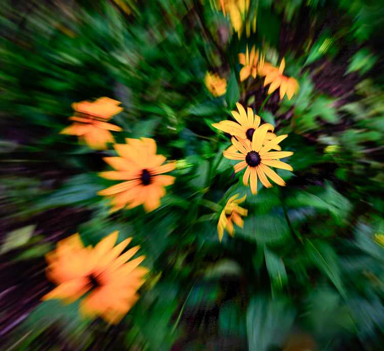
I also love trying out creative techniques Barbara. This is one I found challenging as well! One suggestion I have is to play with cropping the image. I've attached an example.
Since the center flowers are more in focus, I tried a crop that placed them off center and reduced the overall size of the image. To me, I felt like this added a different dynamic, if that makes sense? Kind of like the other flowers are shooting off from those in focus flowers.
I also used selective masks to open the shadows in some of the really dark areas that revealed more of the zoom effect on the leaves. I also increased the overall exposure. That also revealed some interesting colors, making this almost look like fireworks were exploding.
You picked a good subject on which to use this technique and I hope you continue to practice and enjoy this process.
|
Jan 2nd |
 |
| 65 |
Jan 26 |
Comment |
I really like this image David. The composition is very pleasing to my eye and capturing the snow falling gives life to the photo. I think your decision to lighten the background was a good improvement. I love the little piles of snow on the persimmons. Well seen and captured! |
Jan 2nd |
| 65 |
Jan 26 |
Reply |
Thanks so much for your feedback David. I will experiment a little more with darkening the top area. I was looking at the gradations of light going across the pond and thought leaving the top background a bit lighter might provide a little more depth to the overall image. I do understand that lighter areas can draw away the eye though, so I'll play around and see how I feel after I make some changes. |
Jan 2nd |
4 comments - 4 replies for Group 65
|
| 77 |
Jan 26 |
Reply |
Thanks for your feedback Carol! |
Jan 17th |
| 77 |
Jan 26 |
Comment |
This is a delightful moment captured of your precious granddaughters. I like the conversion to B & W. I like that the softness you added gives this a dreamy effect, but I also like the added sharpness on the faces in Georgianne's edit. Maybe there is a sweet spot to explore with a tiny bit more sharpness. Regardless, this is a great image. |
Jan 17th |
| 77 |
Jan 26 |
Reply |
I agree the top is too close. I'll try manipulating the frame in the texture. Thanks Jan. |
Jan 16th |
| 77 |
Jan 26 |
Reply |
Thanks Rita! |
Jan 12th |
| 77 |
Jan 26 |
Reply |
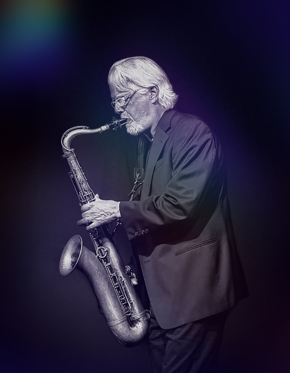
Depending on what version of PS you have things could look a little different, but I think this way is pretty standard and probably easier for me to explain:
Take your image into PS, click on the crop tool (your image will then have a box around it), in the menu across the top of the screen click in the FILL box, then choose Content Aware Fill. Then you can drag the left control point over as far as you think looks good, and drag the right control point in closer to the sax player's back until you feel like it's the right composition. Back at the top menu click the checkmark to apply the edits. You can undo, then redo if you feel you need to after you see the edits applied.
This usually works well on plain backgrounds, like on your image. |
Jan 10th |
| 77 |
Jan 26 |
Comment |
I also like spiral effects and think they can make very interesting images when the right subject is chosen. The color palette and exposure is very nice, but the one long white stamen (if that's what it's called) is throwing me off. When you get closer in towards the center where it's smaller, it feels okay. But on the outer sections it doesn't appeal to me. You can also see very clear lines between the wedges on the larger outer parts as well. Maybe blurring or blending them in some way would help reduce the distraction. But overall, a different subject might work better with this effect. |
Jan 8th |
| 77 |
Jan 26 |
Comment |
Since the original photo you submitted was accepted, do they prefer it as is, or do you think they would be okay with an edit?
My suggestions would be first, go into Photoshop and add canvas to the left, in front of the sax, then crop a little off from the back. You can't tell on this display that the front is closer to the subject than the back, but I could see it on your original image. That would improve the composition. I did that on the example I'm attaching.
Second, adding a texture or effects that make him look like he's under lighting on a stage in a smokey old club might be a nice addition.
Without knowing what editing software you might use, I've just put an example of something I did in Luminar Neo. Maybe I didn't quite get there, but food for thought. I also decreased the highlights in Lightroom Classic after the edits. |
Jan 7th |
 |
| 77 |
Jan 26 |
Comment |
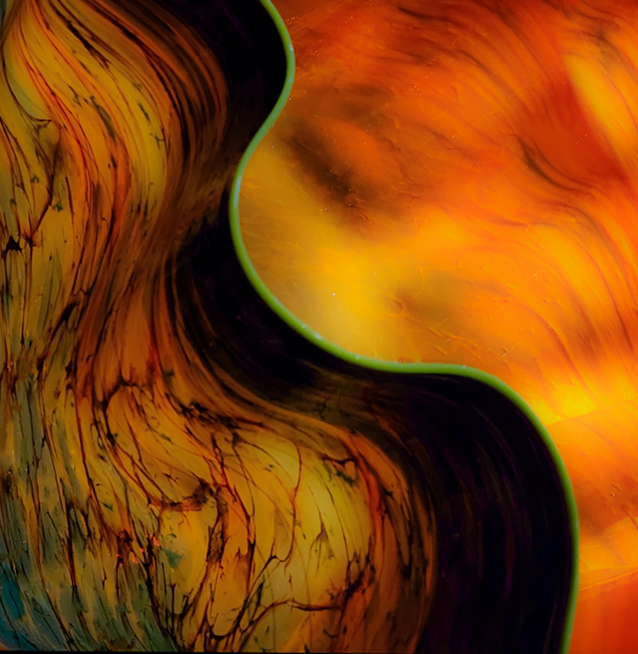
Chihuly glass sculptures are amazing. There are several installed at my local botanical garden; inside some of the buildings and outside on the grounds.
I like all of the curved, flowing lines, but I feel the image might be improved by a crop that simplifies it. There is a lot going on in my opinion, and I wondered if focusing on the curved green edge might be interesting. So I've attached an example cropping into that edge and flipping the image as well. I also blurred it by moving the clarity slider in Lightroom all the way to the left. It reminded me of flowing liquid. Just some ideas. I think you could play around with this a lot, LOL. I can see why you were drawn to photograph it.
|
Jan 3rd |
 |
| 77 |
Jan 26 |
Comment |
Beautiful image Carol! I love the color tones and all of the detail you captured in the leaves. The composition is spot on in my opinion, and the texture and shadows under the berries grounds them well. You also managed the highlights and reflections on the berries nicely. I can see this hanging on the wall of a cafe or restaurant. |
Jan 3rd |
5 comments - 4 replies for Group 77
|
10 comments - 8 replies Total
|


