|
| Group |
Round |
C/R |
Comment |
Date |
Image |
| 65 |
Oct 25 |
Reply |
Thanks for your feedback Mark! I use Topaz Studio 2 for their creative filters. This is an old program that is no longer supported by them, but I believe is still available to download from their Legacy Apps page: https://docs.topazlabs.com/other-apps/legacy
I have not done a lot with PS so can't speak to what is available there. But I have enjoyed playing with Topaz Studio 2 filters and "looks" because you can dive into them and customize/change things very easily. |
Oct 25th |
| 65 |
Oct 25 |
Reply |
Thanks Maria! |
Oct 22nd |
| 65 |
Oct 25 |
Reply |
Thanks for the feedback Dick! |
Oct 9th |
| 65 |
Oct 25 |
Reply |
Thank you so much David. From what I've observed reviewing many of the postings from the past, everyone here is a true lover of nature and flowers. I look forward to participating in this group! |
Oct 8th |
| 65 |
Oct 25 |
Comment |
To be honest, I don't think I've ever seen rose hips, or if I did I probably thought they were some kind of berry. As a lover of flowers and plants, I'm not necessarily well educated in horticulture, LOL.
I like this composition and the bright red against the green. You've controlled the reflected light well on what appears to be a shiny surface. I see you use a polarizer a lot. That is something I need to try more often as well. I don't always think about that unless I know I'll be near water. |
Oct 6th |
| 65 |
Oct 25 |
Comment |
Very interesting capture. I like the shapes and all of the dewdrops in your composition. It keeps your eye moving through the image to take it all in. Nicely seen. |
Oct 6th |
| 65 |
Oct 25 |
Comment |
I also appreciate aged flowers and you captured this one very well. I like the curve of the stem with the flower head slightly bent down, adding to the impression of what can happen as one gets older.
I'm torn between the green or black background. I like them both for different reasons. The green compliments the red flower and picks up some of the other green tones in the stem and back of the flower. But the black adds a "sad" mood to the image as well. So, I think either can work. |
Oct 6th |
| 65 |
Oct 25 |
Comment |
Beautiful magnolia David. I like how the center petals curve around and embrace the carpels and stamens. You did a really nice job of cleaning up the background to focus on just the flower. Love this image. |
Oct 6th |
| 65 |
Oct 25 |
Comment |
Gorgeous dahlia Barbara! You controlled the lighting beautifully to bring out the wonderful details and depth. I love how you captured the gentle movement in her petals. Lovely image.
|
Oct 6th |
| 65 |
Oct 25 |
Reply |
Thank you for the welcome and feedback Barbara! |
Oct 6th |
5 comments - 5 replies for Group 65
|
| 77 |
Oct 25 |
Reply |
Thanks Mary! |
Oct 25th |
| 77 |
Oct 25 |
Reply |
Thanks Rita! |
Oct 25th |
| 77 |
Oct 25 |
Reply |
You definitely brought out more detail on the flower. I like how you were able to bring out the brightness in the dew drops as well. I may play with this a bit more to try and find a balance between my softness and your punchy edits, because I do like them. But maybe a tad softer. Thanks for the feedback! |
Oct 15th |
| 77 |
Oct 25 |
Reply |
Thanks for the feedback Georgi! |
Oct 15th |
| 77 |
Oct 25 |
Comment |
I think adding the mountains makes your image suit the title of Colorado Dreaming. Without them, this looks like a prairie that could be anywhere. I like the colors and the smoothness you achieved.
Did you actually move the camera when taking this, or just let the wind cause the movement? |
Oct 12th |
| 77 |
Oct 25 |
Comment |
I really like the story this image is telling. Moving the accordion made a much better composition. The muted colors coming through also add to the charm of this image in my opinion.
Nicely done! |
Oct 12th |
| 77 |
Oct 25 |
Comment |
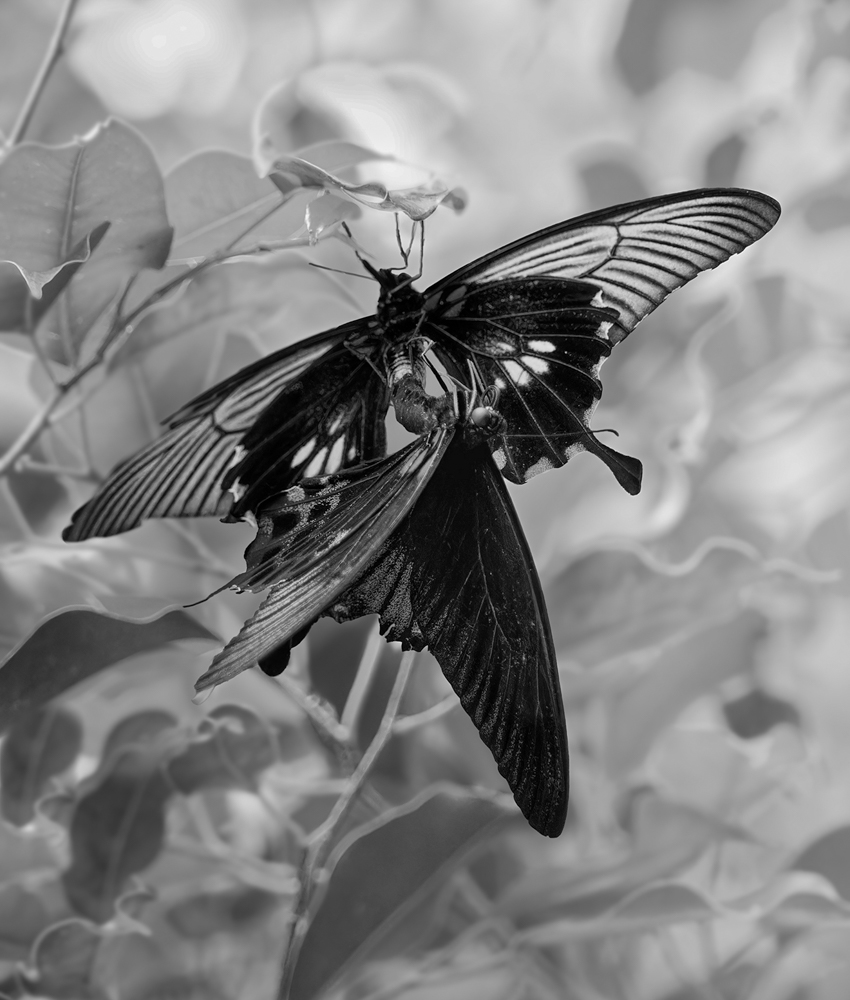
I like your conversion to black and white, which helps tone down the busy background. I feel that there are still some rather bright spots in the background, and on my screen the bottom dark wing of the butterfly seems too dark near the body. I played with an edit to see what would happen if I used several masks to lower the highlights on a few bright spots, then open up the shadows a bit on that dark part of the wing. I also cropped to add a little more focus on the butterflies.
Just some food for thought. I like your concept and that you saw this interesting shape while also capturing the translucence of the top butterflys wings. |
Oct 12th |
 |
| 77 |
Oct 25 |
Comment |
This is a really nice image Georgi! I think your subjects are well placed making this interesting to look at rather than too busy with multiple dancers. The decision to convert to black and white definitely made this more cohesive in my opinion.
I wonder if opening up the shadows on the dancers dress in the upper left would help her stand out a bit more? She's blending into that dark corner, which may have been your creative choice.
Well done! |
Oct 12th |
| 77 |
Oct 25 |
Comment |
This is a peaceful, serene scene. The smoothness of the sky and water looks really nice to my eye. I like your conversion to monochrome and including the bird as well. I do wonder if placing the bird on the short post on the far left would improve the image? He/she would then be looking towards the larger fence posts to draw you into the image a bit more.
Very nice image! |
Oct 12th |
| 77 |
Oct 25 |
Reply |
Georgi - if you intended to add an image it is not showing up. |
Oct 12th |
5 comments - 5 replies for Group 77
|
10 comments - 10 replies Total
|


