|
| Group |
Round |
C/R |
Comment |
Date |
Image |
| 77 |
Sep 25 |
Reply |
You're welcome! |
Sep 20th |
| 77 |
Sep 25 |
Reply |
Thanks for your feedback Carol! |
Sep 20th |
| 77 |
Sep 25 |
Reply |
Thanks so much Rita! |
Sep 20th |
| 77 |
Sep 25 |
Comment |
This is a wonderful triptych. Your edits brought out the detail nicely. I might crop a little from the bottom, but I like your arrangement.
Well done! |
Sep 13th |
| 77 |
Sep 25 |
Comment |
Very nice ICM. You definitely captured an interesting mood with the colors and the dreamy background as the people are waiting for whatever and wherever the viewers imagination wants to take them. This is interesting to look at and makes me stay with it and think about it. The title is perfect in my opinion.
Great job! |
Sep 12th |
| 77 |
Sep 25 |
Comment |
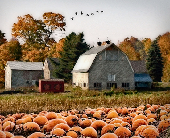
I like the original image but can appreciate that you wanted to add a little more to it. The composition and the fall colors are really nice. The pumpkins also suit the image, but I don't think the scarecrow was necessary. To me, the cornfield just looks like tall grasses in this photo, with the pumpkin patch being more dominant. So I don't see a need for a scarecrow.
There was also something about the perspective of the pumpkins in the foreground that was nagging at me. You're looking at the farmhouse at a side angle, but I felt like the pumpkins weren't quite the same perspective. So I took your final into Lightroom and used the Transform controls to change the aspect ratio a bit and tilt it a little horizontally. This meant I needed to crop it after the adjustments, which makes it a bit tight on the left, but it took away that nagging feeling I had, LOL. Not sure if you can tell the difference as the changes were subtle.
This leaves me craving fall as well!
|
Sep 12th |
 |
| 77 |
Sep 25 |
Comment |
Darling girl and fun, happy image. I like all of the sparkling colors in her jacket which makes the extra pops of light you added fit the image well.
I also like that you can see the window on the right, again, which can add to why there are light sparkles and her jacket pops.
Did you try to remove the trash can in Photoshop or Lightroom? I think taking it out would improve this for sure.
Precious image.
|
Sep 12th |
| 77 |
Sep 25 |
Comment |
I think your decision to turn this image into a nighttime scene really accentuated the story. I agree that Georgianne's edits make the atmosphere more realistic.
This is a powerful, well composed image. Nicely seen and captured! |
Sep 12th |
| 77 |
Sep 25 |
Comment |
I'm amazed at how you were able to totally change the background, yet she looks like she was actually in that new environment. Lovely pose and the light rays are a nice addition. The shadows were well placed as well.
One little thing that caught my eye - where you removed her ring on the hand by her foot, it does look like a small chunk is missing from her hand/finger. For some reason I saw that slight caved in area and went back to your original to see if that was natural to her hand. Then I saw the ring and determined you had removed it. I don't find the ring distracting, but I noticed it missing, LOL. Maybe because the light rays were drawing my eyes down to her hand/foot.
Beautiful image. |
Sep 12th |
| 77 |
Sep 25 |
Reply |
Thanks Georgi! |
Sep 12th |
| 77 |
Sep 25 |
Reply |
Thanks Connie! Unless something is really distracting, I am leaning more towards leaving "extra" things (like spiderwebs) on my nature images as well. Testing the waters, LOL. |
Sep 12th |
| 77 |
Sep 25 |
Reply |
Thanks Jan! I also saw the spiderweb and decided to leave it to see what feedback I might get without specifically asking for it.
Appreciate it! |
Sep 7th |
6 comments - 6 replies for Group 77
|
6 comments - 6 replies Total
|


