|
| Group |
Round |
C/R |
Comment |
Date |
Image |
| 77 |
May 25 |
Reply |
You made a really interesting abstract with the original image Jan! I think I could really dive into a rabbit hole with all of the PS possibilities! I'll definitely continue to play!
Thanks for your feedback! |
May 15th |
| 77 |
May 25 |
Comment |
How exciting to see a beautiful swan in an unexpected place. I can see why you'd want to capture that moment!
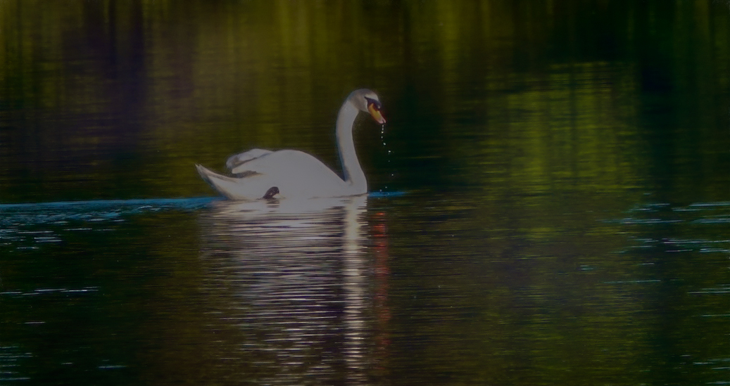
To me, your edited image looks harsh and almost too bright. The original image seems more muted and soft. Because your swan is not in good focus, I would make the overall image even softer and more dream-like. I took your original image into Lightroom and cropped it to include only water and the swan. Then I reduced the whites and highlights plus did more noise reduction that softened the overall image. Then I took it into Topaz Studio 2. I added an impressionistic look. It's hard to get a good result editing the jpeg, but I think this might give you an idea for another approach to this image. I feel it's still too dark for a "light/airy" approach, but I was getting a little frustrated because the file is hard for me to work with, LOL. There's probably better things that could be done in Photoshop, but that's not my strong suit! |
May 14th |
 |
| 77 |
May 25 |
Comment |
I like your concept Jan, but I feel your end result doesn't represent what you might have been trying to accomplish. By that I mean the flowers do look like they've been added to the image and aren't really laying in a way that would make a viewer feel they blend well with your daughter-in-laws face. For instance the pink rose on the left pointed straight forward seems very unnatural. I think you could remove it and have a more balanced look between both sides.
Maybe if the entire background included very defocused flowers, with some stretching across her eyes as if her face was emerging, would make a more compelling image. With everything being more soft and abstract and the background color lighter and a different tone? The background color doesn't exude softness as it appears you would want this image. |
May 12th |
| 77 |
May 25 |
Comment |
I really like the wavy motion of all the leaves and the fanning out of the flowers. You did a nice job of changing the reflective background so your tulips would stand out better. I agree that the reflection of the pot is unrealistic so should be changed. I don't feel the thin gray line is needed as the reflection of the pot makes it feel grounded. However, I personally find the way the foil is standing up around the top of the pot distracting and would have done something about it before I took the shot, LOL. That's a personal preference.
Nicely seen composition. |
May 12th |
| 77 |
May 25 |
Comment |
This is a very bold, strong image to my eye. There is a lot to look at here and frankly I'm torn about whether it is a little too busy. But on the other hand, I find it really interesting to look at. I like the ghost-like transparency of the woman. It makes me feel like I might be imagining a scene as I'm listening to someone telling a story about this warrior (if that makes sense).
Very creative. |
May 12th |
| 77 |
May 25 |
Comment |
I find this image amazing! Your edits changed this contemporary concrete building into a futuristic metal building to my eye. I really appreciate how you've manipulated the light reflecting off the building and removed distractions to make it more minimalist. The sky swap provided leading lines into the building. I also feel the monochrome suits the image really well. Absolutely love it! |
May 12th |
5 comments - 1 reply for Group 77
|
5 comments - 1 reply Total
|


