|
| Group |
Round |
C/R |
Comment |
Date |
Image |
| 77 |
Aug 24 |
Reply |
Thanks for the feedback Mary. I also loved the body position of the spider. I got lucky there, LOL. |
Aug 23rd |
| 77 |
Aug 24 |
Reply |
Thanks for your feedback Connie! |
Aug 23rd |
| 77 |
Aug 24 |
Reply |
Thanks for your feedback Rita! |
Aug 15th |
| 77 |
Aug 24 |
Reply |
I like your additions Jan! Thanks for the feedback! |
Aug 14th |
| 77 |
Aug 24 |
Comment |
Rita - This is a very soft, abstract image. You have two people standing where you can see no beginning and no end. Your mind wonders what they are looking at, thinking, where are they going, why are they here? And where is here?
I think the colors are beautiful and it's really interesting to look at. Would this fit in a landscape category of photos? I don't think so personally, since I don't see any elements of landscape in the image. I see color, reflections, and people in a very ethereal setting. That's my two cents, but I still really like the image as an abstract. |
Aug 10th |
| 77 |
Aug 24 |
Comment |
What a fun concept Jan. Definitely a 60's Pop Art vibe! I really like where you took this. However, the wheel seems to be blocked by a black rectangle at the bottom. Not sure why or what that is. I think I'd like to see the entire wheel instead of just part of it.
I like the simplicity and fun feeling. Nice job! |
Aug 10th |
| 77 |
Aug 24 |
Comment |
What interesting clouds, and you saw them when there was this fantastic light! I think I like the alternate image a little better. For me it seems a little more light and airy than your final version, if that makes sense, although they are very close. However I also wonder if the hills were just a little lighter, closer to the original, if that would add anything? In my opinion, I think the way the light was hitting the hills also emphasizes that this was sunrise and also adds a little depth by showing the direction of the light a bit.
So just my two cents, but a stunning capture and I like the edits to bring out the color. |
Aug 10th |
| 77 |
Aug 24 |
Comment |
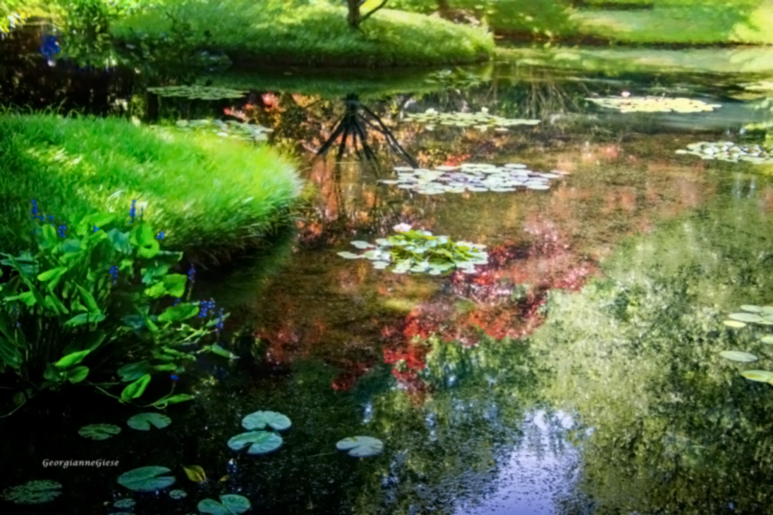
What a beautiful setting you've captured. I can see why you felt this had a Monet-like appearance. I think the composition you choose works well to emphasize that, as did your edits.
A couple of things that really caught my eye were the yellow streak of color at the top left, and the white streak on the top right. I took your edited image into Photoshop and removed those two areas with the remove tool. But I was also curious to see what would happen if I added a Gaussian blur to the image, to soften it even more. I'm not sure if it made any real difference, but I've attached the edited image anyway, LOL. |
Aug 10th |
 |
| 77 |
Aug 24 |
Comment |
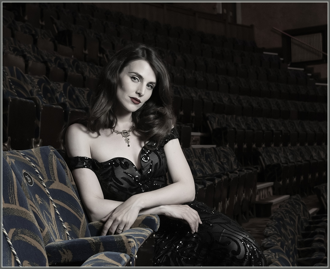
Carol, your model, her pose, her makeup, the lighting, and the setting are all stunning. You captured everything beautifully with the model in sharp focus and the theater background fading off nicely. Your decision to convert to black and white really compliments the mood of this image. Well done!
For me, the expression on her face is really compelling and it inspired me to play with this beautiful photo a bit. I took your original photo and did a crop that I think really emphasizes her expression. Then, I took it into Topaz Studio 2 and did a black and white conversion, but I reduced the opacity to allow muted colors to come through. I also used a layer that allowed me to increase the red color channel slightly so I could boost her lip color, and I slightly decreased the blues. I also used a noise reduction layer that actually allowed me to smooth out her skin a little more. In Photoshop I added a two-tone double stroke around the edges kind of like a frame, just for fun. Thank you for letting me play with this wonderful image! |
Aug 10th |
 |
5 comments - 4 replies for Group 77
|
5 comments - 4 replies Total
|


