|
| Group |
Round |
C/R |
Comment |
Date |
Image |
| 77 |
Jun 24 |
Reply |
I bought the bouquet at a grocery store and took it home to photograph it, LOL. Sorry if my description led you to believe I took this in the store Jan! |
Jun 22nd |
| 77 |
Jun 24 |
Reply |
There is a level of sharpening I use with the Smudge filter that I think brings out those petals. I kind of forget that I do that with the Smudge filter as well. |
Jun 20th |
| 77 |
Jun 24 |
Reply |
Thanks for the feedback Carol! |
Jun 17th |
| 77 |
Jun 24 |
Reply |
Thank you Rita! |
Jun 14th |
| 77 |
Jun 24 |
Comment |
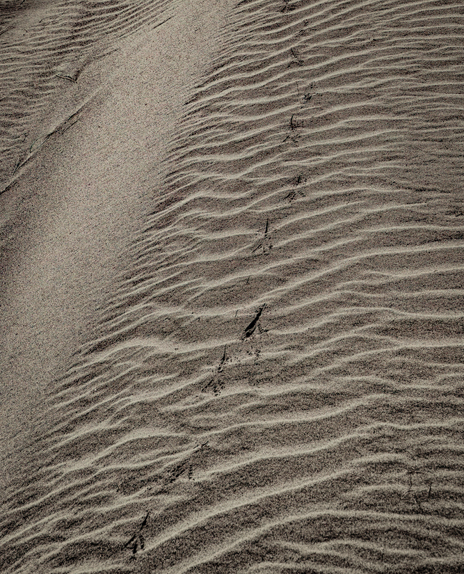
Rita - I think Georgianne's edits gave a lot more detail to your image. But I would also suggest a crop. I've attached another version which I edited in Lightroom, but I'm not saying it's better than Georgianne's, LOL. Just wanted to show you the crop and detail the simple edits I made as an FYI. I think the crop keeps you focused on the sand patterns more and less on the length of the bird tracks. I don't think that length adds anything in my opinion.
In Lightroom, after cropping, I took the Dehaze slider all the way to the right, which increased contrast and added a lot more detail. I then darkened the shadows more and added a slight dark vignette around the edges. |
Jun 14th |
 |
| 77 |
Jun 24 |
Comment |
This is an image you need to view enlarged to really get the benefit. I love how you've taken a basic snapshot and turned it into a work of art. Great eye seeing the possibilities! Everything you've done makes this a delight for me to look at. My only suggestion might be to move the boat and birds over a bit to the right. But I enjoy the "life" they add to the scene. I can imagine being in that boat and quietly sailing through this magical place.
|
Jun 14th |
| 77 |
Jun 24 |
Comment |
I am also drawn to good ICM images! It's something I've tried but have yet to get results that I like. I'm not going to give up though, but just haven't had any subject matter to work with.
The colors in your image remind me of a desert landscape and I feel the tones work well for that. Since you mentioned this was at sunset, the really blue sky is kind of a conundrum for me. Maybe darkening down the sky just a bit more would give a little more of a sunset feel.
Overall, I like what you've done with your edits and think this is a nice abstract image.
|
Jun 14th |
| 77 |
Jun 24 |
Comment |
You certainly made this still life glow Connie! It's nice to have something to experiment with and learn about different effects in post-processing. Thanks for sharing your experiment! |
Jun 14th |
| 77 |
Jun 24 |
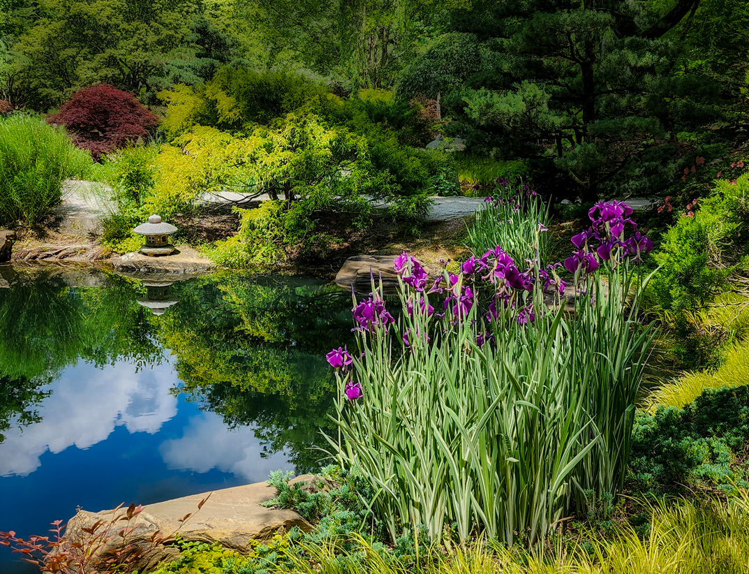
Comment |
This is a really nice composition Georgianne, and beautiful subject matter. I love the cloud reflections in the water and how the scene has some shadow on the right side of the path, moving into sunlight. I feel softening the background is a good choice to add depth, however to my eye it now looks almost hazy compared to the original. Maybe it's just my old eyes, LOL. The small stone lantern seems a little blown out as well and maybe a highlight reduction would help there.
I recently started trying Luminar Neo for creative editing and wanted to try something on your image if you don't mind!
First, I took your original into Lightroom and decreased the highlights overall, then masked the lantern and decreased them even more. I than masked the background and opened some shadows, decreased the exposure a little and reduced the clarity and texture to give it a little blur effect. I then masked and reduced the exposure on the lilacs to bring back some of the color that strong sunlight washes out. Then I took it into Luminar Neo and added a creative filter called Mystical. It adds a softness and glow and has controls to mask and/or adjust the strength of the filter's effects. I thought I'd just give that a try and share the results. |
Jun 14th |
 |
| 77 |
Jun 24 |
Comment |
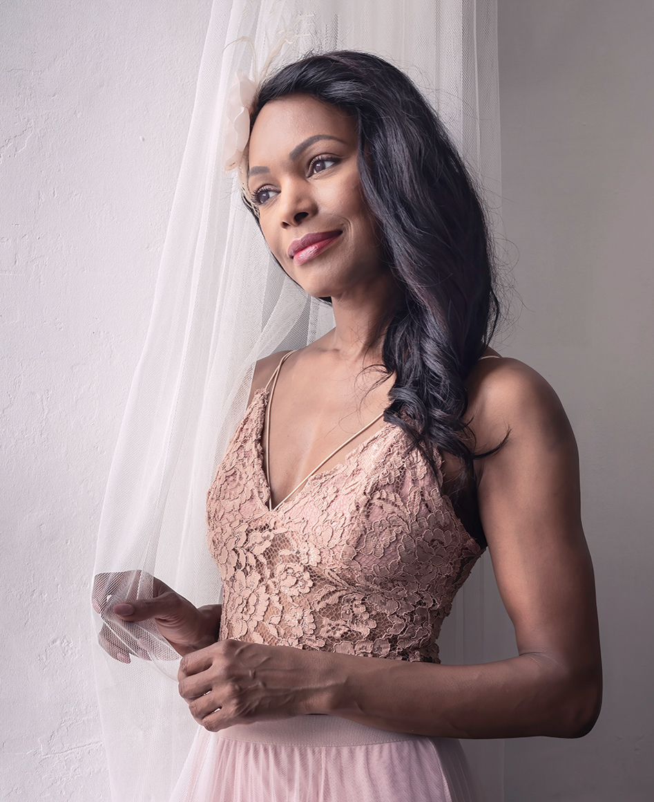
This is a lovely portrait Carol! Her expression is everything and you've brought out her eyes beautifully. You've added a dreamy feel to match the dreamy look in her eyes.
For me, because the environment is rather bland, I think a tighter crop may improve this image. I've posted an example as food for thought.
Wonderful image! |
Jun 14th |
 |
| 77 |
Jun 24 |
Reply |
Thanks so much for your comments! The Color Point tool is in Lightroom Classic and is fairly new. It's in the Color Mixer area of the Develop mode. It allows you to use an eye dropper to pick the color from your image that you want to adjust for Hue, Saturation, and Luminosity. So you can dial in on specific colors. I think it is a great addition to Lightroom. |
Jun 11th |
6 comments - 5 replies for Group 77
|
6 comments - 5 replies Total
|


