|
| Group |
Round |
C/R |
Comment |
Date |
Image |
| 77 |
Apr 24 |
Reply |
Thanks for your feedback Jan! |
Apr 17th |
| 77 |
Apr 24 |
Comment |
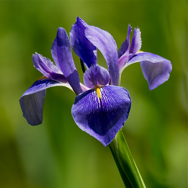
I have yet to try focus stacking, but you seem to have done a really good job!
This is a pretty flower on a bright sunny day. If you'd like to bring out the colors a little more, I would suggest lowering the exposure some, reducing the highlights a bit, increasing the contrast, and opening the shadows a bit. Also, the dark green streak on the right of the stem catches my eye. I've done an example with the changes I suggested and also cropped in the left side of the image a little.
I think this is just personal preference! Lovely photo.
|
Apr 10th |
 |
| 77 |
Apr 24 |
Comment |
I also like seeing tall grasses waving in the wind. I really like your edits but agree with others that the big tree on the right should go. Removing it adds a better balance to the horizon in my opinion.
Nice composition and editing! |
Apr 10th |
| 77 |
Apr 24 |
Comment |
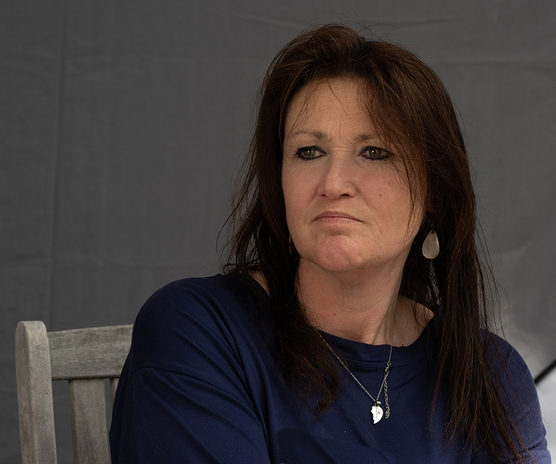
Mary, I think the edits you made to clean things up really helped this image. I agree with Connie that the skin tones seem too red/yellow. I think her edits improved the skin tone a lot. Also, because she has a somewhat severe expression on her face, I feel like her portrait could tell more of a story since she wasn't really "posing" for you. I was thinking if you actually left some of the chair in the scene, it would seem as if she was watching something that caused the expression.
I've provided an example of a possible crop that might work if you want to consider going that direction. It places her left eye (eye on the right when viewing the photo) on the top right intersection of a rule of thirds grid.
Of course portraits of friends are a very personal thing, and you might be absolutely fine with her expression and your crop as a reflection of your friend. But I think the skin tones definitely need attention. |
Apr 10th |
 |
| 77 |
Apr 24 |
Comment |
Great eye seeing this composition Connie. I really like the subject matter and feel I'm being taken back in time looking at this image.
I agree with the editing suggestions that have been made, and think the examples shared are very nice. |
Apr 10th |
| 77 |
Apr 24 |
Comment |
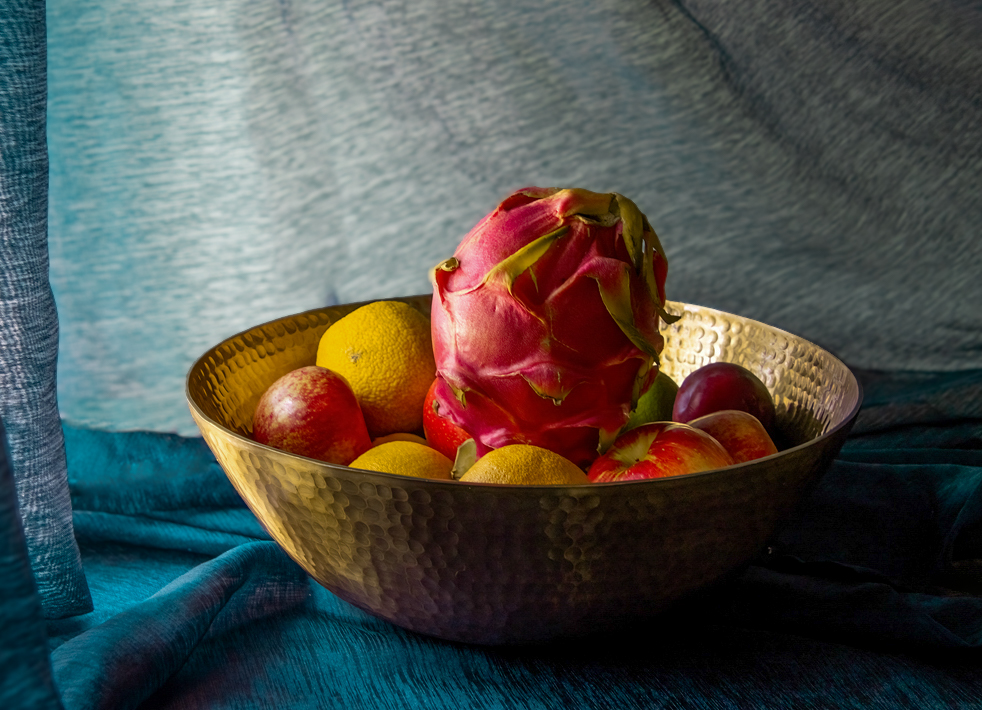
I am a big fan of your original shot Georgianne! I think I'm just really drawn to the color tones with the beautiful blues and red and yellow fruits. I love the way the light is reflecting off the bowl as well, highlighting the texture.
Your edits take it in a different direction but are well done.
I've attached a bit of an edit on the original, just because I like it so much, LOL. I opened up the shadows a bit to show a little more of the back of the bowl and removed a couple of folds I thought were distracting. Also made a little different crop.
Thank you, in advance, for letting me play with your image. |
Apr 10th |
 |
| 77 |
Apr 24 |
Reply |
Thanks Georgianne! You know it's spring when the dandelions start popping, LOL. |
Apr 10th |
| 77 |
Apr 24 |
Comment |
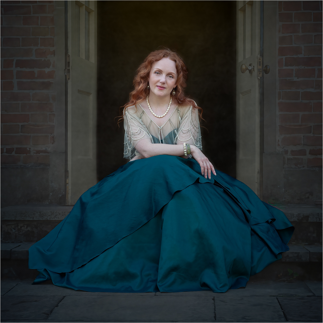
Carol - as usual, another wonderful portrait! I love the composition and beautiful color tones. I also appreciate how you cleaned up a bit of her hair, but left a few loose bits that give me the feeling that the wind has tousled her hair a little as she sits outside cooling off after dancing the night away.
I also like the textures/edits you made to the background, however, I feel that it almost looks as if she is sitting in front of a painting rather than in the scene herself. She seems to pop off of the screen with her smooth porcelain skin against the light background texture in the doorway. So I took this photo into Lightroom and used a mask to darken just the area directly behind her. I reduced exposure and darkened the blacks to see if that would draw her into the image more. There are probably different edits that might do a better job, but that's what I decided to try as an example. Maybe even reducing the amount of texture just in the doorway might help.
Beautiful image!
|
Apr 10th |
 |
| 77 |
Apr 24 |
Reply |
Linda - thanks for the visual example! I like your edits as well. |
Apr 8th |
| 77 |
Apr 24 |
Reply |
Thanks for the example edit Connie. I always struggle with how much to leave in a scene to keep a sense of "place", or if the image would be better without so much detail. I like your edits. |
Apr 8th |
6 comments - 4 replies for Group 77
|
6 comments - 4 replies Total
|


