|
| Group |
Round |
C/R |
Comment |
Date |
Image |
| 77 |
Jan 24 |
Reply |
Thanks for your feedback Carol! |
Jan 22nd |
| 77 |
Jan 24 |
Reply |
Thanks for the feedback Mary! I'm agreeing with everyone's suggestion to do the crop. |
Jan 22nd |
| 77 |
Jan 24 |
Reply |
You definitely made the pumpkin the star of the show with your edits! Thanks for the feedback. |
Jan 22nd |
| 77 |
Jan 24 |
Reply |
I'm not sure how Mary feels, but I really like this suggestion Jan. To me this definitely brings out more attitude and personality. Great eye! |
Jan 21st |
| 77 |
Jan 24 |
Reply |
Thanks so much for your feedback Jan! I felt like leaving the tree line in gave the image a little more depth. But I'll play with some cropping and see what I think.
|
Jan 13th |
| 77 |
Jan 24 |
Reply |
Thanks for your feedback Connie! |
Jan 10th |
| 77 |
Jan 24 |
Comment |
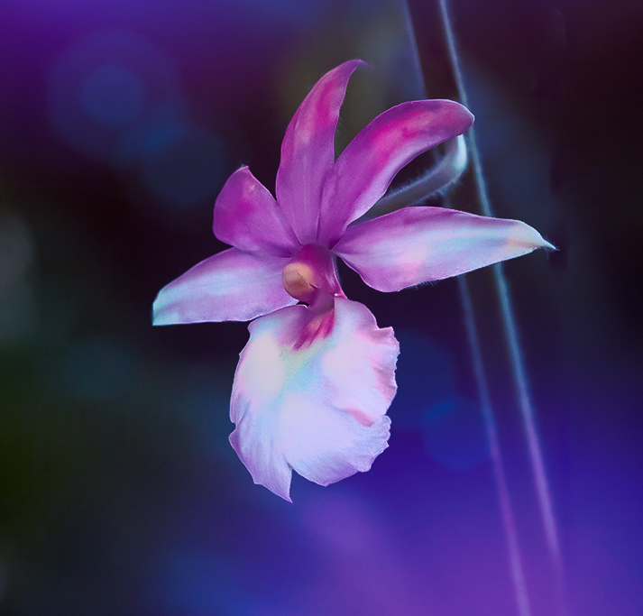
Connie, I like the subject matter and composition of your image. You did a nice job of removing that black pole by the stem as well. I think a closer crop might improve the image too. I really like how you captured a little backlighting and got that slim glow along the sides of the stem.
Did you try noise reduction in your processing software before you began your edits? Orchids are such soft, delicate flowers and to me, that is very appealing. Leaving the original noise and additional edits and sharpening made this very "crunchy", in my opinion, unless that was the look you were going for. If so, you achieved a more grunge look to what is normally a very soft flower.
For fun, I took your original image into Lightroom to reduce the noise and I think it did a great job. It did enhance the softness of the flower petals, which noise reduction can do, but I didn't think it was a detriment. I also cropped the image from the bottom.
I then tried to add some drama in a different way, as you indicated you wanted to do that. After the Lightroom edits I took the photo into Topaz Studio 2 and added a "colorful" look. This applied textures to the background and enhanced the original colors of the flower and added some additional, complimentary color tones. I've added it here as just another example of how one could emphasize this beautiful orchid in a dramatic way. |
Jan 10th |
 |
| 77 |
Jan 24 |
Comment |
This is a very peaceful scene Linda. I like how the composition has leading lines moving into the horizon. Your edits did add more drama with the warm light/colors in the clouds.
I wonder if this image could be improved by cropping out some of the sky? The aspect ratio of the image feels a little too "square". I've done a cropped example as food for thought. |
Jan 10th |
 |
| 77 |
Jan 24 |
Comment |
Well this is absolutely lovely Jan! I love the color tones and the choice of elements you combined in this image. To me it tells the story of a beautiful lady having beautiful thoughts; music, poetry, literature, all come to mind when I look at this image. I'm torn about whether I feel her chin is just a tad too close to the bottom of the image or not. Otherwise, I think all of the elements are well balanced. Well done! |
Jan 10th |
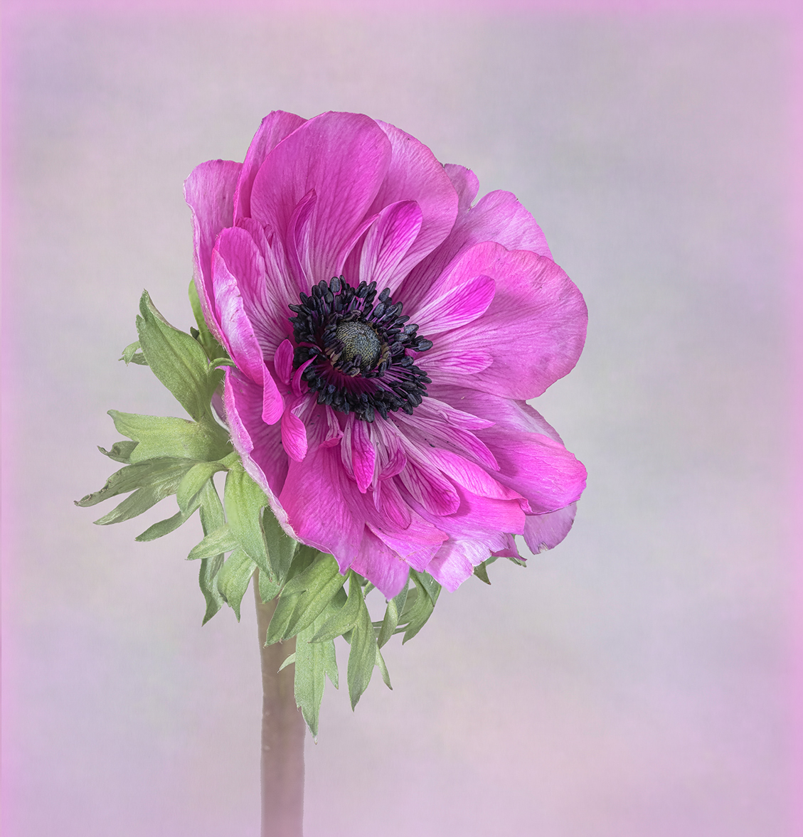
| 77 |
Jan 24 |
Comment |
Your edits brought out beautiful details in the flower while added a subtle softness as well. I thick cropping the long, thick stem could improve the image (agree with Connie), and I don't feel the pink edging elevates the flower either. Maybe a very feathered vignette could draw more attention to the subject rather than the thin, pink edge? I've added an example as food for thought. I cropped the bottom, but I left your original side and top edge because I didn't want to crop any further. I then overlayed a layer with a pale pink vignette. Not sure if that really works as well since I left the original edge in? |
Jan 10th |
 |
| 77 |
Jan 24 |
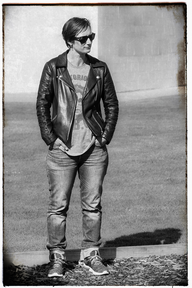
Comment |
Very interesting take on this image Mary. I'm also torn about whether the white could be taken down a bit because this image is very dramatic in the way you made your edits.
I took a stab at doing something a little different as an example as well. Katie's pose and outfit remind me of an old 1950's portrait of a "rebel". Cuffed jeans, leather jacket, sunglasses, and kind of an edgy pose. So I took your original into Lightroom to remove the items on the back right wall, then moved it into Nik Analog Efex to add a black and white film effect. I added a textured film type and frame around the edges, playing with the opacity and strength of the effects I chose. So I went darker and more gritty rather than lighter, LOL, but thought it might be interesting to see. |
Jan 10th |
 |
5 comments - 6 replies for Group 77
|
5 comments - 6 replies Total
|


