|
| Group |
Round |
C/R |
Comment |
Date |
Image |
| 77 |
Sep 23 |
Reply |
Thanks Carol! |
Sep 24th |
| 77 |
Sep 23 |
Comment |
I actually agree with Jan on your original image. With the shadow of the tree branch over the water, I feel it helps tell the story of this leaf falling from the branch into the duckweed. It makes it a bigger story than the leaf alone.
I also like how she added the low pass filter which deepened the colors and decreased the highlights to add a little more mood in my opinion.
Great catch seeing this! |
Sep 19th |
| 77 |
Sep 23 |
Comment |
You really saved this image with the conversion to black and white Linda. The crop was a great choice as well. The details are really nice and this makes for a really nice abstract. |
Sep 19th |
| 77 |
Sep 23 |
Comment |
This is a very compelling image Jan. Everything about this is interesting to me and I think well captured. The old, textured architecture, grizzled worker in his apron smoking a cigarette, staring off into the distance thinking about who knows what or looking at something that's caught his eye.
Your decision to convert to black and white was a good one in my opinion. My only thought is if lightening up the shadows just a little more in the doorway would add anything? Not knowing what's behind him, I don't know if seeing a little more would add interest or not? Regardless, I like your choices and think this is a great image. |
Sep 19th |
| 77 |
Sep 23 |
Comment |
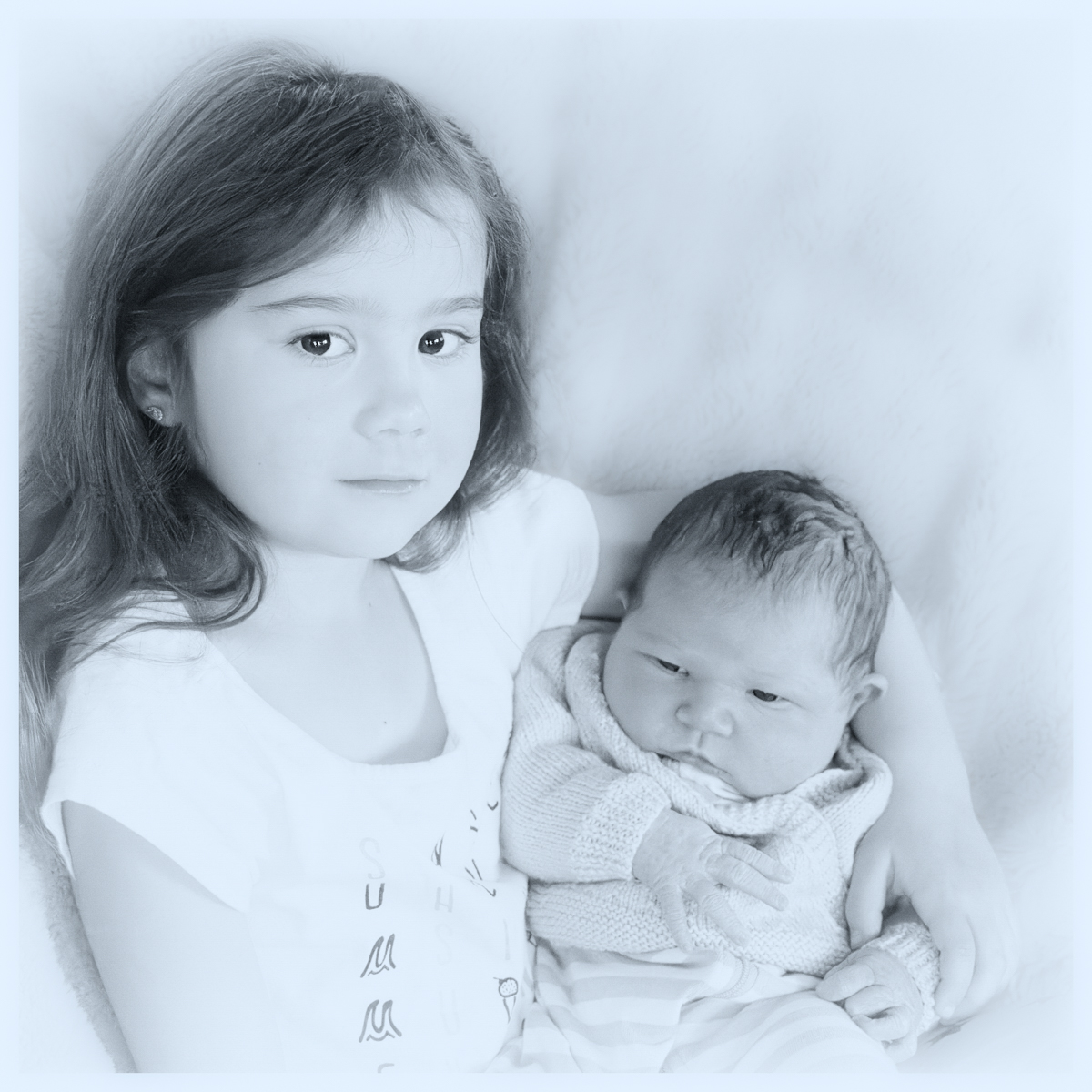
Lovely portrait Mary. Such an angelic expression on the child holding her baby sister. I prefer the black and white portrait as a fine art example. But I'm sure the parents would appreciate either one, as they are both gorgeous in their own ways.
My only suggestion is to blur the background some more, as Linda mentioned as well. For another example I took your image into Lightroom, added a mask on just the background, then reduced the clarity and texture. I also increased the black points just a smidge to make the hair and eyes pop a little more. I like your high-key effect which makes the image a little more ethereal.
I agree that a lightly textured, matte paper could work well for the black and white. Great capture of these beautiful children!
|
Sep 19th |
 |
| 77 |
Sep 23 |
Reply |
Thanks for the example of another option Linda. |
Sep 19th |
| 77 |
Sep 23 |
Reply |
Thanks for your comments Connie! |
Sep 19th |
| 77 |
Sep 23 |
Reply |
Thanks for the feedback Jan! |
Sep 19th |
| 77 |
Sep 23 |
Comment |
Carol, the subject matter and color tones suit the old masters style well and are lovely. I agree with the suggestion about removing the bright spot from the vase. Creative problem solving with the plamp placing the flowers where you wanted them. You can't tell they weren't sitting in the vase! Well done!
One thought that came to mind was that the pears seem a little "posed" to me. I really like that the stem of the pear on the right does provide another leading line towards the vase but the upright position of both pears sitting side by side seems a little unnatural for lack of a better word. I wonder if any improvement could be made by laying or tilting the right pear against or in front of the left pear? I've attached a screen shot of a pear painting as an example. For instance you could turn the left pear so the top bends towards the vase, then lay the right pear down overlapping the left pear with the stem curving upward. Both pears would provide leading lines towards the vase and flowers. It might also add some depth as the vase and pears seem to be lined up all in a horizontal row. Just a thought. |
Sep 19th |
 |
5 comments - 4 replies for Group 77
|
5 comments - 4 replies Total
|


