|
| Group |
Round |
C/R |
Comment |
Date |
Image |
| 77 |
Aug 23 |
Reply |
Thank you Jan. I appreciate the feedback! |
Aug 14th |
| 77 |
Aug 23 |
Comment |
Hi Connie. I like the subject matter and composition. The tree trunk with vines adds interest to this image as well. It was a good choice to cover the siding on the house with grass making a much nicer background. However, the high ISO in your original left a lot of noise and artifacts in my opinion, which become more apparent in your edit. And I agree with Linda to take out the dirt in the background (per her example). So I'm not sure if the photo editor you tried did a very good job. I'm sorry for your struggles with the new computer!
|
Aug 14th |
| 77 |
Aug 23 |
Reply |
I agree with you Jan. I was going to say that in my suggestions as well but forgot! You adding the example really helps. |
Aug 14th |
| 77 |
Aug 23 |
Reply |
I see what you're talking about Linda. Thanks for the feedback! |
Aug 12th |
| 77 |
Aug 23 |
Reply |
Thank you Connie! |
Aug 12th |
| 77 |
Aug 23 |
Comment |
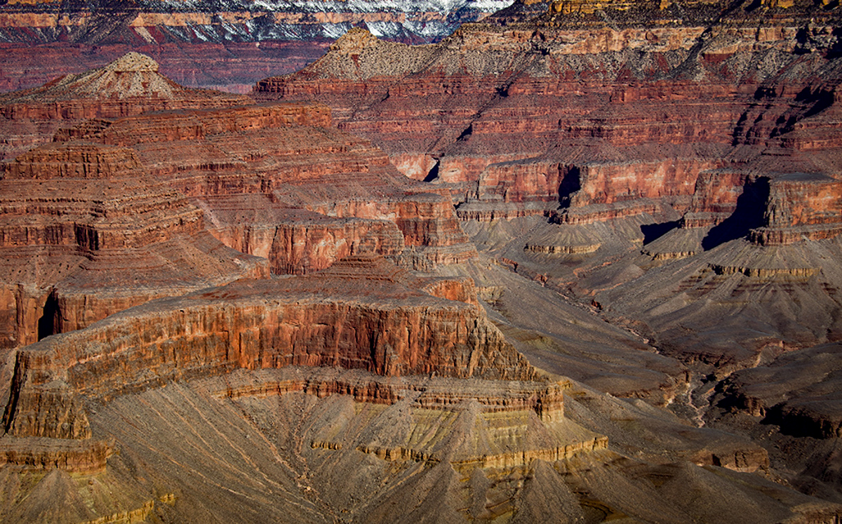
Linda, on my screen this image looks somewhat flat and the top half looks like it's just bands of color going horizontally across the image. Almost as if it's an abstract of the Grand Canyon rather than a landscape. The original of the image is very washed out as well, I'm sure due to the time of day and the available light. So I imagine would be hard to work with to pull out more detail.
I played with the original in Lightroom to see if the following edits could make any improvements. But editing a JPG vs a RAW file, is harder for sure.
- decreased the overall exposure on the image
- used the dehaze slider
- increased the texture, clarity, and contrast
- darkened the black points
- added a mask and brushed in more texture on certain parts of the rocks
- added another mask and used a linear gradient to reduce the exposure a little more just on the lower part of the image
- added a slight, dark vignette around the edges so the image wouldn't appear so bright across the whole area
I'm not sure if I cropped it exactly as you did, but I've attached the edits as food for thought. |
Aug 12th |
 |
| 77 |
Aug 23 |
Comment |
Beautiful minimalist yet dramatic result to this image creation Jan. The leading lines and curve of the river draws you to the misty tree in the distance and adds nice depth. Including the birds flying high in the sky and towards the horizon enhances that sense of depth as well. You sized them perfectly for inclusion here in my opinion.
Really well done!
|
Aug 12th |
| 77 |
Aug 23 |
Comment |
Oh such a sweet, emotional photo. Converting to black and white and removing all the other distractions lets us "feel" the mood so much better.
I'm torn about the glass overlay. I like the story of a forlorn child peering through a window, as if she was waiting sadly for someone or watching a loved one leave. But I think I'm missing something to make the window effect stronger. I can't put my finger on it exactly. Maybe if there was a little bit of a window frame around one of the edges or something. Regardless, this is a sweet image. |
Aug 12th |
| 77 |
Aug 23 |
Comment |
Beautiful flower portrait Carol. The lighting really sets a nice mood and enhances the details in the flowers. The gradation in the background from light to dark and the composition/placement of the flowers to each other all work really well together. I have no suggestions for improvement! |
Aug 12th |
| 77 |
Aug 23 |
Comment |
Great job capturing this awesome moon shot! Adding the stars was a good decision and certainly elevates this image. I like Linda's suggestion to add a little more room around the moon. I also agree with you that the border suits this image well. So well done for your first attempt! |
Aug 12th |
6 comments - 4 replies for Group 77
|
6 comments - 4 replies Total
|


