|
| Group |
Round |
C/R |
Comment |
Date |
Image |
| 77 |
Apr 23 |
Reply |
Thanks Mary! |
Apr 26th |
| 77 |
Apr 23 |
Reply |
Thanks Carol! |
Apr 25th |
| 77 |
Apr 23 |
Reply |
Thanks so much for your comments. There are a number of YouTube videos on a channel called "The Joy of Editing with Dave Kelly" that covers how to use various features of Topaz Studio 2 in detail. But there are others out there as well. Unfortunately, Topaz is apparently not going to support Studio 2 in the future, but it's still good for now. |
Apr 21st |
| 77 |
Apr 23 |
Reply |
I like that change a lot! Great job. |
Apr 21st |
| 77 |
Apr 23 |
Reply |
Yay - I'll look forward to it. |
Apr 21st |
| 77 |
Apr 23 |
Comment |
I love this subject matter Michael and see why you wanted to capture it. I feel your editing really brought out a mood to this image, and helped emphasize the details, age, and nice lighting. The cropping from the left really improved the composition.
I do feel you could open the shadows up just a bit, similar to the example that Linda shared. But being careful not to effect the dark mood too much. I like that I feel like I came upon these steps as I wandered through darkened corridors of an ancient building. Nicely seen! |
Apr 21st |
| 77 |
Apr 23 |
Comment |
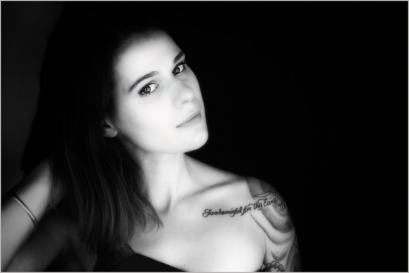
Mary, I love what you've done with this portrait. The way the light is falling across her face and body really sets her off against the stark black background. I like the inclusion of her arm on the final image, as I feel it supports the tilt of her head well. I don't think it makes her look off balance. I also like the ethereal softness, but suggest maybe slightly reducing the highlights as her cheek might be a little blown out and also cropping in a little more from the right.
Since the photo is placed against a black background in this system, without a slight, light stroke around the image it may be hard to tell the original intended crop. I added the image again here so that you can see it better on the gray background and also added a stroke so you can see it when you click on this image.
I think the pose, composition, and subject matter are lovely. |
Apr 21st |
 |
| 77 |
Apr 23 |
Comment |
This is an image I could see in a wedding portfolio. Adding the blur makes the beautiful bouquet stand out nicely and also achieves the ethereal effect you were after. I would suggest reducing the highlights just a hair as well.
For me, I do find it a little distracting to see people in the reflections on the chrome around the headlight and grill, unless it was clearly the bride and groom, LOL. So cloning those out in Photoshop may help.
Great catch to come across this scenario and find an image opportunity. |
Apr 21st |
| 77 |
Apr 23 |
Comment |
This is a very striking image of this waterfall Carol. I appreciate how you've softened the water with the long exposure. The overall image is very dramatic and the composition allows you to get a sense of the unique environment but also keeps the focus on the waterfall.
The slight crop to the bottom that Linda suggested, may put the focus a little stronger on the waterfall, but I like them both. |
Apr 21st |
| 77 |
Apr 23 |
Comment |
I really like the pop of the black bird against the stark white background. It makes this image different from a standard "nature" photo. Your post processing also made the bird's eye and face sharper than the original image, which I feel was an improvement as well.
I'm torn about the reed that crosses the birds face. Since it is out of focus but everything else is in focus; it seems a little out of place to me. I'm not sure how hard it would be to remove that reed as I'm not good with Photoshop on such a challenging area! Learning more about using Photoshop is on my "to-do" list, LOL. |
Apr 21st |
| 77 |
Apr 23 |
Reply |
Thanks for your feedback Linda. I thought about the missing stem as well, but wasn't sure whether it caused a negative impact. I didn't like the angle of the flower when the stem was exposed.
The white spots are because this vase has carved cut-outs, never intended to hold water, so you can see through it to the background. I probably should have worked on leaving the color of the background texture in those spots. Appreciate your comments! |
Apr 21st |
5 comments - 6 replies for Group 77
|
5 comments - 6 replies Total
|


