|
| Group |
Round |
C/R |
Comment |
Date |
Image |
| 77 |
Feb 23 |
Reply |
I'm happy to share ideas Connie. I think we both enjoy using Topaz Studio 2 for some of our post-processing. I'm trying to really understand and deconstruct how they build their various "looks" so that I can manipulate them even further if I desire. I love that you can open all of the layers of each look and and adjust them individually for a unique outcome.
I know I also battle with how far to go with post-processing at times. I can work for hours on an image and then just say "forget it" and walk away, LOL. Then go back to it and completely change my vision and/or approach. I guess it's all part of the creative process! |
Feb 17th |
| 77 |
Feb 23 |
Reply |
Thanks Connie. I really didn't want the viewer to think of this as a hood ornament, but something different. I probably could have done some things to make her seem even more like she was flying off the rusty surface, but my brain got tired, LOL. |
Feb 16th |
| 77 |
Feb 23 |
Reply |
Thanks Michael. I did want to emphasize the age of the subject. The car was a total rusted mess, and displayed "as-is" on purpose. It was intriguing to look at. |
Feb 15th |
| 77 |
Feb 23 |
Reply |
Thanks for your comments Linda! |
Feb 13th |
| 77 |
Feb 23 |
Comment |
Wonderful capture of this beautiful bird Linda. You nailed the focus and have a nice composition with the bird centered in the frame and cropping in from the sides.
My only suggestion is that your paint stroke texture on the background compared to the smooth, photo-realistic image of the bird looks a little out of place to my eye. Should the strokes be softened somewhat or more of the texture added to the bird as well? I don't know, but it seems noticeably "different" to my eye. I do like that there is good separation of the bird from the background, but the texture seems a little strong compared to the bird. |
Feb 13th |
| 77 |
Feb 23 |
Comment |
Well this is a totally fun and creative take on your sunflower! You did a great job in post-processing to bring out all of the detail of the elongated petals and the background texture. You have nice separation from the background as well. This image makes you stop and look for sure.
I agree with Linda that the black spots in the bottom of the frame do draw my attention. Maybe consider removing those or reducing them in some way to see what you think.
Nice job! |
Feb 13th |
| 77 |
Feb 23 |
Comment |
I really like this subject matter and your composition. The balance of sky to mountain to ground is very pleasing to my eye. The leading line of the fence going toward the mountain draws my eye in. I like the touch of softness you added.
I think this image is super nice, but wonder if there was just a tad more sky on the top left corner, if that would add anything to the composition. Would moving the mountain top so that it's not running right into the top corner of the image make any improvement? |
Feb 13th |
| 77 |
Feb 23 |
Comment |
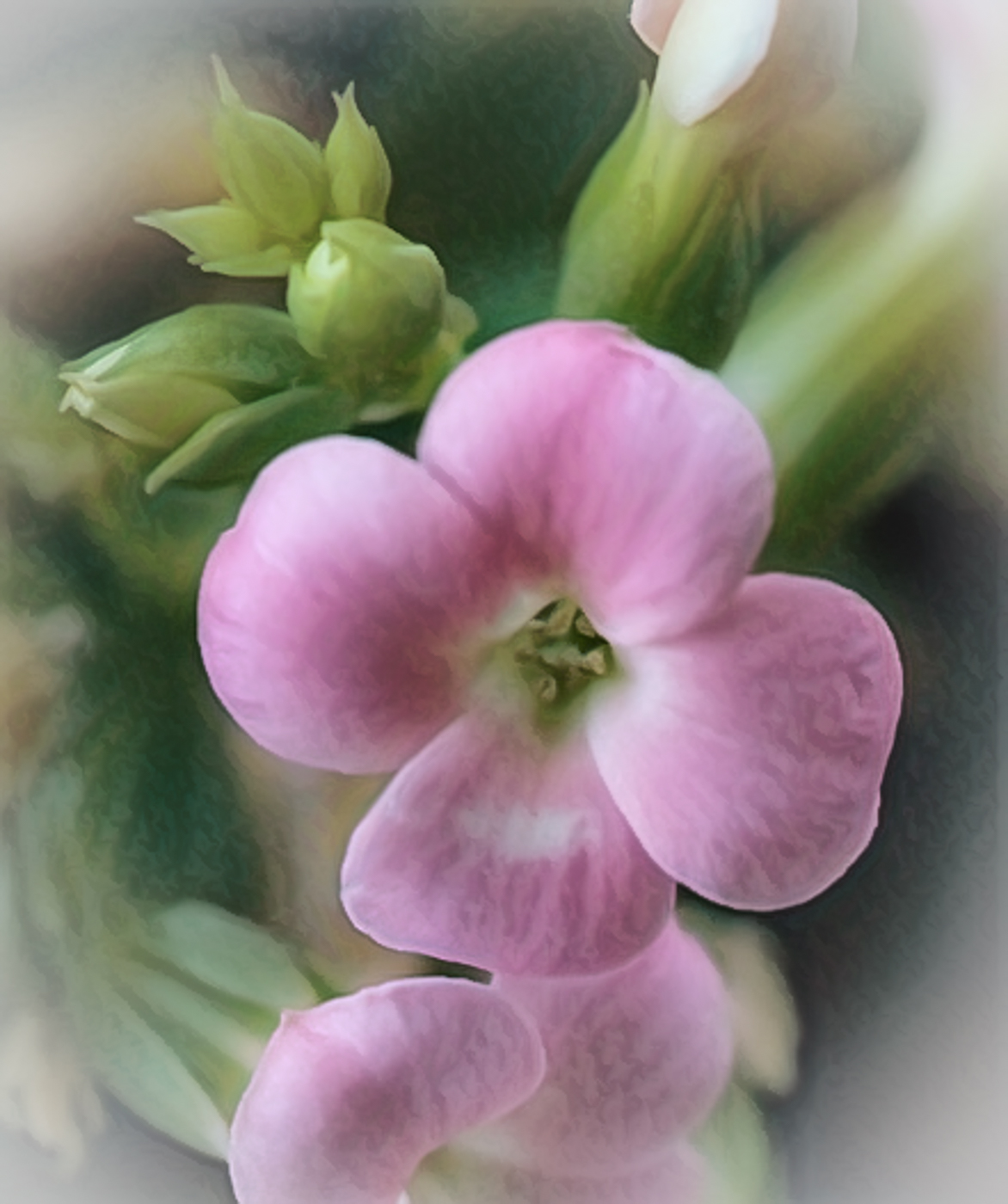
Hi Connie. This is a lovely little flower you decided to capture. I like the composition, but agree with others that the missing edge of the bottom flower stands out and should be added back in for better balance. OR you could possibly just do a tighter crop to take more of that flower out, to make it more intentional. Also, the post-processing did introduce that halo effect others have mentioned, which is distracting. To me, the image looks over-processed, which I think is the result of the high ISO issue.
So could you have taken this in a completely different direction and made it more abstract to counteract the noise? I played around with a tighter crop, took it into Lightroom and reduced the texture making it even softer, then added a light vignette around the edges. I hopped over to Topaz Studio 2 and added a look from the "dreamy" category called Watercolor Lady (I think) which added a canvas type texture to counter the noise issue. I reduced the opacity to keep the image really soft and ended up with the example I've posted. I know that wasn't your original vision, but maybe another way to make lemonade out of lemons? :)
On another note, I sometimes struggle with the tough decision of whether an image is worth trying to "save" or even whether to take the shot. You mentioned all of the work you had to do because of the extremely high ISO. Was there nothing you could do to increase the amount of light falling on the plant so that you could drop the ISO for a better exposure in camera? |
Feb 13th |
 |
| 77 |
Feb 23 |
Comment |
Very lovely image to look at Carol. I love the minimalist approach and the soothing colors. The seam across the back was blended well. The lighting and control of the reflections off of the vase were also nicely done. I also like how you added the additional stem for balance. Nice catch, noticing that doing that would make an improvement.
Very well thought out and executed. |
Feb 13th |
5 comments - 4 replies for Group 77
|
5 comments - 4 replies Total
|


