|
| Group |
Round |
C/R |
Comment |
Date |
Image |
| 77 |
Oct 22 |
Reply |
Thanks Carol. |
Oct 20th |
| 77 |
Oct 22 |
Reply |
Thanks Witta! |
Oct 19th |
| 77 |
Oct 22 |
Reply |
See my second edit. :) |
Oct 18th |
| 77 |
Oct 22 |
Reply |
Thanks Connie! |
Oct 18th |
| 77 |
Oct 22 |
Reply |
I'm glad you like it. :) You're welcome! |
Oct 18th |
| 77 |
Oct 22 |
Reply |
Thanks Witta! |
Oct 18th |
| 77 |
Oct 22 |
Comment |
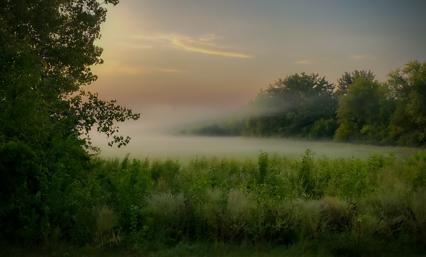
So I took another stab at this and only used Lightroom for the edits. Here's attempt number two:
I wanted a very soft, dreamy effect, so I reduced the texture 100% and reduced the clarity about 50%. I masked the sky and reduced the exposure and highlights to darken it. I cropped more from the top, to center the mist better in the image. I then added a dark vignette. It may appear the mist is over water, but it's actually over a field. I'm undecided about how happy I am with these changes, but I think it's better than the first attempt, LOL. |
Oct 18th |
 |
| 77 |
Oct 22 |
Comment |
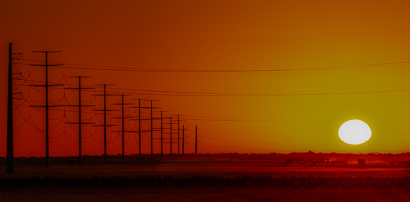
This is a really nice scene to view and good composition with the leading lines of the poles. I love the story it tells of the farm workers doing their job at the crack of dawn. I'm guessing that you may have used a mask around the sun to decrease the highlights. That can sometimes result in a gray/green effect.
With the small image, it is hard to see the workers and machines, but when you enlarge it, I think you can see them better. I also used a brush to mask then decrease the shadows, just over the workers, to see if that helps. I added a bigger file size that people can click on to enlarge a little more. |
Oct 18th |
 |
| 77 |
Oct 22 |
Comment |
What a fascinating image that tells an interesting story! Your decision to convert to black and white worked well. Great job bringing out the detail of the lead truck. I like how your crop took out some of the background, but left just enough to help the viewer get a little more sense of the place to understand that this was a competition. If your point was to just focus on the truck, a tighter crop might improve that. But if this was somewhat of an environmental "portrait" of the truck, I think leaving a little more in worked fine. I love it, either way! |
Oct 18th |
| 77 |
Oct 22 |
Comment |
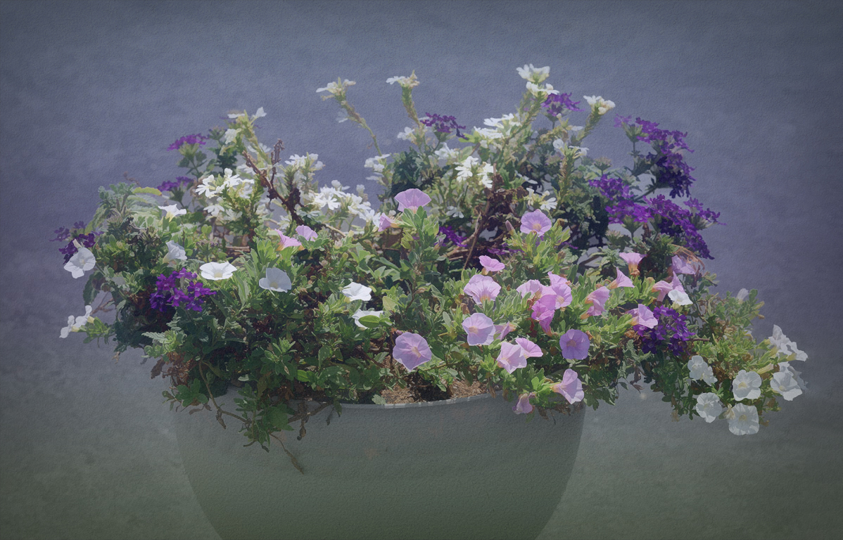
Connie, I do agree that a little more pop to the colors of the flowers may enhance this image. You may have overdone it a bit in your second image, as one of the white flowers turned blue because of the effect on the shadows. Since the flowers were photographed in bright light, that can wash out the richness of the colors that you may have seen with your naked eye. You also mentioned in your description wanting to add a somewhat abstract feel. So here are some edits I made to see if it would take the photo more in that direction.
First, I took your original image into Lightroom and masked the background only, and decreased the exposure. Then I decreased the highlights on the entire image. Doing that already made the flower colors look better. Then I took this into Topaz Studio 2 and added an artistic "look" called Happy Little Trees. That added an abstraction filter which I manipulated until I liked the effect. It also changed the color space which I feel improved the tone of the flowers. This didn't really make it more abstract, but maybe more painterly.
Next, because the original background was very neutral, I added a texture layer with a two-toned color that I felt complemented the flowers. I reduced the opacity, then also used a brush to mask off the texture from the flowers. The last layer I added was a dark vignette around the edges. Then I took it into Photoshop to use the crop tool to increase the canvas on the right side and have the content aware fill it in so the flowers wouldn't be cut off.
I had fun playing with your image, and I hope this helped with more ideas on how to enhance a simple pot of sweet flowers into a little work of art. :) |
Oct 18th |
 |
| 77 |
Oct 22 |
Comment |
This is a very interesting landscape Witta. I like the composition and the subject matter. I feel your decision to convert to black and white enhances this image nicely. You achieved good separation of the sand mound from the background for an image that has so many similar tones.
Well done!
|
Oct 18th |
| 77 |
Oct 22 |
Comment |
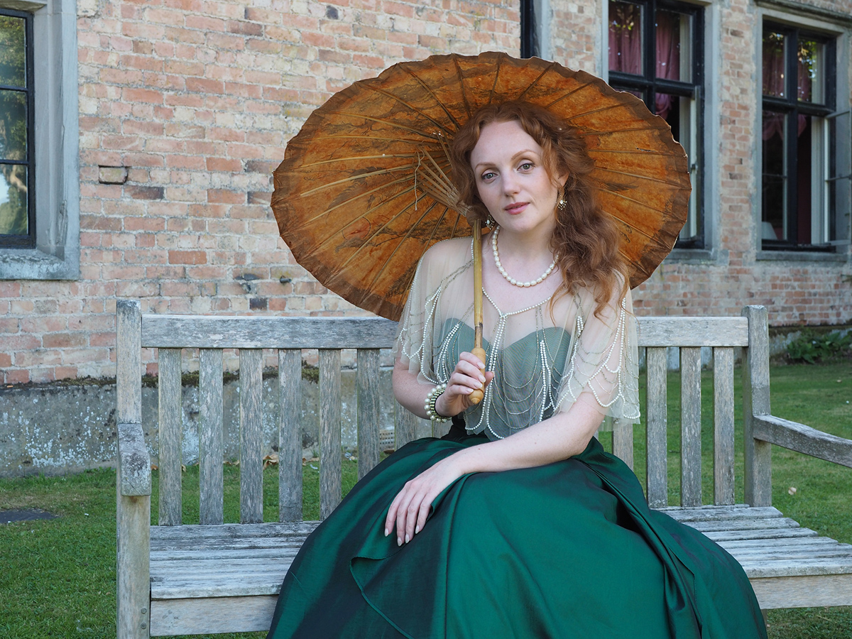
This is a striking portrait Carol. The pose and dressing of the model is beautiful. You captured beautiful skin tones and the overall colors are stunning. Choosing and changing the background took this image to the next level.
This image appears well thought out and well executed. Very nice! |
Oct 18th |
| 77 |
Oct 22 |
Reply |
No problem! |
Oct 14th |
| 77 |
Oct 22 |
Comment |
CAROL - I didn't realize that the original file didn't upload. Apparently the file size was too big. I have added the original to this post because it wouldn't let me update the page for some reason. |
Oct 12th |
 |
7 comments - 7 replies for Group 77
|
7 comments - 7 replies Total
|


