|
| Group |
Round |
C/R |
Comment |
Date |
Image |
| 77 |
Sep 21 |
Reply |
What a charming edit you did to this Georgianne! I love the pencil effect and how the image was transformed.
Thanks for sharing this idea and education with us. |
Sep 24th |
| 77 |
Sep 21 |
Reply |
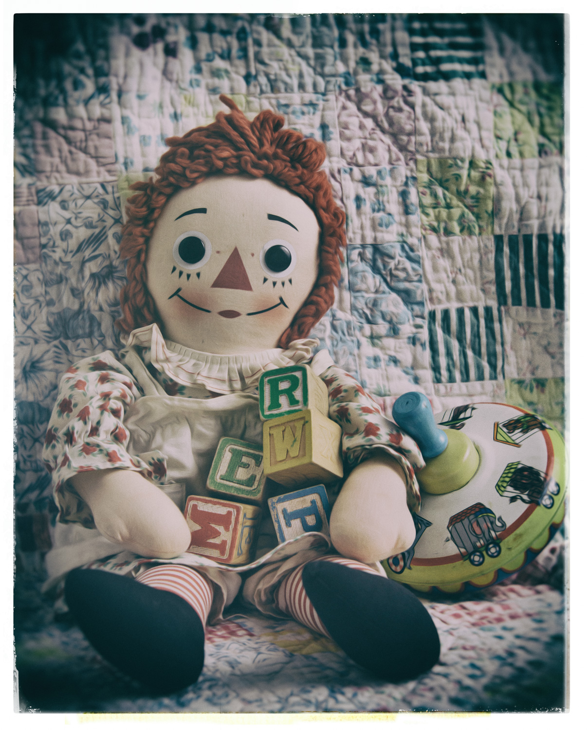
Thank you for your comments and editing examples Linda. For my taste I feel like increasing the clarity might make this image a little "hard". There is a softness to the antique quilt and rag doll that I would not want to lose.
I appreciate you providing another take on this photo. |
Sep 17th |
| 77 |
Sep 21 |
Reply |
I like how you described this as a "mysterious portrait" and called out that aspect from your point of view. I was looking at this more literally, as a woman being transformed by the application of her glow via the make-up brush. I really love how a good photograph can inspire different interpretations. |
Sep 17th |
| 77 |
Sep 21 |
Comment |
This is a nicely cropped and composed photo of very pretty subjects. I think changing the background to black helped bring out the colors well. On my screen the subjects are not in sharp focus, which I feel can add to taking some real artistic license with the image.
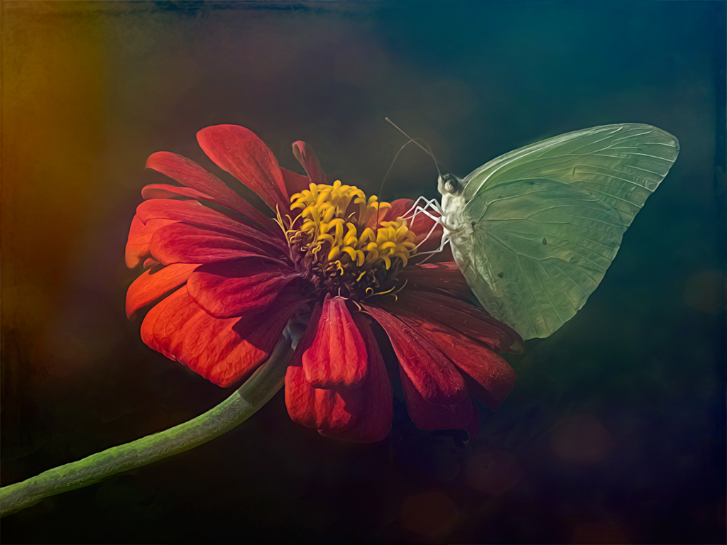
For the theme of "fine art" VS documentary photography, I took the liberty of playing with this image in Topaz Studio 2. I added a "look" made up of multiple filters that I didn't think needed adjusting (Dreamy Day). However I did add one more filter, Smudge, so I could manipulate the lines a bit. I used Normal blending mode at 50% opacity. This version emphasizes the bright light coming from the left and hitting the front of your butterfly. I feel like the color tones of the background compliment both the flower and butterfly. So I hope you don't mind me playing to create another quick version as food for thought. :) |
Sep 6th |
 |
| 77 |
Sep 21 |
Comment |
I love your subject matter and the creative post-processing! I have craved finding these colorful caterpillars but I think I'm always in the wrong place at the wrong time, LOL.
I also really enjoy the card Witta made from this, which frames your photo perfectly!
Great job on this image! |
Sep 6th |
| 77 |
Sep 21 |
Comment |
I like your decision to blur this image and work on how the light is hitting her face. I think you did that well. However, I wish you could see the makeup brush to add context to why she is posed as she is.
On my screen you can't see the brush at all, which takes away from the story in my opinion. Maybe if you can go back and open up the shadows just on where the hand and brush are, it could make an improvement. |
Sep 6th |
| 77 |
Sep 21 |
Comment |
I love the composition you've captured. The curving lines of the drooping roses tell your story well.
I also wonder if eliminating some of the background busyness might add to this image; or as Michael suggested, trying a monochrome version. I feel there is a lot of potential with this subject matter and composition! You had a good eye to pick this out of what you described as a disappointing environment. Kudos for hanging in there! |
Sep 6th |
| 77 |
Sep 21 |
Comment |
In my hurry to make sure I got an image posted, I really didn't flesh out this idea thoroughly! My vision was to take us back to remembering a simpler time using vintage childhood toys.
With my first attempt, which I removed, I wasn't keen on the composition, but I did go down the path of trying to replicate an old photo. Then I diverged and created the posted image. But now I'm going in my original direction again with a revision I'm putting in this comment, LOL.
To me, the posted version could be framed and hung in a baby or child's bedroom. Possibly taking away the "fade", as in Witta's version, for a modern take on classic toys. Not that it's a frameable version yet. :)
But my original vision was to walk us backwards. So creating an "old photo" of these toys might be more appropriate. To do that, I took this image into Analog Efex Pro 2 which allowed me to add several filters replicating a "vintage" camera which I customized to create this image. I feel this tells my story better. Thoughts? |
Sep 6th |
 |
| 77 |
Sep 21 |
Comment |
So I'm going to try to answer your question; is this particular image "fine art"? What's always been interesting to me is that there is not one specific definition for fine art photography. However, one definition I connect with is when the photographer brings a vision, emotion, or state of mind to life. So if I went with that, I'd have to ask what was your vision here? What was it about this man that made you want to take his picture and how did your post-processing decisions help you express that idea?
As it stands, it's an interesting portrait and I like how your post-processing brought out the details in his hat, hair, and skin tones. But I don't think the background adds to this image. I'm curious to hear more about your objective for this photo. |
Sep 6th |
| 77 |
Sep 21 |
Comment |
I really like your post-processing of this beautiful flower. I enjoy being drawn into the entire scene, the environment, of where your subject matter exists. So I appreciate seeing the surrounding leaves and water.
However I did feel the flower itself was a bit blown out, therefore getting a little lost in the image. So I brought this into Lightroom and reduced the highlights on just the flower and increased the white point just a bit to try to maintain a bit of the glow without blowing out the detail too much. Here's that result.
|
Sep 6th |
 |
| 77 |
Sep 21 |
Reply |
Thank you for your feedback Witta. You definitely made Ann pop with your adjustments, which to me, gives this image a more modern feel. I was trying to lean more towards a vintage feel which reads "faded" to me. However I'm not even sure I met my own objective. I think I'll continue to play with this for a while. :) |
Sep 4th |
7 comments - 4 replies for Group 77
|
7 comments - 4 replies Total
|


