|
| Group |
Round |
C/R |
Comment |
Date |
Image |
| 77 |
Aug 21 |
Comment |
As I think has become obvious - I love flower photography. You did a really nice job with changing the composition to bring the flower closer. I like the change of the angle and maintaining a blurry background effect.
However I actually like the softness of your original photo, which got somewhat lost in this new version. I also wonder if you might consider building on that softness to create a more dreamy version. I don't know if you use Topaz Studio 2 but there are a variety of effects, textures and "looks" you can experiment with and customize, that could help bring about that kind of result. I'm sure you can do that with other tools as well, but I've really enjoyed using Topaz Studio 2 for image editing lately! |
Aug 21st |
| 77 |
Aug 21 |
Reply |
I agree with you Connie, that it's sometimes hard to comment on certain things due to monitor differences.
Thanks for your comments! |
Aug 17th |
| 77 |
Aug 21 |
Reply |
Witta - I may take a stab at your suggestion, but may need to consider calibrating my monitor as well, per Michael's comment. That may help in the long run when I consider making a print. I think I'd like this image printed, but not if the shadows scream at me after that's done. |
Aug 17th |
| 77 |
Aug 21 |
Reply |
Linda - I really like this crop. It puts more emphasis on the beautiful flower. Thanks for sharing this version. |
Aug 17th |
| 77 |
Aug 21 |
Comment |
There is so much about this image that I love! The subject matter, the location, the color palette, and the composition are just wonderful to my eye. The placement of the child within the lavender and that beautiful backlighting really makes this image stand out to me.
I personally prefer the color tones of your original 2, and I see that you've made an adjustment to the image in the comments. I think losing the yellow helps that beautiful back-lighting shine. Best of luck in the competition! |
Aug 17th |
| 77 |
Aug 21 |
Reply |
Thanks for your comments Michael. I'm curious, why would you edit out the shadows on the water from the petals? I actually had to look really hard to see them on my screen. :) Could you expand on how you think that would help this image? I'd like to understand your thoughts better. |
Aug 9th |
| 77 |
Aug 21 |
Reply |
Thanks for your comments Witta. Your edits have made an interesting take on the photo. Your square crop and change to the orientation does add more negative space in the image. So nice to get a different perspective.
I like the feeling I get of climbing up from the bottom towards the flower in the rectangular crop. That's the sense I got from that orientation.
Thanks for giving us another version to look at! |
Aug 9th |
| 77 |
Aug 21 |
Comment |
You picked a great subject to capture and composed it nicely on the background! I enjoy all of the textures and warm tones with the pops of green around the edges. You did a really nice job of fixing the end of the leaf that appeared to have been held by something. It looks very natural.
I agree that the shadow seems out of place, but it looks like an easy fix. Other than that, I don't have further suggestions for improvement.
Nice job Michael!
|
Aug 9th |
| 77 |
Aug 21 |
Comment |
I really enjoy looking at lightbox photography. It takes a really good eye and creativity to make a beautiful arrangement that suits that type of photography well. Of course the point is to create a high-key effect that compliments the subject matter. I think you chose your items well and gave us a simple but pleasing arrangement to admire.
Although I do like this image, I'm glad Witta mentioned the one in Group 34. I also think that is really well done, and like that even more!
Thank you for sharing the detailed information on lightbox photography technique. |
Aug 9th |
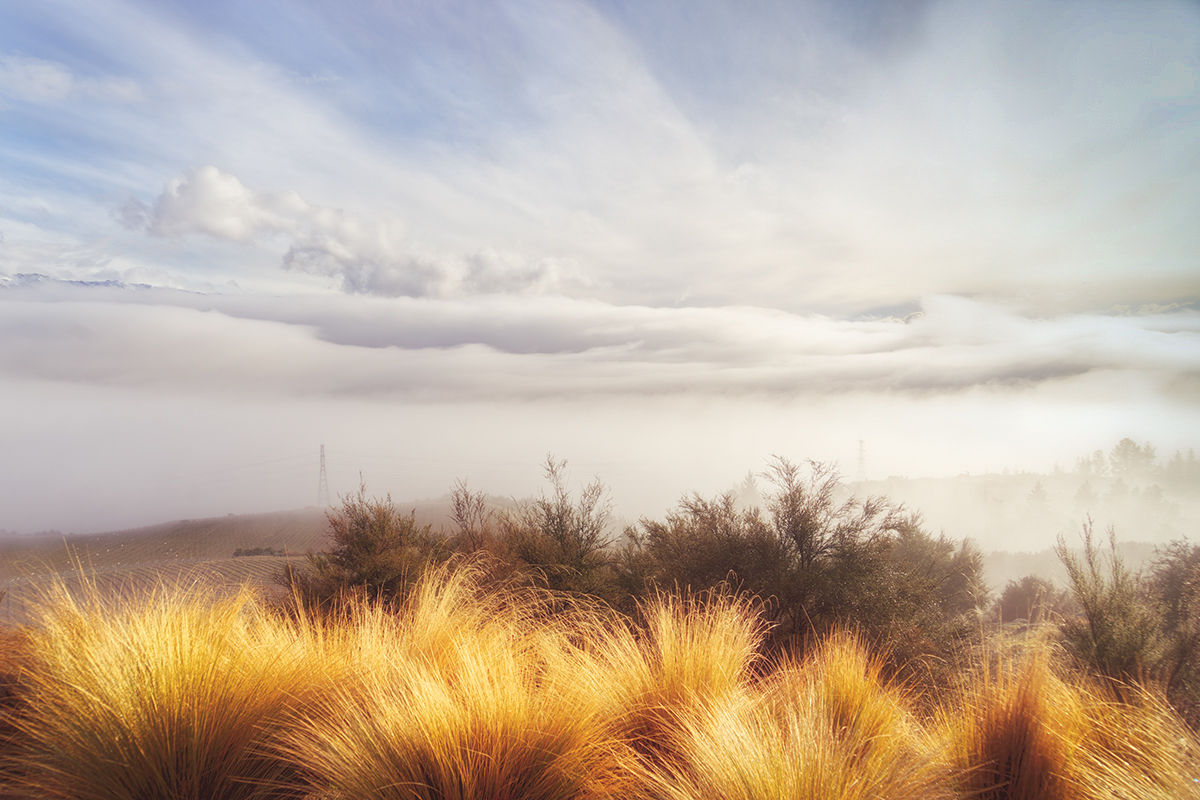
| 77 |
Aug 21 |
Comment |
I love this image. The composition and lighting are wonderful to my eye. Your post processing gave this additional warmth and really brought out the mood.
Unlike Michael, I actually really like the two towers in the photo. I think they add to the story by how they fade into the mist. It's also a reminder that although this area looks very secluded, there is life out there somewhere.
As already mentioned, the right upper corner does seem a bit bright, and I would be curious about how Witta's suggestion might help there. But just for the heck of it, I took your final image into Lightroom and used the graduated filter to drag down diagonally from that corner, just in that area, then decreased the exposure and lowered the color temperature towards the cold (blue) side. This is the result. It may not be the perfect solution, but I think gives us food for thought. :)
|
Aug 9th |
 |
5 comments - 5 replies for Group 77
|
5 comments - 5 replies Total
|


