|
| Group |
Round |
C/R |
Comment |
Date |
Image |
| 77 |
Jun 21 |
Reply |
Fantastic idea Witta! |
Jun 19th |
| 77 |
Jun 21 |
Reply |
Thanks Mary. Your comment that the darker tones may ground the rose makes sense to me as well! I often make adjustments that just "click" with me, and I really don't have a definitive reason why I made those choices. Hearing how someone else analyzes the results is really helpful. |
Jun 18th |
| 77 |
Jun 21 |
Reply |
Thanks Georgianne! So good to see you posting again! |
Jun 18th |
| 77 |
Jun 21 |
Reply |
Thanks Connie. I agree that personal preference is definitely a factor when viewing and making an image. It's interesting, helpful, and often surprising when we get a variety of opinions. |
Jun 18th |
| 77 |
Jun 21 |
Comment |
I really like how you captured this flower and the post processing you did to bring out it's beauty. I agree with the others that a little different crop and Georgianne's edit to deemphasize the dark out-of-focus flower in the center, could add some improvements.
Beautiful image! |
Jun 16th |
| 77 |
Jun 21 |
Comment |
Dandelions have always been a favorite of mine! I agree with Connie that part of that might be fond childhood memories of blowing the seeds away and watching them dance in the wind.
I like the composition and tilt you added to the image. Definitely makes it very appealing to look at. It also lends itself to lots of creative interpretation. I like Georgianne's take on it, but also added one of my own. I took this into Topaz Studio 2 and added a filter called Smudge. This softened the seed heads and allowed me to add some painterly movement. Just a slight adjustment that I felt added something a little different.
Great job getting all the detail in this shot. |
Jun 16th |
 |
| 77 |
Jun 21 |
Comment |
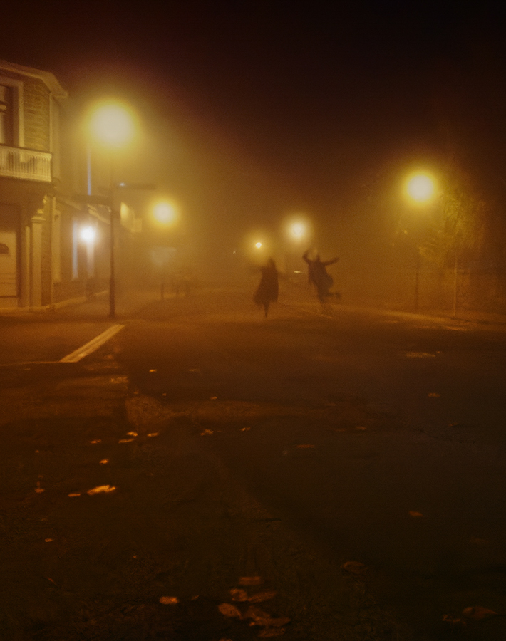
Great capture Mary. The mood and environment is captivating to look at. I like the perspective and point of view of seeing this couple down a stretch of empty road due to the time of day. I wondered if cropping in a little bit differently than other's examples would accentuate that feeling of looking down the road, so I gave it a try. |
Jun 16th |
 |
| 77 |
Jun 21 |
Comment |
I love bleeding hearts, but have yet to take a picture of them that I like for some reason. I think Witta's necklace version is very clever. I like your version as well and enjoy the soft pink against the rough, white wood background. I agree with others that the "sparkles" are distracting and don't add to the image.
I thought I'd make another version of this where I cropped in to put the focus more on the larger blossom and put a faded white vignette on the edges. Just playing around to see how this would look filling the frame more. |
Jun 15th |
 |
| 77 |
Jun 21 |
Reply |
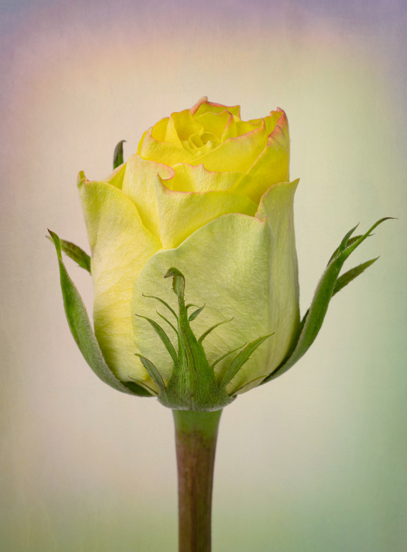
Thanks Michael. I did lengthen the stem a little, but I probably need to go a bit further, as Witta suggested. |
Jun 5th |
| 77 |
Jun 21 |
Comment |
Hello again everyone! I decided to try another version where the texture is flipped and the red in the background is desaturated a bit. I wondered if having the reddish hues at the top would make a difference. I also expanded the canvas size to slightly lengthen the stem and add room at the top (as suggested by Witta). So here is that version as well. |
Jun 3rd |
 |
| 77 |
Jun 21 |
Reply |
Thanks for your feedback Witta! I'm torn about increasing the length of the stem. I think I like it, but I wonder if it takes some of the focus off of the flower itself. I'm going to ponder that for a while.
However I did decide to try a version where the texture is flipped. I've posted that image in another comment. |
Jun 3rd |
| 77 |
Jun 21 |
Comment |
Well, there are no improvement suggestions I can make here. I think this is a wonderful image that your friend should snap up! I really like the texture you created for this as well. This would be fantastic as a large print over your friend's bed.
|
Jun 2nd |
6 comments - 6 replies for Group 77
|
6 comments - 6 replies Total
|


