|
| Group |
Round |
C/R |
Comment |
Date |
Image |
| 77 |
May 21 |
Reply |
Thanks Connie. I also got the feeling of the flower facing into a breeze. I have also landed on the brighter version being more suitable for this subject.
Appreciate your feedback! |
May 24th |
| 77 |
May 21 |
Reply |
I do think moving the moon balanced it the image better. Here's my take at edits on the moon. All done in Lightroom, I changed the hue, desaturated the color a bit, added a little blue and increased the blacks a bit. Just playing with giving the moon a little more "life" to it as well. :) But again, this is just my take - it's your vision! |
May 24th |
 |
| 77 |
May 21 |
Comment |
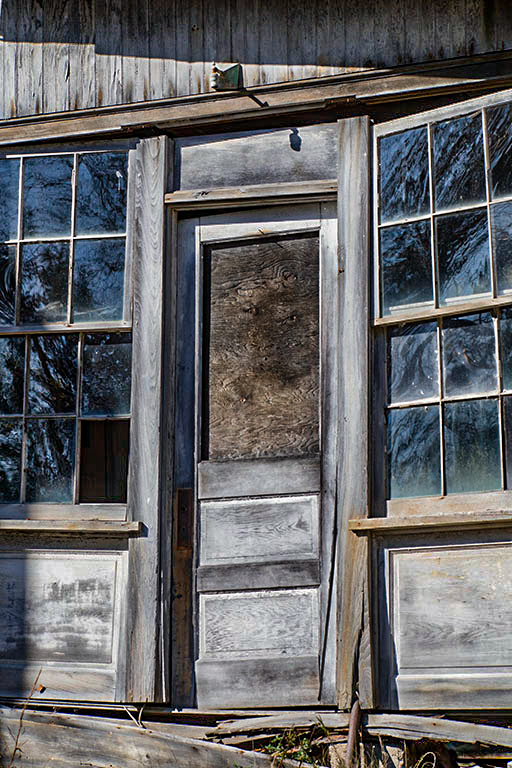
Hi Connie,
I really like the composition and subject matter but you mentioned when you looked at the building it was "drab", so I decided to play with it a bit.
Because the door was in such harsh light I decided to capitalize on that, and left the overall image somewhat bright although I reduced the highlights and exposure. So in Lightroom I did the following: decreased highlights dramatically, increased texture and clarity to bring out all of the reflections in the glass and textures in the wood, used the dehaze slider to enhance contrast, then decreased overall exposure a bit. I also adjusted the blue hues a bit which mostly affected the glass, then used the adjustment brush to paint on the boarded up door window, adjusting the color temp and hue to bring out the orangey/brown color similar to what was in the trim boards. I also used the adjustment brush on the broken out window pane to open up the shadows so you could somewhat look through it into the building.
So rather than go for a dark moodiness, I went for a bright harshness. Just a different take on the subject. :) |
May 24th |
 |
| 77 |
May 21 |
Reply |
I think a smoother texture probably would work as well and would be something to play around with more.
That may have been what drew me to the darker version, because that background is smoother.
Thanks for your feedback Michael! |
May 10th |
| 77 |
May 21 |
Comment |
You have composed this beautiful scene very nicely Linda. I too, am drawn to the curves of the trees and how that one specific tree points to the lovely bridge. I think this photo would be more suited viewing as a large print, to better appreciate the little details that make up the scene as a whole. Are the water and rocks the "stars" of this photo, or the entire place? Does the curved tree add or detract? I'm somewhat torn about that.
You also have lost the sky with the addition of the green, and I wonder if adding it back in would make this image a bit stronger?
What you've captured in this photo makes me want to go visit there for sure!
|
May 9th |
| 77 |
May 21 |
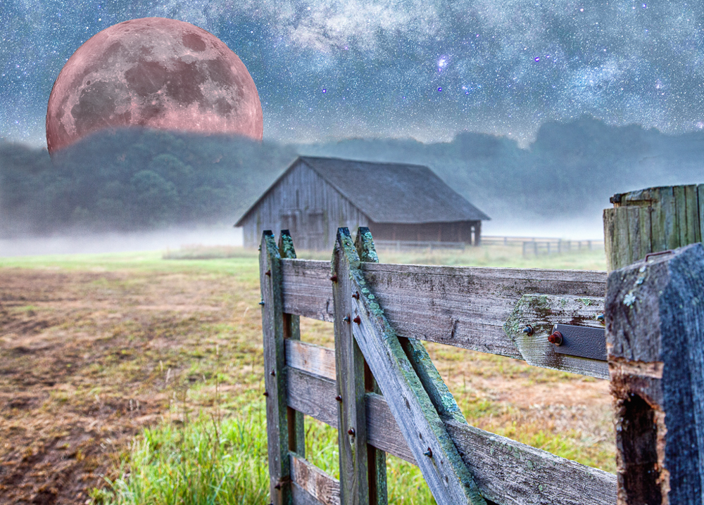
Comment |
I really like the subject matter and concept around this composite. All of the elements appeal to me as a view of a fictional world, which was your intent.
I do agree this image might be stronger with the moon tinted a reddish hue and moved to the left. It does look like a screw is sticking horizontally out of the front gate post, which probably should be cloned out.
It would be interesting to see the result if you try any of the suggestions.
Really nice image you've made! |
May 9th |
| 77 |
May 21 |
Comment |
I really like your final edits on this image. The color tones are so warm and soft, evoking a peaceful feeling in my opinion. The curve of the hills draws me nicely into the angel.
I think this is a well balanced photo of an entire scene and mood, not just focusing on the angel which you voiced as a concern. I enjoy looking at this photo. |
May 9th |
| 77 |
May 21 |
Reply |
Thank you Witta! I was also feeling happiness as I walked through the park and kept coming across many blooming flowers. The brighter, final image has grown on me and is really more an expression of what I was experiencing as well.
I appreciate your feedback! |
May 9th |
4 comments - 4 replies for Group 77
|
4 comments - 4 replies Total
|


