|
| Group |
Round |
C/R |
Comment |
Date |
Image |
| 77 |
Mar 21 |
Reply |
I think this definitely made an improvement. Thanks for trying it and reposting. |
Mar 23rd |
| 77 |
Mar 21 |
Reply |
Thanks Connie! I would say this bubble was maybe 1.5 inches in diameter. My Lensbaby allows very close focusing, plus I cropped in to get an even closer view. I learned about frozen bubble photography when I took a macro photography workshop from Don Komarechka, who was kind of the king of frozen bubble photography for a while. However there are tons of YouTube videos on how to do this. Temperature, patience, lighting and no wind are key!
I made my own bubble mixture using Dawn dish soap, water, and white corn syrup. I would suggest checking out the YouTube videos because many go into great detail about different bubble mixtures, best practices (allowing your bubble mixture to get cold, etc.) as well.
I used a plastic straw as a pipette, then dropped a bit of the bubble mixture into the indentation on the bottom of my small, inverted bowl. I then blew the bubble with the straw, by inserting it into the little pool of mixture. That works really well! |
Mar 15th |
| 77 |
Mar 21 |
Reply |
Thanks for your feedback Mary! |
Mar 13th |
| 77 |
Mar 21 |
Reply |
I really like how you turned this into a full bubble Witta! I assume this was done in Photoshop, but I'm not well versed in using Photoshop right now. I'm trying to learn more.
I was torn between the color and black and white, but on the day I was editing, I was going down a dark, hard edge kind of path, LOL. It's funny how one's mood can influence where you take an image, even when that was not the intent during the time you are shooting.
Thanks for your feedback!
|
Mar 13th |
| 77 |
Mar 21 |
Comment |
Hello Linda, I like your subject matter and the composition you achieved through cropping. I agree that the grass/reed on the left needed to be moved, as Witta demonstrated.
I personally prefer the smooth, creamy feeling of your background in your edit. However, I wonder if you could get the stem of the iris to stand out from the background a bit more? Otherwise, I enjoy the beautiful pop of purple against the green background. |
Mar 13th |
| 77 |
Mar 21 |
Comment |
I like the B & W version the best here. It makes me feel like I'm peering into this kind of other worldly space, unsure of the time period, what it's used for, etc. But somehow really interesting to look at and a bit mysterious.
I like the lighting, shapes of the boxes/containers sitting on the table, and the movement of the wires. I think the noise is just fine. The overall image has a lot going on that is very appealing to me. I think this was a great catch for just having a "quick minute" to take your shot! |
Mar 13th |
| 77 |
Mar 21 |
Reply |
Connie, I love how you got that little heart at the base of the center stem! Fascinating technique for sure! |
Mar 13th |
| 77 |
Mar 21 |
Comment |
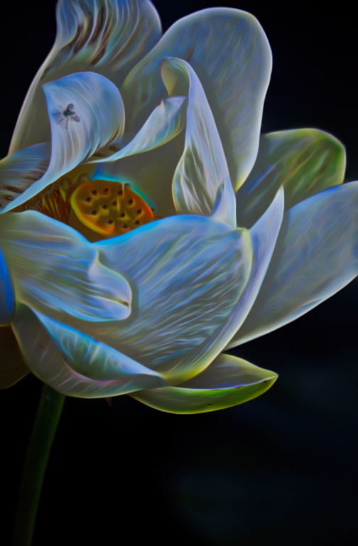
Wow, very interesting technique! I can see how much fun this would be. I really like your concept and the images you selected for this experiment. I agree with the others that a stem might anchor that blossom better.
Really nice result! Thanks for sharing this technique and your process. |
Mar 13th |
| 77 |
Mar 21 |
Comment |
Witta, I really like your subject matter and the adjustments you made to the flowers. However, in my opinion, the water spot texture looks more like grit and gives a hard, harsh feeling to the background that distracts from the beauty of the flowers and pretty backlighting of the petals. I wonder if you had just softened up the original couch background a bit, maybe blurring the lines a little more, if that would still allow the flowers to stand out well.
Just a thought! |
Mar 13th |
| 77 |
Mar 21 |
Comment |
Georgianne - you have definitely transformed this image into a very interesting piece of art. I like that Witta put it on a wall which gives it even more context.
I also appreciate the step by step process you've provided as a lesson for us.
Because I enjoyed all of the movement and texture in your original image, I played with it in Topaz Studio 2 to make a different version of modern art. I used a preset "look" called Galactic, reduced the opacity to about 45%, then added a mask and used a brush to paint different levels of opacity on various sections of the image. Since the preset was all about glowing light, I thought this would be fun to play with. |
Mar 13th |
 |
5 comments - 5 replies for Group 77
|
5 comments - 5 replies Total
|


