|
| Group |
Round |
C/R |
Comment |
Date |
Image |
| 77 |
Feb 21 |
Reply |
Thanks Georgianne! |
Feb 24th |
| 77 |
Feb 21 |
Reply |
Thanks Witta! |
Feb 24th |
| 77 |
Feb 21 |
Reply |
That was a great idea Georgianne! The colors really enhance the image but brings in Witta's concept as well.
Very nice! |
Feb 24th |
| 77 |
Feb 21 |
Reply |
See my new comment with edited image taking in everyone's feedback. |
Feb 21st |
| 77 |
Feb 21 |
Reply |
See my new comment with edited image taking in everyone's feedback. |
Feb 21st |
| 77 |
Feb 21 |
Reply |
See my new comment with edited image taking in everyone's feedback. |
Feb 21st |
| 77 |
Feb 21 |
Reply |
See my new comment with edited image taking in everyone's feedback. |
Feb 21st |
| 77 |
Feb 21 |
Comment |
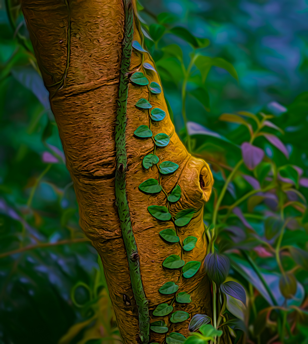
I've taken all of the comments and edited my photo further by doing the following:
Back in Topaz Studio 2 I added several layer masks to do the following:
- added a gaussian blur on the background only
- added a color overlay to the background only to add more green tones
- added an adjustment mask to desaturate some of the bright blues/purples, increase the blacks/shadows on the trunk only and darken the background
- added a filter that allowed me to increase the swirls in the background
I started to feel like I was just working this image to death and not sure if I should have just started over from the beginning, LOL! But here's my result.
|
Feb 21st |
 |
| 77 |
Feb 21 |
Comment |
I find I like your first image more than the second. With a bit of distortion to the clock and some of the frame fading away, I imagine how one could be "losing time". Like this clock is being sucked away into another world.
I think this is more about understanding the intent from the artist's perspective or the story one is trying to tell. I feel the first image tells a better story than your second edit that you posted. |
Feb 21st |
| 77 |
Feb 21 |
Comment |
I love this image, and you nailed capturing that look. I like the dreamy quality of your original edits as well, however the bottom left seems a bit bright to my eyes. Maybe toning that down somewhat would not draw my eye to that spot. But I think you did a great job with the capture and removing all of the distracting elements.
Your granddaughter looks like a real pistol, LOL! |
Feb 21st |
| 77 |
Feb 21 |
Comment |
I also like the perspective of the original image, but with just a tad bit of straightening. I have never tried cutting out parts of an image and replacing them, so I can't offer any advice for getting a better result. But I do have to agree with the others that it doesn't look natural.
I like your composition and choice of subject. |
Feb 21st |
| 77 |
Feb 21 |
Comment |
Photo 2 is my favorite as well. I like the composition and love the colors and the inclusion of the red berries. I also learned about this technique in a workshop, but never got around to trying it!
The darker image does not have the same impact of the color one, which to me really embodies the appeal of the frozen flowers concept and process. However I did find your Frozen Buttercup Browns image on Flicker really interesting as well! |
Feb 21st |
| 77 |
Feb 21 |
Comment |
I find this image very peaceful to view. I really like the composition and how this is a modern day scene with an old world kind of touch with the impressionistic styling.
I don't mind the pole by the legs or the blurry face of the man because even though your title is Early Morning Fisherman, I don't really consider him the focus of this image. It's the entire environment that I'm drawn into. And I enjoy the little pops of color from his hat, his shirt, his reflection in the water, the decal on the boat, etc.
I do agree that a lot of the whites seem too bright on my monitor, and toning them done a bit helps this image. But I really like the overall scene that you've captured Georgianne. |
Feb 21st |
6 comments - 7 replies for Group 77
|
6 comments - 7 replies Total
|


