|
| Group |
Round |
C/R |
Comment |
Date |
Image |
| 77 |
Jul 20 |
Reply |
Thank you so much Cecilia. I love that so many people did their own spin on this photo. It's a great way to see different perspectives that I might not have considered! |
Jul 8th |
| 77 |
Jul 20 |
Reply |
Thank you so much Connie. I continue to work hard at improving my lighting techniques to elevate my flower portraits. I truly enjoy working with flower photography in that way.
I was confused by Georgianne's reference to "pixel strokes" and now understand she was talking about the border, LOL! I find using PS and extending the canvas very easy as well.
I am so grateful for everyone's suggestions! |
Jul 8th |
| 77 |
Jul 20 |
Reply |
This looks like a nice, versatile texture. Thanks for the better view. |
Jul 4th |
| 77 |
Jul 20 |
Reply |
Thank you! I really appreciate everyone's feedback. |
Jul 3rd |
| 77 |
Jul 20 |
Reply |
I like how you added some stem here. I would have never thought it wasn't part of the original photo! On my monitor I can't see the texture you added though, however I do like this version as well.
Thanks! |
Jul 3rd |
| 77 |
Jul 20 |
Reply |
I did not realize that NIK Color Efex Pro 2 has an Image Borders preset! I will check that out. Thank you! |
Jul 3rd |
| 77 |
Jul 20 |
Comment |
Love the composition and colors! I also like the clean background.
I too, thought the bottle/vase was a bit tilted, LOL. So that was going to be my only comment.
|
Jul 3rd |
| 77 |
Jul 20 |
Comment |
I have to agree with the others. Great job with post-processing, but the legs do nothing for me. The landscape, however, is beautiful! |
Jul 3rd |
| 77 |
Jul 20 |
Comment |
Mary - love that you are capturing this historic time with personal photos.
For me, including Pete's body and protective headgear tells a better story about this "person" who is working his craft. I also feel the reflections on the mask helps me to feel the heat, with the sparks almost touching the face.
I like Witta's edits as well.
Great photo! |
Jul 3rd |
| 77 |
Jul 20 |
Comment |
I can't add anything different, except to compliment you on your eye to capture this composition. It's very appealing, and I love the pop of color from the fresh flowers in this aged scene.
I also encourage you to try out new found post-processing skills and software to see if you can elevate this photo any further.
Very nice!
|
Jul 3rd |
| 77 |
Jul 20 |
Comment |
I have a similar decaying house that I photographed over and over and still never seemed to get the result I wanted. But, that was also when I had less knowledge about post-processing, and you've inspired me to dig out some old images and start working on them again. The house is no longer there, so I can't go back and take another shot!
I think your strategy to have a wide-angle to include more landscape helps to tell the story of this house being "alone". Also, converting the image to black and white and the edits on the sky are improvements over the color original in my opinion.
I also wonder if the suggestion made by Larry, trying a lower angle would make a difference to achieving your vision.
I like your subject matter, composition, and the edits you made.
|
Jul 3rd |
| 77 |
Jul 20 |
Comment |
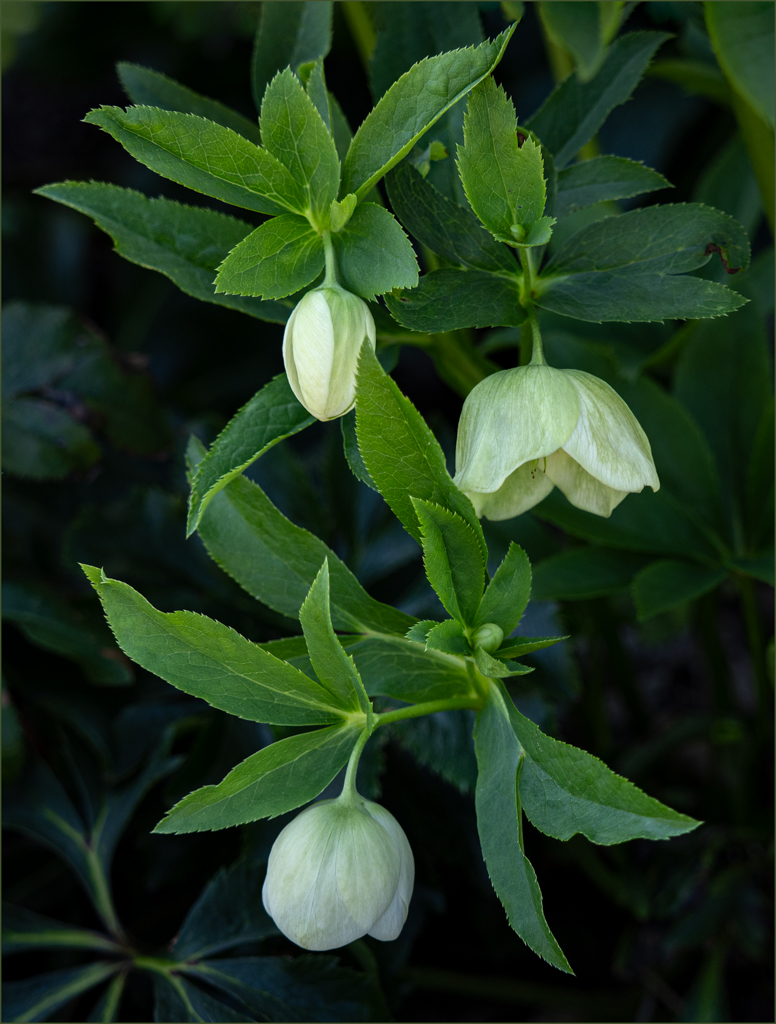
You definitely achieved your objectives with this lovely image. The lily looks like it is sunlit in the center parts with nice shadows/darkness on the front, undersides of the petals and stem. There is a definite separation of the background from the subject.
As Witta mentioned, the reds at the bottom right look a little out of place. There were none in the original photos. Rather than just cloning them out, would adding more red in other strategic places make the bottom ones seem more fitting? Like there were random red flowers popping up in this wildflower background?
Kudos on making your own unique backgrounds. Very nice, painterly image.
|
Jul 3rd |
| 77 |
Jul 20 |
Reply |
See my edits in Georgianne's comments |
Jul 3rd |
| 77 |
Jul 20 |
Reply |
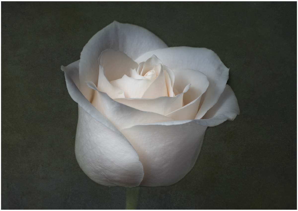
Georgianne, I'm not sure I understand "needs more pixel strokes". Can you explain that and how I would do that?
So taking in everyone's comments, I edited more as follows:
- Added a texture with a dark green hue
- Slightly tilted the rose to the right, very subtle
- Somewhat closer crop but also just a little off center, cropped in more from the left, leaving a tad more room on the right this time
- Brightened the rose but also increased clarity a little, mostly on the center area
Thoughts?
|
Jul 3rd |
 |
| 77 |
Jul 20 |
Reply |
Thank you Larry. There are times when I struggle with whether to crop or not, and if I do, what might be the proper placement. However, now reading Georgianne's comments as well, I see the logic behind cropping in the manner she described, and why the crop looks awkward to you! |
Jul 2nd |
| 77 |
Jul 20 |
Reply |
Thanks for your comments Witta. As for my choice of Lensbaby, you can actually get fairly good depth of field if you work at the angle of view. I imagine that I could also use focus stacking if desired, to get that front to back sharpness. But for me, I like what I call a "sharp softness" that you can get when using these lenses at a small aperture. In this case, I'm pretty sure it was f 16, but possibly f 11.
There is a feel that these lenses give to an image that I'm having a hard time clearly defining. If I had shot this with my 90 mm macro lens at the same distance and same aperture, there would have been a different result. I would have needed to get the look that I like through post-processing, and even then might not have quite achieved it.
I'm going to play with adding a texture to the background and see how it turns out. I'll post it when I'm done. |
Jul 2nd |
| 77 |
Jul 20 |
Reply |
Thank you Bunny! For flowers, I like tight crops when my image angle is more head on. At this angle, I like to include some stem so that the flower isn't just floating. That's generally my personal preference. but not a "rule", lol. |
Jul 2nd |
| 77 |
Jul 20 |
Reply |
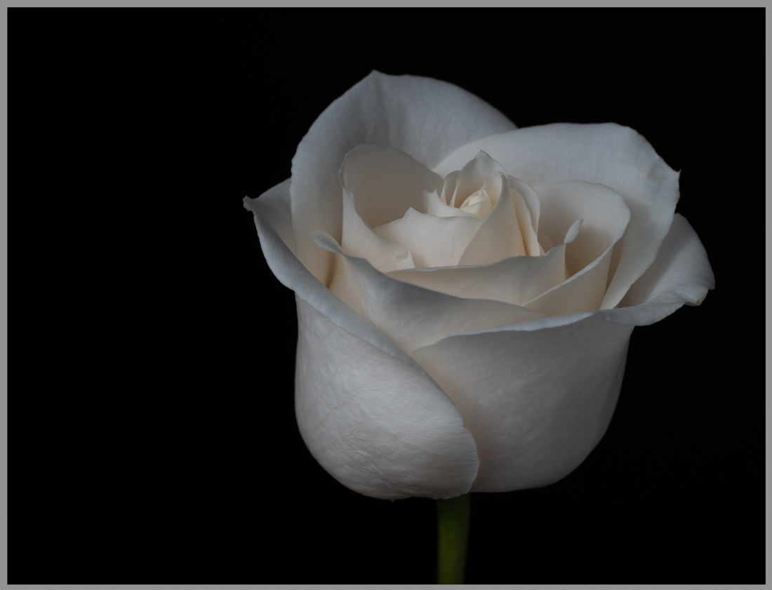
Here is the original, unedited version with a border, to compare to the cropped version. I should have thought about that before I sent the images!
Ha, I also just realized posting it in the comments resolved that problem without a border, LOL. Oh well! |
Jul 1st |
 |
| 77 |
Jul 20 |
Comment |
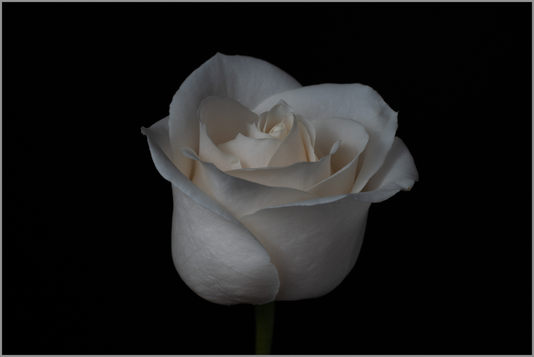
So I see with the black background, you can't really tell how it was cropped. I've attached a version with a border around it to help with that. Before, it was directly in the center of a longer rectangle, no cropping. |
Jul 1st |
 |
7 comments - 12 replies for Group 77
|
7 comments - 12 replies Total
|