|
| Group |
Round |
C/R |
Comment |
Date |
Image |
| 77 |
May 20 |
Reply |
I really like this suggestion Bunny. That section was really what caught my eye, so I like how this crop really hones in on that.
Thanks for your feedback! |
May 10th |
| 77 |
May 20 |
Reply |
Thank you Connie. I can see being in this group is going to really push me to practice with and learn more about the post-processing tools I dabble with but have far from mastered. That is exactly what I need!
I appreciate all of the feedback. |
May 7th |
| 77 |
May 20 |
Comment |
Bunny, I don't think there is anything I can add to what others have suggested. I really like this photo and the way you were able to compose the shot to highlight the "tree house" appearance. What a fantastic structure to have on your property. You captured it well. |
May 6th |
| 77 |
May 20 |
Comment |
Cecilia, This image has an "Alice in Wonderland" feeling to me. I find it very visually interesting, and I think you could use a variety of post processing techniques to make this even more fairy tale like, and less documentary.
I love the color tones and textures of the pink birds with the greenish brown water reflecting the surrounding foliage. I also like the juxtaposition of the metal feeders in this natural environment; again giving this photo a kind of surreal feeling.
I agree with other comments about removing the flamingo reflection at the top, where no bird can be seen, and possibly extending the bottom of the canvas a bit more.
I see some fun possibilities with this image if you care to go there! |
May 6th |
| 77 |
May 20 |
Comment |
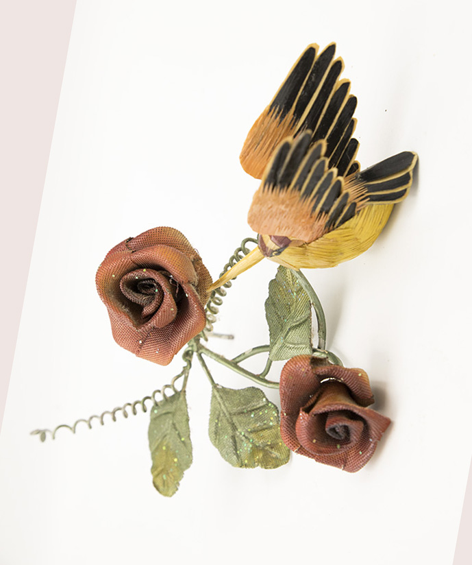
Connie, the only thing I can add that is a little different from the others, is that there is something about the bird sitting on the ground that nags at my brain, LOL. To me, the bird doesn't look like it's flying, even though the wings are out-stretched. Maybe if there was a twig included in the composition, under the bird in some manner (and removing the shadows under the bird), or if the bird was higher up in the photo. The pose just doesn't look natural to me so detracts from your image in my opinion.
I took your original into PS and rotated the image 80 degrees counter clockwise to illustrate what I mean. This may throw the composition off with the way the flowers are positioned, but the bird feels better positioned. |
May 6th |
 |
| 77 |
May 20 |
Comment |
What a fantastic abstract image you've made. I love the curves, geometry and symmetry. I can see this as being striking in either the current color tones or blues. Both would be just as beautiful.
To me, this looks as if some natural object was sliced in half to expose the inner workings. I love it! |
May 6th |
| 77 |
May 20 |
Comment |
Georgianne, you definitely made this a dreamy still life, with your objects floating in the clouds. I like the composition and the post-processing treatments.
You mentioned you did some processing around where the candle was lit in the red candle holder. I don't get a sense that it was lit at all. That was one thing I thought might add to this photo. I think because the glass was so textured and thick, the light from the candle did not come through that well. I would have liked seeing a glow from the candle. To me, that area looks more like it is reflecting light rather than having an inner glow.
Overall, I find this very creative and enjoy looking at it.
|
May 6th |
| 77 |
May 20 |
Reply |
Thank you Georgianne! I am still learning how to use all of the post-processing tools available to me, and I can tell I'm going to get a lot of great feedback from this group. |
May 6th |
| 77 |
May 20 |
Reply |
What a totally different perspective you've added to this image Cecilia! I'm glad you enjoyed playing with it. The fact that the flower is hovering above the leaf does throw this off for me a bit, but had this been actually laying on it's side, therefore more settled into the bottom, I would have taken that shot for sure! I like your processing, and trying it out in black and white was really interesting. Thanks for sharing your ideas. |
May 6th |
| 77 |
May 20 |
Reply |
Thank you Witta. I also noticed the blurring of the tip after post and I was trying to decide whether it bothered me or not. Now that you and Georgianne both mentioned it, I need to bring it back! I will try your suggestion with adding a layer to add some blue to the green area on the right of the tulip and see what I think. |
May 6th |
5 comments - 5 replies for Group 77
|
5 comments - 5 replies Total
|


