|
| Group |
Round |
C/R |
Comment |
Date |
Image |
| 60 |
Mar 20 |
Reply |
Hi John. Thanks for stopping by our group. The color transition is the natural color of the flower. It was a pinkish cream color, with more pink on the outer petals. On the very outside edge I placed a vignette and picked the same darker pink color that was on the petal edges. Does that answer your question? |
Mar 17th |
| 60 |
Mar 20 |
Reply |
I, personally, like the black and white conversion a lot! This makes for a really interesting shot that you sit and study for a while.
Nice job Bob! |
Mar 11th |
| 60 |
Mar 20 |
Comment |
Hi Lou. I love Longwood Gardens since I visited for the first time last year. I'm dying to go back.
You chose a very interesting and colorful plant for your photo. If you were thinking this is a Lady Slipper Orchid, it is not. There may be other plants named Lady Slipper, but I don't know what this is!
I really like the composition, since this is such a curvy plant. The vertical crop and center framing were great choices for this subject. I wish the background wasn't so busy as I find it distracting. There are such pretty patterns and colors in the flower but the blob of roots at the top, and dark bottom don't compliment it very well in my opinion.
I agree with Bob that maybe if you opened up the shadows at the bottom (or took out the vignette), it might help this stand out a little better from the background. But I also wish it were in a different setting so that the flower could really shine, LOL. But that's where it was!
|
Mar 5th |
| 60 |
Mar 20 |
Comment |
I almost thought these were some kind of shells Bob. My brain did not see pine cone here! You did a nice job with the focus stacking. Everything in the frame is in focus. I also like the composition choice, having the pine cone on it's side with the scales pointing left. I love the pattern of the criss-crossing lines of the scales.
However, the addition of the red/blue lighting did not add anything to the photo in my opinion. There are three spots with blobs of blue/black that seem out of place (the right bottom, right top edge of the cone, and on the left). The shadows between some of the scales are very dark as well, which I suspect is caused by the lighting.
Because this subject is so interesting and has great texture, did you consider going in even closer, making this more abstract, and possibly converting to black and white? So the scales would totally fill the frame with no negative space around the cone at all. And the black and white conversion might make you feel better about the appearance.
I don't know if that would do anything for what you envisioned, but just a thought! |
Mar 5th |
| 60 |
Mar 20 |
Reply |
I actually like the vertical crop as well. The only thing that bugs me (pun intended), is that the very tip of the needle on the left is chopped off. Sometimes, when just the tips of leaves, needles, or petals on plants are cropped, it feels more like a mistake than an intentional decision. So if you could crop in a bit more, OR go out to include more of the needle, I think that would balance this out better. |
Mar 5th |
| 60 |
Mar 20 |
Comment |
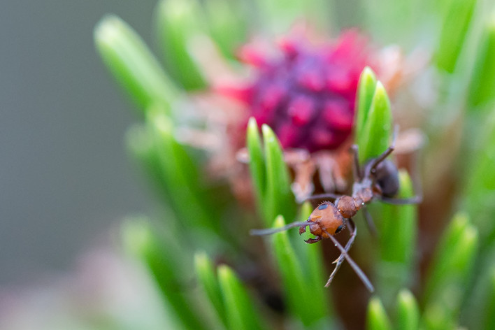
Hello Jennifer! I like this fun image. Your title suits this photo as only the head/face of the ant is in sharp focus, so he/she seems to be peering out at the viewer to say hello. I also enjoy the colors, with the green and red of the plant complimenting the brown of the ant. I also like that the ant is off center, which makes a pleasing composition to me.
If your intent was to have just the head in focus, you did that. I am no expert in shooting bugs, trying to get moving, thin antennas, etc., but had you wanted more in focus, using f11 or f16 may have helped there. I also wonder, since the ant is the focal point, if the image would be stronger if you cropped in more to lose some of the left, blank area. Also, if you remove the front, in focus leaf/blade of the plant. All the other parts of the plant are not in focus, so that stands out being front and center and may distract from the ant a bit.
As an example, I did a little editing which I've attached below. With these images being so small, I'm not sure if this helps illustrate my point or not!
Welcome to the group! |
Mar 5th |
 |
| 60 |
Mar 20 |
Comment |
You made a nice find, catching sight of this little critter when he blends in so well! I agree with the others that the moving water framing the crab is really nice. I like the color tones in the picture as well. The round shapes of the rocks compliment the shape of the crab. Great composition and subject matter! |
Mar 5th |
| 60 |
Mar 20 |
Reply |
Thanks for your feedback Bob. As I mentioned to Lou, my intent was to have this photo somewhat soft and moody, therefore left the lighting a bit dim and kept some shadows.
I am familiar with Viveza, but really never used it. I will try your suggestion, similar to Lou's, to see if I like the photo better and to learn more about using Viveza. |
Mar 5th |
| 60 |
Mar 20 |
Reply |
Thanks so much for the feedback. My intent was to have the photo somewhat soft and "dim", to enhance the mood. However I will try your suggestion and see if I like it better. |
Mar 5th |
4 comments - 5 replies for Group 60
|
4 comments - 5 replies Total
|


