|
| Group |
Round |
C/R |
Comment |
Date |
Image |
| 41 |
Oct 17 |
Comment |
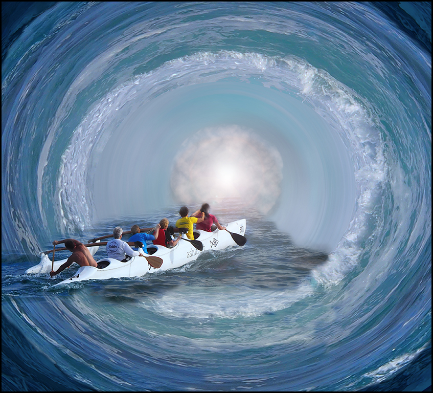
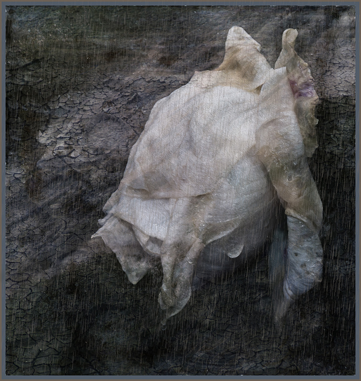
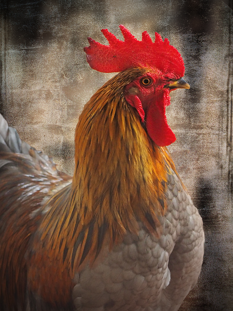
Great result and atmosphere. Make a great movie poster. |
Oct 11th |
| 41 |
Oct 17 |
Comment |
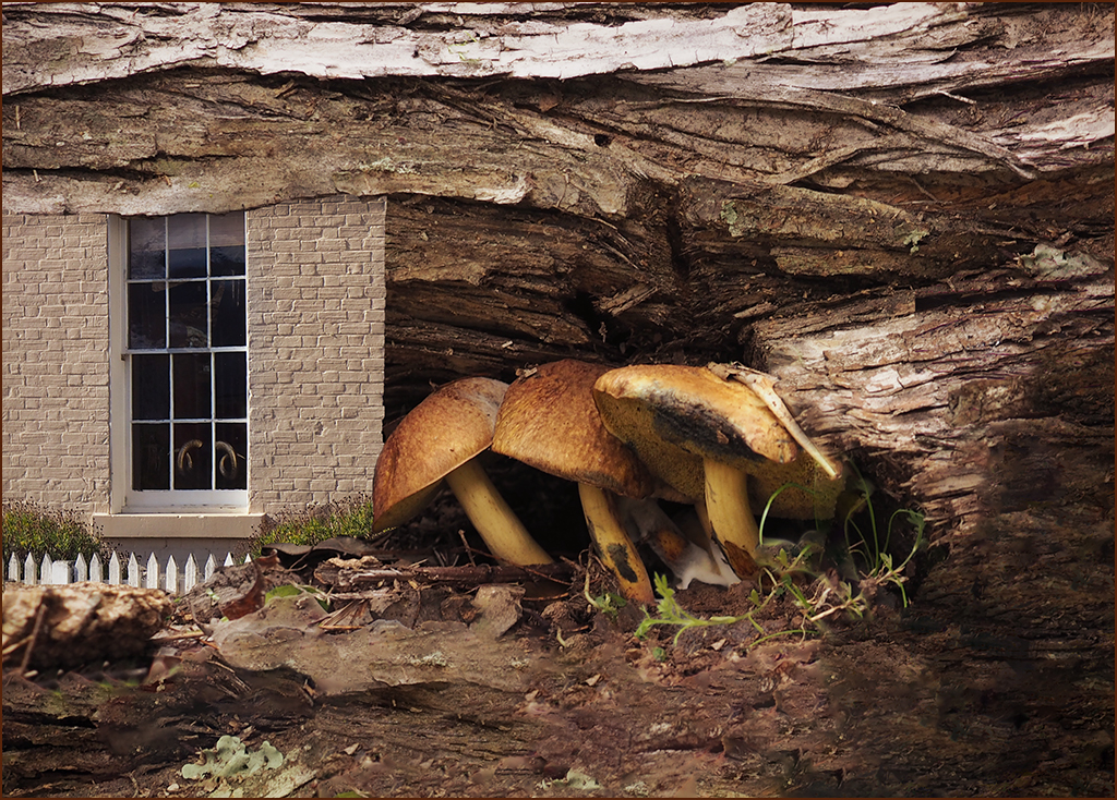
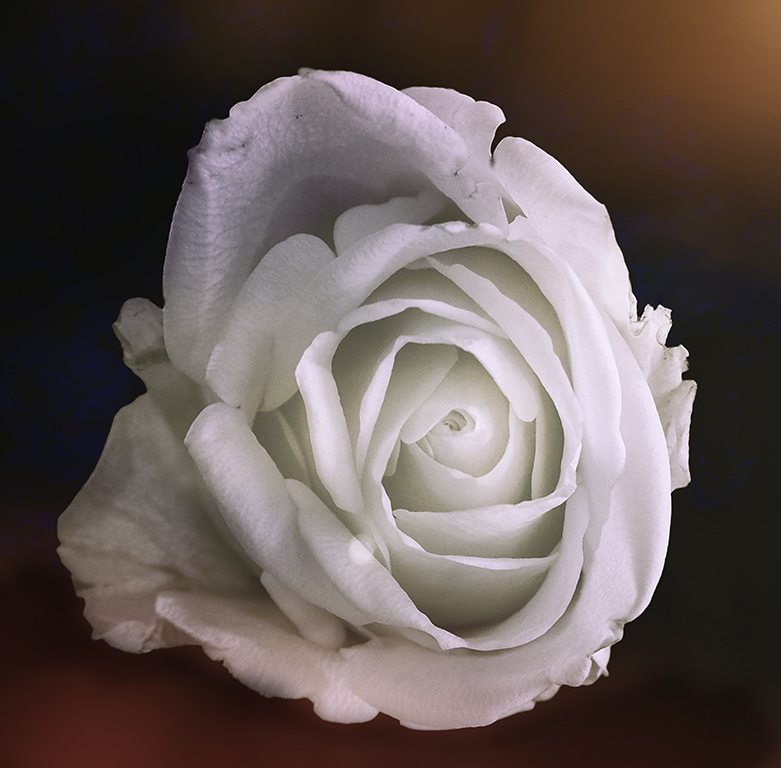
Fantastic result. Great compositing work and stunning result. Perfect in black and white. Agree about straightening up the building |
Oct 11th |
| 41 |
Oct 17 |
Comment |
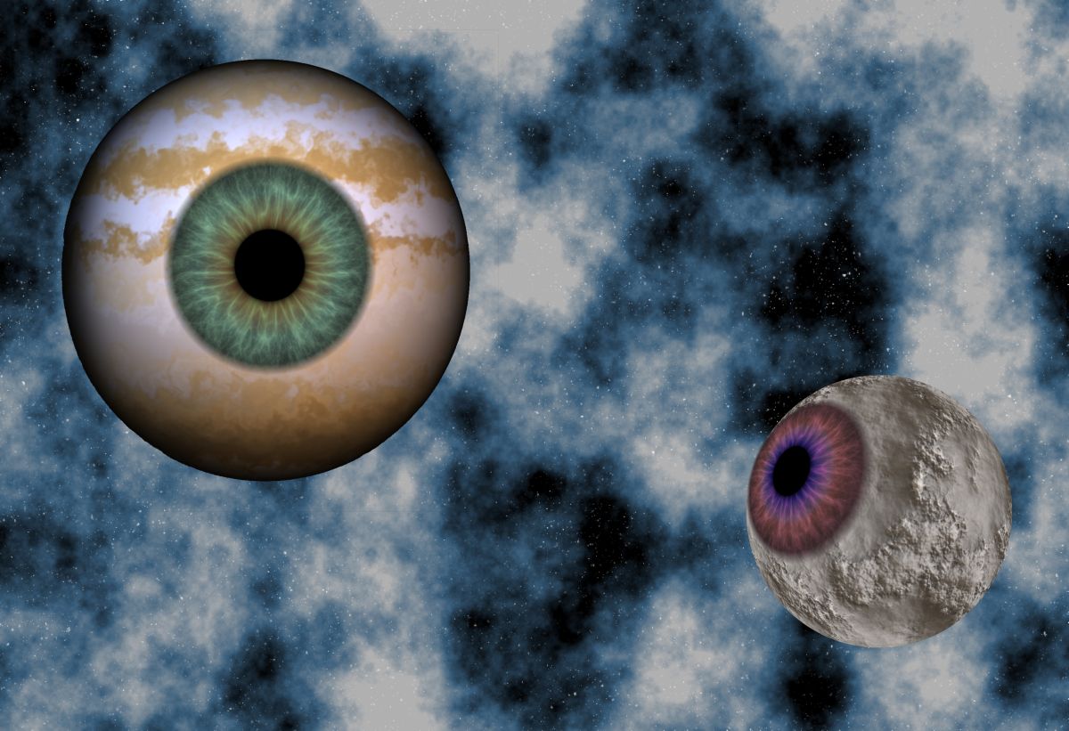
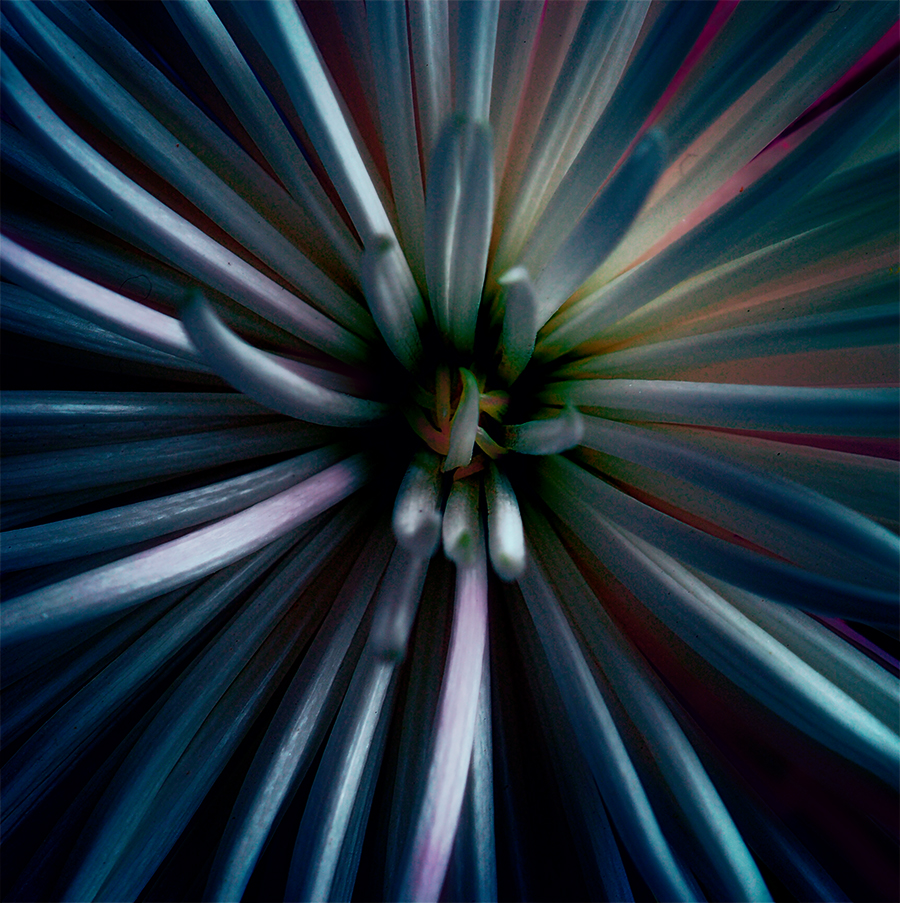
You've ended up with an interesting abstract. I like the purplish colour in the original |
Oct 11th |
| 41 |
Oct 17 |
Comment |
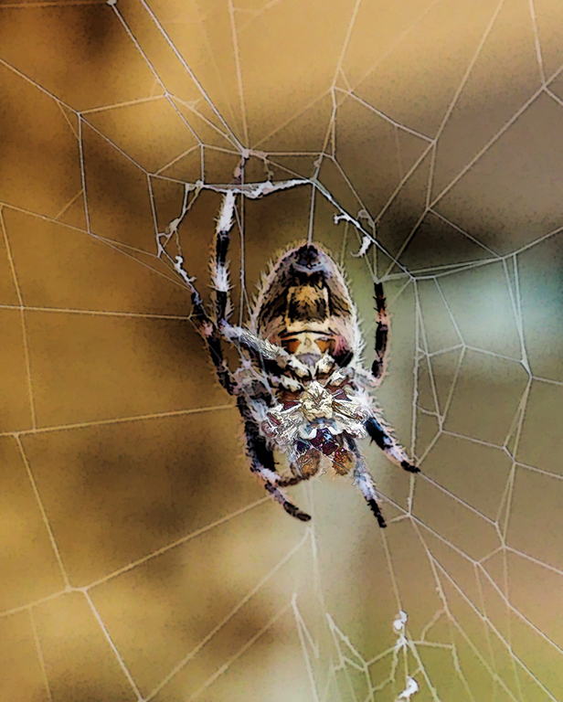
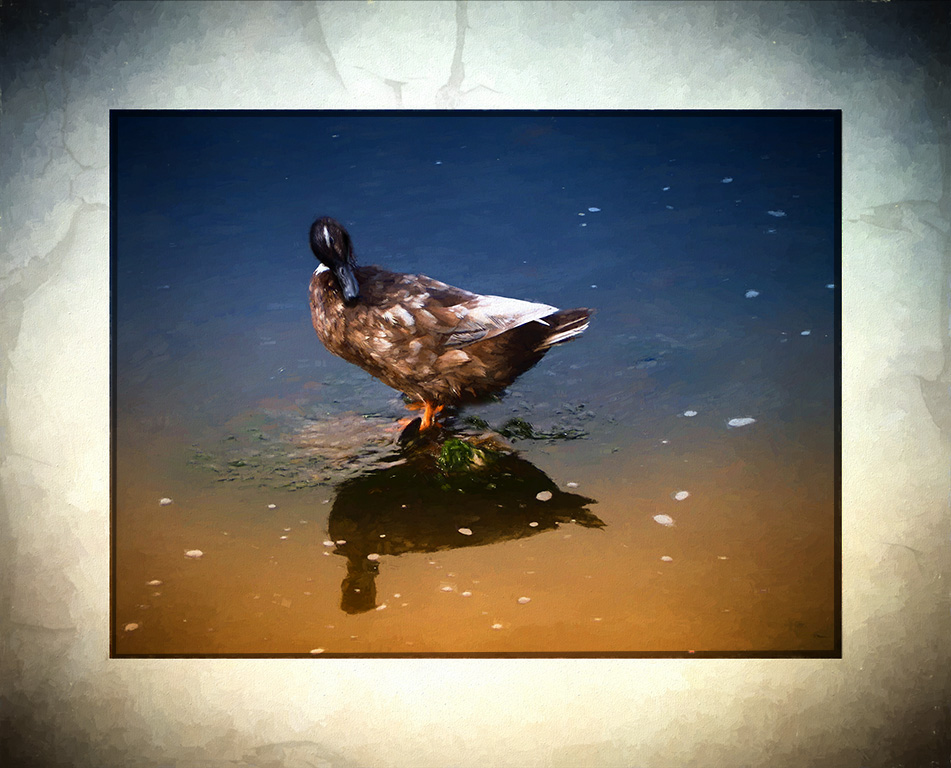
Great idea and love the vibrancy of the final. I would get rid of the lines that create a vertical line through the birds left wing and tail. It cuts the image in two a bit. |
Oct 11th |
| 41 |
Oct 17 |
Comment |
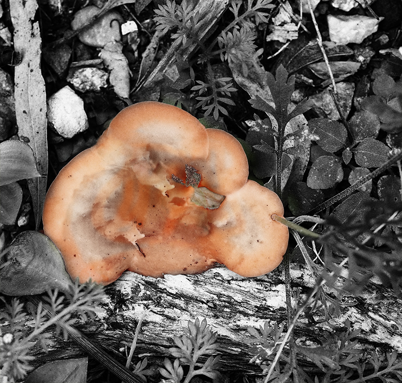
I love the final effect and the building in the final image, but agree about retrieving more detail in the palm tree. I think also keep more sky but reduce the opacity. |
Oct 11th |
| 41 |
Oct 17 |
Comment |
Thank you everyone. I will change the border.
|
Oct 11th |
6 comments - 0 replies for Group 41
|
| 53 |
Oct 17 |
Reply |
Thanks Tom, I like what you have done - has really brought the texture in the bricks out. |
Oct 25th |
| 53 |
Oct 17 |
Comment |
Great work - all different moods to the images. I like the main one = nostalgic, and the light in the original and the movement in variation 2. |
Oct 11th |
| 53 |
Oct 17 |
Comment |
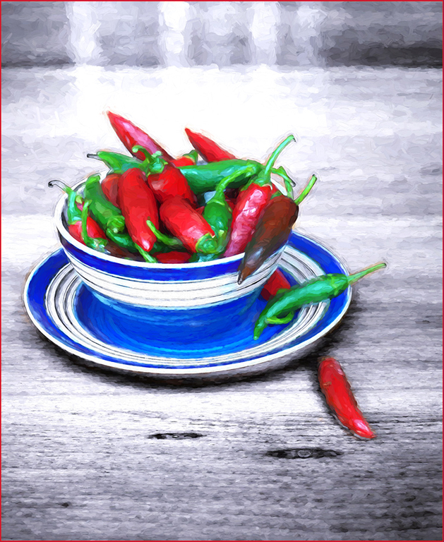
Good shot and portrait of the worker. I like the composition too and don't mind the background. I would keep the yellow cup as it is forms a rough diagonal with the yellow green machine at the top and the yellow and black edges. |
Oct 11th |
| 53 |
Oct 17 |
Comment |
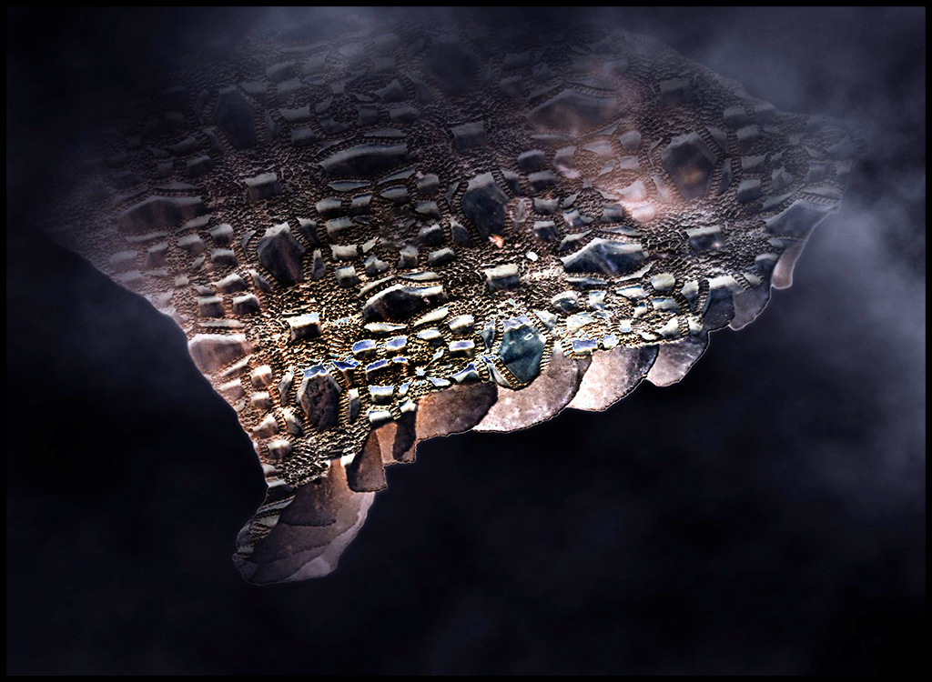
Nice image, I like the simplicity and the various shapes. The diagonal composition works well and the contrast of the stones above and below the water. Also like Rusty's version - gives a different feel to the pic. |
Oct 11th |
| 53 |
Oct 17 |
Comment |
Great scenery. Trying to take pics of fantastic scenes from a moving train/car is so frustrating. Good idea to turn it into a painting. I would suggest removing the white lines around the pine tree on the right if you can. |
Oct 11th |
| 53 |
Oct 17 |
Comment |
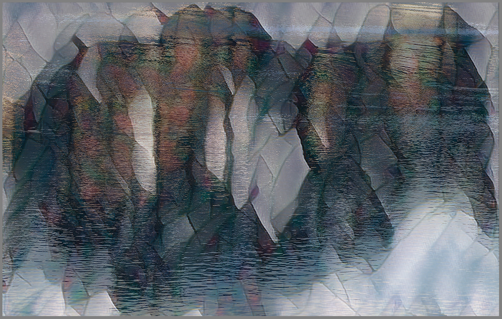
Great image. I like Brenda's idea for lightening the shadows etc. I don't mind the original colour. I think you could get a multitude of different images trying black and white versions. |
Oct 11th |
| 53 |
Oct 17 |
Comment |
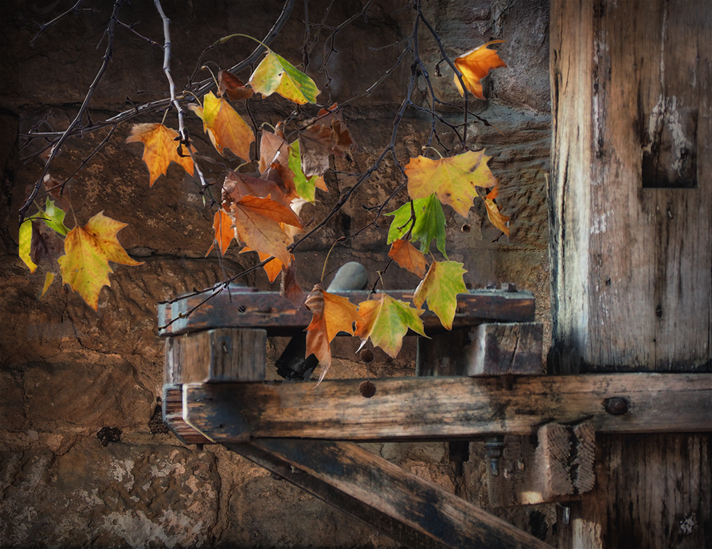
Beautiful leaf. I agree with the comments about the focus. Also agree with Dan about adding stars.
Very creative in using the leaf in space. |
Oct 11th |
6 comments - 1 reply for Group 53
|
12 comments - 1 reply Total
|