|
| Group |
Round |
C/R |
Comment |
Date |
Image |
| 41 |
Feb 17 |
Reply |
To do this, just add a layer and fill with the colour you would like as the background, then mask it with the spatter brush so that just the subject section shows. |
Feb 18th |
| 41 |
Feb 17 |
Comment |
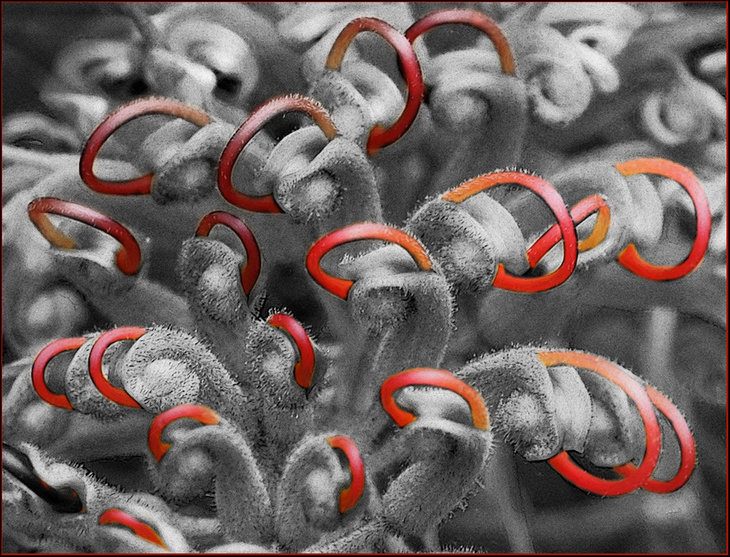
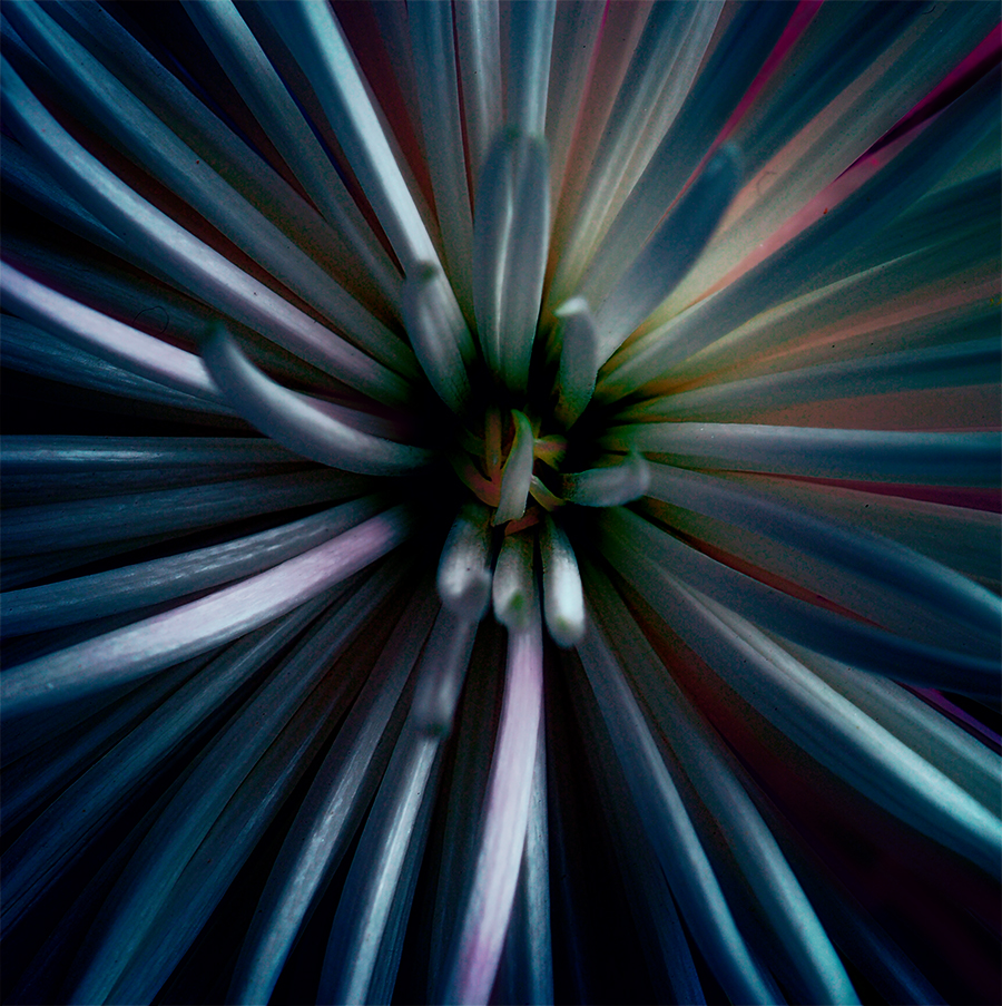
Nice abstract with great colours. Very creative. I would try increasing the size of the central image and moving it down slightly. |
Feb 16th |
| 41 |
Feb 17 |
Comment |
Great idea, my immediate reaction was the ballerina looked a bit 'stuck on' rather than part of the overall image. Maybe 'ground' her on the leaf. Beautiful shot of the flowers. It could stand alone. |
Feb 16th |
| 41 |
Feb 17 |
Comment |
I agree with John about removing the people. Maybe using a splatter brush as Carol has would also work. Then you would have a great action shot. |
Feb 16th |
| 41 |
Feb 17 |
Comment |
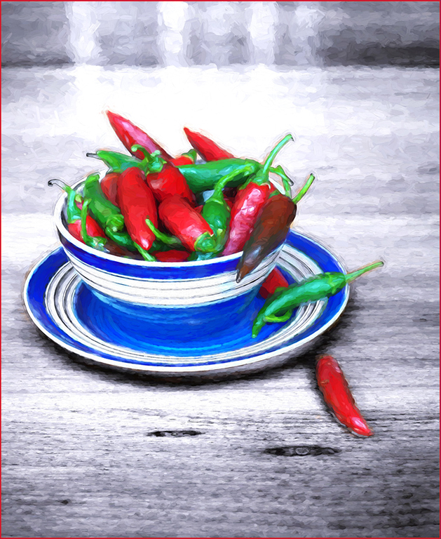
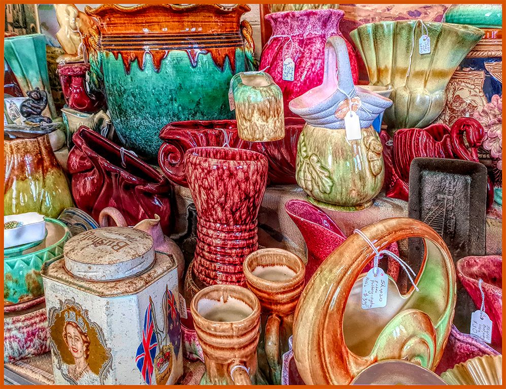
Clever idea changing the colour of the pots. I would try and remove those vertical lines of the tin at the top as they tend to draw your eye up. Love the overall tone of the image and the contrasting textures. |
Feb 16th |
| 41 |
Feb 17 |
Comment |
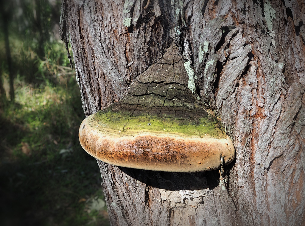
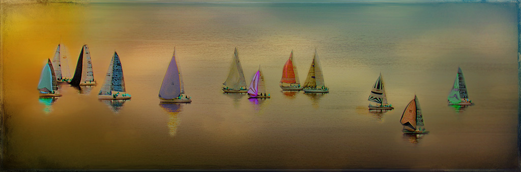
Great image you have. I prefer this to the other. I find it a more interesting subject. Pleasant tones and the contrast with the colours in the window lifts the image. I think the texture would probably work but like it as it is. |
Feb 16th |
5 comments - 1 reply for Group 41
|
| 53 |
Feb 17 |
Comment |
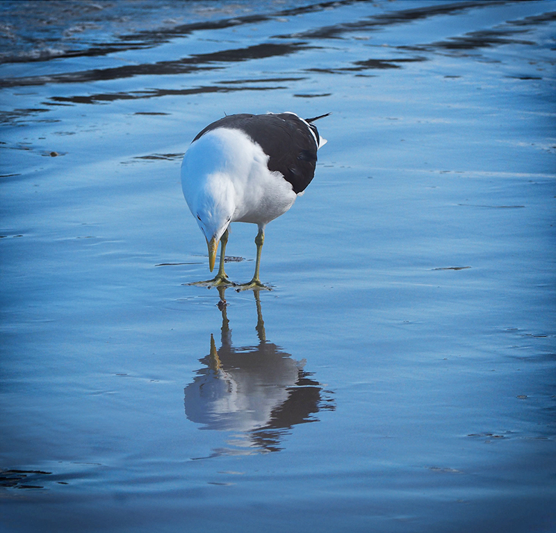
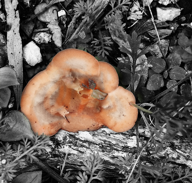
Getting rid of the background worked well and agree with Rusty that it needs to be grounded. |
Feb 12th |
| 53 |
Feb 17 |
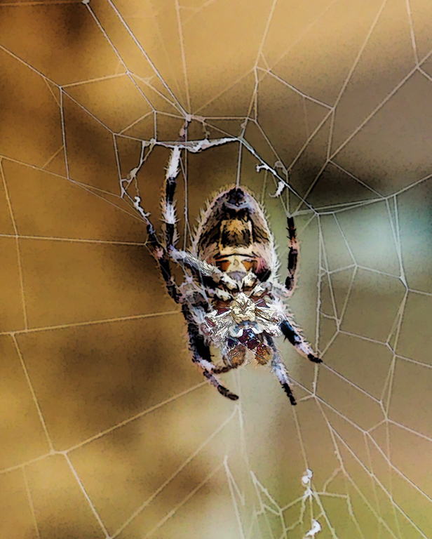
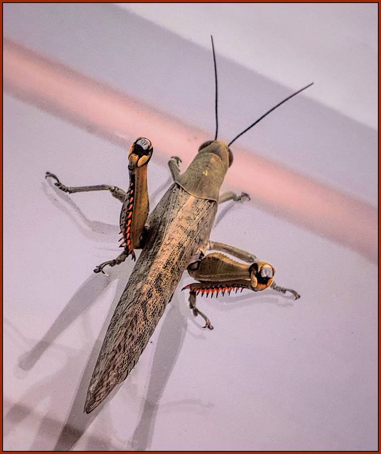
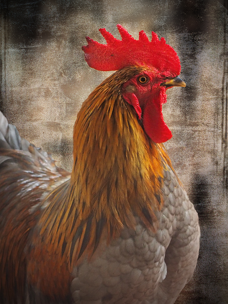
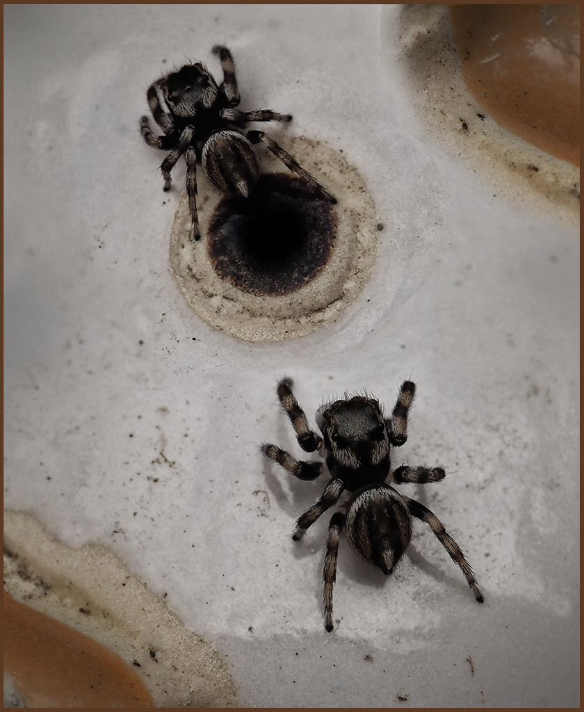
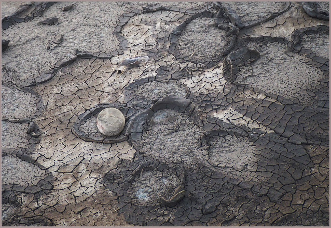
Comment |
You did really well to capture your 'critter.' Lovely and sharp and great contrasting colours.
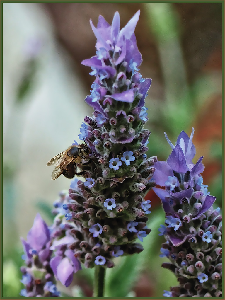
I think you could crop this, particularly from the bottom to get rid of the chomp out of that large leaf. You are immediately drawn to the critter so he is always going to be the centre of attention so I think try cropping it with him more in the centre. |
Feb 9th |
| 53 |
Feb 17 |
Comment |
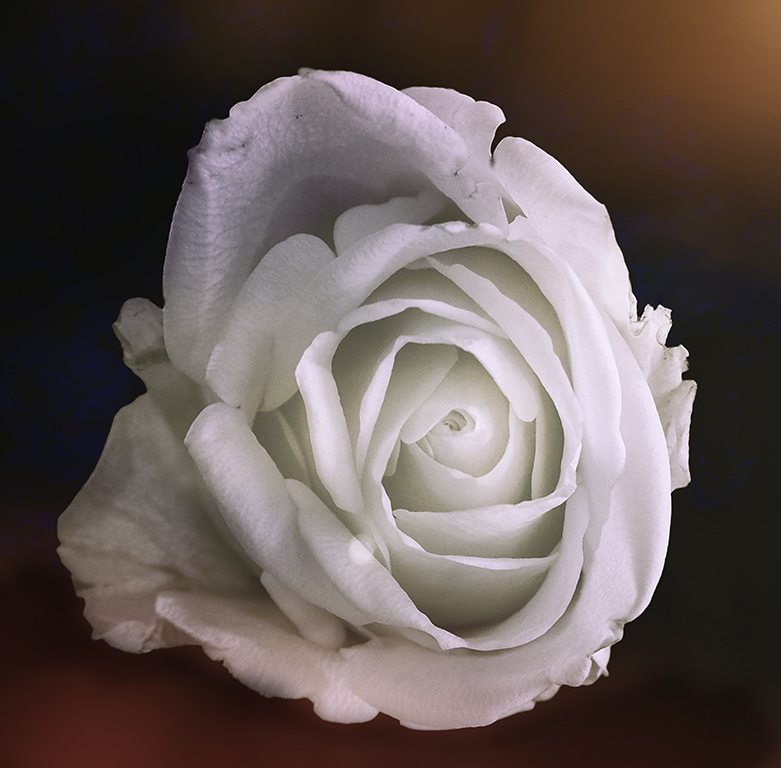
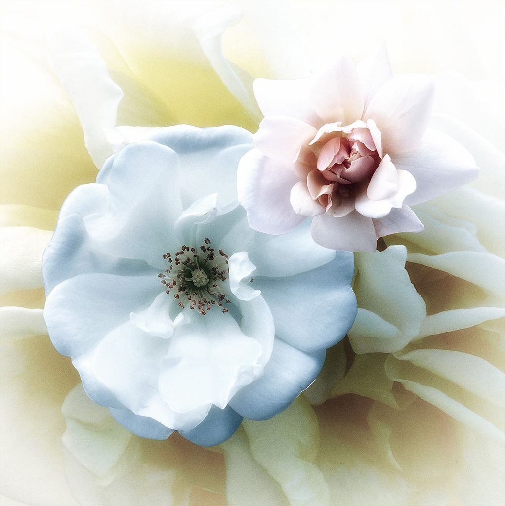
I love the vintage delicate effects used on the rose, but also love the snow on the rose and the colours in the original. Rose is a bit too blurred in the original to use as is though. |
Feb 9th |
| 53 |
Feb 17 |
Comment |
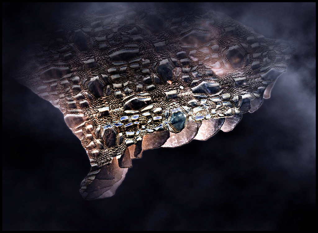
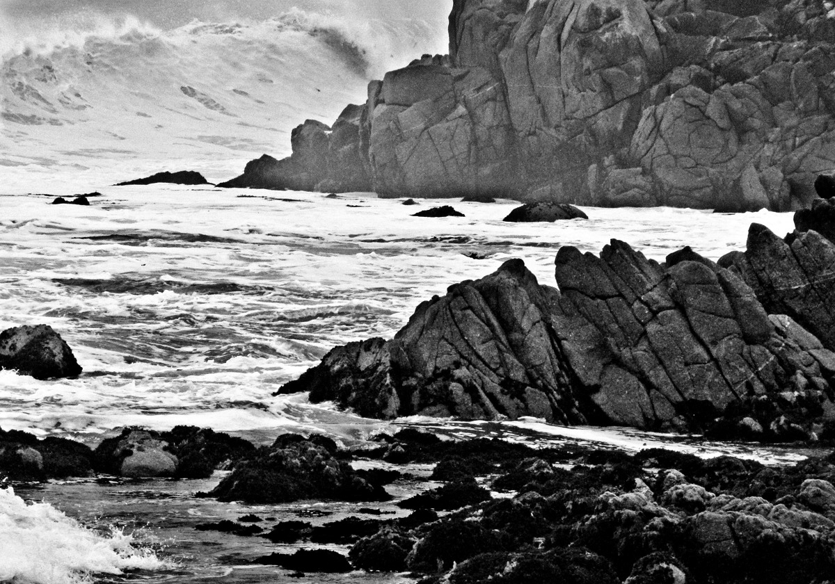
What magnificent waves. It was a good idea to convert it to black and white. I had a play with it to get back a bit more definition in the waves. I darkened the waves at the top and lightened the rocks a little. I copied the image and used the blend mode multiply to bring back the wave details. I masked the bits I didn't want to darken. Then I slightly lightened some of the rocks. |
Feb 9th |
 |
| 53 |
Feb 17 |
Comment |
Lovely portrait. I like the pose with her looking directly at the camera. Emphasises those big eyes. Good idea to keep it natural. |
Feb 9th |
| 53 |
Feb 17 |
Comment |
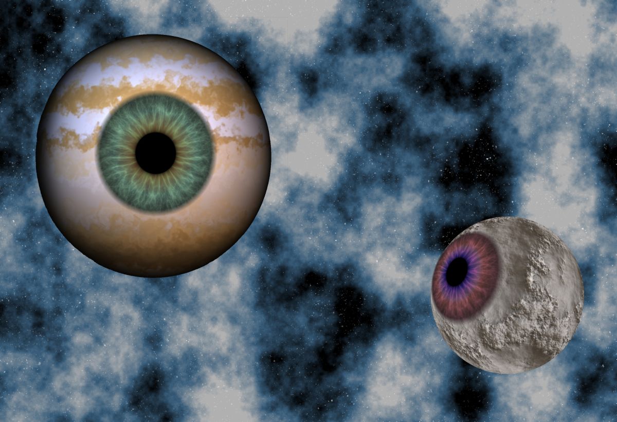
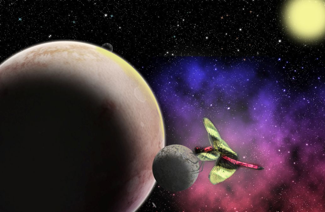
These space scenes look like so much fun. Great idea to use insects. I coloured in the dragon fly as an option and used content aware scale to bring the sun in a bit closer. Might be a bit too bright though. |
Feb 9th |
 |
6 comments - 0 replies for Group 53
|
11 comments - 1 reply Total
|