|
| Group |
Round |
C/R |
Comment |
Date |
Image |
| 4 |
Feb 25 |
Comment |
Thanks Bill. That is a good constructive comment. I will make a change to it before the 24th when the four chapters exhibition closes. I did by the way already warmed it up a bit. |
Feb 18th |
| 4 |
Feb 25 |
Reply |
Ian, thanks for sharing that poster. You should get a copy have it framed and hang it in your study. What a great compliment. We look forward very much to your next photos. |
Feb 11th |
| 4 |
Feb 25 |
Comment |
Bill, a very interesting shot. I love the bright colors from the stained glass and the pattern of the roof panels. As I gaze into it, it reminds me of a child's Kaleidoscope. I was also thinking that it might be very interesting to see something like this printed onto a 3-D surface. Almost "a church turned inside out." Thanks for sharing. |
Feb 10th |
| 4 |
Feb 25 |
Comment |
Just an awesome picture! Your talent really shows through. There is nothing I could add to improve upon what you have done. A combination of good skills in capture and post work. Congratulations on having an image chosen for the world museum event. I can't wait to see what you get in the next two shoots. All the best. |
Feb 10th |
| 4 |
Feb 25 |
Comment |
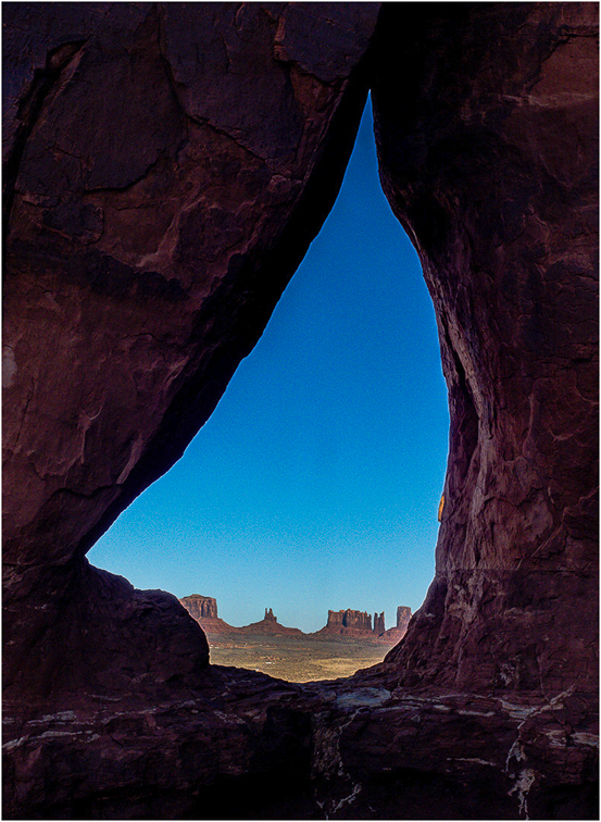
Erik, I like the image composition. I feel that th optical balance between the "natural vignette" of the slot canyon and the monuments in the background will truly [ull the viewers eye to the monuments and hold it there. I have done something a bit different. I brought out just a bit more detail in the canyon rocks, less I think than Isaac. Then I used "Clarity" and "Contrast" in On1 to bring out the monuments and ever so slightly decreased the exposure (-1/3 stop) of the sky. This is what I got. |
Feb 10th |
 |
| 4 |
Feb 25 |
Comment |
Guy, I really like the detail that this image contains. It gives the viewer much to look at and think about. One small change, for those of us in the western hemisphere. Our eyes tend to move through the image from left to right. For me the original causes some distraction as my eye wants to back up into the archway. I did not take the time to flip around the words "big easy" but I did flip the image left to right. At least for me it makes it more pleasing to the eye. |
Feb 9th |
 |
| 4 |
Feb 25 |
Comment |
Vella, great work in post-processing. From the images I found online the blue seems to be correct but to me the orange seems to be overly-saturated. He looks to me to truly have the breast colors of an American Bluebird. None-the-less very striking. |
Feb 7th |
| 4 |
Feb 25 |
Comment |
Good Morning Isaac. For me the leading lines on this image really help the viewer's eye to be drawn in and held. I (Mr. Symmetry) also like the shorter lines on the right as they tend to make my eye move left to right and follow the traffic. To my eye the bright lights in the background draw me in further and present a "cornucopia of color" for the eye to feast on. Nice shot.
Let's try to shoot Wakodahatchee sometime this winter. Let me know what your schedule looks like. |
Feb 7th |
| 4 |
Feb 25 |
Reply |
Erik, thanks for the comments. Yes, I have actually considered that and done it, but as you said, just a tad. I want to try this in nature competition and of course you have to be very very careful with anything like that. I might try a slight additional global warming. |
Feb 5th |
8 comments - 2 replies for Group 4
|
8 comments - 2 replies Total
|


