|
| Group |
Round |
C/R |
Comment |
Date |
Image |
| 4 |
Aug 24 |
Reply |
Thanks again. I did put a mask over the lower part and darken it somewhat before resubmitting it to the PSA Exhibition which closes today. |
Aug 8th |
| 4 |
Aug 24 |
Reply |
Bill, you have a good eye. I went back and checked all of the the original .dng images. The lower portion of the tower is lighter on every image. I suspected this as I did not lighten just the lower portion. Studying the image I am guessing that the morning sun is reflecting off of the far side of the red-brick building and throwing some light onto the base of the lighthouse. The question, based on your longtime experience is this. Even though the lighter area is real, should I darken it for a PIDC entry? Obviously I would not for PT. Thanks for you input. |
Aug 8th |
| 4 |
Aug 24 |
Comment |
Guy, I grew up with our closest friends being dairy farmers. We carried the full milk
Pails into the creamery. We used hooks to pull the hay bales out of the baler and stack them on the wagons,�� So you and I could probably share some similar memories. Thanks for sharing. |
Aug 6th |
| 4 |
Aug 24 |
Reply |
Ian, I put the picture in the Photoshop and use the lection tool and the magnetic lasso to get all of the parts of the halo and its post. I did not worry about getting any of the surroundings in since the background is very uniform once I had it selected, I enlarged it by three pixels and feathered it by three pixels. I then made a new layer via copy. I moved the new layer to the left and then erased most of its base so that the original base which started in the center was being used. I then cloned in from the left on the feathers to make it the same length as the feathers on the right. Then I flattened it. I hope that helps if not bounce back and I will try to give you more detail, or better detail. |
Aug 6th |
| 4 |
Aug 24 |
Comment |
Thanks Guy! |
Aug 6th |
| 4 |
Aug 24 |
Comment |
Guy, I grew up with our closest friends being dairy farmers. We carried the full milk
Pails into the creamery. We used hooks to pull the hay bales out of the baler and stack them on the wagons,�� So you and I could probably share some similar memories. Thanks for sharing. |
Aug 6th |
| 4 |
Aug 24 |
Comment |
Guy, this is a very nice shot. I think that one thing you didn't mention was the variation in the people and in their outfits, which seems to add to the image as well. I don't know if you ever got to the Palouse area of Washington state in your travels in the US. But this overlook reminds me of that. I wonder what this scene might look like with a variety of people in the fall near Sunset when you might get some outstanding colors across the valley? |
Aug 5th |
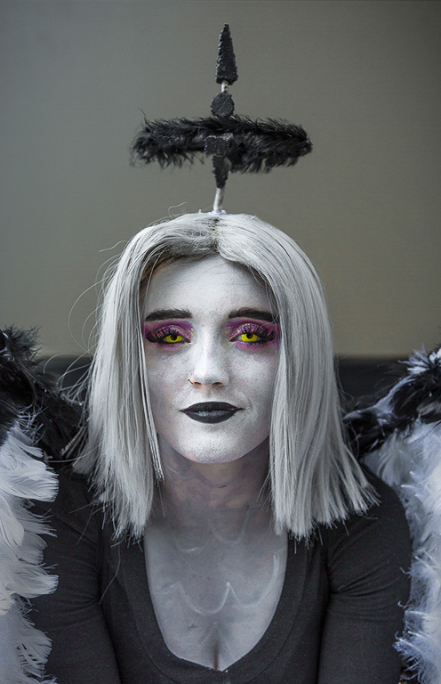
| 4 |
Aug 24 |
Comment |
Ian, I would not suggest cropping because the Halo is an important part of the image. I put your Final into PS and rebalanced the halo a bit making the two side more even and moving it a bit to the left. A very quick job but here is what I got. BTW, I think I like the original. For me, it creates more of a story - who is this young lady? Why is she dressed that way? etc. |
Aug 5th |
 |
| 4 |
Aug 24 |
Comment |
Erik your patience is commendable and your composition exquisite. They didn't do you and favors by moving you back another 20 yards. And I suspect that you did not do yourself any favors by using the (what I'm guessing is) digital internal 1.25 extender. I would be pretty sure that all it did was crop the sensor and you could have done that in post.
These least terns are difficult to get in a "great image" because of the black eye inset in the black cap. I have at times overly sharpened (nobody can tell) and reduced contrast to bring the eye out more.
I am still very much looking forward to shooting chicks with you in the future. Hope you made out ok with Tropical Storm Debbie. |
Aug 5th |
| 4 |
Aug 24 |
Comment |
Wow Bill, I like this even better than last month's image. Where the biuilding shadows were a bit of a distraction for my eye last month, the centered shadow in this image for me adds to the interest, I also feel that your capture with a line coming directly out of the lower left corner also adds the the quality of the composition. For me the street signs add to the image as well. Absolutely no suggestions for improvement. Well done! |
Aug 3rd |
| 4 |
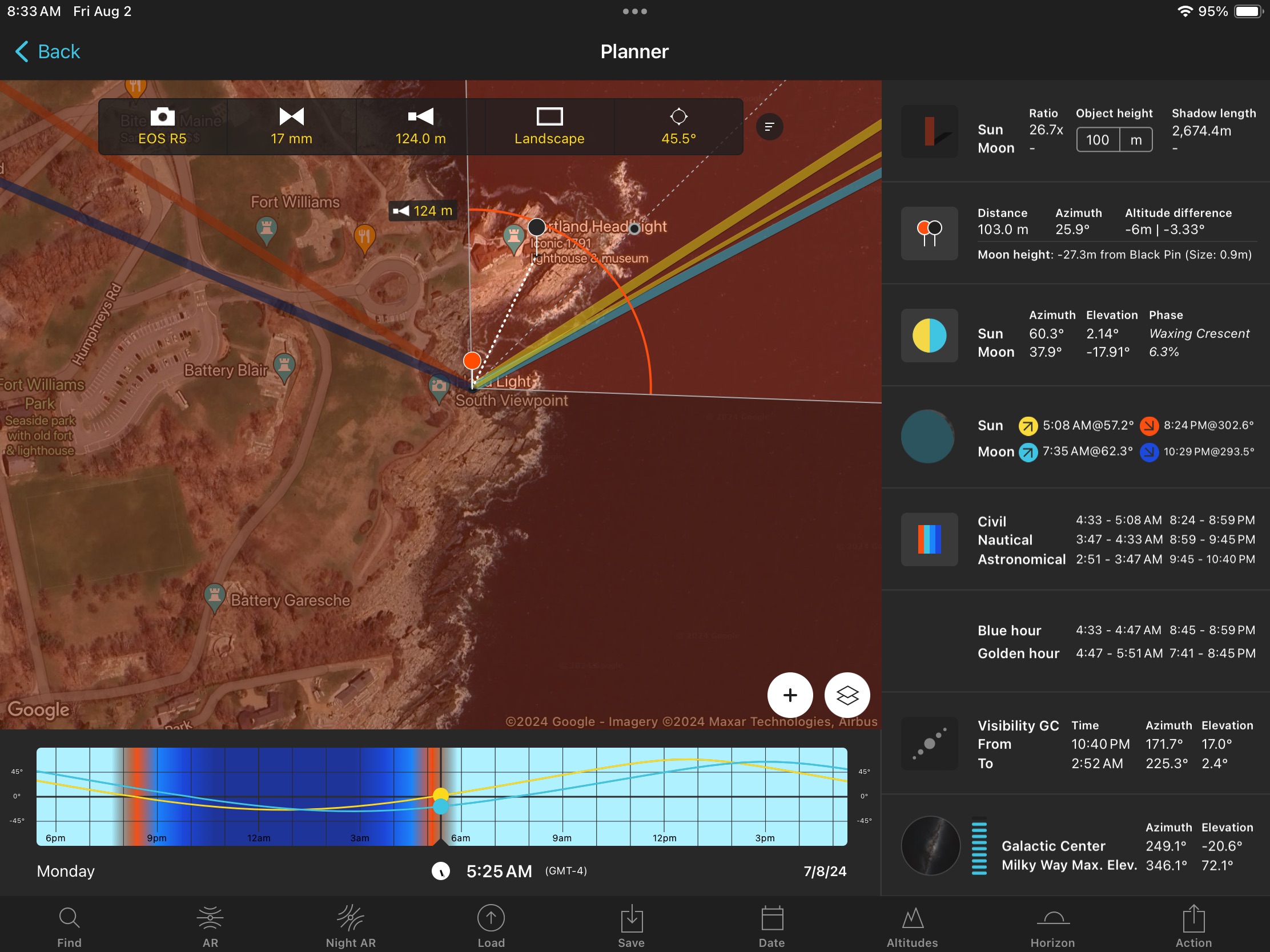
Aug 24 |
Comment |
I thought I should also add that this entire shot was set up before hand using PhotoPills, an extremely valuable planning tool. Here is a screen snap of the PhotoPills plan. |
Aug 2nd |
 |
| 4 |
Aug 24 |
Comment |
Vella, to me this has interest as I have only seen these little critters once in my life. I think that you did an excellent job in capture getting the fine details of the animals in sharp focus. Honestly, either the original or the final work for me. Thanks for sharing. |
Aug 2nd |
| 4 |
Aug 24 |
Comment |
Isaac, a very interesting and unusual picture. I think you had a good eye to spot this one. AS you described I agree that the silhouetted spectators add to the total image and do not distract from the focus point - the surfer.
I know that you no longer enter Exhibitions, but if you were I would suggest two small changes. For me I would put this image into PS and "pull" all the lower left/right lines to horizontal. I don't think that would noticeably impact the sign letters at the top. I might also darken the right arm or hand of the spectator on the left as it is the only piece not in silhouette. |
Aug 2nd |
10 comments - 3 replies for Group 4
|
10 comments - 3 replies Total
|


