|
| Group |
Round |
C/R |
Comment |
Date |
Image |
| 2 |
Feb 24 |
Comment |
Jim, my response and his were different. He cropped the nowel post out, and as a result, he lost that part of the image. I cloned the cloned post out and this retained that part of the image.
|
Feb 8th |
| 2 |
Feb 24 |
Comment |
Jim, this is to me a very interesting shot with nice lines and high potential. The exposure and DoF are well done. To my eye the colors look very real.
From my experience there are a few things that can add to any shot that features architecture. Among this are 1. Make the eye run left to right into the image (in western culture this is our nature.) 2. Try to reduce or eliminate bright spots and distractors at the edge of the image. 3. Use contrast to your advantage to highlight the structure you want to eye to fix on.
In the VF I have (quickly) flipped the image and removed the newel post top in the corner. I selected the sky (again quickly) and reduced the exposure as much as possible w/o having it gray-out on me. I selected the spiral stairs in the back and added contrast. I then adjusted the white point and black point. If I had more time I would have tried to also eliminate the window that is now in the lower left. The VF is what I got. |
Feb 8th |
 |
2 comments - 0 replies for Group 2
|
| 4 |
Feb 24 |
Reply |
Erik test number 2 |
Feb 25th |
| 4 |
Feb 24 |
Reply |
Test note to trigger a connection |
Feb 25th |
| 4 |
Feb 24 |
Comment |
Thanks Bill! |
Feb 10th |
| 4 |
Feb 24 |
Comment |
They look like evil personified. One could imagine this being the devil and his "hit woman." I think the lighting is well done, minimum shadows. to me the exposure together with post processing is good at managing both the shadows and the highlights |
Feb 9th |
| 4 |
Feb 24 |
Comment |
Nice image and a good tribute to a great hockey player. It is amazing what "stitching" has done for landscape photography. You didn't say it but I assume you shot in manual mode so that all exposures were equal and uninfluenced by the direction to the sun of any one shot. Looks like there's another opportunity when complete to shoot it at sunrise or sunset if you can get the right angle on it. |
Feb 9th |
| 4 |
Feb 24 |
Comment |
|
Feb 7th |
 |
| 4 |
Feb 24 |
Comment |
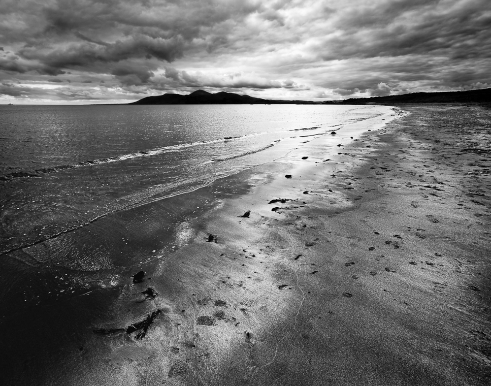
Guy, I probably played too much but here is what I did. (I would add that I prefer most landscapes as horizontals so I left it that way.)
I removed a number (6-0) offending dark spots from the lower right and then cropped in the 11 x 14 from the lower right a bit. I then moved it to LR where I used a linear gradient to ever s slightly lighten the sky. I used a separate set of linear gradients to lighten just the water and reduce contrast to better see the fine waves. I then burned a few hot spots on the water right at the beach. I "tailored" the rocks going up the beach to hopefully draw the viewer's eye up that line.
Forgive me. Once I got started I couldn't stop. |
Feb 7th |
| 4 |
Feb 24 |
Comment |
Just looked at it again, and would say you don't want to get the bright water in the mid right side too close to the right edge |
Feb 7th |
| 4 |
Feb 24 |
Comment |
I think that's a possibility, but I would bring it in from the lower right corner taking a little bit out of the right and the bottom to maintain the perspective. Give it a try and let me know what you think. |
Feb 7th |
| 4 |
Feb 24 |
Reply |
Thanks Guy. I will adjust per the second variation |
Feb 7th |
| 4 |
Feb 24 |
Comment |
Guy, thanks for the feedback. Good point I actually have switched to another picture that I think is better. It's a little higher Rez so I'll send it to you in an email. If you want, let me know what you think of that one as well - Either through DD four through email. Thanks. |
Feb 6th |
| 4 |
Feb 24 |
Comment |
Guy, I feel that you have dramatically improved this image by converting it from color to monochrome. To my eye you seem to have covered the entire tonal range in this image. I believe that the background is a bit stronger than the foreground. As such, I might suggest thinking about cropping up from the bottom to remove some of the beach. I don't know and would have to play with it to fully appreciate, but you might want to remove some of the dark spots on the beach. To me the ones near the water are OK but the ones further to the right can be a distraction. Just a thought. Hope all is well! |
Feb 6th |
| 4 |
Feb 24 |
Comment |
Erik, thanks for sharing this unusual bird and the attached article. I was very interested to learn more about the root causes of unusual bird coloration. I am sure this is a bird you will never forget. Please give my best to your wife and let me know how she makes out with her surgery. |
Feb 6th |
| 4 |
Feb 24 |
Comment |
Very well composed image Isaac. My eye comes in from the left to right but ends at the two rocks in the foreground. To me they provide a great fixation point. The colors - reds and yellows work well together. The light in the closest part of the foreground, in my opinion helps add depth to the image. One possible minor adjustment might be to give the large rock of the right a bit of a "burn" (just a tad) so that it has as much definition as the rock on the left. Thanks for sharing. |
Feb 3rd |
| 4 |
Feb 24 |
Comment |
Very interesting picture. To me it is amazing to see the bird taking on a fish that large. I agree with Isaac's comments; it would have been nice if you could have gotten more light and definition out of the background. |
Feb 3rd |
12 comments - 3 replies for Group 4
|
14 comments - 3 replies Total
|


