|
| Group |
Round |
C/R |
Comment |
Date |
Image |
| 4 |
Jan 24 |
Comment |
Awesome picture Isaac. In my opinion a very strong foreground, mid, and backgrounds. I feel that the colors are very soothing to my eyes. The sharpness of the foreground keeps my eye right there. The softer silhouetted trees add depth but do not distract. Looks like this was a real adventure. If you are a reader, check out "The Lioness." |
Jan 9th |
| 4 |
Jan 24 |
Comment |
Bill, that was a grand tour of some of my favorite post-processing tools. I have used DxO Pure Raw 3 with images shot at ISO 12800 and it is remarkable what that program does to improve those low light images. I used Photomatix Pro through V6 but stopped because the HDR's were too saturated. I went back to doing any HDR's in LR Classic. Did you find this with prior versions and if so is V7 better? To my eye this particular image looks spot on - the saturation is natural. Your Vignette is not obvious and wouldn't have noticed if you hadn't told me, so well done there. You know I like churches so really enjoyed this image. |
Jan 9th |
| 4 |
Jan 24 |
Reply |
I didn't want the sky to be as blue as you saw it in my VF. I thought I had pulled the saturation back to where you had it but I guess not. I think your saturation is correct. |
Jan 8th |
| 4 |
Jan 24 |
Reply |
That is why I didn't say to increase exposure, just reduce contrast. |
Jan 8th |
| 4 |
Jan 24 |
Comment |
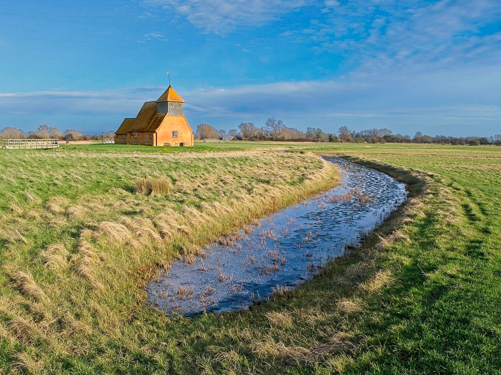
Guy, I am not a big fan of making every image better by cropping it. My first thought was to use PS to extend the ditch to the corner of the image. As I contemplated it more I felt that would only cause the viewer's eye to drift out of the image. Bottom line - to my eye your composition is good and I would not change it.
I feel that the exposure and the sharpness are very good. The ditch leads my eye to the church. From my experience the sky is not holding up its end of the deal. In the VF I have increased the contrast and decreased the exposure on the sky (while not allowing it to become over saturate.) I also tweeted up the contrast on the church. let me know what you think. |
Jan 8th |
 |
| 4 |
Jan 24 |
Comment |
Ian, to me this is an interesting image that really made me stop and think. I feel that it is sharp with great exposure and colors. To my eye it would be better if you had the entire left hand, HOWEVER, I would not crop out what is there. I believe that the red "blood" on the hands adds to the story. As I consider the photo I think it would have been perfected had she given you a sinister look to go with the bloody hands and the red hair. Your photos are great because they frequently make me think about the image. Keep shooting! |
Jan 7th |
| 4 |
Jan 24 |
Comment |
Erik, I have since (Isaac's comment) lightened the foreground as you have done. I keep looking at it though and I do not like a crop that tight on the sky. I brought it down a bit but not that much. Will see how it does in a European PT PSA Exhibition. |
Jan 7th |
| 4 |
Jan 24 |
Comment |
Vella, I will go the other way from the group. In western hemisphere we read from left to right and that is the way our eyes travel into a picture. For me in your current image I firs see the face of the heron and the catch. My eye simply stops there and I don't have to look at the "butt" of the bird. I went back and checked and virtually all of my PSA Bird acceptances are facing this direction. The other suggestions for cropping and brightening are in my mind good ones. |
Jan 7th |
| 4 |
Jan 24 |
Comment |
Erik, you are right, the look on the fishes face tells the story. The only suggestion I might make from my experience would be to make the Skimmer's eye stand out a bit more. What I often do is use a LR Radial filter on the eye. I first sharpen a bit and then reduce (yes that's right) contrast. This tends to that white gleam in his eye stand out more.
I am in Florida now and very much looking forward to our first outing. |
Jan 7th |
| 4 |
Jan 24 |
Reply |
Guy, my thoughts align with yours exactly. Thanks for reconfirming. |
Jan 5th |
7 comments - 3 replies for Group 4
|
7 comments - 3 replies Total
|


