|
| Group |
Round |
C/R |
Comment |
Date |
Image |
| 4 |
Mar 23 |
Comment |
Erik is having some computer issues so I have agreed to upload his input and VF.
Isaac-This is a strong mono image Isaac, the hues of black to white offer anticipation, mystery and emotion to the viewer. Good structure definition as well. The difficult problem to overcome are the three hot spots. My attempt to soften them. Bridge-Camera Raw Filter, white slider to the left, then Quick Selection Tool, one area at a time, then lower the brightness to your liking. Hope this helps |
Mar 19th |
 |
| 4 |
Mar 23 |
Reply |
That picture of Pittsburgh was shot from Mount Washington. It's an easy ride up to Duquesne incline, and a great view from the top especially during the Three Rivers Regatta. Thanks for the compliment. |
Mar 17th |
| 4 |
Mar 23 |
Comment |
Guy, to my eye the image is properly exposed, has good DoF and color balance. I also feel that the consistency of the diagonal lines works nicely against the more casual lines of the sculpture. From my experience the glass sections top and bottom are distractions to the eye that makes it more difficult for me to fixate on the sculpture. |
Mar 12th |
| 4 |
Mar 23 |
Comment |
Isaac, I would take the finished product and overlay it with the one that has the softest edges on it, and then slowly with a soft brush, blend the two of them to ease the significance of the line at the edge of the light. The impact of the HDR can be overcome. I would suggest trying this in Photoshop. I've had success with this in the past. |
Mar 9th |
| 4 |
Mar 23 |
Comment |
Isaac, to my eye the composition of this image, two light beams one each side of the table, is exceptional. The contrast you have chosen seems to cover the spectrum from near-total whites to full blacks. From my experience the one "touch" that might improve the image would be to soften the edges of the lighted squares on the floor. Nice work. |
Mar 8th |
| 4 |
Mar 23 |
Comment |
VELLA, THANKS FOR YOUR POSITIVE COMMENTS. IN "NATURE" COMPETITIONS NO REMOVALS VIA CLONING ARE PERMITTED. THE IMAGE QUALITY HAS TO GET BY ON THE STRENGTH OF THE STORY OVER THE DISTRACTIONS. FOR "COLOR OPEN" COMPETITION THAT WOULD BE ALLOWED. |
Mar 8th |
| 4 |
Mar 23 |
Comment |
I see a ballerina up on her toe and spinning as she dances. Her right arm is in front of her body and the left behind as she sling counter clockwise. The light is catching her left eye as she looks for her exit spot for the spin. Her long hair has been blown up by an offstage fan and is lifting and floating as she turns.
Obviously a good and provocative shot that draws the viewers' eyes in and stimulates the imagination. |
Mar 8th |
| 4 |
Mar 23 |
Comment |
Bill, for me the output of this software is very pleasing to the eye. I believe that you did an excellent job of choosing the original that would work well in that software. I do wonder though if there are ways to modify what seems to be the "brushstrokes?" My eye seems to pick up patterns in 3-4 places that would not be as random as a true painting would yield. Thanks for sharing the information and the rendition from this software. |
Mar 7th |
| 4 |
Mar 23 |
Comment |
Erik, this is a great action shot captured razor sharp at the 1/3200 sec shutter speed. For me the quality of the image is enhanced by the eyes of everyone in the background watching the rider and horse. Like Stuart I thought about the crop but think that his result is cropped too tightly and loses the gaze of the young girl at the left end of the gate. From my experience she brings balance to the image left to right with the young man on the other side. Nice shot! |
Mar 7th |
| 4 |
Mar 23 |
Comment |
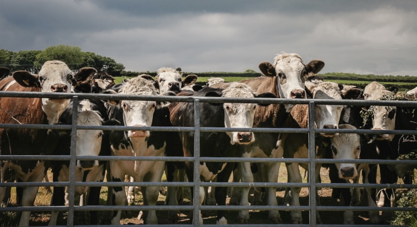
Vella, having grown up helping on a dairy farm this image brought back quite a few memories. - from milking cows by hand to the infamous game of "cow tipping." I spent a few moments pondering what this group was thinking which probably wasn't much as their processing power is not great.
I believe that the cows are the focus of your image so in the VF I have cropped in the unnecessary spaces left and right. To my eye the image seemed a bit fat so I also bumped the contrast and adjusted the black point a bit. |
Mar 6th |
 |
9 comments - 1 reply for Group 4
|
9 comments - 1 reply Total
|


