|
| Group |
Round |
C/R |
Comment |
Date |
Image |
| 4 |
Nov 22 |
Comment |
To me this image has nice color, great balance and excellent sharpness. The composition allows the viewer's eye to move into the image and down through the cascade. From my experience I might have looked at a bit longer shutter speed to allow the middle and lower falls cascading water streams to extend down a bit further. If this softened the upper falls too much I would have blended two images to get each falls as I wanted them. |
Nov 9th |
| 4 |
Nov 22 |
Comment |
This really tells a good story. From my experience most people won't realize what the other bird is doing and he can be made to part of the story. Like Isaac I cropped but unlike Isaac I moved our second friend closer to the hydrant to make him more a "engaged." I also believe that it gives the image more left to right balance. |
Nov 9th |
 |
| 4 |
Nov 22 |
Comment |
Ian, I loved this picture from the moment I opened it. Many people oversaturate a picture to draw the viewer's eye and then there is not much else left to consider in the image. But this one - saturation makes the image better! For me I like the balance of the straight lines of the wall with the curved lines of the wheel on the bike. I think this is a great combination. Given that this is a 1M JPEG image, I am guessing that the original is tech sharp in every respect. My experience at first told me that I wanted to crop it some from the right. But after studying it I think it is best as it is. Nice work! |
Nov 8th |
| 4 |
Nov 22 |
Comment |
Isaac, to me this is a great Photo-travel image - whether or not it meets the PSA guidelines. To my eye the original is better than the crop. For me the red pickup is part of the story as all agree. However, to my eye the partial crop of the black SUV is much more distracting than the entirety of the red pickup. I believe that the image is also better balanced right to left with the red pickup truck in the image. |
Nov 4th |
| 4 |
Nov 22 |
Comment |
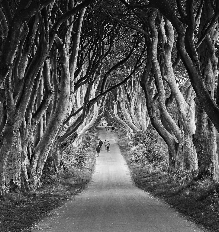
Guy, for me the lines of the path leading into the picture and the "weaving" trunks of the trees create a great composition. I did find that the lighter areas on the right and the very dark path in the foreground were not allowing my eye to flow into the picture and toward the walkers.
In the VF I darkened some spots on the right and then pulled that edge in ever so slightly. I did that with a simple brush filter in LR Classic. For the path I put in a linear gradient and then subtracted the banks on either side and lightened. (Also in LR Classic). Here is what I got. |
Nov 3rd |
 |
| 4 |
Nov 22 |
Reply |
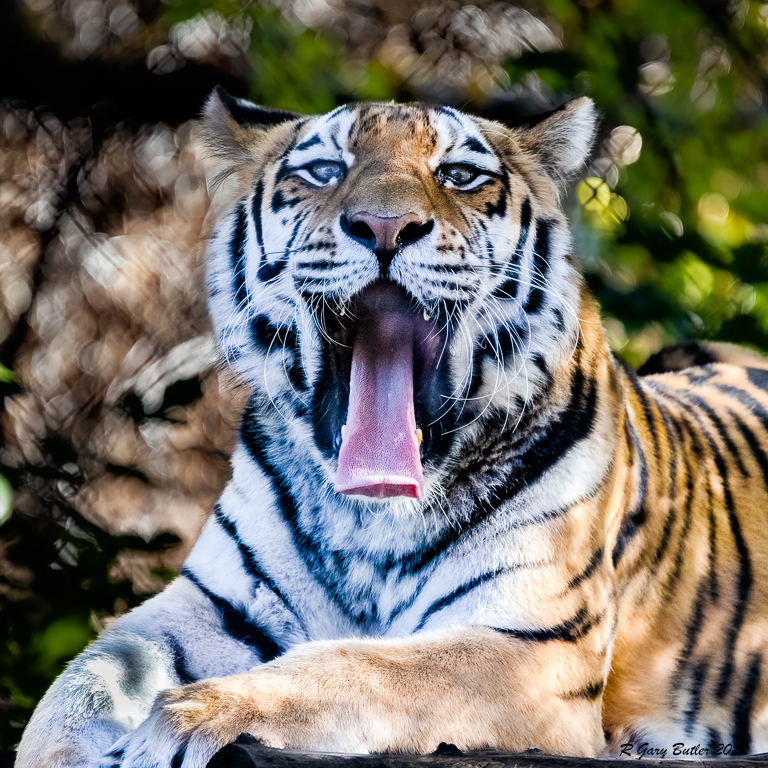
Isaac, thanks. Followed your lead but did the White Neutralizer in Color EFEX Pro 4 and also added Tonal Contrast. This is what I got. |
Nov 2nd |
 |
| 4 |
Nov 22 |
Comment |
Guy, first thanks for all the work. I will take a deeper look into the techniques you used. I always want to understand more about Photoshop. But I also believe the new masking in Lightroom classic may allow me to do the very same thing. Not sure if I like the brighter face, but again will have to study that. Either way I've learned something from your response and I think that's the intent so thanks again. |
Nov 1st |
6 comments - 1 reply for Group 4
|
6 comments - 1 reply Total
|