|
| Group |
Round |
C/R |
Comment |
Date |
Image |
| 4 |
Aug 22 |
Comment |
That is a very interesting change. I like it. Thanks for the suggestion |
Aug 25th |
| 4 |
Aug 22 |
Comment |
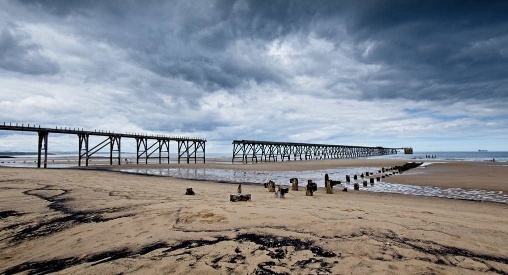
Well I looked at this for a good 10 minutes. The first time I looked at a new photo and tried to re-crop it I was inclined to tell you that the first one was better. I didn't like the left to right balance that I was getting. I download the new Image again and this time turned it into a Panorama. For me this looks best.
Like your first one I've taken some of the black sky out of the image. I think the old and new piers in this version make strong leading lines. And to my eye the end of the pier holds my eye in the image. What do you think? |
Aug 12th |
 |
| 4 |
Aug 22 |
Comment |
On this image I like the 50-50 balance of the blue sky in the brown shore. I also like that the dark line lower left comes directly out of the corner. |
Aug 12th |
| 4 |
Aug 22 |
Comment |
Well I looked at this for a good 10 minutes. The first time I looked at a new photo and tried to re-crop it I was inclined to tell you that the first one was better. I didn't like the left to right balance that I was getting. I download the new Image again and this time turned it into a Panorama. For me this looks best.
Like your first one I've taken some of the black sky out of the image. I think the old and new piers in this version make strong leading lines. And to my eye the end of the pier holds my eye in the image. What do you think? |
Aug 12th |
 |
| 4 |
Aug 22 |
Comment |
Very interesting image Guy. I looked at it awhile before deciding how to comment. For me, Isaac's comment is spot on - that is, I thought to crop some sky but in the end I believe it is a strong portion of the image. For me, I especially like that it ends in blue sky on the right. I feel that the rotted pilings of the old pier give the foreground character. To my eye the area for improvement would be that the intended "fixation point" (the end of the pier) is too close to the right edge of the image. For me, the eye doesn't hold there and drifts out the right side of the image. |
Aug 11th |
| 4 |
Aug 22 |
Comment |
Ian, from my experience your capture work has three exceptional attributes. To me these are (in no particular order) the soft green background with no bright spots to distract the viewer's eye from the subject; the sharpness on every bit of the flower and; the drops of water on the petals. I believe that Isaac's suggestion to crop away some of the dead space is a good one. The placement of the subject at a 2/3rd's point in my opinion, also improves the image. Let me know how this does in "Nature" exhibitions. Nice Work! |
Aug 9th |
| 4 |
Aug 22 |
Comment |
Bill, the original composition is good - I feel it tells a story and invokes feelings that we all have had walking those same boardwalks. I think that you have made an excellent improvement in the original image.
I also liked what Isaac did and in my VF lightened the overall image, especially the couple. I added one more twist from the "Architectural" standpoint. I distorted the right side railing so that it also ran to the new (shortened at the bottom) corner of the image as the left side does. |
Aug 8th |
 |
| 4 |
Aug 22 |
Comment |
Thanks for the comments and the improved contrast on the black-and-white image. I think that works well. Will adjust mine and see how it does in Exhibitions. |
Aug 8th |
| 4 |
Aug 22 |
Comment |
Beautiful shot Erik and wonderfully composed. For me the two outstanding traits are the balance between the two owls and the soft green backdrop of the foliage. I like the sharpness of the feathers and the eyes. Nothing to say but "well done."
Let me know how this does in Exhibitions. |
Aug 4th |
| 4 |
Aug 22 |
Comment |
This is a nice action shot of the Cormorant fishing. Very unique! Too bad you could not have gotten closer. From my experience when I take pictures of moving birds I start with an ISO no less than 1600. This may have given you more light for the capture. |
Aug 4th |
| 4 |
Aug 22 |
Comment |
For me those two changes make a significant differences. I feel it is now much more pleasing to the eyes and holds my view on the barn. Well done! |
Aug 3rd |
| 4 |
Aug 22 |
Comment |
Isaac, to me the idea of framing the barn with the fence is creative. As I observe the image it seems that you have well chosen the camera settings to get the fence and the barn both in sharp focus. I believe that the color and the contrast of the barn and the trees add to the image.
From my experience I feel that the amount of the fence you have chosen to include together with the "featureless" sky creates too much dead space in the image. I wonder if this might be a good candidate for sky replacement and/or showing more of the fence to make it a foreground object. |
Aug 2nd |
12 comments - 0 replies for Group 4
|
| 88 |
Aug 22 |
Comment |
Charle, nice shot with great perspective and lines. I feel that you did an excellent job in post with the contrast. To my eye I would remove the wall light and dark box near the lower edge of the image. To me they are a bit of a distraction. Nice shot! |
Aug 29th |
1 comment - 0 replies for Group 88
|
13 comments - 0 replies Total
|


