|
| Group |
Round |
C/R |
Comment |
Date |
Image |
| 4 |
Nov 21 |
Comment |
Bill, thanks for sharing. To my eye this is an outstanding image and one that I would love to look at for a month on my calendar. I feel that the composition is superb with the rectangular buildings, the near triangular shape of the carousel with the "softer" shape of the tree between. To me the DoF is spot on and the colors realistic. I happen to like the open space at the bottom. Nice Job! |
Nov 13th |
| 4 |
Nov 21 |
Comment |
Guy, to me this is an interesting idea and could be developed further. It shows a creative mind to see the value of the reflection not just the people themselves.
I feel, however that as presented there is too much "open space" that isn't adding to the image. It's probably just me but I cannot figure out the intended subject as presented.
Please excuse the high crop in the VF, but for me something like this has a better subject focus. I'd call it "Feeling Out Of Sorts." |
Nov 13th |
 |
| 4 |
Nov 21 |
Reply |
Well done!! |
Nov 11th |
| 4 |
Nov 21 |
Comment |
Ian, this image shows a level of creativity rarely seen in the monthly DD submissions. Well done using the input from last month and the bravery to ask a woman in a coffee shop to pose for someone she didn't know.
To my eye you did a excellent job on the placement of your model over the underlying image and the amount of transparency of the underlying image. The suggestion to remove the jewelry was "spot on." Great job! |
Nov 10th |
| 4 |
Nov 21 |
Comment |
Isaac, thanks for sharing this image. I haven't looked at this monument since 1990 and thought it would have made more progress. Makes you wonder how capable the "heirs" are??
I like the way you positioned the real monument just in front of and below the "mock-up."
Also great for me to get a picture of three key members of DD4. |
Nov 10th |
| 4 |
Nov 21 |
Comment |
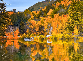
Vella, I love the bright colors of the image. They really draw the eye. for me it wants me to enjoy the entire image, scanning back and forth at the variations in the foliage.
What follows is a suggestion based on an experience that I had. Warning - my attached image is cropped so far that it is nothing more than a lot of pixels. But I felt it was the best way to demonstrate what I was saying.
Three years ago I shot a picture very similar to your own, but with a man spin casting from a small boat in the middle of the lake. Mine, like yours was a panorama. I submitted it to PSA exhibitions and could not get it accepted.
Just recently I saw an image taken at the same lake (it's local) That image featured just a small section of the lake. That person focused their image on a the bright foliage and its reflection. They took out the sky and its reflection. And it won a local contest. (Which of course can be very different from what wins in a national PSA exhibition.)
I cropped your to keep the boat and house in the image as a focus point.
Just another way to look at it. |
Nov 8th |
 |
| 4 |
Nov 21 |
Comment |
Erik, this is a great action image. I love the detail and the sharpness. For me this p[icture tells a story as I notice the the attacking bird has the talons out and the attacker is in a total defensive position.
Two pieces of information that would also be helpful to me are - What was the metering mode (Center Spot Weighted)? What was the focusing mode? On the 5D Mark IV I use 9 point for aerial birds. Not sure what the 7D provides. Thanks for sharing. |
Nov 8th |
| 4 |
Nov 21 |
Reply |
Ok, I am home now and able to look at the image on the larger monitor. On this version I have desaturated green a bit further. In addition I have changed the Hue for Green and Yellow and reduced the luminance on the Green as well. Unrelated I also put a radial filter on the door and increased contrast and exposure to help draw the eye there. This is where I am. |
Nov 8th |
 |
| 4 |
Nov 21 |
Comment |
My monitor is calibrated every month. But that aside I will keep looking at the image and try to get it right. Thanks for the feedback. Tomorrow my objective is to shoot the cars at Old Car City. Looking forward to that. |
Nov 4th |
| 4 |
Nov 21 |
Reply |
Isaac, thanks for the suggestion. In LR I desaturated the green significantly (-35). I desaturated the yellow slightly (-10) because to my eye the rock was a starting to lose its true brownish cast that this fieldstone has. What do you think? I always appreciate your constructive criticism. |
Nov 4th |
 |
7 comments - 3 replies for Group 4
|
| 52 |
Nov 21 |
Comment |
Sharon, this is an interesting dialogue. Just another "old guy's" input but here it is.
With respect to color balance I feel that you created an image that was true to what you saw as you stood there. Mike's is also believable but probably more like what some one would want to see on their wall - sharper, more intense colors.
At EK we often "tailored" 35mm films to a niche market (eg over saturated greens on summer consumer products so that everyone's burned out backyard still looked green when they showed pictures of their July 4th family picnic.)
For me, being true to what you saw is most important and I think this image can stand on its own with your original balance. |
Nov 10th |
1 comment - 0 replies for Group 52
|
8 comments - 3 replies Total
|


