|
| Group |
Round |
C/R |
Comment |
Date |
Image |
| 4 |
Oct 21 |
Reply |
Well, I think we'll just have to wait and see. I feel that the crop leaves the workers facing out of the image which is not necessarily good for artistic quality. I'm going to go ahead and leave them in and see how it does in the PSA competitions. But thanks for your suggestion. I'll let you know if I made a mistake by not listening. |
Oct 24th |
| 4 |
Oct 21 |
Reply |
Well, I think we'll just have to wait and see. I believe that the crop leaves the workers facing out of the image which is not necessarily good for artistic quality. I'm going to go ahead and leave them in and see how it does in the PSA competitions. But thanks for your suggestion. I'll let you know if I made a mistake by not following your suggestion. |
Oct 24th |
| 4 |
Oct 21 |
Reply |
Bill, I am sure that you are very experienced in PJ and Travel criteria in PSA exhibitions - probably even have multiple stars in that area. So here is my question. The people on the right are the people who will be going up in the balloon and the ground team is giving them their instructions. Per PJ criteria isn't that part of the story more important than improving "artistic quality" by cropping. As I am trying to venture into this area would greatly appreciate your thoughts in that regard. Thanks. |
Oct 22nd |
| 4 |
Oct 21 |
Reply |
Isaac, these templates were developed by Jim Welninski, a noted photographer from Chicago (the U.S. Mecca for architecture.) Has has many good videos on YouTube. Here is one though simplistic has had good results in Exhibitions. |
Oct 20th |
 |
| 4 |
Oct 21 |
Comment |
Erik, I lover the story this picture tells and the memories it evokes from living in PA, NY and OH always near Amish country. To me the buggy and the simple sign hold the eye and tell the story.
Even though it will disqualify the image for PF, I believe the story gets better when the utility pole is removed (see my VF.) I did that in PS. I also took the liberty of darkening the grass near the rode and darkening and adding structure to the road - all to bring out the horse and buggy more. I slightly sharpened the faces of the occupants. |
Oct 14th |
 |
| 4 |
Oct 21 |
Comment |
Bill, for me the colors and the brightness of this image are strong points. To my eye the leading lines are not strong enough to hold my eye at any one fixation point. In the VF I placed the image into Viveza and slightly decreased the brightness of the foreground grasses while increasing the contrast injury order to make stronger shadow lines. |
Oct 14th |
 |
| 4 |
Oct 21 |
Comment |
Ian, to my eye there is much of interest in this image - the various toned leaves and the variegated trunk. Similar to what Isaac did I worked to highlight the key elements by putting the image into Viveza 2 and using control points to brighten, add contrast and add saturation as each area needed. Then for the leaf on the bottom like Guy's I added some red. I then added a "Big Softie" Vignette in On1 Effects 2019. I believe this puts more focus on those key elements and lets the viewer's eye wander down through the leaves top to bottom. What do you think? |
Oct 12th |
 |
| 4 |
Oct 21 |
Comment |
Guy, thanks for sharing. I love symmetry and glass and feel that there is alot of opportunity in this image. To my eye I can accept asymmetry much more easily top to bottom than left to right in an image. For me Isaac's rotation holds my eye much better at the center of the triangle.
From my experience the architectural lines work even better when the emanate from the corners. I have attached a template that I picked up from an webinar that I overlay for cropping architectural shots. |
Oct 11th |
 |
| 4 |
Oct 21 |
Comment |
Vella, I believe that Isaac and Guy have provided quality suggestions so will not repeat. To my eye Guy's lighter image brings out much more detail in your dog's beautiful coat. |
Oct 11th |
| 4 |
Oct 21 |
Reply |
Isaac, thanks for picking that up. It's amazing how when I get so involved thinking about contrast and brightness and other technical details I can miss something as obvious as an amputated foot. Will make that change immediately. Thanks again. |
Oct 7th |
| 4 |
Oct 21 |
Comment |
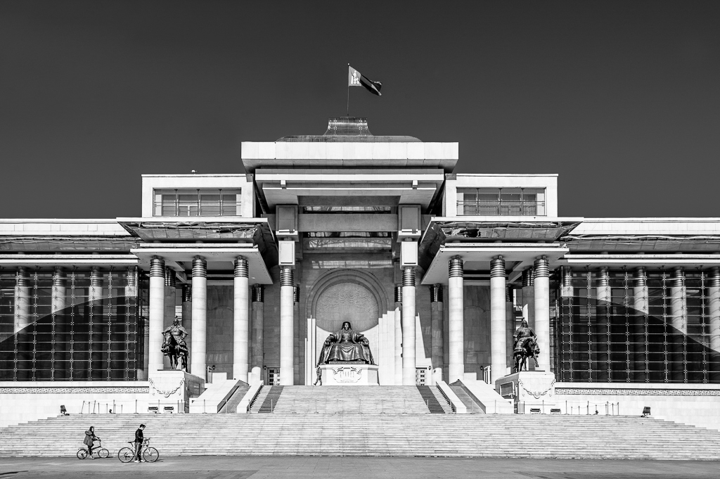
For me the strong point of this image is the symmetry and the strong lines of the architecture - including the curves on each side. I believe the sky is a distraction from that strong symmetry. For me that says "Try it in Monochrome." I made a quick conversion on LR and chose the BW Landscape preset. I did an inversion of the typical D/Log E curve in the heel of the curve and then used the blue slider to keep the sky darker. This is what I got. |
Oct 6th |
 |
6 comments - 5 replies for Group 4
|
6 comments - 5 replies Total
|