|
| Group |
Round |
C/R |
Comment |
Date |
Image |
| 4 |
Jul 21 |
Comment |
Vella, I really like this image - well done. Growing up in the Christian tradition there is something here that touches to me when I see sheep together with the church and the headstones. This image really speaks to me!
From a composition standpoint I believe you did an excellent job of placing the sheep (either in Capture or post work) where they could complement the fixation point of the church and add to it. In my opinion the mountains in the far background, and the coloration of the church roof also add to the quality of the image.
To my eye, the stonework of the church is a bit too sharp. In the VF I have backed it down a bit. I would echo Guy's comments if you are not using this for Travel.
Thanks for sharing this! |
Jul 11th |
 |
| 4 |
Jul 21 |
Comment |
Erik, when I enlarged this picture on my monitor it became obvious to me that you the fine details of the paddler and the kayak extremely well - very, very sharp. For me I love the way this contrasts with the softness and the "swirl" of the reflection in the water. I think that you have done a good job also with the Contrast as the back of the kayak is not too bright to cause any distraction and the left side is still bright enough to see all the details.
You obviously are a very accomplished photographer so I am curious and hope you can help me learn. If you intended to enter this image in a PSA Exhibition would have left the background shoreline in the image? If this is cropped would you have included more of the shore in the background? Or would you have eliminated it entirely? Thanks for any feedback you can give me. |
Jul 11th |
| 4 |
Jul 21 |
Reply |
Thanks Isaac. I noticed that as well. Very useful comment. I will make the adjustment and show you the result. Thanks for your help. |
Jul 9th |
| 4 |
Jul 21 |
Reply |
Thanks for the feedback Ian, will give that change consideration. I am always open to making adjustments. At this point I will see how it does in PSA International and then decide on other adjustments. I do appreciate the keen eye! |
Jul 8th |
| 4 |
Jul 21 |
Comment |
Ian, I love this shot for it's uniqueness. When it first popped up on my computer to post for you, my first thought was "Terminator."
I agree with Isaac that you have managed the background well. In my opinion it is both the (lack of) focus as well as the significant difference in brightness from the "hand."
To me this is not something I would enlarge and hang on the wall - BUT - it is so different I probably would keep A5 size on my desk somewhere.
Thanks for sharing. |
Jul 8th |
| 4 |
Jul 21 |
Comment |
Bill, I really like this image. For me it seems to bring out more tonal variation than many of the other IR images I have seen. I think the composition is also well done. Both the "major" items like the 'widow's walk' as well as the smaller inclusions like the bit of roadway in front of the home. To my eye the lighting on the home seems to match well with the "moodiness" of the sky - mores than in the second image you added.
|
Jul 8th |
| 4 |
Jul 21 |
Comment |
Guy, thanks for sharing this wild image! For me, these are very different from what the "average" imager would take and therefore very exciting to look at and look "into." The green and magenta colors in the trees complement each other and make the image, to me, very soothing. As Isaac pointed out the "evens" of the rotation adds to the quality of the image.
I had hoped that the trunks of the trees were close enough that I could layer them and place the focused trunks together with the circular foliage. But, alas that did not work. I believe that a series of these swirled, vibrated and multi-exposure images would make for a very interesting art exhibit.
Thanks for sharing your creativity. |
Jul 7th |
| 4 |
Jul 21 |
Reply |
Thanks for that additional info Guy! Very helpful! |
Jul 7th |
| 4 |
Jul 21 |
Comment |
Isaac, I like the "Three Up" because, from my experience, it is less often seen in these racing type images. As Guy said I feel that you did a great job in the framing, leaving room in front of the horse and rider. I think the Brightness of the images very natural. The colors of the rider's uniform add nicely to the image.
Enlarging each of the "3 Up" and "4 Up" pictures it appears to me that the latter is sharper, especially when I look at the jockeys face. It seems to me that at 1/2500 sec. this has nothing to do with the shutter speed but perhaps with the angle of the horse as you were panning (diagonally at you versus straight in front)? |
Jul 7th |
| 4 |
Jul 21 |
Reply |
I adjusted and resubmitted the image if you want to take another look. Thanks for all your comments. |
Jul 7th |
| 4 |
Jul 21 |
Reply |
I tried to address each of the improvements you made. I have to say you do a very good job just working with a jpeg file. After two months in a row do you think I tend to leave my final images too bright? My monitors are calibrated so it could be just me. |
Jul 7th |
 |
| 4 |
Jul 21 |
Reply |
Thanks Isaac. I noticed that as well. Very useful comment. I will make the adjustment and show you the result. Thanks for your help. |
Jul 6th |
6 comments - 6 replies for Group 4
|
| 35 |
Jul 21 |
Comment |
To my eye you have done a fine job with what you termed initially as a "boring Subject." For me what makes the image special are 1) The way in which you peeled back the husks of the corn - you must have had much practice at it! 2) The use of the Vignette to focus the viewers' eyes on the corn and tomatos. |
Jul 11th |
1 comment - 0 replies for Group 35
|
| 40 |
Jul 21 |
Reply |
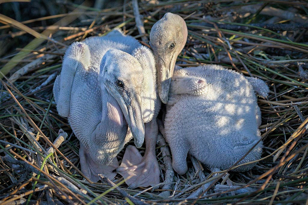
Hi Catherine. I was browsing the photos from various groups this month and your image caught my eye. Rarely, do we get glimpses into the nests of pelicans in this venue - so thanks for sharing.
For me, a valuable nature lesson was evident. Much to my surprise Brown Pelicans get BETTER looking as they age!
As Sharon Prislipsky inquired above, it would be very helpful if we, the viewers could have insight into the camera lens and settings that you used to get this image. To my eye the image is sharp and the overall brightness is about right. I feel that you used an appropriate f/stop as you have successfully softened the background.
I believe that you intend the viewer's eye to go to the two chicks as the fixation point and that you have achieved. In my opinion, however, the left wing of the left chick is too bright and a bit of a distraction. To further aid the focus on the chicks in the Visual Feedback I have taken the liberty of doing 3 adjustments.
First, In LR Classic "Basics" I applied the "Auto" feature which increased (among other things) the Contrast slightly. Second, I used the Brush Tool to select small area of each bird that were, again to my eye, too bright and reduced "Exposure." You can see that this brought out more of the pre-emergent feather locations. Last, I used On1 Photo Raw to put a Vignette on the corners of the image to further focus on the chicks.
Please feel free to tell me what you think. |
Jul 11th |
 |
0 comments - 1 reply for Group 40
|
| 88 |
Jul 21 |
Comment |
Very creative Charles! "A walking Landscape." |
Jul 8th |
1 comment - 0 replies for Group 88
|
8 comments - 7 replies Total
|