|
| Group |
Round |
C/R |
Comment |
Date |
Image |
| 4 |
May 21 |
Comment |
Bill, to my eye the technical aspects - sharpness, exposure and color are all well done. I like the way the orange, purple, green and rust colors play off against each other. AS an ex-Kodak'er it amazes me that these new phone cameras have a higher pixel density than the equivalent of the best film we ever made (@ 11M)! To my eye the fixation point is the grill and the lines of the bumper and smaller headlight circle lead my eye to that point. After some personal debate I feel that the shadows are also done correctly. That is, lightening the area to the right of the grill to bring out the spark plugs would be more of a distraction from the main composition. |
May 11th |
| 4 |
May 21 |
Reply |
Thanks Guy. I also use On1 Photo Raw and have done B/W conversions there. Right now I am doing my conversions in DxO Silver Efex. I will get back to you soon though on the Zoom to look at the PS process. Thanks again. |
May 10th |
| 4 |
May 21 |
Reply |
That is a really interesting version. Two questions:
I do not do this type of work much in PS (I mostly use DxO) so if I wanted to learn this and couldn't figure it all out would you be open to a Zoom call to walk me through it?
The sky has what appears to my eye to have some dark blue in it. In your opinion would this disqualify it as a Monochrome image? Thanks. |
May 10th |
| 4 |
May 21 |
Comment |
Guy, thanks so much for sharing your technique. You have added a technique to my bag of tricks. I had never though of stopping at point in the middle of a long exposure sequence.
For me this is "entrancing" to look at - trying to pick up the multiple pieces that are shifting. To my eye the strongest are those that are those clearly discernible at each of the stopping points. For me, those that can only seen 2 or 3 times seem to be distractions.
I have tried to strengthen the some strong parts and eliminate some distractions in the attached VF. I have taken some of the stronger shapes (notably the buoys) and replicated them to add to the lines they form. I took one of the (again for me) weaker points (the two posts in the left foreground and eliminated them.
Let me know what you think. Thanks for sharing. |
May 9th |
 |
| 4 |
May 21 |
Comment |
Erik, for me this is an intriguing image. Before reading your description I studied the picture and totally missed that this was a GBH upside down. Once realizing that I believe this is one very unique GBH pose. Well done!
From my experience I would say that you have done an excellent job in capturing the color of the heron (many pictures oversaturate.) As Isaac pointed out the "completed circle adds to the quality of the image. To me the circle allows the viewer's eye to move around, taking it all in without losing the "fixation" on the bird. I would agree that the "flip" enhances the image. Nice shot! |
May 7th |
| 4 |
May 21 |
Comment |
Vella, thanks for the detailed explanation of your post-processing work. For me I really like the increased brightness of the tiger contrasted to the darker background. I feel that this leads my eye to the jaguar and holds it there as a strong fixation point.
In the VF I have lightened the left side of the jaguar's face (the right side as we view it) to make all of his head standout a bit more. For me the histogram showed too much total black so I also slightly lightened the shadows.
AS always I would be interested in your thoughts. |
May 5th |
 |
| 4 |
May 21 |
Reply |
Yes, of course I know that one does not normally reduce sharpness of an image. My comment was not a critique of the equipment but a comment on how the image appeared to me.
That being said, from my experience it seems that a bit higher f/stop might have resulted in the back half of the dog being as sharp as the front. It might also yield a smaller difference in sharpness between the monkey and the "dirt" behind it which for me would be an improvement. |
May 5th |
| 4 |
May 21 |
Comment |
From all the images I have viewed in 5 years of DD this is certainly one of the most unusual. This image made me stop and consider how much fun this must have been for the attendees but even more, what training needed to be done to get a monkey to ride a dog to round up sheep!!
I agree with Vella that the exposure and the colors are well done given the strong contrast at this time of day. To my eye the sharpness of of the front of the dog and the shoulders and head of the monkey appear too sharp against the background. I believe that the other parts of the dog have a somewhat softer (and for me) more natural edge against the background. |
May 4th |
| 4 |
May 21 |
Reply |
Excellent suggestion Isaac, thanks. In the VF I not only reduced the blue sky but also went to 11x14 format and now have the pillar on the right directly out of the corner of the image. Thoughts? |
May 4th |
 |
5 comments - 4 replies for Group 4
|
| 40 |
May 21 |
Comment |
Andrew, to my eye the sky is well done and casts a very nice mood for this seafront image. From my experience however there is too much dark space. In the VF I played around with what pieces to brighten to add a "mid-ground" to this image. I chose only the three tankers on the left of the channel. I felt that the white forecastle at the extreme left and the small boat in the channel toward the right were distracting when lightened. To your Q about the yellow box, for my taste I would not crop it out bu leave it in as is or perhaps slightly darker. |
May 10th |
 |
1 comment - 0 replies for Group 40
|
| 88 |
May 21 |
Reply |
Definitely better! |
May 2nd |
| 88 |
May 21 |
Comment |
Trey, to my eye the strongest parts of the image are the sky first and the contrast of the dark treetops to the sky second. I feel that the birds add to the picture but as composed are too small to make a difference to this viewer's eye.
For me the reflected trees and sky are not bright enough to add much to the image. Did you consider cropping further to take advantage of the magnificent sky and to enlarge the Sandhill Cranes in the image?
Thanks for sharing and feel free to take a good shot at my image in Group 4. Would appreciate your thoughts there.
Stay safe. |
May 2nd |
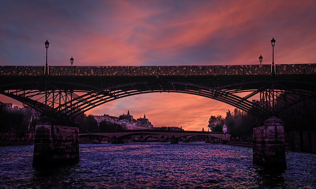
| 88 |
May 21 |
Comment |
Charles, another lovely image and worth the "risk" you took. For me the colors in the sky and the reflected water is enchanting. I believe that you have done the brightness correctly on the bridge by bringing out the deck detail but leaving the pillars in the shadows. AS you know I like three layers in images - so to my eye the lightened houses on the left bank in the VF add a bit more dimension to the overall image. Nicely Done! |
May 2nd |
 |
2 comments - 1 reply for Group 88
|
8 comments - 5 replies Total
|


