|
| Group |
Round |
C/R |
Comment |
Date |
Image |
| 4 |
Apr 21 |
Reply |
Thanks for your ideas Bill. I got a lot of comments on this one. I also sent it to Nancy Speaker for her comments and got some good suggestions from her. |
Apr 27th |
| 4 |
Apr 21 |
Reply |
Thanks for your ideas Bill. I got a lot of comments on this one. I also sent it to Nancy Speaker for her comments and got some good suggestions from her. |
Apr 27th |
| 4 |
Apr 21 |
Reply |
The original sky had a high haze that didn't keep the banks from
being lit but left a light uniform look to the higher background sky. |
Apr 13th |
| 4 |
Apr 21 |
Reply |
I sent your picture to a friend of mine who lives in the UK and is a big Liverpool FC fan. She love the picture and passed it on to another friend of hers who lives in Liverpool. So you're getting some pretty wide distribution. All the best. |
Apr 12th |
| 4 |
Apr 21 |
Comment |
|
Apr 10th |
 |
| 4 |
Apr 21 |
Comment |
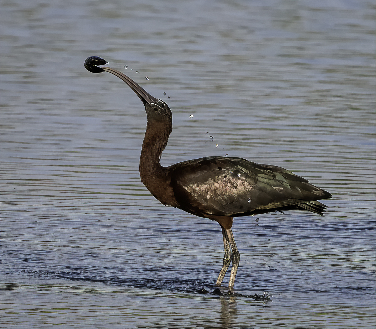
I'm envious. You have captured a bird I don't see often with a background that complements, not distracts, from the main subject. From my experience this is outstanding composition. I think that the sunlight on the feathers, yielding what seems to be a 'metallic' appearance, adds to the uniqueness of the image. For me the droplets add yet another dimension to this image.
To my eye the small feathers in the head and the eye (especially given that the bird has another similarly sized black spot) could be sharper and the eye alone a bit brighter. I have tried to do this in the VF.
Thanks for introducing me to DFine. I have it but have not used it to date. |
Apr 10th |
| 4 |
Apr 21 |
Comment |
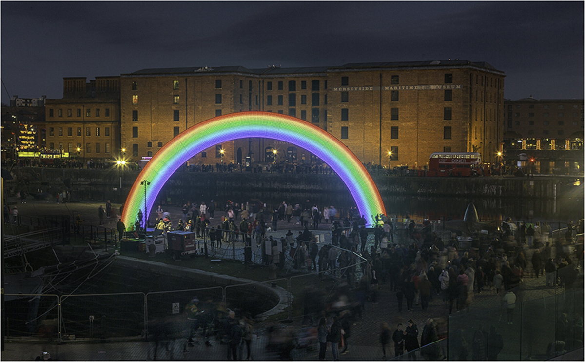
Ian, thanks for the detailed explanation of your process. Always appreciated. I can see that you gave much thought to the placement of your camera. From my experience the placement of the rainbow against the building with the crowd in the foreground is well done. To my eye the people could be brought out a bit more to add to the foreground strength. In the VF I placed your final into On1 Photo Raw, created a mask for the crowd, inverted the mask and then increased the exposure of the D/Log E curve about 50% above straight line position down near the toe. Let me know what you think. Thanks. |
Apr 7th |
 |
| 4 |
Apr 21 |
Comment |
Bill, thanks for sharing this wonderful image. For me it helps to see what an accomplished artist can do in an area of photography that is one of my favorites. I have photographed churches in Chicago, Buffalo and other locations. There are so many beautiful old churches in this country. I will have to add this one to my list.
I believe that you have done a very good job in post work bringing out the details throughout. Your presets have resulted in an image that accentuates the details through contrast and coloring yet remains very believable to the viewer's eye. From my experience I often debate on the starburst from the ceiling lights - I like that look and am glad to see that you do as well.
I am curious to know if you got the same lighting/brightness on all the stained glass windows just by using a 3-shot HDR. I often take additional exposures for the purpose of substituting if the the light varies. How broad were your exposure settings for the three shots.
Thanks. |
Apr 7th |
| 4 |
Apr 21 |
Reply |
Since you mentioned it, it is now time for total disclosure. The sky is not an HDR but a compilation of one image taken every minute for 45 minutes. I used a program called Starstax that was described by JR Schnelzer in a PSA journal in 2017. Same sky just a different day.
Having said that you think it overpowers the landscape a bit, what would you suggest to bring better balance? Thanks. |
Apr 5th |
| 4 |
Apr 21 |
Reply |
Isn't that exactly what's great about this opportunity to dialogue. We get to see both our own interpretation of the image as well as those of our viewers and then decide which is stronger or more touches the heart. Thanks for giving me more information on what you intended. |
Apr 5th |
| 4 |
Apr 21 |
Comment |
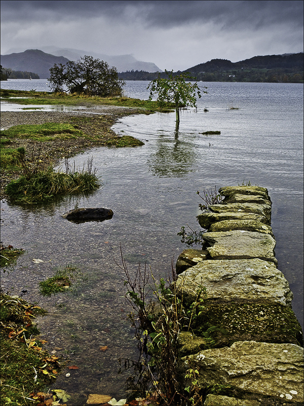
Guy, reading your description I sense that you did what every good photographer should do - that is work hard to find the right lines and the best composition for the image. To my eye you did a very good job with your choice of ISO, shutter speed and f/stop to get a sharp image on a cloudy day with what I assume is a handheld shot.
It seems to me that of the 3 layers, the foreground should be the strongest and "carry" the image. To that end in the VF I put the image into DxO Color Efex Pro 4 and used Tonal Contrast to bring out more of the detail in the shallow water to the left of the rock and on the leaves at the very bottom. To me this helps hold my eye on the fixation point in the foreground. Was that what you intended for the viewer? if not, bounce back and let me know. Thanks for sharing this image. |
Apr 5th |
 |
| 4 |
Apr 21 |
Comment |
Vella, this post work is nicely done. For me, the work that you have done to lighten and bring out the color of the clay on the tea cup as well as the hands makes me feel as though I am right there watching the creation. The skin tones, to me, look realistic and the texture that you have brought out in the hands and wrist leaves me with the impression that this person has been doing this for many years. Yes, I also think you should enter this image. |
Apr 4th |
| 4 |
Apr 21 |
Comment |
Isaac, for me this evokes memories of being a kid at the beach and searching for a conch shell that was like the one in your picture. To my eye the placement of the line of water bubbles in the wave from the lower right corner leads the viewer's eye to the conch and holds it there. The softness of the water compared to the crisp detail of the shell also work to accomplish this as well. |
Apr 4th |
| 4 |
Apr 21 |
Comment |
Marie, Thanks for the note. This is quite a coincidence as I also live in Webster New York. Perhaps next time we could try a shot like this together. I am always looking for somebody to shoot pictures with. |
Apr 1st |
8 comments - 7 replies for Group 4
|
| 76 |
Apr 21 |
Comment |
Ian, to my eye this is aa very peaceful and very pleasing image. I feel that you were not too heavy handed in bringing out the rock detail as I think it adds to the image by making the foreground stronger.
In light of our Q's we are working on, Did you shoot any longer exposures? If yes, did you consider manually layering in the boat details so that it could further add to the mid ground?
BTW I've worked with Trey for 2+ years in group 88. He provides very good feedback. |
Apr 16th |
1 comment - 0 replies for Group 76
|
| 88 |
Apr 21 |
Reply |
I think this version looks much more realistic. |
Apr 20th |
| 88 |
Apr 21 |
Comment |
To my eye the color in this image really makes the image. The rock formation at the bottom is well placed to lead the viewer's eye to the rocks in the stream.
I believe that the shutter speed has "frozen" the water. This sharpness places the water in competition with the rocks to hold the viewer's eye. Did you try shooting at a slower shutter speed in order to soften the water? It seem to me that a soft Vignette might also help hold the viewer's eye on the structure and beauty of the rocks in the river. Great shot! |
Apr 9th |
| 88 |
Apr 21 |
Comment |
Rick, I really like the composition of this image. It brings back memories as I have one very similar from Mt. Denali. I think you have captured the mountain and falls with a brightness and crispness that draws and holds the viewers eye. For me I use sky substitution on a limited basis but can buy in to what you have done here - to me it looks original. From my experience I would brighten the foreground trees so that at least a small amount of definition can be seem. To my eye that might further enhance the foreground. Nice job! |
Apr 7th |
| 88 |
Apr 21 |
Comment |
Louis, for me the two most important elements of the image are composition and lighting. I feel that you have done an excellent job with the composition in capture and post - creating three very interesting layers - the temple, the mountains and the sky. I went to Photographers Ephemeris and checked the location of the temple and the Mountain to make sure that the lighting in the sky was correct and (as you said) it is.
The brightness of the temple certainly catches and holds the viewer's eye. I think that is what you intended. From my experience the only change I would make is there at the temple. It seems to me that the temple is just a bit too bright and I would darken it just a small amount.
Nice picture. Thanks. |
Apr 7th |
| 88 |
Apr 21 |
Comment |
I understand now what you see in the image. Assume (maybe incorrectly) that I represent your typical viewer, how could you enhance or change the image so that your viewers see the same? |
Apr 5th |
| 88 |
Apr 21 |
Comment |
I understand now what you see in the image. Assume (maybe incorrectly) that I represent your typical viewer, how could you enhance or change the image so that your viewers see the same? |
Apr 5th |
| 88 |
Apr 21 |
Comment |
Trey, to my eye you did an excellent job with the colors and sharpness of these autumn trees. I see your logic of putting the 'V' at the 1/3 point; but I feel that the 'V' is too large. It appears to interrupt the flow from left to right and leave the image unbalanced. Did you consider in post work just moving all of the trees on the right over to close down that gap a bit and create a more continuous flow left to right for the viewer's eye. Would be interested in your reaction to my thoughts. Thanks. |
Apr 5th |
| 88 |
Apr 21 |
Comment |
Charles, thanks for sharing the details of your post work. It really helped me understand what you as the creator were trying to have the viewer see in the image.
I feel that the intent was good but the original image lacked too much to have the impact that you wanted. In my opinion the the bridge is neither bright enough or large enough to draw and hold the viewer's eye. It seems to me that you may have had a better chance with a tighter crop and opening up the shadows to see some details in the trees.
I tried this in LR and what I saw was that the light falling upon the trees then seemed to be at a different angle than the light in the replacement sky. Is that so? If I am mistaken and the light angles are correct, what could you have done additionally to put more of the light onto the tree tops to help hold the viewer's eye. |
Apr 4th |
7 comments - 1 reply for Group 88
|
16 comments - 8 replies Total
|


