|
| Group |
Round |
C/R |
Comment |
Date |
Image |
| 4 |
Mar 21 |
Reply |
Just wanted to let you know that I used all of the suggestions from the group for my image and have entered the upgraded version in 2 PID Color exhibitions. Thanks for the suggestions. |
Mar 30th |
| 4 |
Mar 21 |
Comment |
Guy, learning from your response I stayed with the "low light" version of the image. To my eye though the foreground trees lacked some definition and it seemed their color was muted. (The latter may have been that low angle light again.) In the VF I put the image into On1 Photo Raw and created a luminosity filter to only impact the trees in the foreground. I applied a Dynamic Contrast filter and adjusted the "small" and "Large" filters upward slightly and decreased the "Medium" filter slightly. for me this gave the foreground a bit more strength to contribution to the image. Thanks for sharing. |
Mar 10th |
 |
| 4 |
Mar 21 |
Comment |
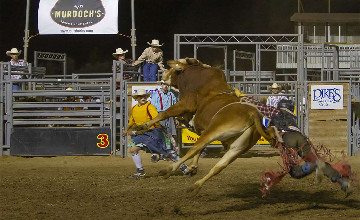
Erik, thanks for sharing the details of the capture. I use Nik but have never used the "Define" function so you have taught me something. For me the motion of the rider's leg gives evidence to the action as you said. It seemed to me that the left leg and chap were harder to separate from the background. In the VF I used the LR brush tool to slightly lighten the lower left leg and the lower part of the chap in order to make the catch my eye a bit more. |
Mar 8th |
 |
| 4 |
Mar 21 |
Comment |
Bill, from my experience with old cars you have chosen one of the most unique - most lack the variety of colors you have found here. I feel that the saturation level you have chosen makes a statement without stealing from the composition. For me the composition leads my eye down from the windshield through the yellow fender and holds it at the single headlight, with no distraction. Nice image! |
Mar 8th |
| 4 |
Mar 21 |
Comment |
Isaac, for me this image brings back great memories. I lived for two years in Guangdong Province of the PRC. I would wake up each morning to a large group doing Tai Chi on the back lawn of our apartment building. For me the shallower depth of field helps hold my eye on the gentleman in front. I feel that the "quiet intensity" on his face adds to the image. Thanks for sharing. |
Mar 4th |
| 4 |
Mar 21 |
Comment |
Ian, thanks for sharing this image and teaching me. From this image I see that I have much to learn from the Group 4 veterans.
From my experience you have done an exceptional job with the composition of the final image. To my eye the partial reflection in the water significantly adds to the image. For me that is the fixation point (is that what you hoped the viewer would do?) is that reflection. I feel that the hues in the sky and the softness of the sky add to the image as well. I believe that the shadow areas of the rocks add just enough foreground without overtaking the more important parts of the image. |
Mar 4th |
| 4 |
Mar 21 |
Comment |
Vella, first let me apologize if it was me who forgot to upload your title.
To my eye you have done a good job in your "Post" work with the colors, the brightness and the sharpness of the Kingfisher. For me the sharpness of the blue tones on the bird work nicely with the soft blue hues in the background to create a very pleasing image. I believe that Isaac has given some very good suggestions as well with his Visual Feedback (VF). Thanks for sharing this image. |
Mar 4th |
6 comments - 1 reply for Group 4
|
| 88 |
Mar 21 |
Comment |
To me this really tells a story. We spend the winters in Estero, FL which is only minutes from Ft. Myers Beach. In my opinion you have done a good job in capture on the colors, the sharpness and the Depth of Field. For me the fixation points of the sun (well done at f/9 without starburst in this case) and the people is somewhat distracted by the one tall grass that is out of focus. I believe that the image can be improved by removing at least that one. It also seems to me that there is too much on the right side of the image that isn't contributing - hence I would crop that side still leaving some space between the last grass and the edge. |
Mar 7th |
| 88 |
Mar 21 |
Reply |
That is a very observant suggestion. Thanks. |
Mar 7th |
| 88 |
Mar 21 |
Reply |
That looks great! |
Mar 7th |
| 88 |
Mar 21 |
Comment |
Sanat, I feel that this is one of the nicest images you have submitted.
From my experience the two most important elements of an image are Lighting and Composition. For me, I feel that you captured the first nicely. It seems to me however that from a composition standpoint you wanted to be further left in order to move the red tend into the image.
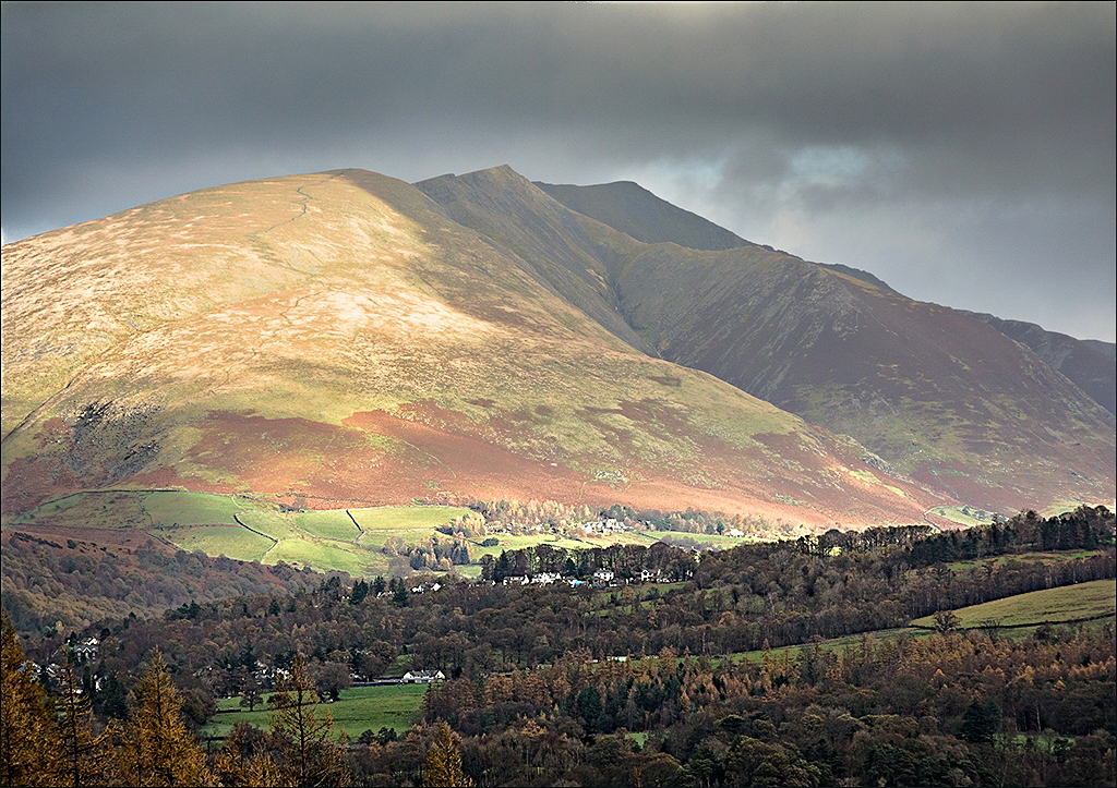
In Bruce Burnbaum's "The Art Of Photography" he teaches that the eye will go to the brightest points in the image first. To me, in this image, that is the blue in the sky and the red tent. It seems to me that by moving left you could bring the fixation point - the tent - into a better spot in the image that will then allow the viewer's eye to appreciate the valley beyond. To me, the blue sky is a bit over-saturated. Thanks for sharing this image. |
Mar 6th |
| 88 |
Mar 21 |
Comment |
Louis, for me the sweep of the bridge makes a very pleasing composition. I feel that it leads my eye into the image and holds it there. I believe that you have done an excellent job with the DoF getting sharpness of the details above the bridge and softness in the distance.
It seems to me that the underside of the bridge could be lightened slightly. In my opinion it may look good to lighten just the vertical elements that can be seen (perhaps drain lines, I don't know) on the sides of some of the pillars. To me the entire orange sky captures my eye initially but on contemplation of the image does not seem real. From my experience a good alternative may be somewhere between the original and the final.
Thanks for sharing. |
Mar 4th |
| 88 |
Mar 21 |
Comment |
Rich, thanks for the lovely image. For me, the colors and the hues you have captured (either in camera or post-processing {BTW It's often good to send an original so that others can see your post work}) have created a visually pleasing image. I believe that often a composition with centered images top-to-bottom don't work well but this one certainly does.
From my experience, I feel that the image is not quite sharp enough. I don't think it is a DoF issues as the softness appears - under enlargement - to be consistent across the image. |
Mar 4th |
| 88 |
Mar 21 |
Reply |
Ahah! Now I understand. I feel relieved! The input on the pano work was for me very useful! Thanks. |
Mar 4th |
| 88 |
Mar 21 |
Comment |
Trey, thanks for sharing the details of your capture and post work. I think I like the original because it has more contrast and - for me - grabs the eye a bit more than the softer image. In my opinion the footprints are not enough to grab or hold my eye. As a result I feel that I just keep wandering back and forth in the image with no real fixation point. Please excuse my lack of constructive input - I put this into LR and tried a few things but couldn't come up with any suggestions. |
Mar 4th |
| 88 |
Mar 21 |
Comment |
Charles, you have made the phrase "Simple is Best" come alive with this image. For me the three primary colors work in harmony to yield a very visually pleasing image. To my eye your composition is extremely well done. I feel that the location of each of the three main components works to bring my eye to the center of the image and hold it there with no distractions. Well Done! |
Mar 3rd |
6 comments - 3 replies for Group 88
|
12 comments - 4 replies Total
|


