|
| Group |
Round |
C/R |
Comment |
Date |
Image |
| 1 |
Feb 21 |
Comment |
Dennis, this is a great photo and very unique from met experience. For me the colors inside the tents together with the colors of the sunrise draw and hold my eye at their intersection. For me, I like the "moody" sky that you showed in response to Beverly's comment together with the tent colors in the first image you posted. Thanks for sharing. |
Feb 6th |
1 comment - 0 replies for Group 1
|
| 35 |
Feb 21 |
Comment |
To my eye there are several things that are striking in this image. For me the balance between the darker tones at the top and middle bottom together with the lighter tones at each side in the bottom give this image great balance. I also feel that the lines on the stream together with the lines of the bridge draw and hold the viewer's eye right in the center of this image. Lastly, I think that the softness of the grasses and rocks also adds to the image. Good job! |
Feb 8th |
1 comment - 0 replies for Group 35
|
| 88 |
Feb 21 |
Reply |
Thanks Charles! |
Feb 16th |
| 88 |
Feb 21 |
Comment |
You did a marvelous, I mean REALLY GOOD, job in post-processing. If I were you I would have this done on canvas and put it on the wall. One minor suggestion - for my eye - the edge of the silo is a bit too sharp. Go to PS, select the silo. Then go to the "Select" menu and choose "Modify" then choose "Feather" and feather the edge by 1 or 3 pixels.
BTW If you decide you might like the canvas option I have a great guy in Arkansas that does that. |
Feb 13th |
| 88 |
Feb 21 |
Comment |
To my eye you have done a good job with the focus, DoF and exposure. In post you have done a good job of bringing out the blue of the sky without impacting the greens of the fields.
From my experience I would suggest cropping the image so that the cattle are more noticeable in the image. I feel they should be the focal point. |
Feb 8th |
| 88 |
Feb 21 |
Comment |
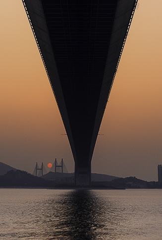
To my eye you have nailed one of the two key components of an image - the color and lighting component. For me the oranges and the grays work well in harmony. I feel that you have done an excellent job with the sharpness, DoF and focus.
From my experience there is not enough to hold the eye in the image. I have taken the liberty in the VF of significantly cropping to make the distant bridge work and the setting sun large enough to (for my eye) hold the viewer's eye at that point. I will be interested to hear your thoughts. |
Feb 6th |
 |
| 88 |
Feb 21 |
Comment |
From my experience I would say that you have done an excellent job with the two key ingredients of image capture - composition and lighting.For my eye, the location of the driftwood with the leading sand lines perfectly draws and holds the viewer's eye. I believe that you have done a good job, capture or post, with the contrast of the sky and that adds a nice background for the driftwood.
Well done! |
Feb 4th |
| 88 |
Feb 21 |
Comment |
From my experience, what you have done with the castle (which I have toured) has added significantly to the quality of the image. I feel that the colors are rich yet believable and the shadows/highlights improve the image. I believe that the sky substitution is well done as the angle of the light matches the light falling on the castle.
For me you have given up too much by taking away the railing and water. To my eye your problem must have been that the fence in the foreground and the top of the castle were at two different angles. In the VF I placed the image into PS and skewed it to get everything level. I then cloned away the pillar on the left to remove that distraction. I did not attempt to mess with the sky or try to replicate your castle work. This is what I got. Your feedback would be of interest top me. |
Feb 3rd |
 |
5 comments - 1 reply for Group 88
|
7 comments - 1 reply Total
|


