|
| Group |
Round |
C/R |
Comment |
Date |
Image |
| 88 |
Jan 21 |
Reply |
Thanks for the comment Gary. I'll play with that a little bit. |
Jan 24th |
| 88 |
Jan 21 |
Reply |
Thanks for your comments Trey. I tried my best to get the right color, it's very hard when you are repainting and not at 100% opacity. I looked up the CMYK color of the red stripe on the American flag and used that to paint the field. As I mentioned I left it as an independent layer so that I could adjust the opacity of that color Independently from everything else. When I went higher in opacity it covered some of the corn stocks in very quickly looked unreal. On your suggestion though I will go back and study it one more time to see if there's anything I can do to improve without making it look "fake". Thanks again. |
Jan 18th |
| 88 |
Jan 21 |
Comment |
That looks better to my eye. |
Jan 18th |
| 88 |
Jan 21 |
Reply |
Thanks Lou. Good to hear from you. I hope you are well and also hope that someday we can share images together again. Stay safe! |
Jan 16th |
| 88 |
Jan 21 |
Reply |
Thanks Lou. Good to hear from you. I hope you are well and also hope that someday we can share images together again. Stay safe! |
Jan 15th |
| 88 |
Jan 21 |
Comment |
Sanat, I feel that you have done a good job in capture with the color, brightness, sharpness and the depth of field.
To my eye there is nothing to hold the viewer's eye - every image should have a fixation point. I agree with Charles and from my experience I would remove some of the water. To me the most interesting part are the clouds. I feel that you could add some contrast in that area to perhaps attract the viewer's eye there. |
Jan 13th |
| 88 |
Jan 21 |
Comment |
Charles, thanks for the comments. In order ...
First where would I find the sky replacement tool? I have never used it and would like to see what it could do.
Second I feel that B&W would defeat the purpose of the picture.
Third, I kept the stripes and sky layers separate until the end so that I could adjust the opacity and therefore the saturation of the color. They are at 74% and when you go greater than that it looks less real and you start to lose the underlying detail in the corn stalks. |
Jan 11th |
| 88 |
Jan 21 |
Comment |
To my eye you have done an excellent job with the composition, exposure, DoF and the color balance. From my experience the sky adds to the image and the placement of the bridge and the home hold the viewer's eye where you want it in the image.
I believe that the angle of the road is a distraction and from my experience would make this suggestion - if you can return, shoot this same scene in the spring with new blossoms and probably no algae on the water. Shoot it in the same direction but from the other side of the road.
I believe that this the potential to be an outstanding image. |
Jan 10th |
| 88 |
Jan 21 |
Comment |
For me the strong points of this image are the contrast of the blue sky and water against the browns of the buildings; and the smoothness of the water against the sharpness of the buildings. To my eye the color is realistic and the sharpness correct.
I believe, however, that there is too much open space in the image. I think that a crop to make this more of a panorama shape (having less sky and less water) might accentuate the buildings as the main subject. |
Jan 9th |
| 88 |
Jan 21 |
Comment |
I believe that this image has several very strong points. First, to my eye, the composition with the falls - leading the eye to the rainbow -serves well to bring the viewer's eye to the center of the image. I think that the sharpness of the falls and mid-to-background rocks is well done. For me the structure of the rocks adds to the quality of the image. This picture, for me, evokes memories of my one and only (so far) trip to Yosemite.
From my experience the DoF of the image is too narrow, leaving the foreground rocks and the foliage on the right out of focus. I believe that the original image could support this. However, the bright green you have given the foliage on the right keeps drawing my eye to that out of focus area. I think that the original sky was also better in that it does not want to draw my eye from the falls - as the saturated blue does. |
Jan 4th |
| 88 |
Jan 21 |
Comment |
Happy New Year Trey. I hope the new year finds you and your family happy and healthy.
I fell that you have done a very good job with composition and lighting on the image. Having spent little time in Wisconsin, this is typical of what I envision as Wisconsin's natural areas - very nice. For me, the flow of water from center right to lower left helps to fix my eye on the water and hold it there. I like the idea of using ND's to get softer water.
From my experience I would be interested to see what your water looked like (if you shot this as well) at an 8 second exposure. To my eye the entire image is a bit soft but wonder if that is some artifact of getting it up onto this web page.
Thanks for sharing. |
Jan 3rd |
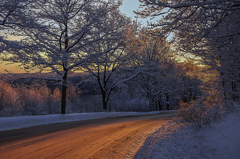
| 88 |
Jan 21 |
Comment |
Happy New Year Charles. I hope that you and your family are healthy. Lert's look forward to a better 2021.
For me, I like the simplicity of this picture. At first I wasn't sure about the more intense reddish glow - but after studying the image I believe that the color is believable and adds interest to the scene. To my eye the flow from left to right works well to draw the viewer's into the image and hold it there.
From my experience I feel that the shadows are a bit too dark. In the VR I have lightened them. For me this yields more detail for the viewer's eye to feast on! |
Jan 3rd |
 |
8 comments - 5 replies for Group 88
|
8 comments - 5 replies Total
|


