|
| Group |
Round |
C/R |
Comment |
Date |
Image |
| 14 |
Dec 20 |
Comment |
Quang, to me this is an excellent image. I love the contrast of the dark image, the rainbow backdrop behind her and then back to the (almost) BW background. Well done. |
Dec 5th |
1 comment - 0 replies for Group 14
|
| 35 |
Dec 20 |
Comment |
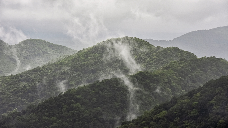
Sharon, you get to some great places to create your images and this is another good one. For me the composition is well done - you have drawn my eye to the lowest point in the mountains in the center of the image. And the image fixes my eye there. The contrast and brightness work to support the feeling of "Solitude." I feel that perhaps the image needs just a bit more contrast in the smaller trees and bushes in the foreground. Thanks for sharing this image with us. |
Dec 5th |
1 comment - 0 replies for Group 35
|
| 88 |
Dec 20 |
Comment |
Gary, I feel that the sharpness and DoF of this image are strong points - with everything from the near rocks to the far trees being sharp. To me the contrast of the trees at water's edge, and their reflections, is well done and adds to the quality of the image.
To my eye however, the conversion from Color to Black and White removes the color contrast and the remaining tonal contrast does not create a fixation point for the eye (that WAS in the color image.) I haven't played with the image on my computer but from my experience I might suggest that you try reducing tonal contrast in those parts of the image that are not where you want the viewer's eye to rest? I would be interested in your thoughts. Thanks. |
Dec 6th |
| 88 |
Dec 20 |
Reply |
Yep I like that one! |
Dec 5th |
| 88 |
Dec 20 |
Comment |
Trey, I really like the Post work you have done on this image. For me, the PS burning and/or dodging (my guess) has made all of the trees much more interesting. To me, in doing that you have also created the right fixation point to draw and hold the viewer's eye. One small thing you might try (and I would be interested in your feedback) would be to crop from the bottom about 1/4 to 1/3 of the grasses to create an even stronger fixation on the trees. Thanks for sharing and Happy Holidays. |
Dec 5th |
| 88 |
Dec 20 |
Comment |
Sanat, I really like the composition of this image and the way you have captured the wispy clouds across the ridges. I feel that the combination of those two pieces leads the viewer's eye into the image and holds it there. The DoF and sharpness are also to my eye correct.
I believe that in making the mountains more green that you have given the entire image a green cast. I placed your image into LR and redid the White Balance. For my the VF (visual feedback) maintains enough of the green of the hills and returns the sky to the neutral hue it should be. Tell me what you think. |
Dec 5th |
 |
| 88 |
Dec 20 |
Comment |
Louis, to my eye the symmetry of the bridge works very well. I believe also that the choice of shutter speed is well done leaving pleasant soft images of the vehicles on the bridge. From my experience the DoF, sharpness and color are also well done. If I understand you correctly you chose not to take out noise but to add more to the sky. Either way what you have done results in a good backdrop sky for this image. |
Dec 5th |
| 88 |
Dec 20 |
Comment |
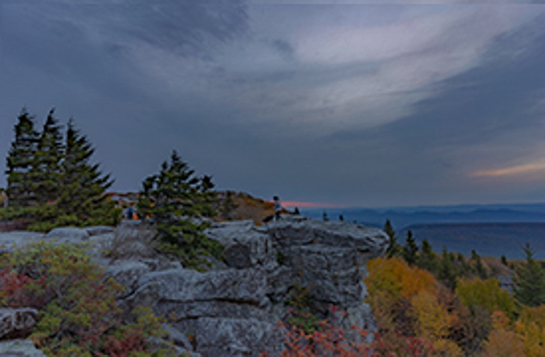
Quang, to me this image is very pleasing to the eye. I feel that there is a wonderful contrast between the soft colors of the lower part of the image and the near-uniform grayness of the top of the image. I really holds my eye on the foreground. I think that the depth of field is well done but wonder if you couldn't get a bit more sharpness on the evergreens. I took the liberty of playing with this a bit as, for me, there was a bit too much sky. I simply cloned the sky downward and cropped slightly in my VF (visual feedback.). Thanks for sharing. |
Dec 5th |
 |
| 88 |
Dec 20 |
Comment |
Charles, I really like the inclusion of the artist in the image. If you remember about a year ago Scott Messner had a similar image except that the artist was missing from the image. It looked "lacking" in my opinion. This looks much more complete to me from a composition standpoint.
To my eye your capture has created a pleasing depth of field and sharpness to help hold my eye. I believe that the highlights are "spot on." From my experience, I might suggest opening up the shadows a bit to get some detail on the artist's jacket and pants. I also feel that Trey's suggestion is a good one . To me I would have preferred to see the artist higher in the foreground - at a 1/3 point - but unless you have cropped something at the bottom I think Trey's suggestion may be the next best alternative. Thanks for sharing. Good job! |
Dec 5th |
| 88 |
Dec 20 |
Reply |
Louis, thanks for your feedback. I will consider a bit heavier GND on the sunrise. As for the hills in the foreground, their brightness is better "questioned" than stated to be too bright. What you, the viewer cannot see and understand is that these trees are already being lit be the reflection of light off of the the sheer rock wall that is just below my camera. |
Dec 5th |
| 88 |
Dec 20 |
Reply |
For everyone's understanding and to cut down the work I have to do --I did not post the wrong image. The supplied image was too large. When I tried to resize it it came out this way. From now on I will send back all images that arrive outside of specification. I will no longer try to fix them for you. |
Dec 3rd |
6 comments - 3 replies for Group 88
|
8 comments - 3 replies Total
|


