|
| Group |
Round |
C/R |
Comment |
Date |
Image |
| 88 |
Nov 20 |
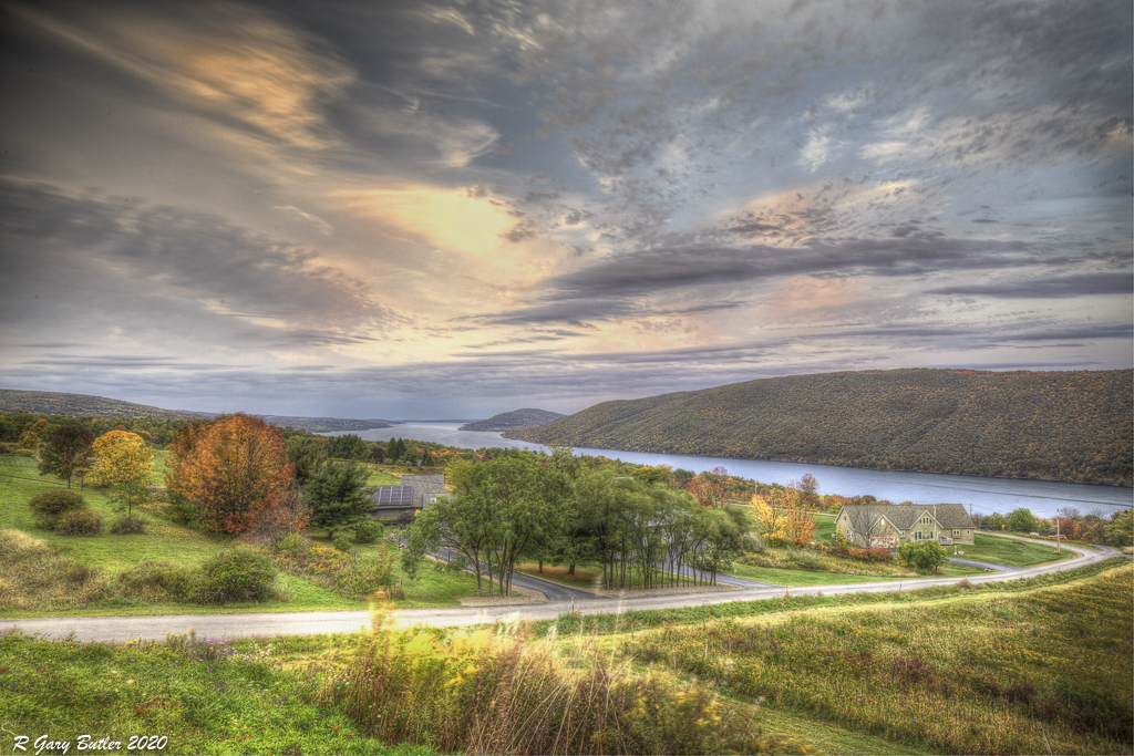
Comment |
Did you see the image above that I did receive in response to a previous comment? That one is desaturated a bit. I have used the "clarity" slider to improve the image and tend not to use both clarity and Dehaz as the combination gives you some unwanted affects. Thanks for the comment |
Nov 18th |
| 88 |
Nov 20 |
Reply |
Thanks for the thoughtful comments Gary. I played with that idea as well. Two considerations came into play. First, can the sky stand the increased interest? I believe the answer to that is 'yes' as it has some unique features. Second, how interesting is the bright cloud if I reduce its brightness. I felt the answer there was that I gave up too much. So on balance I decided to stay with the brighter version. |
Nov 7th |
| 88 |
Nov 20 |
Reply |
Thanks for the comment. I went back into LR and Desaturated somewhat. This is what I got and I think that this may do better in a Color Open Exhibition. |
Nov 6th |
 |
| 88 |
Nov 20 |
Comment |
For me the image, as I understand it, has possibly good content. Unfortunately, in my opinion, it is overexposed leaving too much oof the foreground and background dark and without detail. From my experience this is a scene where you want to shot a at least a 3 shot (Nom. +/- 2EV) or perhaps a 5-shot Exposure Bracket and then use PS or LR to combine them into an HDR. I believe that you will find the resulting image much more pleasing. |
Nov 5th |
| 88 |
Nov 20 |
Comment |
To my eye you have correctly captured the colors of this fall scene. I feel that the sharpness and depth of field add to the quality of the scene.
Every image needs a fixation point where the viewer's eye can flow to and be held. In my opinion with this cropping you have created strong lines with the tree trunk and horizontal branch that move my eye to the upper right corner. I think you are taking me away from the heart of the picture in the center. For me I clearly prefer the uncrossed image. |
Nov 5th |
| 88 |
Nov 20 |
Comment |
Louis, to my eye you did an excellent job in capture with the positioning of three key elements - the moon, the dome and the road to the observatory. To me this leads the viewer's eye to the dome and holds it there. I feel that your post work has significantly enhanced the image. I believe that the final color of the sky is maybe a bit too saturated, but to me still believable (don't change it!)
From my experience there may be too much "plain area" constituted by sky, sea and hill with little detail. I would not change the first two. Perhaps a small amount brightness (not enough to distract from the sky/sea) would be helpful. Thanks for sharing this image. |
Nov 4th |
| 88 |
Nov 20 |
Reply |
In my opinion the Photomatix kept it together - I told it to allow "Ghosting" because the shots were longer duration. Careful saturating with DxO also helped. I actually did 12 different ones (time based) and then chose the one I liked best. Hope that answers your Q! |
Nov 2nd |
| 88 |
Nov 20 |
Reply |
Yes, I do. To my eye that is an improvement. Good job! |
Nov 2nd |
| 88 |
Nov 20 |
Comment |
Gary, great Image and nice job processing it. To my eye I love the way the light clouds lead the viewer's eye back down into the Arch. I like the DoF, colors and Sharpness of the image as well. Can you tell me how long after sunset the image was taken? Thanks. |
Nov 2nd |
| 88 |
Nov 20 |
Comment |
I should proof read my own entries. I used f/16 and did local adjustments on "other minor points." |
Nov 2nd |
| 88 |
Nov 20 |
Reply |
Thanks for the comments. Here aren my best answers. Yes, Viveza allows you locally to do many adjustments with the location (or locations if you link Control Points) chosen. The adjustments include Brightness, Saturation, Structure, Contrast, Hue, Red, Green, Blue, and others.
As I mentioned I have now started placing my LR image into PS and save it as a Smart File. Then by going to the "Filters" tab I can open any of the Nik (DxO) filters and continue local work.
I use TIFF for 2 reasons. If I am working on an image and still have not compressed the layers TIFF seems to handle it best. I also move in and out of Topaz Studio and On1 Phot Raw and the TIFF format seems less destructive (easier to back and forth and not lose the ability to change my work.)
If you have any tips/recommendations in this area I am always open to learning. |
Nov 2nd |
| 88 |
Nov 20 |
Comment |
Trey, I love the description - to me it is very thought provoking and took me nicely into the nature setting. It seems to me that the available light at the tree was not sufficient to give you the tonal separation you really would want for this picture. I tried putting it in On1 Photo Raw and boosting the Dynamic Contrast for the tree vs background. I tried adjusting the Tone Curve. Both did not make the tree stand out further - as my eye would have liked it to do. If you have some other techniques that could accomplish this. to me at least, I think it would help. |
Nov 2nd |
| 88 |
Nov 20 |
Comment |
Charles, I really like the creativity of this image. I feel that the contrast you were able to achieve to bring out some of the interior architecture is well done. I think that the cropping at the top is spot on. I believe that your spot work (darkening the open window on the right) adds to the quality of the image. To my eye you could have used more (not all) of the lower part of the original to further enhance the look of this image. Thanks for sharing. |
Nov 1st |
8 comments - 5 replies for Group 88
|
8 comments - 5 replies Total
|


