|
| Group |
Round |
C/R |
Comment |
Date |
Image |
| 35 |
Sep 20 |
Comment |
I feel that your post processing work turned an above average picture into an excellent picture. To my eye the cropping well uses the fence line to lead the viewer's eye toward the tree and the sky. Good Job! |
Sep 10th |
1 comment - 0 replies for Group 35
|
| 88 |
Sep 20 |
Reply |
Yes, that can be a problem. I calibrate my monitors monthly to avoid that. It is especially a problem when entering photo exhibits or making prints. |
Sep 14th |
| 88 |
Sep 20 |
Reply |
Yes, that can be a problem. I calibrate my monitors monthly to avoid that. It is especially a problem when entering photo exhibits or making prints. |
Sep 14th |
| 88 |
Sep 20 |
Reply |
Please see revisions to my image per your comments. Thanks. |
Sep 9th |
| 88 |
Sep 20 |
Reply |
Please see revisions to my image per your comments. Thanks. |
Sep 9th |
| 88 |
Sep 20 |
Reply |
Please see revisions to my image per your comments. Thanks. |
Sep 9th |
| 88 |
Sep 20 |
Comment |
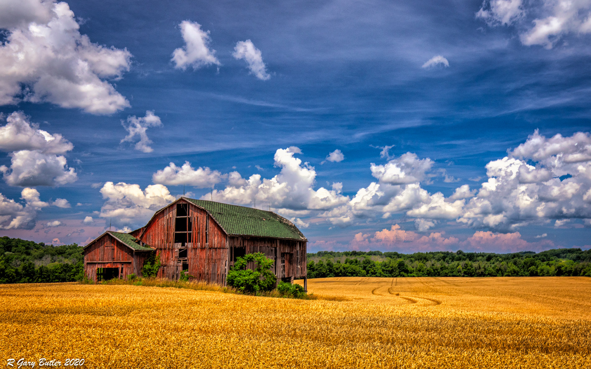
I took all of your comments to heart. I do not compete well in the PSA Mono category but do better in the Color Category. I have decided to use the color version. As Louis suggested I decreased contrast in the more substantial clouds - leaving the wispy ones as they were. Trey, the conversion back to color gives me the color separation for trees versus barn that I did not get with just tonal separation in BW. I have desaturated the entire image a bit and added a very soft Vignette in On1. Gary, I think the diagonal line (the beginning of the truck tracks) is less distracting in color. |
Sep 9th |
 |
| 88 |
Sep 20 |
Comment |
To my eye you have done a good job with the lighting and sharpness the image. The green of the grass draws my eye as a fixation point but from your description that doesn't seem to me to be the intended focus. Or is the earthen works behind the boats a part of the Dam? |
Sep 9th |
| 88 |
Sep 20 |
Comment |
To my eye the composition of this image is well done - I like the placement of the sun at a 1/3 point. I feel that you have done an excellent job with the depth of field and sharpness, catching the details of the logs in the pond in the foreground. I believe that you used a well chosen f-stop to get some rays of the suns but not a starburst effect that really wouldn't go with an image of a fire scene. I think you have donee a good job in post-processing of keeping detail out of the pines as they are just "place holders" here and not the main subject. Well done! |
Sep 8th |
| 88 |
Sep 20 |
Reply |
Trey, given that intent you may want to crop some from the right side as the picture is very heavily weighted on the left versus the right. Many people can except imbalance top to bottom, most have a problem with imbalance left to right - if you believe Bruce Barnbaum ("The Art of Photography"). |
Sep 7th |
| 88 |
Sep 20 |
Comment |
Scott, to my eye the balance between the blue sky and the brown earth is very pleasing. I believe that Louis is correct, if not a bit too harsh in saying, that landscapes are better shot in the f/8-f/16 range. I feel that this might be really interesting as a "Stretch" picture". That is cropped to be much wider than high. I feel that you don't need much of the foreground. Just a thought! |
Sep 7th |
| 88 |
Sep 20 |
Comment |
To my eye the image is very well balanced left to right and top to bottom. I feel that you have done an excellent job in capture with the depth of field and sharpness. From my experience the contrast and exposure you have created makes this a very pleasing image. I believe that you have achieved the desired effect of making the two fixation points the mountain and the temple.
For me the temple is a bit brighter and therefore draws the eye a bit more than the mountain. To me, reducing the brightness of the temple a small amount might improve that balance.
Nice shot! |
Sep 7th |
| 88 |
Sep 20 |
Comment |
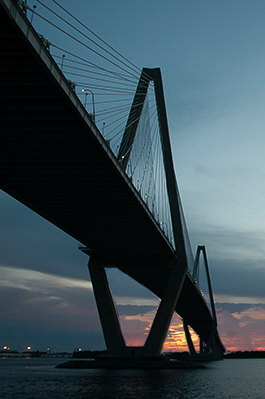
Trey, to my eye there is much to work with in this image. From my travels, this type of bridge is very photo-worthy. I believe that the light in the original is close but I do light the extra saturation you have given.
For me the sunset off to the right draws my eye from the great structure and sharpness of the bridge. So I have taken the liberty of refocusing my eye (at least) back to the bridge by moving the sunset under and going to a vertical image.
As always am interested in your thoughts back. All the best! |
Sep 6th |
 |
| 88 |
Sep 20 |
Comment |
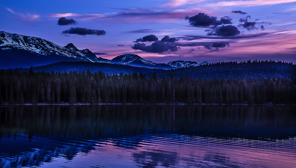
To my eye the colors of the sky and reflection are exquisite. I like the contrast in the sky - it adds to the image. This for me is the fixation point of the image.
I agree with Louis that you need to bring out the trees in the mid-ground as they add to the quality of the image. However, in my opinion Louis has lightened them too much so here is my version. |
Sep 4th |
 |
7 comments - 6 replies for Group 88
|
8 comments - 6 replies Total
|


